Shop Products
Houzz Logo Print
elissahart

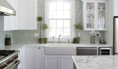
Reveal of our smallish white and gray kitchen

elissahart
11 years ago

I've been hanging out here for a few months and have learned a lot. Plus I always love seeing what other folks have done and I adore the pictures of newly renovated kitchens. We are now done with our remodel so I thought I'd return the favor! Here goes.

The old kitchen had a bunch of issues: not enough storage or countertop space, no ventilation, peeling paint on the cabinets, hideous vinyl floor, and stained butcher block countertops.

Here's the old kitchen:

There was a bunch of unused space in the eating area--we stuck our microwave and recycling bins in this area:

Although the old kitchen had a number of issues,we found the layout to be reasonably functional (given the constraints of the house--it's a 1935 brick colonial with a 1970's-era addition on the back). We did not have the budget or the patience for a major remodel that would involve an addition and/or moving walls around, and we generally like the layout of the rest of the house. So we decided to keep the basic floorplan while replacing everything and making some changes around the edges. We added shallow lower cabinets and a strip of countertop to the wasted space in the eating area, with open shelving above. We added an externally vented hood and switched to a wood floor that matches the rest of the flooring on the first floor of the house. We went with two big lower drawers instead of cabinets for pot and pan storage. Here are some pictures of the new kitchen--I'll list all the details at the end.

Counters: Caesarstone Raven
Floors: oak stained to match the rest of the first floor
Cabinets: local custom shaker cabs in "frosty white"
Hardware: Top Knobs
Sink: Kohler Whitehaven
Faucet: Delta Allora
Backsplash: Solistone Mardi Gras in Carollton
Range: GE Cafe gas with double oven
Dishwasher: Bosch SHX33RL5UC
Refrigerator: Kitchen Aid Counter Depth French Door
Hood: Zephyr Savona 30"
Microwave: GE Profile with trim kit
Paint: Martha Stewart Spring Melt
Table: Room and Board Aria in white
Chairs: Ikea Sigurd in dark gray

We are very happy with the end result. I'm particularly pleased with how all the colors came together. We LOVE the new backsplash. I had seen a few pictures online of how the tile looked installed, but it's hard to envision in your own space with just a single sample tile. The tile is a greenish gray that varies depending on how the light hits it. It's actually uniform in color, but it appears variegated because of the light effect. It has a little bit of shimmer but isn't too showy. I had originally thought we would go for gray paint on the walls, but our dining room is painted green so I started looking at grays with some green in them, and we ultimately ended up with paint that is green with a gray overtone (Spring Melt from Martha Stewart at Home Depot). The pictures don't do it justice, but it coordinates really well with the backsplash and I find it really soothing. I also really love our new hood--going from no ventilation to this is a huge improvement! The Zephyr Savona is a chimney-style hood but it has a rounded edge that makes it a little sleeker looking.

Based on everything I've learned over the last few months it seems like a lot of what we did is right in line with current trends (quartz counters, white cabinets, some open shelving, farmhouse sink), but we love it so I'm not too concerned about it looking dated in a few years. Plus we are planning to stay in this house for years to come, so no worries about resale.

Let me know if you have any questions. I benefited so much from seeing and hearing about others' decisions--would be happy to help if I can!

Comments (62)

  • ccfuss07
    11 years ago
    last modified: 9 years ago

    So gorgeous! Now I'm wishing I went with the caesarstone raven, it looks amazing, especially with that tile.

  • deedles
    11 years ago
    last modified: 9 years ago

    That's really beautiful... the tile is perfect. I think the soffits look great and totally make sense.

    Wow, that is so nice... enjoy!

  • Catherine Roddick
    11 years ago
    last modified: 9 years ago

    Gorgeous proof that amazing doesn’t have to be big! Enjoy your space!!

  • AnnaA
    11 years ago
    last modified: 9 years ago

    A cozy kitchen with lots of architectural charm is now a show stopper! I love the transformation.

    Thanks for sharing!

  • andreak100
    11 years ago
    last modified: 9 years ago

    What a sweet, lovely kitchen! I hope it makes you smile every time you go in!

  • finestra
    11 years ago
    last modified: 9 years ago

    Wow! What a stunner! Great job. Enjoy!

  • badgergal
    11 years ago
    last modified: 9 years ago

    What a nice transformation. Your kitchen proves that "good things come in small packages". I love the way your tile looks a bit variegated. What a great idea to put the cabinet and shelves in your eating area. Your fridge area with the cabinetry is so much nicer than it was before
    Pat yourself on the back for a job well done.

  • motherof3sons
    11 years ago
    last modified: 9 years ago

    That is lovely! I especially like the open shelving.

  • gr8daygw
    11 years ago
    last modified: 9 years ago

    It's fantastic! I love it.

  • springroz
    11 years ago
    last modified: 9 years ago

    Gorgeous!! Love the spot you chose for the MW, and the hood is really pretty. Very, very nice.

    Nancy

  • covingtoncat
    11 years ago
    last modified: 9 years ago

    Love! Very updated and neutral. Can you post more pictures of your eat in area?

  • michoumonster
    11 years ago
    last modified: 9 years ago

    love all your colors! very soothing and sophisticated!

  • threegraces
    11 years ago
    last modified: 9 years ago

    Gorgeous - great use of the space. We're old house livers (and lovers) too and you have to be creative to work in the confines of what you have. You did a fantastic job and I love the colors and materials you chose. Congrats!

  • onedogedie
    11 years ago
    last modified: 9 years ago

    I love your cozy eat-in kitchen.

  • Mur12506851
    11 years ago
    last modified: 9 years ago

    I love it -- very tasteful, modern without being over-the-top, and elegant. OK, here's the really rude question: How much did you spend, all in? I ask because I'm curious how much it really costs if you're not moving walls, moving plumbing, etc., and basically improving function and aesthetics only.

  • mpagmom (SW Ohio)
    11 years ago
    last modified: 9 years ago

    I love it! I predict a surge in sales of Caesarstone Raven when people see your kitchen. The tile and paint color are lovely too. Great job!

  • rovo
    11 years ago
    last modified: 9 years ago

    Oh, it's beautiful! I adore the bs! Really nice job.

  • lazy_gardens
    11 years ago
    last modified: 9 years ago

    Very nicely done.

  • corgimum
    11 years ago
    last modified: 9 years ago

    Nice work! Your tile had me at hello. Off to check it out...

  • shanghaimom
    11 years ago
    last modified: 9 years ago

    Wow, this is perfection. One of the best transformations I've seen on this forum!

    Your space is so typical for a '30s home, and this reno proves that you don't really need to mess around with the footprint to have a beautiful, functional kitchen and eat-in area. It will no doubt be saved as inspiration for many!!

    Love the tile, farmhouse sink, cabinet style, and flooring. That Raven is a nice neutral charcoal to pull it all together.

    Great job! Enjoy!

  • msrose
    11 years ago
    last modified: 9 years ago

    Your backspash is my favorite part! I looked it up and it looks so different up close than it looks far away, kind of like an optical illusion.

  • stealthecrumbs
    11 years ago
    last modified: 9 years ago

    Looks great! I love the tile back-splash. Wonderful job!!!

  • smiling
    11 years ago
    last modified: 9 years ago

    That is a remarkable transformation! Agree with all the praise and comments above, and just want to add what a clever idea it was to add doors to that bookcase in the eating area. Simply wonderful all through the materials and finished kitchen. Bravo!

  • go_figure01
    11 years ago
    last modified: 9 years ago

    So glad you posted erhm! Looks lovely, love your color choices, shelving, etc. TY for listing your products, esp that gorgeous BS w/the Caesarstone!
    Manifique !!

  • alvmusick
    11 years ago
    last modified: 9 years ago

    Congratulations! I love every inch: enjoy your new kitchen!

  • amck2
    11 years ago
    last modified: 9 years ago

    Fabulous job! Your thoughtful planning and choice of materials transformed the space. Looks fresh, welcoming and functional. Enjoy -

  • jentrex
    11 years ago
    last modified: 9 years ago

    What a lovely kitchen. All your choices work so well together. Thanks for posting.

  • taggie
    11 years ago
    last modified: 9 years ago

    This is such a beautiful bright kitchen, you just did an amazing job!! So much to admire. The beautiful countertops, your backsplash, the great looking floors, that fabulous coffee bar area (wow), and the beautiful appliances. Everything just harmonizes so nicely. I had to go back and look for the soffit and only noticed it after you pointed it out. Pretty amazing kitchen when even the soffits are praiseworthy. :)

    Great job, congratulations!

  • shelayne
    11 years ago
    last modified: 9 years ago

    Wow, that is beautiful! Congrats!

  • enduring
    11 years ago
    last modified: 9 years ago

    Beautiful job and congratulations on completion. I think is so put together. The tile is very nice. The bright little eating area is now so much more functional and the doors to the shelving to the right of the window really finishes it off. Thanks for posting. Many happy and nourishing times!

  • islanddevil
    11 years ago
    last modified: 9 years ago

    WOW, is that really the same space? Looks fantastic! Love your cabinets and all your surface materials and colors. The backsplash is very pretty. Is it glass, ceramic or ?

    Can you please tell me how long the upper cabs are next to your sink? Also can you please post another picture of your sink wall that shows both uppers in the same pic?

    I ask because I really like how your microwave looks (is it on a shelf?) and am wondering if I can do the same in my small kitchen. Except it would be alongside my range rather than sink and I would love to see how the 2 different length cabs look. My micro is currently above the range and I don't want that again, but not sure where else I can fit it other than to the right of the range and for that reason I'd like a micro that's hinged on the right, but haven't seen any. Do you find it at all awkward that it opens on the right, next to the wall?
    Thanks.

  • nap101
    11 years ago
    last modified: 9 years ago

    Love what you did!

    My kitchen design is so similar to yours it's scary. I have a small galley kitchen. My layout for the fridge, stove, sink, dishwasher is the same. And I even chose the same whitehaven sink. I may have to look at your tile as well....

    Can I ask the size of your sinkbase cabinet? It looks to be about 1.5-2 inches wider than the sink. I like the scale and the way it works in the the layout. I've been debating on the size of that cabinet for a while. As you probably know with a small kitchen, every inch counts.

  • elissahart
    Original Author
    11 years ago
    last modified: 9 years ago

    Wow, thanks for all of your comments. You know how to make someone feel like a million bucks! I know that folks who frequent this forum are generally very savvy, so your compliments really mean a lot.

    For those who asked, here are a few more pics of the sink area and the eating area:

    In response to the questions, so far we are pleased with the range and the refrigerator. The refrigerator is the larger Kitchen Aid one (number KFCS22EVMS). It has lots of room, and I think the layout makes it much harder for you to forget about food (only to discover it moldering in a back corner . . .) We love the internal water dispenser--once we looked at some models in person the tradeoff for moving the water inside the fridge was a no-brainer, as the external dispensers take up so much space. There's a small six-inch wide series of shelves in between the refrigerator and the wall that allows the righthand fridge door to open all the way (we plan to use it for wine and maybe some cookbook storage, although we haven't filled it yet). This makes the fridge set-up less awkward. It's not an ideal situation, as the fridge is opposite the door to the basement, but it really was the only place for the fridge to go.

    The range burners have plenty of power (love the power boil feature on the two front burners). The upper oven heats up quickly and cooks fairly well. The heat is not entirely uniform, but it's fine for roasting and broiling (you just need to watch the stuff in the back corners, as those seem to get the hottest. The lower oven works great--I have baked in it several times now and the temperature is true and even. One note about the range--it's supposed to work like a slide-in range (although I think it's technically freestanding?) and it doesn't have controls on the back, so the plan was for the back of the range to be flush against the wall. But the way it's designed means it won't slide in all the way--there is still a small gap between the back of the range and the wall. We dealt with this issue by running the backsplash down below the top of the range a couple of inches and our contractor was able to make some grooves in the drywall to get it as far back as it would go. We're happy with the end result, but it's something I wish I had known about in advance. The gap is now less than an inch, but it was much more conspicuous before the changes above and it was an unpleasant surprise.

    The backplash tile is glass--it's got some kind of backing (maybe paper?) and it has very thin stripes on the paper and on the glass itself, which I think is what leads to that optical illusion effect.

    For those who asked about the cabinets by the sink, the cabinets flanking the sink are a little over 50 inches. We wanted to get the microwave off the counter and I had my heart set on a true hood, so we opted to do the microwave in those cabinets. It means that the cabinet with the microwave is 18 vertical inches deep (rather than the standard 12" for uppers), so that cabinet covers more of the countertop (and the microwave with trim kit takes up 18 inches of cabinet space). The door to the microwave opens to the left, so it's no problem having it next to the wall like that.

    Thanks again everyone, and let me know if you have any other questions.

    P.S. If you look carefully at the pictures I just posted you will see how much my children love bananas :)

  • jerzeegirl
    11 years ago
    last modified: 9 years ago

    I just love your kitchen - you did a great job!

  • debrak_2008
    11 years ago
    last modified: 9 years ago

    Your kitchen is wonderful! That tile is great.

  • westleyandbuttercup
    11 years ago
    last modified: 9 years ago

    Your kitchen is absolutely beautiful. I LOVE your backsplash.

  • fouramblues
    11 years ago
    last modified: 9 years ago

    Eye candy alert!! Love the counters, the open shelves, and your soffit looks lovely and well integrated. I also love your color palette, which is tight, but not so grey scale as to be boring IYKWIM.

  • islanddevil
    11 years ago
    last modified: 9 years ago

    Well your kitchen looks like a million, bucks so no wonder you feel that way!
    Thanks for the additional details. Do you remember the specific name or # of the bar door pulls? I like the shape and finish.
    The cabs on both side of your table are very nice too. Looks like you have quite a bit of storage. Wall color is very soothing.
    I didn't notice your ovens at first. Always wondered about that type of double oven. I bet the small one would be handy for a casserole or reheating a pizza.

    Did notice the bananas and had to laugh when you mentioned them because when I was a child the motto in our home was "No bananas, no school!" If only that worked. Even my husband says that now!

  • Gooster
    11 years ago
    last modified: 9 years ago

    Congratulations! Such an optimal use of space! I especially love the angled recessed light that shines directly into the fridge. Brilliant!

    I also admire how you have optimized the area in your breakfast nook to create more storage without making it feel closed in.

    I had that exact same Martha Stewart color in my candidate list. And the hood, the counters and other items are all things that were on my list.

  • beekeeperswife
    11 years ago
    last modified: 9 years ago

    That is gorgeous! It just fits perfectly with the age of your home. It's contemporary-vintage. Is that a style? It is now. Love how you maximized your space and really thought the whole thing out (including the rest of the home) when you made your choices.

    Wishing you many many years of happy cooking in there!

    Thanks for sharing.

    Bee

  • elissahart
    Original Author
    11 years ago
    last modified: 9 years ago

    For nap101, the sink base cabinet is definitely wider than 30"--I think it's maybe 33 or 34 in? The good news is that the offset drain means that there's a fair amount of storage space in the left half of the cab (we are keeping a small recycling bin in there now). I know how tough it is to work with a small space--having a sink this big has meant giving up some counter space, but so far the trade off has been worth it!

    For island, the cabinet pulls are Top Knobs #M530. We really like how they look with the shaker cabs and I think they are a nice combination of vintage and modern (or "contemporary vintage," to quote beekeeperswife!)

  • sudaki
    11 years ago
    last modified: 9 years ago

    Great transformation. Love the way you used the space in your eating area. The open shelves and narrow cabinets finish the space nicely. Enjoy!

  • chiefy
    11 years ago
    last modified: 9 years ago

    It's a gorgeous kitchen. What a great transformation.

  • a2gemini
    11 years ago
    last modified: 9 years ago

    Great job on updating your kitchen. Love your color choices and your countertop!
    I agree - there will be a run on that countertop! Sweet!!!
    Congratulations!!!

  • ginny20
    11 years ago
    last modified: 9 years ago

    Just lovely. I especially love the BS, hood, and the eating area storage. The floor and wall colors work so well with everything. Great job, congratulations!

  • pandora1
    11 years ago
    last modified: 9 years ago

    erhm-
    You did a great job with your kitchen. I actually have Ceasarstone Raven on order and should be install by the end of the month. It has taken the cabinet shop longer than expected to make our cabinets, which makes me always second guess my choices while I am waiting. I kept thinking I should have gone maybe 1 or even 2 shades lighter on the gray countertops. After seeing your pictures, I am glad a picked Raven and are excited to get them. Thanks for posting pictures!

  • islanddevil
    11 years ago
    last modified: 9 years ago

    Thanks for the TopKnob # and the mention of the offset drain. Will keep that in mind for my own since I would prefer to have a small trash container under my sink if possible.

    I have to tell you it's really inspiring to see small kitchens done so well. Function plus style.
    I have a small kitchen compared to most I see on GW. Restricted by one wall taken up by a nook and windows and limited options for where the appliances can go. I contemplate swapping my kitchen with our typically unused dining room. It would make one big space, but so far no design is a home run. I keep coming back to how efficient it is to work in my step saving kitchen. Sure a swap would make it a showstopper and it would be functional, but not more functional and is it worth jackhammering my foundation and who knows what else to reroute everything? Is it worth the time, hassle and $? Would that $ be better spent updating my patio and backyard landscaping since here in S CA we entertain more outside? I struggle with the choice. I know that sounds so dramatic, me and my first world "problems". Ridiculous. Too many choices.
    I just want a little style to go with my function and it's kitchens like yours that remind me style can come in small packages!

  • hellonasty
    11 years ago
    last modified: 9 years ago

    AMAZING transformation! Love it! Love the way the colors all work together. Love the countertop! And your open shelves in the breakfast nook are really nice! Contemporary and traditional married together perfectly!

    We had an almost identical layout... minus the stairs going up thru the corner, and the addition of a closet. But we did wind up knocking out the closet, and the dividing wall between the kitchen and the nook... and then we switched everything around completely. We had zero counter space so that was important to do. To see what you were able to do with the same footprint is very impressive! Does your vent hood vent out of the house?

  • lalalisa123
    11 years ago
    last modified: 9 years ago

    Love love love it!!! Very Beautiful!

  • angie_diy
    11 years ago
    last modified: 9 years ago

    Yes! That really works. So beautiful and it looks like it will function very well. You sure got a lot placed in there well.