I'd like to ask for some help in choosing my backsplash. (Yes, Marcolo, I am guilty of trying to grab some matching, uhh, pants at the last minute on my way out of the house.)
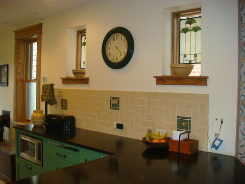
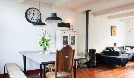
Background: My house is a 1929/1930 Mediterranean revival. I am going for a vintage vibe, but not a reproduction of an old kitchen. As I will show later, my floor is travertine, but with a checkerboard of salmon/coral and tan tiles, the cabs are light brown maple shaker, and the countertops are a grey-blue soapstone with black flecking. The walls are a fairly bright yellow. (I was aiming for butter yellow and missed; I have grown to like them, however.) The fridge and DW will be covered in patinaed copper, and I am planning to use copper cabinet hardware. There is still plenty of stainless steel, however, as I did not get the copper sink or range hood I coveted.
I was influenced by the succession of "timeless" threads; I do not delude myself to think my kitchen will not age, but I'd like it to age gracefully. With no offense intended to others, I also happen genuinely not to like most of the current BS trends. So, all in all, I am looking for something that is a little offbeat and memorable, but tasteful. Frankly, I also do not want to spend $30/sq. ft. or even a fraction of that.
With all of this in mind, I think an interesting design in simple ceramic tile may fill the bill. I think such a thing would make the BS hard to date. I have two contenders to suggest, but would really love to hear ideas from others. I need help both on the pattern and on the colors.
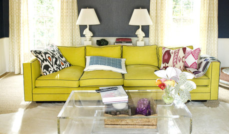
The first pattern contender is to blatantly rip off, err, I mean pay deep compliments to, Melisstar's lovely kit. This would employ subway tiles set in a herringbone. However, the orientation of the herringbone would be not the usual angled one, but rather running vertically:
Note that my house has original subway tiles in the upstairs bath, and many other vintage ceramic tiles and designs throughout, so I think it could "support" subways in the kitchen.
The other contender is a hopscotch pattern. Here is a schematic of that pattern:
I would probably use larger tiles (maybe 6") in a sage green color, and smaller tiles (maybe 2") in a lighter yellow than the walls, but hopefully something that matches.
Here is a mood board that incorporates that backsplash (although my range is really a black BS that does not have brass trim):
And here is a closeup of some of the relevant elements. The cabinet color is visible above as well as on the wooden square on the left. Next is a tile in Daltile "Cypress" and then a small one in Daltile "Cornsilk," and another small Cypress. The red and tan squares represent the floor, and the copper pipe represents the patinaed copper panels on fridge and DW, as well as the eventual pulls. The countertop is Python soapstone, and you can see a bit of the yellow in our stained glass panel. (The brass pull was there to see if antiqued brass was tenable; we don't think it is.)
So, can the backsplash geniuses at GW suggest patterns and colors that they think would work?
As always, you have my lasting gratitude for getting me this far!! (But that and $4 will get you a latte!)


angie_diyOriginal Author
ayerg73
Related Professionals
Leicester Kitchen & Bathroom Designers · Northbrook Kitchen & Bathroom Designers · Ossining Kitchen & Bathroom Designers · Verona Kitchen & Bathroom Designers · University City Kitchen & Bathroom Remodelers · Eagle Kitchen & Bathroom Remodelers · Jefferson Hills Kitchen & Bathroom Remodelers · Kendale Lakes Kitchen & Bathroom Remodelers · Oklahoma City Kitchen & Bathroom Remodelers · Spokane Kitchen & Bathroom Remodelers · South Jordan Kitchen & Bathroom Remodelers · Norfolk Cabinets & Cabinetry · Englewood Tile and Stone Contractors · Soledad Tile and Stone Contractors · Schofield Barracks Design-Build FirmsCateskitchen
flwrs_n_co
angie_diyOriginal Author
angie_diyOriginal Author
jessicaml
angie_diyOriginal Author
cawaps
laxsupermom
marcolo
formerlyflorantha
bmorepanic
angie_diyOriginal Author
deedles
User
User
thrauli
formerlyflorantha
angie_diyOriginal Author
FabFrugalJane
marcolo
angie_diyOriginal Author
angie_diyOriginal Author
angie_diyOriginal Author
pawa
angie_diyOriginal Author
dseng
BalTra
jessicaml
home4all6
deedles
angie_diyOriginal Author
angie_diyOriginal Author
jessicaml
jmcgowan
melle_sacto is hot and dry in CA Zone 9/
jessicaml
gregincal
sweeby
melissastar
angie_diyOriginal Author
angie_diyOriginal Author
petra66_gw
stranger4
pawa
pawa
angie_diyOriginal Author
Oakley
pawa