


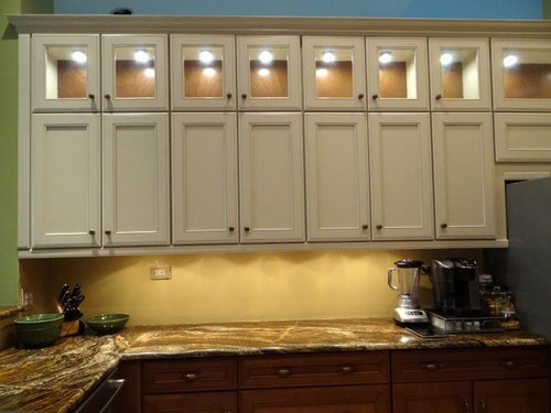
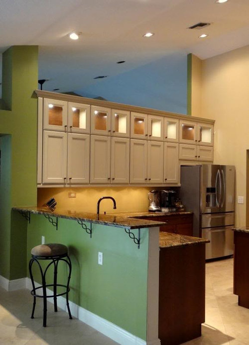
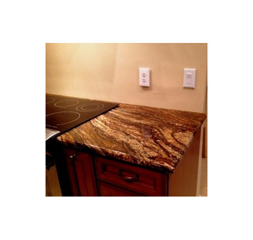
Backsplash opinions needed
fishymom
10 years ago
Sort by:Oldest
Comments (13)
Related Stories

DECORATING GUIDESNo Neutral Ground? Why the Color Camps Are So Opinionated
Can't we all just get along when it comes to color versus neutrals?
Full Story
WALL TREATMENTSExpert Opinion: What’s Next for the Feature Wall?
Designers look beyond painted accent walls to wallpaper, layered artwork, paneling and more
Full Story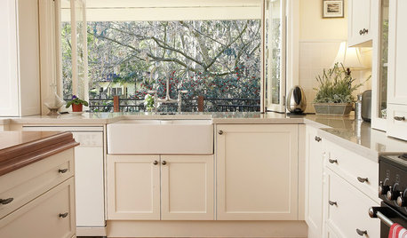
KITCHEN SINKSEverything You Need to Know About Farmhouse Sinks
They’re charming, homey, durable, elegant, functional and nostalgic. Those are just a few of the reasons they’re so popular
Full Story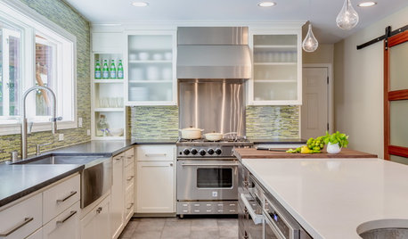
KITCHEN DESIGNKitchen of the Week: Taking Over a Hallway to Add Needed Space
A renovated kitchen’s functional new design is light, bright and full of industrial elements the homeowners love
Full Story
DECORATING GUIDESWhat You Need to Know Before Painting Brick
Sure, painted brick can be a great look. But you need to take some risks into account. Here's how to paint brick like a pro
Full Story
REMODELING GUIDESGet What You Need From the House You Have
6 ways to rethink your house and get that extra living space you need now
Full Story
MAN SPACESWhy Men Really Do Need a Cave
Don't dismiss cars, bars and the kegerator — a man space of some kind is important for emotional well-being at home
Full Story
KITCHEN APPLIANCESLove to Cook? You Need a Fan. Find the Right Kind for You
Don't send budget dollars up in smoke when you need new kitchen ventilation. Here are 9 top types to consider
Full Story
COLOREvery Room Needs a Little Bit of Black
‘I’ve been 40 years discovering that the queen of all colors was black.’ — Pierre-Auguste Renoir
Full StoryMore Discussions

a2gemini
ineffablespace
Related Professionals
College Park Kitchen & Bathroom Designers · Frankfort Kitchen & Bathroom Designers · Hemet Kitchen & Bathroom Designers · Saint Peters Kitchen & Bathroom Designers · Verona Kitchen & Bathroom Designers · Beaverton Kitchen & Bathroom Remodelers · Bloomingdale Kitchen & Bathroom Remodelers · Fort Lauderdale Cabinets & Cabinetry · Graham Cabinets & Cabinetry · Kaneohe Cabinets & Cabinetry · Mount Holly Cabinets & Cabinetry · Ridgefield Cabinets & Cabinetry · South Gate Cabinets & Cabinetry · Wildomar Cabinets & Cabinetry · Tabernacle Cabinets & CabinetryfishymomOriginal Author
nosoccermom
fishymomOriginal Author
fishymomOriginal Author
oldbat2be
OOTM_Mom
romy718
canuckplayer
fishymomOriginal Author
hyjenist
mjocean