


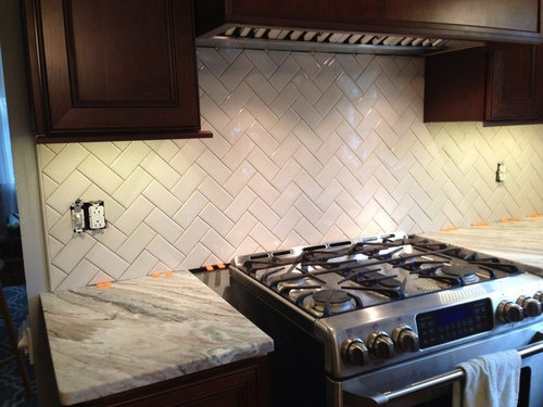
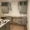
Backsplash has started!
OOTM_Mom
10 years ago
Featured Answer
Sort by:Oldest
Comments (24)

Kitch4me
10 years ago
mgmum
10 years agoRelated Professionals
Arlington Kitchen & Bathroom Designers · Martinsburg Kitchen & Bathroom Designers · Ocala Kitchen & Bathroom Designers · Ossining Kitchen & Bathroom Designers · South Farmingdale Kitchen & Bathroom Designers · South Farmingdale Kitchen & Bathroom Designers · Lisle Kitchen & Bathroom Remodelers · Olney Kitchen & Bathroom Remodelers · South Jordan Kitchen & Bathroom Remodelers · Hopkinsville Cabinets & Cabinetry · Prospect Heights Cabinets & Cabinetry · Whitehall Cabinets & Cabinetry · Albertville Tile and Stone Contractors · Davidson Tile and Stone Contractors · Fayetteville Tile and Stone Contractorsbreezygirl
10 years agoOOTM_Mom
10 years agofirstmmo
10 years ago
lydia1959
10 years ago
eam44
10 years ago
cat_mom
10 years agodeedles
10 years ago
amykath
10 years agofishymom
10 years agoOOTM_Mom
10 years ago
speaktodeek
10 years ago
Gracie
10 years ago
mark_rachel
10 years ago
romy718
10 years agochiefy
10 years ago
a2gemini
10 years agoOOTM_Mom
10 years agoOOTM_Mom
10 years agoSarina
10 years agodgormish
10 years agotmy_jax
10 years ago


Related Stories
HOUZZ TOURSHouzz Tour: New Love and a Fresh Start in a Midcentury Ranch House
A Nashville couple, both interior designers, fall for a neglected 1960 home. Their renovation story has a happy ending
Full Story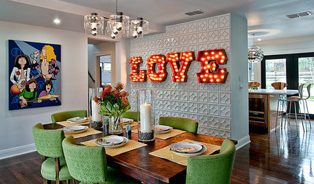
You Said It: ‘Texas Has It Going On’ and More Houzz Quotables
Design advice, inspiration and observations that struck a chord this week
Full Story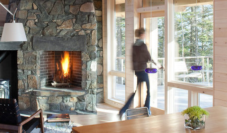
WOODKnotty and Nice: Highly Textured Wood Has a Modern Revival
Whether it's cedar, fir or pine, if a wood has a knot, it's hot
Full Story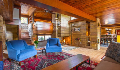
HOUZZ TVHouzz TV: This Dream Midcentury Home in a Forest Even Has Its Own Train
Original wood ceilings, a cool layout and, yes, a quarter-scale train persuaded these homeowners to take a chance on a run-down property
Full Story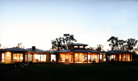
CONTEMPORARY HOMESHouzz Tour: Family Has Room to Spare in New Rural Home
A builder and his wife design a streamlined house for their family that embraces the land and shows careful planning
Full Story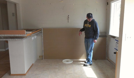
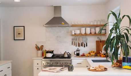
KITCHEN DESIGNStylish New Kitchen, Shoestring Budget: See the Process Start to Finish
For less than $13,000 total — and in 34 days — a hardworking family builds a kitchen to be proud of
Full Story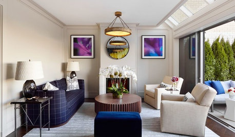
DECORATING GUIDESDecorating 101: How to Start a Decorating Project
Before you grab that first paint chip, figure out your needs, your decorating style and what to get rid of
Full Story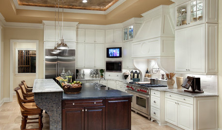
REMODELING GUIDESPlanning a Kitchen Remodel? Start With These 5 Questions
Before you consider aesthetics, make sure your new kitchen will work for your cooking and entertaining style
Full Story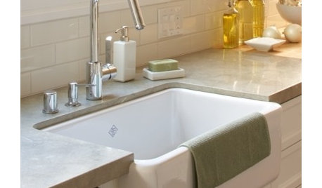
CONTRACTOR TIPSContractor Tips: Countertop Installation from Start to Finish
From counter templates to ongoing care, a professional contractor shares what you need to know
Full Story
COLOR PALETTESCrisp, Clean White Interiors to Start the New Year Right
Beginning with a blank-slate backdrop gives you infinite design freedom with accent colors, furniture styles and finishes
Full StorySponsored
Zanesville's Most Skilled & Knowledgeable Home Improvement Specialists
More Discussions


OOTM_MomOriginal Author