


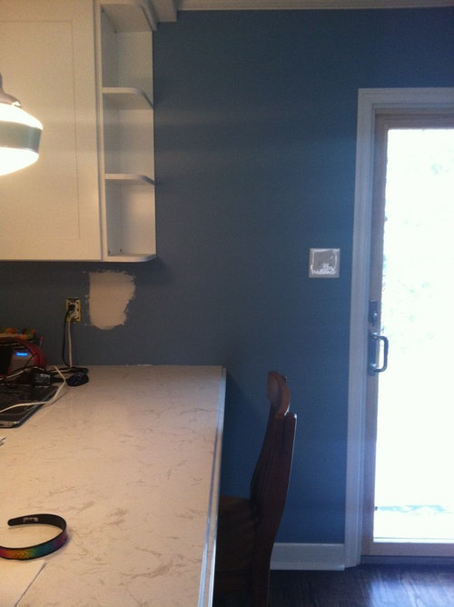
Opinions Needed! Where to end backsplash? Photo included
Beth1406
11 years ago
Featured Answer
Comments (52)

Beth1406
11 years agochicagoans
11 years agoRelated Professionals
Clute Kitchen & Bathroom Designers · Northbrook Kitchen & Bathroom Designers · Redmond Kitchen & Bathroom Designers · Williamstown Kitchen & Bathroom Designers · Avondale Kitchen & Bathroom Remodelers · Champlin Kitchen & Bathroom Remodelers · Panama City Kitchen & Bathroom Remodelers · Westchester Kitchen & Bathroom Remodelers · Buena Park Cabinets & Cabinetry · Parsippany Cabinets & Cabinetry · Ridgefield Cabinets & Cabinetry · Vermillion Cabinets & Cabinetry · Warr Acres Cabinets & Cabinetry · Atascocita Cabinets & Cabinetry · Ardmore Tile and Stone Contractors
mama goose_gw zn6OH
11 years agoBeth1406
11 years agoellendi
11 years agonosoccermom
11 years agoBeth1406
11 years ago
cookncarpenter
11 years agonosoccermom
11 years agobuildinva
11 years agobcafe
11 years agoBeth1406
11 years agoBeth1406
11 years ago
Tim
11 years agorkb21
11 years agobcafe
11 years agokaren_belle
11 years agoislanddevil
11 years agoBeth1406
11 years ago
Gracie
11 years agoBeth1406
11 years ago
gr8daygw
11 years agoGracie
11 years agochinchette
11 years agoislanddevil
11 years ago
Linda
11 years agoBeth1406
11 years ago
gyr_falcon
10 years agoislanddevil
10 years agobuildinva
10 years agoruthie51
10 years ago
Holly- Kay
10 years agoBeth1406
10 years agobreezygirl
10 years agotaggie
10 years agoBeth1406
10 years agoLinda
10 years agogo_figure01
10 years agorkb21
10 years agokaren_belle
10 years agola_koala
10 years ago
sanjuangirl
10 years agoMrsD
9 years agoelisabe isme
8 years agoericr262
8 years ago
Nick Yoskin
8 years ago
enduring
8 years ago
Cheryl Vanvoorhies
8 years agogr8daygw
8 years ago


Related Stories

DECORATING GUIDESNo Neutral Ground? Why the Color Camps Are So Opinionated
Can't we all just get along when it comes to color versus neutrals?
Full Story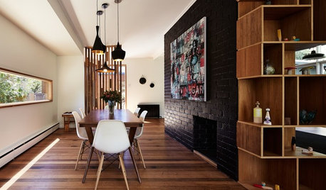
WALL TREATMENTSExpert Opinion: What’s Next for the Feature Wall?
Designers look beyond painted accent walls to wallpaper, layered artwork, paneling and more
Full Story
REMODELING GUIDESWhere to Splurge, Where to Save in Your Remodel
Learn how to balance your budget and set priorities to get the home features you want with the least compromise
Full Story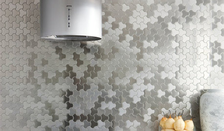
DECORATING GUIDESBling Where It’s Least Expected
Give your interior some sparkle and shine with metal tiles on a backsplash, shower or floor
Full Story
HOME OFFICESRoom of the Day: Stately Study Includes a Cozy Family Space
A new fireplace, windows, millwork and furniture make this room hard to leave
Full Story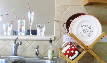
KITCHEN DESIGNYour Kitchen: Where to Stash the Dish Towels
Solve the Dish Towel Dilemma With 13 Ways to Keep Them Handy and Dry
Full Story
GREAT HOME PROJECTSPower to the People: Outlets Right Where You Want Them
No more crawling and craning. With outlets in furniture, drawers and cabinets, access to power has never been easier
Full Story
ECLECTIC HOMESMy Houzz: Stylish City Living, Toddler Included
Natural fabrics and nontoxic furniture make for a home that’s as beautiful as it is family friendly
Full Story
DECORATING GUIDES7 Reasons to Include a Little Gloss in Your Decor
High-shine finishes look good, are practical and can infuse your home with an air of glamour
Full Story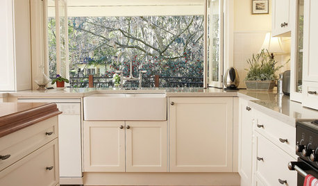
KITCHEN SINKSEverything You Need to Know About Farmhouse Sinks
They’re charming, homey, durable, elegant, functional and nostalgic. Those are just a few of the reasons they’re so popular
Full StoryMore Discussions


Beth1406Original Author