


Which cabinet color-Simply White vs. White Dove?
I seem to flip colors on a daily basis. I have looked on GW for finished pictures showing both cabinet colors for Ben Moore's Simply White and White Dove. I can't seem to make up my mind! Going crazy(like others with white paint).
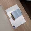
Pictured here are - Simply White on the left and White Dove on the right - shaker panels.
Dark square is perimeter countertops- Ceasarstone-Raven (charcoal grey color)
Background color for walls - BM Nimbus (1465)
Backsplash in front - Cararra Marble random strips Hardwood floor color choice.
Also, but not pictured is island top- Bianco Romano. My piece has a lot of grey veining through out, which is why I picked the Raven for perimeter. Island base is knotty alder stained a dark espresso color(painter still working on sample)

This photo was taken with natural light, no flash, no overhead lights. Tried to get as accurate as possible.
Which white do you prefer with my wall paint, backsplash, and flooring color, Simply White or White Dove? I'm not looking for an exact match to the marble backsplash, but don't was a white to clash either.
Here is a link to our renovation process so far.
Here is a link that might be useful: 1pandora' library
Comments (134)

jwhitney07
6 years agolast modified: 6 years agoI ended up using Simply White for all my trim, window sills, doors and kitchen cabinets. It’s definitely not as “yellow” as white dove and is not a stark white, which I didn’t like. I absolutely love it.
I have bedrooms painted with quiet moments and beach glass, trim looks nice and white against them. The rest of the house is edgecomb gray. It’s not harsh and we are about to install Argento Pental quartz in the kitchen, which has a white base. It looks great with the cabinets painted Simply White.
Pam
5 years agoRosalie, any painter who tells you Simply White and White Dove are the same color should get out of the business. Very hard to tell the difference between any whites in full sun because the undertones get washed out in full spectrum light. The differences become very apparent in afternoon light or shade. Simply White is a bright white with a subtle creamy yellow undertone that comes out more in shade. Make sure you test colors both on bright walls and shady walls, and look at them in both natural and lamplight. Simply White has a light reflecting value of almost 92% (very high, even higher than Super White, which has virtually no undertones), compared to White Dove’s LRV of about 85%. White Dove has “greige” undertones (grey, yellow, green and I think some violet) which tone it down and give it more depth, keep
it from glaring in bright sun. and keep it from reflecting back as much color from floors and objects in the room as a white will—but it can look drab in rooms that aren’t well lit, and putting it next to warm woods or reds will bring out the green undertones. Cloud White is somewhere in between the two, with a lighter greige undertone. I would recommend going a white trim color whose undertones best match the undertones in your wood floor (yellow, red, grey, brown?) and match your cabinet color to that, maybe going with a 25% darker or lighter shade of that color, and a wall color that complements the trim. I personally love Simply White in semigloss for trim and in eggshell; I find it a little stark in flat wall paint in full light, but even in flat it retains a warm white glow in shadow when other whites turn grey.Related Professionals
Bonita Kitchen & Bathroom Designers · Citrus Park Kitchen & Bathroom Remodelers · Idaho Falls Kitchen & Bathroom Remodelers · Martha Lake Kitchen & Bathroom Remodelers · Mooresville Kitchen & Bathroom Remodelers · Port Angeles Kitchen & Bathroom Remodelers · Turlock Kitchen & Bathroom Remodelers · Forest Hills Kitchen & Bathroom Remodelers · Manville Cabinets & Cabinetry · Murray Cabinets & Cabinetry · Vermillion Cabinets & Cabinetry · Atascocita Cabinets & Cabinetry · Rancho Cordova Tile and Stone Contractors · Aspen Hill Design-Build Firms · Bell Design-Build Firms
Rosalie Carter
5 years agoThank you so much for that information. I am planning on Simply White for my Kitchen cabinets and mantle. My flooring is engineered wood warm tones a little grey.

divecaribbean
5 years agoYou should never compare these color boards side by side - it skews your perception of each color. They should each be placed on a white backdrop separate from one another. If you want to compare them next to your marble and such that’s fine, but not one color abutting another color board.
I agree with Mike in that White Dove is in no way dingy. It’s creamy but not yellow at all, and looks great with warm woods adjacent. It is perfect if you have warm tones in your home and want to avoid the stark white hospital look. I’ve walked away from homes on the market that had their trim painted hospital white. Ugh. Chantilly white is probably as white as you can get, but it reminds me of hospital white unless you have a bright contemporary space which is the only way I think I could pull it off. Linen white is creamy and a tad yellow in it but it is still definitely a white and looked great in our 1920’s Tudor style home, but I went with White Dove in our bathroom as it tied in with our 1920’s subway tile really well and didn’t look overwhelmingly bright in our south facing bathroom. Cotton Balls was a contender next to our subway tile too but the LRV was too much for the south sun. It DID work on a ceiling in our north facing low light bedroom and wow what a difference, Cotton Balls is fabulous for brightening up a north facing room without looking stark or gaudy. Back to WD.... I recall comparing White Dove to Simply white years back and if memory serves me right the Simply White seemed grayed out to me, or lacking in oomph...But it depends on your lighting and surrounding colors I suppose.
Maria Killam posted something awhile back about the best white next to Carrera marble, I’ll have to go back to that post because I can’t remember what white it was.

Chris Carlson
5 years agoDo you mind sharing the wall color you used? Remodel looks great. You've got us second guessing dove white!
Janet
5 years agoI painted all my trim, wainscoting and fireplace White Dove 16 years ago, and would love to order my cabinets to match. It’s been a lovely color to live with. My walls are shades of yellow. My bedroom is a warm green. Some whites are just too white for me.Janet
5 years agoHere is my BM Dove White as it looks with surrounding colors and other white backgrounds, like the matting.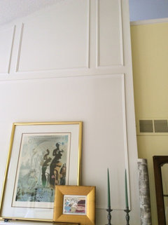

Laurie Malenick Wise
5 years agolast modified: 5 years agoAren't Dove White and White Dove Two different paints? BM White Dove you can get from a can, Dove White is a factory finish cabinet color you can get from Lowes? Are they the same?
Janet
5 years agoGood question! I have BM and always thought it was White Dove, but then keep hearing “it” called Dove White, so thought I was confused. So, are they different? When my pantry was painted, I was told, they don’t have White Dove, but have something called Dove White. So we went with it. I can’t tell the difference, but they are not next to each other for comparison.Laurie Malenick Wise
5 years agoJanet, Who said they dont have White Dove? it's a Benjamin Moore paint.Janet
5 years agoTo clarify, my BM paint is White Dove. The contractor that went to the store said they had Dove White, but it may not have been BM. It was just for my pantry. I’m just trying to figure out if they are two different colors by two different paint companies, or are the names getting mixed up for the same paint. I seem to see both.Rosalie Carter
5 years agoI am still not completed. The lady I was planning to use backed out as she thought I was to particular. I had another guy come out and paint my mantle to get an idea of the color prior to proceeding. It looked a little whiter then the homes I'd looked at and when compared to the BM sample it is whiter. The painter that backed out brought me a paint sample from here last job and it is slightly darker, but the same tone the (true Simply White). I have another painter coming on the 10th. I'm not sure if I should stick with this really white as my kitchen is darker.
Or have the true Simply white and repaint the mantle Uggh. Yes, the prior painter is right I am particular.


Alex511
5 years agoWell I am glad to know that I am not alone in being particular. I totally understand your predicament. Thank you for answering my question. :)
Rosalie Carter
5 years agoAlex, do you think the white on the mantle is too white. I'm thinking a shade creamier would be nice. Thought, anyone?
cubby325
5 years agoIt looks like the white on the mantle and the baseboards are brighter, with the window trim looking a bit creamier. I would think you would want your millwork to match throughout the living area (unless a direct contrast is used).
Alex511
5 years agoI agree with what cubby325 wrote. Is the window trim creamier than the baseboards?
blondelle
5 years agoWith carrara and a counter with grey veining I like Decorator's white. It's crisper and the chalky grey undertone compliments carrara. If you use either of the two whites you mention you will need to use calacatta marble instead.Rosalie Carter
5 years agolast modified: 5 years agoYes, I realize the plantation shutters are not the same white. I may have them painted later. I did not want that creamy yellow color on my kitchen cabinets. I am trying to find a white I like for my entire kitchen and want the mantle and the stair railing to match. I am not matching my kitchen and new paint to the 15 year old dingy shutters. I will worry about later. I'm talking about the color against the tiles and potential for my not nearly as much lighting kitchen..
Baseboards I thought were always bright white, I don't really want cream white baseboards. Too much to worry about, uggh.
divecaribbean
5 years agoMy husband and I have walked out of homes when house searching if they had stark white woodwork. I need something softer to the eye. Simply white is pretty but it’s much too stark for my taste. I love white dove, it doesn’t go yellow but it’s a nice soothing white.
Pam
5 years agolast modified: 5 years agoEverything depends on what look and feel you are going for, and what elements you have in the house that you can't or don't want to change. Make sure you are choosing a white in the context of what works with your house and your style. Don't worry about being "too particular" -- you are picking the one element that needs to work with everything in your house and that isn't easy and it takes time!
This may be a stupidly obvious thing to say, but you really need to have your colors painted on a large sample board (at least 8x11") that you can move around and hold up against your floors, countertops, backsplashes and cabinetry throughout the house. What works in the living room may not work in the kitchen or bathroom, and vice versa. and what looks "too bright" "too yellow" or "too gray" depends entirely on what it's being paired with. If you haven't already, paint two coats of 3 or 4 contenders on sample boards that you can get at any paint store. Leave a half inch unpainted border on three sides and paint all the way off the edge on the third side. then carry then around and see which one best coordinates with most of your floors, counters and tile.
Also, if your painter "matched" Benjamin Moore Simply White OC-117 in a base made by another manufacturer, you are not seeing what true Simply White looks like. A cheap base will make it look much starker, as you need to do about twice as many coats to get the same level of saturation. Sherwin Wiliams makes some beautiful colors, but their base is about half as thick as Benjamin Moore so it acts very differently in different lights, if this isn't "real" Simply white, real Simply White will probably look a little softer/creamier.
All that said--If you ignore the creamier color of the shutters and window trim, I think the mantle looks great: nice and crisp and fresh against the warmish-neutral floor and your warmish-neutral walls, a little brighter and warmer in tone than the white tile fireplace surround, but not so far in tone from the tile that either is made to look too stark or too dingy. It's only when you compare the mantle to the window trim that the mantel looks "too" white. (you might try covering up the windows and looking at the mantle without the comparison to the windows--all white is relative, so having cream next to a white will always make the white look whiter and the cream look yellower) Either the shutters/window trim, walls and floor could look great in a traditional feel, OR the mantel, tile, floors, and walls could look great in a more contemporary/transitional feel. It depends on whether you want a crisp modern feel or a more time-mellowed feel--and what the other elements in your house dictate.
If the white on the mantel feels TOO bright and contemporary for your aesthetic (Simply White does reflect a lot of light with an LRV of 92), you could go with a softer white, but probably not a much "creamier" white, if by creamy we mean tending toward the yellower undertones of the window. You can see from the picture that the yellowy cream tones in the shutters don't work with the tile, which seems to have a soft gray, maybe even slightly blue-gray tone.
To get a softer white without going too yellow for the tile, or too gray for your walls, you may want to consider whites with an LRV lower than 92 that are softened with gray or grayish beige. Consider Benjamin Moore Mountain Peak White, Benjamin Moore PM-2 "White", Benjamin Moore PM-1 "Super White" (I think you may find this too stark, though, even though it is less reflective, because it has no colorant at all except titanium and gray), Benjamin Moore White Dove OC-17/PM-19, or White Dove lightened to 75% (note BM White Dove is very different from either Glidden Dove White or Valspar Dove White), or Benjamin Moore "Cotton Balls." Cotton Balls is usually a favorite of mine, not too stark, not too creamy, but it depends heavily on what it's next to. BM Cloud White can be GREAT in trim, I find it doesn't go as yellow in a glossier finish than it does in flat wall paint. If you go on the Benjamin Moore website and look at their color search tool, they have the LRV listed for every color, as well as lighter and darker shades and similar colors. If you're concerned that White Dove, with an LRV of about 85 is too close to cream (it's a fabulous and versatile color that I think has enough gray in it to keep from getting too yellow) but Simply White at nearly 92 is "too white" you may find something you are more comfortable with in the 87 to 90 LRV range. Just be sure to hold up your sample boards next to the features of the house that you know you don't want to change and be sure that it looks good with them. Once your trim works with your other elements, you can adjust wall paint if needed.
By the way, if you have samples of your flooring or countertop materials, you can take those to a good paint store where there is usually a color consultant who can give you a few minutes of free advice!
Janet-- the name thing is so confusing! You're right that the Benjamin Moore color White Dove OC-17/PM-19 is very different from either Glidden Dove White (very bright, almost blue white) or Valspar Dove White (a soft warm white a little darker than White Dove). I THINK there may even be a Sherwin Wiliams Dove White that is gray.... Always best to use the color number as well as name.
Pam
5 years agolast modified: 5 years agoThis paneling is Benjamin Moore PM-1 Super White in satin, the countertop is calacatta gold (grey and caramel streaks), the perimeter cabinetry is factory finished in Super White (which finish looks very slightly softer and warmer than the paint), and the island base is a soft neutral-warm gray (I think Cloud Cover). For a more modern transitional house like this, I think Super White works great, but it has very little nuance, and changes very little with the light, so could look harsh in a more traditional home.
Rosalie Carter
5 years agoPam, thank you so much for that good information. I am going for a more transitional look. I've always been traditional, but I am now loving a lot of the new modern look. I wanted something in-between the white and the cream. The decorator recommended white dove, but I felt it would take me back to traditional and warm colors.
I found the tiles at a model home and bought them and tried to match the paint to the tile, possibly a mistake. I had no intention of painting my blinds and now feel stuck. The decorator did warn me of this problem., but I felt like I was decorating around 15 year old dingy cream blinds - N000! I may have to look into the cost of painting my blinds. My kitchen also has dingy cream blinds.
divecaribbean
5 years agoI had a 1920’s Tudor before we sold last year, with the original subway tile in the bathroom. I wanted to match the walls to the tile so there wasn’t much contrast, I didn’t want any color blocking going on in there since the room was so small. I couldn’t decide between BM cotton balls and white dove. Either could have worked well with the tile and my husband agreed. I had sample boards against the walls, the tile, everything.
However, this was a south facing room. Cotton balls, while beautiful, would have been waaaaay to bright. Lrv 90 I think. White dove was perfect for this room since it was a bit more toned down.
On the flip side, In my north facing bedroom with low natural lighting, I painted my dingy white ceiling cotton balls and it just glowed at night. I looooved how it brightened up the space but not in a stark or gawdy way. My ceiling glowed at night even with the lights off (compared to the ceiling that was lost to the depths of nightfall before that). My husband loved it too. It was a very fresh feeling, but it would have been way too much for my south facing bathroom.
i would keep this in mind - lrv and which direction your room faces and how much natural sunlight it gets - before you decide on the color.
Good luck & have fun!
Linda Caley
5 years agoHas anyone used BM Mascarpone for kitchen cabinets? Thoughts? I am considering this or simply white. I have used Mascarpone on trim and some doors in my house and love it, just not sure if I should commit al my kitchen cabinets to it. I am concerned that it may pull out too much yellow in kitchen lighting. Thank you
Pam
5 years agoWhat color are the trim and walls in your kitchen, Linda? I LOVE Mascarpone and have used it throughout a house on trim, built-ins and doors, but the "white" bathroom and kitchen cabinetry was done in the manufacturer's version of a canvas white (so a very light greige), so I can't say how a kitchen with all Marscapone cabinetry would look. I can say that the canvas white cabinets work fine with the somewhat brighter and creamier Marscapone window trim right next to them, without making the trim look yellow. Marscapone will look very yellowish/creamy next to a bright white, but it looks like a soft white next to off-white colors like canvas and Linen White.
Pam
5 years agoRosalie, I think you're probably right that White Dove is a more mellow color than you want if you are looking for a more contemporary/transitional look. (It's actually just off-white enough to be a wall color if you use a very bright white trim) Unfortunately I do think you will need to paint your shutters to match the rest of your trim, or the brighter white paint will make them look dingy rather than creamy, and it will detract from the more contemporary look yo-yo want. (I think they are lovely, but our eyes tend to view white as absolute -- we latch onto the highest level of contrast and call that "white" and everything else either dingy or too much of some color that isn't present in the brightest white in the room.) I have been doing this "brighter than White Dove, not as bright/yellow as Simply White" thing recently myself. We wound up going with Super White which works great in the house but frankly was my least favorite color when looking at samples because it has so little depth! Here are some of the samples we looked at. I really liked the custom color we came up with mixing Simply White and the very slightly gray Super White 50-50--it's just a little bit less reflective and less yellow than Simply White, but a little warmer and a little more depth than Super White. Unfortunately by then the cabinets had already been done in the Super White so I never got to see it on a whole wall! The card with no name on it is White Dove, the one with the bend is the Simply white/Super white 50-50 mix. Note how mellow Simply White looks compared to super white and Chantilly Lace. On the walls behind the bed the trim is Super white and the wall color is Sea Pearl at 75% strength, which is a little darker than White Dove at full strength.


Linda Caley
5 years agoThanks Pam! Right now the walls are a creamy yellow and trim natural wood, but that will change. I plan on painting the trim and the walls. I just returned from a Benjamin Moore store that had a designer on staff. Spent a long time talking to her about potential cabinet colors. Have now added White Dove back in the decision and took Simply white out. Mascarpone is still a contender. I bought some very large pieces of foam core board from staples and am going to paint one White Dove and the other Mascarpone to see what I like. I had originally ruled White Dove out because of comments about it having more grey but comparing it to some other colors, it actually has a nice warmth to it. Will see what the Foam Core boards revel:-)
Rosalie Carter
5 years agoPam I cannot read the small writing on the samples. Can you tell me which one is simply white? I went and bought some Benjamin Moore Simply White and some Dove White, the Simply White looks better against the tiles. I am really annoyed with the blind problem, I didn't realize it would present this problem. Also, i notice the Simply white on my mantle is lighter than my Benjamin Moore sample, so I may be able add a slight more depth to it. I am noticing that at times it looks cream, white and grey, depending on the lighting.
divecaribbean
5 years agoComparing those colors next to each other is the wrong way to go about this. Compare them only to your fixed elements in the room, and at different times during the day and against a white background/border. Keeping those color cards side by side will completely skew your perception of those colors.
Pam
5 years agoSorry, I didn't post as high resolution photos as I thought I had! In the brightly lit photos on floor, Simply White is in the row closest to blue rug, all the way to the right (compared to Chantilly Lace and Super White, it looks very slightly yellowish). In the photo on the cotton duck duvet, it's in the row closest to the camera (and near edge of the bed) all the way to the right. Others in that line from left to right are Chantilly Lace (possibly the purest white out there, it reflects whatever is nearest, so can often look vaguely blue or sometimes very very slightly soft cream depending on lighting and surroundings) and Super White (white base with just a drop or two of gray--label shows only titanium and black :)). The one directly above Simply White on the duvet (away from camera) is Cotton Balls. You're right that the color shifts around with the light! But with trim that will matter a little less than if you were painting whole walls--and also keep in mind most samples are in flat or matte, but that for trim you will likely use satin or semi-gloss, and in these higher sheen finishes colors will look a bit brighter and less gray or yellow.
Just by the way, somebody on this thread has repeatedly said that Simply White is "just white base with just a couple of drops of black in it", which actually isn't true (I think it IS true of the PM colors like Super White (PM-1), White (PM-2), Decorator's White, etc, though). The label on Simply White shows that it has a very small but discernible amount of Yellow Oxide (Y3) in it, as most bright whites do, along with a tiny bit of black (S1), or sometimes synthetic charcoal gray (S2) depending on who is mixing it.
I don't know if the rules here allow links to outside the site site, but THE most useful article I've ever read on "white paints for most of us" is by Kylie M Interiors (.ca) and talks about the undertones, uses, styles and pairings for 8 Benjamin Moore colors and which other colors to check out if a color is to stark or too creamy for you. This is the link, but if it is disallowed just google "Kylie M Interiors" and 8 Benjamin Moore white paint https://www.kylieminteriors.ca/the-8-best-benjamin-moore-white-paint-colours-undertones-and-more/Pam
5 years agolast modified: 5 years agoLinda, that's great. I think they are both beautiful colors. If your cabinets will turn a corner in an L shape, it might be worthwhile to do two boards for each color and try them on the adjoining walls on both sides of that corner. You'll get two different light angles, and the surfaces will reflect each other more and more the closer you get to the corner--so the undertones will come out most strongly/be most visible there. If you like how the color looks in a corner, you will most likely like it everywhere.:) What color are your countertops (and are they a 'fixed' element)? If your counter tops are set, you may find that laying one board at a time on your counters will tell you pretty quickly what works best! Have fun!
Linda Caley
5 years agoThanks Pam. Great idea to have them reflect onto each other! Counter tops are not set and those will be replaced as well. Have not chosen the counter top yet as waiting to get cabinets painted first. My initial concern with White Dove where the comments about "grey", which I do not want. But when you look at it by itself, you really can't see grey, just a warm tone. Such a tough decision. It's an expense having cabinets painted and want to do it right the first time:-)
Heather H
5 years agoThis is such a helpful thread! I am renovating our master bathroom with carrera tile on the floor and shower and vanity top. Previously I used cotton balls on the wainscoting in our foyer and it is gorgeous, but looks too creamy against the marble and vanity. I also looked at Chantilly Lace and Decorators White - too stark- and Distant Grey - lifeless in this room with this light. I’m planning to go back and get samples of Simply White and White Dove based on these comments. But here’s a question I haven’t seen addressed directly: if I want to to semi gloss trim and matte walls both in white, is there a good combo that people like? Just stick to one color or because of the finish is it better to choose two that complement each other?divecaribbean
5 years agoHeather, go with the same color in two different sheens. I did that in my bathroom with white dove.
divecaribbean
5 years agoLinda, white dove doesn’t look grey at all. When we say the color is bit more greyed out it doesn’t mean the color looks grey. It’s just not a glaring in your face white (and that’s a good thing). It’s really a beautiful color, doesn’t go yellow and it’s a nice creamy white.
Alex511
5 years agodivecaribbean--does white dove look whiter with an eggshell or satin sheen versus a flat sheen?
cubby325
5 years agoA shinier finish should look lighter and brighter, as it reflects more light. So the satin would probably look lighter. Consider a matte for the walls for more contrast - Ben Moore matte is great, even for cleanup, especially in the Aura paint.
divecaribbean
5 years agoWhat cubby said. And here’s a pic of our bathroom at our last house - there is the original 1920’s subway tile and the previous owners put the newer tile above that. If it were me I personally would have matched the tiles better. In any case, I opted for BM White Dove - I believe it was a satin finish in their regal line - on the walls, and I did a semi-gloss finish in the same color on the trim. The full view photo is a professional realtor photo from our listing. It’s a really pretty white, not too stark, clean and very soothing. The toilet and sink are both Kohler white. (Note that the BM satin finish in their BEN paint is much much shinier than their regal line of paint).

Heather H
5 years agoThanks divecarribean - i was actually going to ask next whether the aura paint in the bathroom is really better. i've looked at both white dove and simply white in the room and so far with morning and daylight, simply white is spot on.
Heather H
5 years agoThanks divecarribean - i was actually going to ask next whether the aura paint in the bathroom is really better. i've looked at both white dove and simply white in the room and so far with morning and daylight, simply white is spot on.
Linda Caley
5 years agoI started to look at each paint on it's own rather than putting it side-by-side to compare. Once I started to look at White Dove on it's own, I found that I really like it. Looks like White Dove for kitchen cabinets:-)
divecaribbean
5 years agoI’ve heard nothing but great things about Aura paint but I’ve never actually used it myself. I do recall reading that it tends to dry faster but you’ll never see any lines where you cut in along the edges like you do with other paints. From what I hear the finished product is fantastic. They tout that you can get away with one coat but I think that’s marketing hype - I’ve read painters say you will still want two coats for a truer depiction of the color you are going for.
Linda Caley
5 years agoI've used Aura paint and LOVE it. It is more expensive for sure, but worth it!
cubby325
5 years agoI always use an extender with Aura. It gives you more time before drying. If you're painting a bathroom, research "surfactant leaching." This happens when the paint in a bathroom isn't fully cured, and you use the shower. Google photos of surfactant leaching. Most paint stores will say latex cures in a few days, but I had this problem in two homes and did extensive research. You get ugly drips down the walls, and they are yellow or brown. You can wash it off, but it comes back. Now, when I paint a bathroom, I wait 30 days before using the shower. That may be overkill, and if you only have one shower, that would not be possible.
Heather H
5 years agothanks so much! We will be sure to use 2 coats and also continue to use my son's shower for as long as we can all take it. :-)

Heather P
2 years ago@jwhitney07 I'm looking to do white cabinets and the argento quartz. Would you mind sharing pictures of your kitchen?


jeri