


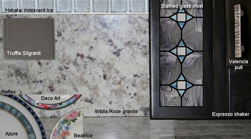
'Almost Final' Color Scheme
uroboros5
13 years ago
Sort by:Oldest
Comments (21)
Related Stories
GARDENING AND LANDSCAPINGScreen the Porch for More Living Room (Almost) All Year
Make the Most of Three Seasons With a Personal, Bug-Free Outdoor Oasis
Full Story
MODERN HOMESHouzz TV: Seattle Family Almost Doubles Its Space Without Adding On
See how 2 work-from-home architects design and build an adaptable space for their family and business
Full Story
HOUZZ TOURSMy Houzz: Family of 5 Lives (Almost) Clutter Free
Smart decor decisions and multipurpose items help this San Francisco family keep things tidy
Full Story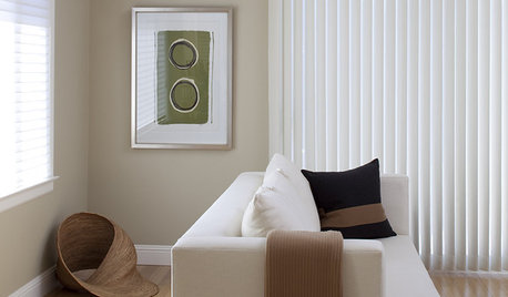
BROWNBeige to Almost Black: How to Pick the Right Brown
Warm your home with paint the color of lattes, espresso and chocolate
Full Story
GARDENING AND LANDSCAPINGAlmost Invisible Outdoor Furniture Lets Views Star
No less stylish for all its modesty, barely there furniture for gardens, patios and decks is designed to offer a clear view of the landscape
Full Story
GUESTHOUSESHouzz Tour: A River (Almost) Runs Through It in Aspen
This guesthouse on a family compound has rustic charm, modern touches and dramatic river views
Full Story
FLOWERSGreat Design Plant: Zagreb Tickseed Takes Care of Itself (Almost)
Get colorful drama along with deer resistance, drought tolerance and low maintenance — plus a butterfly or two
Full Story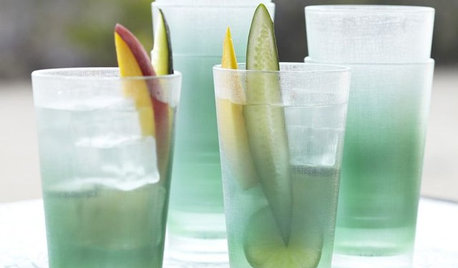
PRODUCT PICKSGuest Picks: 20 Almost-Unbreakable Mealtime Pieces
Sure, you could run 'em over with a bulldozer. But these sturdy and shatterproof glasses, dishes and accessories are much more fun to use
Full Story
COLOR5 Ways to Go Bold With (Almost) All White
Take away color to gain focus on textures and interesting details and create a purely relaxing mood
Full Story
KITCHEN DESIGNPalatable Palettes: 8 Great Kitchen Color Schemes
Warm and appetizing or cool and relaxing? These 8 paint palettes can help you choose the best colors for your kitchen
Full StorySponsored
Columbus Area's Luxury Design Build Firm | 17x Best of Houzz Winner!
More Discussions


dldl
petra66_gw
Related Professionals
Federal Heights Kitchen & Bathroom Designers · Ocala Kitchen & Bathroom Designers · Pleasant Grove Kitchen & Bathroom Designers · Pleasanton Kitchen & Bathroom Designers · Woodlawn Kitchen & Bathroom Designers · Brentwood Kitchen & Bathroom Remodelers · Fort Myers Kitchen & Bathroom Remodelers · Lomita Kitchen & Bathroom Remodelers · Pico Rivera Kitchen & Bathroom Remodelers · South Barrington Kitchen & Bathroom Remodelers · South Plainfield Kitchen & Bathroom Remodelers · Livingston Cabinets & Cabinetry · Wyckoff Cabinets & Cabinetry · La Canada Flintridge Tile and Stone Contractors · Roxbury Crossing Tile and Stone Contractorslavender_lass
lavender_lass
uroboros5Original Author
Circus Peanut
wizardnm
BlueKitten
rhome410
uroboros5Original Author
lavender_lass
uroboros5Original Author
formerlyflorantha
uroboros5Original Author
uroboros5Original Author
lazy_gardens
earthpal
uroboros5Original Author
dianalo
uroboros5Original Author
rhome410