


Design Around #19 Post Designs for A-a-h-vocado & Gold
Post Your Designs for Design Around This #19: Keeping the Avocado and Gold appliances/Using the new versions of Avocado and Gold Appliances. (They are out there.) The only limitation on this one is No Stainless, White, or Black appliances.


You can use appropriately sized blocks of color to stand in for the appliances if you don't find pictures you like.
Comments (85)

sochi
11 years agolast modified: 9 years agoWhy are coloured appliances routinely offered in Europe? Larger population base is one reason I'm sure (probably a major reason). Plus I guess North American design tastes are traditionally more conservative.
I like your idea LL of being able to order different colours. Probably cost prohibitive I expect though.

pricklypearcactus
11 years agolast modified: 9 years agoPer Angie_DIY's idea of Bistro Green and lavendar_lass's suggestion to use it in my previous design, I gave it a try. What do you think?
To be honest, I don't particularly like it. While I think the colors work with the appliances, I don't like what it does to the sleek color palette of this particular design. I prefer the pop of the green appliances and random accessories (chair, lighting) in an otherwise crisp clean palette. Maybe it would need wood floors? Or something else to work with the counters? Or do you like it better?
Related Professionals
King of Prussia Kitchen & Bathroom Designers · White House Kitchen & Bathroom Designers · Alpine Kitchen & Bathroom Remodelers · Camarillo Kitchen & Bathroom Remodelers · Las Vegas Kitchen & Bathroom Remodelers · Rancho Palos Verdes Kitchen & Bathroom Remodelers · South Barrington Kitchen & Bathroom Remodelers · Walnut Creek Kitchen & Bathroom Remodelers · Fort Lauderdale Cabinets & Cabinetry · Lindenhurst Cabinets & Cabinetry · Saugus Cabinets & Cabinetry · Town 'n' Country Cabinets & Cabinetry · Des Moines Tile and Stone Contractors · Fayetteville Tile and Stone Contractors · Hermiston Tile and Stone Contractorspalimpsest
Original Author11 years agolast modified: 9 years agoI don't think Americans would go for it.
Since everything is now some sort of "sound bite" and we seem to process information in snippets, and want to put everything in some kind of category: yes/no, in/out, hot/not, without considering context, I am not sure what you could call these colors for this generation to approve.
Whether it makes sense or not, gold or green appliances are bad/out/not. It doesn't matter that they are extremely close to two popular paint colors. They just aren't done for appliances. So it goes with granite good, stainless good, hardwood good, white bad, laminate cheap, carpet bad.
It doesn't matter what the application or the context is, most people want their information fast, in not too many syllables, clear-cut. Whether it is actually accurate or meaningful is secondary.sochi
11 years agolast modified: 9 years agoThat is a very sad commentary Pal. Goes far beyond interior design too - into realms where the results can be/are truly frightening.
pricklypearcactus
11 years agolast modified: 9 years agoWould I ever put gold or avocado appliances in my own kitchen (in my current house or some other potential property)? No. There are a lot of styles and designs out there that I can enjoy, but wouldn't choose to live with. I conceptually like the idea of colored appliances for *certain* kitchens and certain homes, but I would not personally choose avocado or gold (old or new). I would consider some of the Blue Chill appliances in other colors (blue, maybe orange, red, or yellow even) or some of the stunning professional ranges in a bold color. But I honestly do not really like the earthiness or warmth of gold or a green like avocado green.
Additionally, one of the major concerns I have with colored appliances is what happens if one of them needs to be replaced? Is the color still available? Is the brand even still available? Perhaps some of this comes down to the change in mentality from eras past of fixing what you have rather than replacing. And of course the dreaded "re-sale" concern and even longevity of personal preference concern.
debrak_2008
11 years agolast modified: 9 years agoI usually don't post on these threads but do read them all. Just wanted to comment on Lavendar's question....would anyone really choose these appliances, in their kitchen?
For me, no. I think its the "timeless" thing. For most people appliances are a big expensive so you have to live with your choice a really long time. I would be afraid I would get tired of the color but would be stuck with it. Custom colors I think would be expensive. I heard recently that car colors are picked out by manufacturers 5 years in advance! I wonder about appliances and other items.
I think all the designs posted look really nice. You are all so talented.
purplepansies
11 years agolast modified: 9 years agoPrickly, I like the counter with those appliances, but not in that kitchen. It needs to be redesigned to use that counter.
As far as whether I'd use any of these. . . I'm not really sure. Mostly, though, because these brands are out of my price range. But if I could, I think I might - not necessarily the avocado above, as I don't really like that color, but the Viking version of avocado I do like (see my next kitchen.) And I like the gold, and many of the Bluestar colors. People certainly do use colored appliances here and there (I'm thinking of marthavila's red aga, for one) but it seems to me that most people are really scared of color.
Prickly, the replacement issue is a real concern, though - I can see them discontinuing colors. And you're right, then what? Replace all appliances, or mix and match?
sochi
11 years agolast modified: 9 years ago
Walnut cabinets, custom I presume
Backsplash: formica
Ovens: vintage
Pendants: Niche Modern
Upper cabs: Sliding glass over walnut shelves, custom (pics from Houzz I think)
Chairs: Infiniti Design (Italy)
Table : Duffy London
Painting: Gabriela Silvina Azar Schreiner: decorabstractart.compurplepansies
11 years agolast modified: 9 years agoLOVE that marble and backsplash with those appliances prickly!!
purplepansies
11 years agolast modified: 9 years ago
Viking appliances in avocado
Lacanche Brasserie hood
Merillat cabinets in maple, painted "mushroom"
soapstone counters
frosted light sage green glass subway tiles - Susan Jablon
Kohler stages sink and Karbon faucet
dining table from bestdiningroom.blogspot.com
Parsons chair from Home Decorators
weave pendant light from Crate and Barrel
floor - walnut planks in chocolateI was inspired by the glassy veins in the soapstone and remodelfla's kitchen, especially her beautiful backsplash! I tried white cabinets, but they looked too stark, and many beiges were too "muddy;" this color seemed crisp and right, at least to me.
purplepansies
11 years agolast modified: 9 years agoSochi, I really like that kitchen as well! It's very fresh, modern and different, but warm at the same time.
lavender_lass
11 years agolast modified: 9 years agoPrickly- As for the revised green kitchen...I like the green, but the brown seems to be out of place. If you had wood cabinets or floor, it would probably look better.
Sochi- I like that kitchen! Maybe it's the fern frond, but it feels very natural and organic...and relaxing!
Prickly- Gold kitchen...I think the brass hardware really works, in the space! With the marble and slight touches of blue, it's a very calm, yet inviting kitchen...and still quite elegant.
As for the color appliances, what ever happened to the idea of replacing the front panels? I thought that was something that was going to be popular, especially for dishwashers and fridges. The doors would be easy to swap out...maybe ranges, too.
lavender_lass
11 years agolast modified: 9 years agoPurple- I like the green with the soapstone and backsplash...and the chair looks great, too. It's nice to see a little floral, in this space :)
palimpsest
Original Author11 years agolast modified: 9 years agoI think that mix and match could be the answer.
For a long time this was the how it was done, because not everybody who manufactured or badged one appliance had all appliances.
Then when many manufacturers started carrying all major appliances the big thing was to have all matching brand name (and this still seems to be a selling point in some areas real estate wise)
Then came the resurgence of the "professional" range, which came in stainless. Does anyone remember GE having a stainless fridge on the market to match this immediately? Of course not. The range was the important thing, and if you were concerned about matching...which most weren't at this point, you had to have a big noisy True or something like that.
Then people also decided that some companies made a great stove but their dishwashers sucked. And then it came around again to matching finishes, but not matching brands.
Of course if you can afford an AGA or a Lacanche, you can get whatever color they offer and don't have to worry about having an Aubergine fridge to match, because that would be...kind of vulgar, like a couple going out in matching outfits (which is Also okay and done in some places).
Ultimately I don't think matching matters but it is still the norm. What has to actually match has changed over the years but it is still one of the things that people expect.
lavender_lass
11 years agolast modified: 9 years agoLaura was so excited about her new house. She had saved up for a long time...and now her dreams of a little cottage were finally coming true :)
Her kitchen (realtor's picture) when she bought the house...with a view of the sunny dining room, beyond. {{gwi:1791182}}From Avocado green and harvest gold kitchens
The kitchen needed some work, so she painted the cabinets this cream color...and refinished the countertops. She replaced the hardware with the round wooden knobs, too. {{gwi:1791183}}From Avocado green and harvest gold kitchens
Then, the unexpected happened...her grandmother had a bad fall and decided to move into a very nice retirement complex. The problem, she wanted Laura to have her vintage range...which they had baked cookies in, since Laura was very small. It was a great range, but it was also very green. {{gwi:1791184}}From Avocado green and harvest gold kitchens
Well, of course she would take the range...and it fit amazingly well, despite how it looks in the picture :)
But, how to tie the green in with her cottage kitchen? Then she found this washable wallpaper...and that was her new backsplash. {{gwi:1791185}}From Avocado green and harvest gold kitchens
She needed new dining chairs, so when she saw these they seemed a good fit. {{gwi:1791186}}From Avocado green and harvest gold kitchens
Some fabric for panels at the windows...and to tie in all the greens. The range, the chairs, the plants... {{gwi:1791187}}From Avocado green and harvest gold kitchens
Her favorite rose china, on her tea cart (which she's had since high school). Yes, she'd been in love with china, even back then! {{gwi:1791189}}From Avocado green and harvest gold kitchens
And some real roses, for the table. {{gwi:1791191}}From Avocado green and harvest gold kitchens
Looking around at her finished kitchen and dining room, Laura realized she would have stuck with all neutrals, if it hadn't been for that green range. Instead, she ended up with a beautiful pink, green and cream space...that really reflected the items and memories, she treasured.
sochi
11 years agolast modified: 9 years agoPalimpsest - I really like Wasabi, the colours work together so nicely. Your SS kitchen is way too cool for me, but interesting concept. The Art Deco kitchen is my favourite - fun and interesting.
Prickly - your SS and avocado kitchen is pretty cool. I think both vetrazzo picks work, the one with more green is warmer (or softer??) I think somehow. Your gold kitchen is wonderful and lovely. I tink many would be very happy with this kitchen.
Lavender - I love all the MCM pieces, I think I'd be happy in that house.
Dee - I really like the blue, red and gold combination. I might have tried gray walls instead of the light blue though.
Interesting thread as usual.
pawa
11 years agolast modified: 9 years agoThis is the first time I've posted this type of thing, so I'm not sure doing a crazy kitchen is 'allowed'. Does it have to be something people would realistically want to live in?
Anyway, I'll post it anyway, and maybe one of you can let me know if I'm within the spirit of this thread.
Nancy (in the foreground) likes to go big in her kitchen. Why have yellow when you can have GOLD, RED, BLACK, and TEAL!!!
:-)I thought I would play down the gold appliance by making everything else super-saturated. I also didn't see much red in the other posts.

lavender_lass
11 years agolast modified: 9 years agoPawa- Love the lights and the backsplash. You're right...the gold range and hood are barely noticable :)
Seriously, nice kitchen and I like the retro casserole dishes with the fancy pots. Definitely an eclectic mix, but retro and fun!
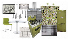
pricklypearcactus
11 years agolast modified: 9 years agopurplepansies - Thanks so much! I think the counter and backsplash are my favorite too. I suppose I could have still used them and mixed in silver toned lighting and hardware instead.
(Viking Avocado) I really like this one. The combination of soapstone with the green appliances is perfect. And the backsplash is fantastic too.sochi - Thanks! I think you're right that the Bistro Green Vetrazzo gives some softness. Icestone also has several green colors with green pigmented cement binder and one with a white binder and green glass. Perhaps one of them could work with green appliances? I imagine the green shades could be a little tricky.
palimpsest - I always really appreciate the incredible wealth of information you provide on this forum. It's great to know about the history of appliances. In some cases I really do like the mixing, specifically when the range is highlighted with a color, while the other appliances are paneled or stainless. For me I'd definitely have to love the color of the appliance. And unfortunately avocado green and gold just doesn't do it for me.
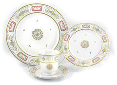
pawa - Glad to have you join in! I'm a bit of a newcomer in these threads, but I love to see new ideas and perspectives. So I consider a "crazy kitchen" more than welcome. Everyone has different tastes, perspectives, and ideas and yours design very unique and interesting. I love the flooring and lighting and the bold red with the gold range. I actually have a small set of plates and bowls very similar to the plate you included in your design, but in white and avocado green. They were my grandmother's and while they match nothing else in my home, I enjoy the memories that they bring when I use them.

cawaps
11 years agolast modified: 9 years agoPurplepansies #1, walnut & avocado: This has a classic 70's palette with the dark cabinets, avocado and rust, but in spite of that and the vintage style, your kitchen reads entirely contemporary to me. Like many, I carry cultural baggage from the color palettes of the 60s and 70s, but your kitchen makes me get the appeal of avocado and rust together. A great design to set the stage for this thread.
Palimpsest Wasabi: The wasabi color straddles avocado and gold--it comes off as very yellow on my monitor. As daring as the color is by current standards, the design as a whole is quite conservative. It works together well.
Pricklypearcactus Avocado/Stainless/White: A very clean and striking combination. I love Vetrazzo, and this design uses it very well, with the grays in the glass picking up the color of the stainless. I thought this one worked much better than the version you did with the Bistro Green Vetrazzo. I think the simpler palette (without the added brown/amber in the Vetrazzo) worked much better in this design.
Lavender Mid-century cool: Wow, now that you've gone out on a limb you just keep going! This is a nice example of using actual mid-century appliances. I LOVE the collection of mid-century furniture you put together, with all the sexy curves. And the fabric on the chair is fabulous.
Palimpsest Stainless: The green of the range fades to almost neutral amid all that stainless. Interesting concept, although I think most people would find it not very comfortable to live with.
Sochi Maple and Harvest Gold: Nice to see some gold thrown in. I think it works well with this very simple palette. I love the backsplash tile and the dining chiairs.
Dee850 Gold, Blue and Red: I think the primary palette works with the gold appliances, but I�m finding the blue walls to be a bit overwhelming on top of the dark blue cabinets. Maybe white or off white?
Palimpsest Federal Case: Nice job capturing the period. I especially like the lighting fixture. I think I would find the wallpaper pattern a bit overwhelming in real life, though.
Lavender Vintage with Avocado: I love the vintage range. I think this color green is different enough from the 70s avocado (which was kind of muddy) that it doesn�t come with as much baggage. The matching lighting fixture was a great find.
Purplepansies Havest Gold: That counter is absolutely gorgeous, and your kitchen shows it off well. The potted palm makes the dining room. As an aside, it would be helpful if you would title your kitchens for easy reference when commentin (like Pal does in the subject line). Since you've been doing so many of these.
Lavender Lass Avocado/Turquoise/Orange. What a great range--I love the porthole window! The bright colors look really fresh with the white. You have a lot of retro elements, but taken as a whole it doesn't feel like a time capsule at all.
Palimpsest Art Deco. Scrolling down through this one, it starts out neutral and then you hit the purple dining chairs. The artwork and the rug pull it all together. The wallpaper is fabulous.
Sochi Walnut and Avocado. Love the repeated stripes in this one. It remind me of an okapi (Design Around This: Zoo Animals!).
Pricklypearcactus White and Gold. I am really liking the gold and white designs on the thread. Your shell backsplash is gorgeous, and the fabric is beautifully subtle.
Purplepansies Viking Avocado. It's funny, even though sage greens currently are more socially acceptable than avocado greens, I don't like these appliances as well as many of the others. But you've used the sage green well. The chair fabric really pulls all the colors together.
Lavender Lass Unexpected Avocado. Yet another really cool range in a great color. I really really want one. I wonder if the fabric and the wallpapers aren't too-close-but-not-quite-close-enough to work in the same room? I think it would be easier to work with distinctly different patterns.
Pawa "Crazy" kitchen. Welcome and congratulations on your first design. It's a bit addictive, I should warn you. While not for everbody, I like the way you used primary colors in this one. I do think, though, that beyond the red, blue and yellow you have too many other colors with the white counter, black cabinets, brown on the floor, and taupe in the wallpaper. They're all neutrals, but they are all different and create a bit of visual chaos. I think that simplifying those, for example by doing a black/blue checkerboard floor, or keeping the floor but going with brown cabinets, or, heck, even having the lowers red like the uppers, would calm it down while still keeping the palette interesting and a bit "crazy."
On the subject of "would I buy colored appliances?"--I totally would. Turquoise or spring green would be tops on the list. But I need them to be at mainstream price points, not high end.
Work has been busy, and I indulged myself in a Avengers movie marathon on Thursday, so while I've started a couple things, I haven't been able to complete anything.
lavender_lass
11 years agolast modified: 9 years agoCawaps- Thanks...I love those vintage ranges, too. I think my favorite is the one with the porthole! Turquoise and spring green is one of my favorite color combos :)
I agree with you about the fabric and wallpaper. I was hoping that having the wallpaper in the kitchen would bring out the spring green in the range and the fabric would tie in with the china and dining chairs. You have an excellent idea about trying a different fabric. I'd like to play around with a plaid. Maybe take down the 'girly' vibe, just a bit :)
formerlyflorantha
11 years agolast modified: 9 years agoThese appliance colors are just too close to my psychological flashpoints for me to keep trying to make a kitchen plan myself and I'm not going to comment on the kitchens--except to say that I truly and sincerely congratulate you posters for giving this challenge such a good try.
Except for the...Neoclassical kitchen of Palimpsest. That one is so very amazing that I have to comment. And it doesn't go near to my 1960s-70s personal hangups. It's so absolutely amazing in its weirdness. Good job Pal! You are absolutely correct in your description of early Federal fearless use of prints and colors. Take a look at John Quincy Adams' personal White House china...
angie_diy
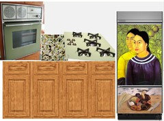
11 years agolast modified: 9 years agoEliza wanted an avocado kitchen in the worst way. Ironically, that is pretty much the way it came to her!
She bought her 1950s tract house with a kitchen that had been renovated in high 1970s style, and later had a "freshening" in the 1990s. The 1970s reno put in new avocado appliances, including a wall oven, fridge, cooktop, sink, and dishwasher. The 1990s freshening replaced the decrepit cooktop with an anemic electric white coil cooktop. The cabinets were solid from the 1970s and the layout was good; the 1990s owners just refaced the cabinets using golden oak, which was still in good shape. At least they weren't arched, she muttered.
She got her avocado kitchen, but what could be saved? Assessing the appliances was disappointing. The DW had long ago been replaced of course, and the replacement needed replacing. The anemic cooktop had yellowed and not all the burners worked. The enamel on the sink was badly chipped and worn completely off of the top of the center divider, but she assumed this could be repaired. Water had gotten under the laminate countertop near the sink and bubbled the top. The floor was greige sheet vinyl that covered the 1950's vinyl composite tile held down with asbestos-containing mastic. At least the fridge worked. She adored the wall oven, which was a compact unit with an Aztec calendar motif.
She read up on new appliances. She discovered that the enamel on the sink could not be repaired. But the fridge was what really gave her pause. It did not cool very well, and she realized it was an energy hog. What remained of her avocado dream? Very little. She debated giving up on her vision; her sister counseled her to put in granite countertops and stainless steel appliances. But she was stubborn.
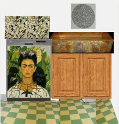
She spent time research fridges: looking for either an old avocado one that had decent energy ratings (no dice), or one of the new modern retro ones, which didn't fit her taste or pocketbook. Finally, she hit on the idea of decorating a modern, panel-ready fridge with something of her own choosing to fit the kitchen vision she was developing. She had recently read the DAT #18: Art thread, and hatched an idea. She decided to build off of the Mesoamerican motif present in the wall range. She always loved Frida Kahlo's art, attitude, and sense of color. She arranged to have some of Kahlo's paintings transferred to MDF panels to be mounted on a panel-ready fridge. Oh! And might as well do the dishwasher that way, too!
In looking for the retro fridge, she found a Smeg cooktop in a passable color. The countertops were Vetrazzo recycled glass. She always wanted an apron sink; a Rachiele copper sink provided her the opportunity to get a patina to match. She did not want to pull up the asbestos-containing floor, so she was limited to thin flooring materials. Hmmm: the kitchen now had elements spanning many decades, so she decided to put in green and buff checkerboard Marmoleum tiles. She chose dove gray to make the walls fade into the background, and decorated with a Mayan calendar. After all, it's the end of the world as we know it.
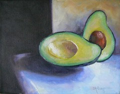
angie_diy
11 years agolast modified: 9 years agoAfter the kitchen was nearly done, Eiza's sister came by with a housewarming gift: a painting to help decorate the new space:
Jamie
11 years agolast modified: 9 years agoAngie that kitchen is really great. I've never seen golden oak cabinets look good like that before, in any setting. It must be the chunky countop making it all work together. It just feels so comfortable and right. The fade away walls are beyond genious. Everything has just the right amount of strength.
palimpsest
Original Author11 years agolast modified: 9 years agoPawa, thanks for joining in. Yours illustrates that gold (or avocado) are just saturated hues that shouldn't really have anything negative attached to them...Angie, the murals on the appliances are great.
palimpsest
Original Author11 years agolast modified: 9 years agoI wasn't going to do a 1960s-70s kitchen with this challenge but here goes: A 1970s contemporary. What kind of kitchen would fit if you were not changing things like cathedral ceilings with glass end walls?
{{gwi:1791202}} {{gwi:1791202}} (would choose 4x4)
{{gwi:1791204}}{{gwi:1791204}}
{{gwi:1791207}} {{gwi:1791209}} {{gwi:1791207}}{{gwi:1791211}}
{{gwi:1791213}}{{gwi:1791215}}
{{gwi:1791217}}{{gwi:1791219}}{{gwi:1791217}}
{{gwi:1791222}}{{gwi:1791224}}
{{gwi:1791226}}{{gwi:1791227}}{{gwi:1791228}}AnnSacks Stoneware Tile
Panolam Tropical Getaway laminate
Woodmode Fairfield Cabinets, with DuVerre Forged hardware
Bluestar in RAL Reed Green
Ann Sacks concrete floor
Knoll Cyclone open weave casement.
The house
Curtis Jere-Artisan House oversized utensils (5 feet tall)
Currey and Company pendant ( a modern take on 1970s RLM warehouse pendants)
Spoleto chairs (1971) and Platner wire table (1966) in bronze, Knoll.pawa
11 years agolast modified: 9 years agoSuper surprisingly, I really like Angie DIY's kitchen. Like others, I don't despise the oak cabs. I still really hate avocado though :-( Blech. It's interesting how the 'high art' (I think that's what it's called) becomes decorative art.
If I find some time tonight, I might come up with another design that is more toned down.
I don't take it personally if you critique my ideas.
angie_diy
11 years agolast modified: 9 years agoThank you, Jamies, Pal, and pawa for your positive feedback. In my own mind's eye, I keep flipping back and forth between "Hey, that is pretty cool! I like that space!" and "Gawd! Avocado and Goak! Rip it out! Rip it out!!"
I like how I managed to work in references to 3 other DATs. I should have gone with a wild Formica to make it 4. :-)
I don't take it personally if you critique my ideas.
Good. That is one of the premises (and "ground rules") upon which this series rests -- otherwise it is hard for us to actually learn anything and instruct each other. Problem is I don't feel "qualified" to evaluate -- I like almost everything!
cawaps
11 years agolast modified: 9 years agoAngieDIY It's the End of the World as We Know It--The Kahlo panels are brilliant. I'm definitely filing that idea away.
Palimpsest "Of the Period." I don't like this one, and I freely concede that that has much more to do with baggage than from the merits of the design. In other words, great job capturing that genuine 70s zeitgeist! Your range is such a muted green that it borders on taupe, and I think I would like it in a different context. But with the yellow undertones in the cabinets it makes me think of Army drab. I do like the dining room, and like the idea of the oversize kitchen tools (the effect of scale is lost in the board, though).
palimpsest
Original Author11 years agolast modified: 9 years agoI don't much like the color of the cabinets in the "of the period" one either, because of the undertone. But generally I wanted to capture that period without making it quite as unattractive to modern eyes, so I think tweaking the stain color could do a lot. Maybe a stronger dark walnut.
I really don't understand the negative baggage with regards to these appliances unless one was slapped around in a kitchen with avocado or gold appliances on a regular basis. (and I don't mean any offense to anyone who relates these to an awful childhood)...but I don't make associations like that.
The thing that I did do in this kitchen is use everything that is currently available as new retail. The laminate counter was introduced within the past couple of years, and the Ann Sacks backsplash tile is new for 2012. The table and chairs have never been out of production, I don't think.
The exception is the Curtis Jere-Artisan house giant implements, but there is a lot of Jere on the vintage market now. If not those it could be something else.
purplepansies
11 years agolast modified: 9 years agoThanks, cawaps, for pointing out that I forget to title my posts - it is something that usually slips my mind, but I'll try to remember!

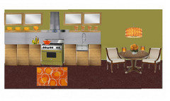
Viking Harvest Gold appliances
Lacanche Brasserie range hood
Crown Point cabinets
walnut counters
multicolor slate tiles from glasstilestore.com
Currey and Company Chatelaine chandelier from laylagrace.com
Hampton 3 piece upholstered set from ballarddesigns.com
curtains from overstock.com
rustic dining table - google image, unsure of source
Blanco silgranit sink and Danze Opulence bridge faucet in blackI probably would use black cup pulls/knobs or something, but realized after I downloaded the jpeg I forgot to do them! (Been a crazy week!)
pawa
11 years agolast modified: 9 years agoHere's a new attempt. I think you'll be proud of me: I toned it down, and I actually feel I could live with a kitchen like this.
I do feel I'm cheating a little as the 'avocado' stove isn't the true, hideous, avocado of yore.
I find 70's colour so dingy. I thought bright white and crisp green would de-dinge.

pawa
11 years agolast modified: 9 years agoMy fave, I think, is Sochi's maple and harvest gold. It has lots of layers of beige which is interesting and soothing.
Also like artful oak, wasabi, white and yellow, and primary colours :-)
cawaps
11 years agolast modified: 9 years agoFinally finished one. This one pushes the boundaries of "Avocado and Harvest Gold," although it wasn't intended as a cheat. I started out with avocado, found the artwork, and then worked back into this one. The range is definitely more orange than harvest gold, but orange tones were definitly part of the 70s colorways. I also think that the kitchen would work with an avocado or gold range with some minor tweaks.
The "range" is a Viking in the color Cinnamon, which I think is new (replacing the old orange, Pumpkin). I found a color swatch, but couldn't find an actual image of a range, you you get a colorblock.

Cabinets are Kraftmaid, in Willow
Hardware is Schaub & Co. Empire Collection
Counter is Silestone Tigris Sand
Backsplash is a glass tile mosaic from statiles.com
Rangehood is Murano Autumn by Futuro Futuro
Floor is Daltile Natural Hues in Paprika
Cinnamon Hill dining table from Thomasville
Dining chairs from Heywood Wakfield
Wall color is Benjamin Moore Polar Lights
Painting is from Kathryn C. Eddy, from 1stDibspalimpsest
Original Author11 years agolast modified: 9 years agoPawa, I like the tighter palette of your latest design. The first one was fun, but I think anything goes might be fun to look at on paper but not so much fun irl.
Purple, in your last one, I don't know. The appliances look almost white when I do the squint test, the range anyway.
Cawaps, in your last one, I am not sure how the orange range fits in the scheme...I see red, a deeper green, or black working better than the orange. I like the orange, I am just not sure I like it in this context--I see it with a navy kitchen.
palimpsest
Original Author11 years agolast modified: 9 years agoThis DAT has run for two weeks and was introduced three weeks ago.
Should we do another? Take a hiatus?
I would be interested in Sports Fan colors or redoing kitchens found it Real Estate.
CEFreeman
11 years agolast modified: 9 years agoI am so surprised at how much I like both avocado and harvest gold look with the different cabinets!!!
I love the combinations and could actually consider ... repainting ... changing the color of the appliances for which I'm saving ...
I might be posting, since I'm bookmarking this thread.....
marcolo
11 years agolast modified: 9 years agoI am too late to the party to give individual critiques, but I think it's fair to say that the point has been proven that these colors can work quite well in a modern kitchen.
Why are the colors so often despised? Not to go off on a tangent but there has been a lot of academic scrutiny lately of the way Americans are using language and opinion--not to reason out a debate, but merely to express membership in a certain group. I think a lot of design phrases have turned into that, simple markers to denote that the speaker is in the supposed cool set. We get to be "in" by mocking what is "out," even if what we say is completely illogical. Anyway.
I think people have been asking for re-dos of real estate listings for a while, so I'd vote for that. It's pretty similar to the real world challenges that people face when they buy a house.
sochi
11 years agolast modified: 9 years agoReal estate listings sounds good. Anything but sports team kitchens!
I agree with you Marcolo, there is no good reason (to my mind at any rate) that these colours are so disliked. I grew up with 1970s brown appliances, I really like them too.
Cawaps, love the red. The range is missing though, right?
cawaps
11 years agolast modified: 9 years agoWith the real estate listing idea, is it everyone re-doing the same kitchen, or everyone picks a different listing and works from that? I thought it was the former when it was originally proposed, but either would work.
I actually have a sports fan kitchen ready and waiting--I did it for the tract home thread (not thinking sports fan, but it is incidently in my college colors), and it didn't quite work (mostly because I was thinking the home would have an open or quasi-open floor plan, and I couldn't figure out how the kitchen colors would fit into the larger space). But since we just did a color-themed DAT, I think we should do something different for this one.
Marcolo, I think that there is some truth to the in crowd/out crowd idea. Some of it is driven by indivduals who want to be cutting edge. Some is driven by the industry, since remodeling is significantly driven by things being identified as dated (if nothing was ever dated, we'd all keep our stuff until it wore out, and where's the profit in that?).
In clothing fashion, I have seen so many trends come and go, and be completely reviled, only to come back again with a different name 15 or 20 years later(bell bottoms, flares, boot cut; hip huggers & low rise). I have photos of me from high school in outfits that would have been the height of fashion two years ago. I've seen this happen so many times that I no longer take clothing fashion at all seriously, and laugh at those who do (waiting for my daughter to hit her tweens). Design cycles in kitchens are much longer, and so things stay out of fashion much longer.
cawaps
11 years agolast modified: 9 years agoSochi, the orange box is a stand in for the range. I found the Viking color swatch, but couldn't find an image of a range in that color. No, it isn't gold or or avocado.
palimpsest
Original Author11 years agolast modified: 9 years agoHere is what I was thinking for Real Estate Kitchens:
Find a listing of a house you would buy because it has a number of features you like, but a kitchen that is either worn out or wildly inappropriate (in your opinion) for the rest of the house. Select new fixtures and finishes for the kitchen. You don't have to be purist, but make a case for its suitability to the house.
I think this would involve having a picture of the outside (heavily cropped if you feel better about that), and/or a typical room inside + the kitchen. Of course some houses will be pretty blank on the inside (except for being "soft contemporary") so that's where an outside picture may come in.
So, we could start with our own selection, but then maybe take a crack at the house that someone else has picked, if we want to do more than one.
marcolo
11 years agolast modified: 9 years agoWow, pal, the way you suggest setting it up sounds really fun.
I wonder if it will work better to copy photos to photobucket or whatnot, because MLS changes so frequently.
pawa
11 years agolast modified: 9 years agore: Why are the colors so often despised?
That's a good question. I don't know...One thing I have noticed is that the context of the colour plays a part. Beige cars cars look awful to me, but beige khakis are ok. A bright purple dress looks good on me, but maybe not on my walls. Avocado -- especially with the darker ridges and lighter centre -- yuk. puke. I really don't like it. But on a cushion or in some fabric? I think it looks OK.
RE: using language of opinion to be in the 'in' crowd.
Right, well colour is precisely a matter of opinion. You can't really have a logical debate over colour. Plus, **every** opinion you express puts you in one camp or another, whether it be about colours, politics, etc...
purplepansies
11 years agolast modified: 9 years agoLast one. I agree that the real estate listing idea would be fun.
I actually started this a while ago, just could never finish it. I was intrigued by the pairing of an avocado colored appliance with the zebra wood cabinets. The counter and backsplash are both stainless steel, and the upper cabinets would lift open with a shelf below. I also wanted to see what using the avocado on the walls would be like - I actually like it!Bluestar range in green beige
Plain and Fancy cabinets
Marmoleum floor in "cosmic red"
zero radius stainless steel sink and semi pro faucet (google images)
Pucci drum pendant - 2modern.com
pedestal dining table - amishdirectfurniture.com
Belle Meade Acadia dining chair - laylagrace.com
rug from homeandpatiodeccorcenter.com
walls - Behr retro avocadopalimpsest
Original Author11 years agolast modified: 9 years agoI agree that expressing an opinion always puts you in one camp or other, but when it comes to politics, religion, cultural viewpoint and the like one usually has a reason that one expresses the opinion that puts you in one camp or another.
I think the colored appliance, the stainless steel, the granite, and other opinions are more of a circular argument for some people: I like it because I like it because I am supposed to like it...I don't like it because I don't like it because I am not supposed to like it...but they can't formulate an independent reason for feeling one way or the other.
I have had clients recite an exact List of what they want their kitchens to look like based upon the prevailing local "kitchen of the year" (and in my locale it is not the OTK)...when further analysis and questioning has revealed that they would NOT choose _____ independently, they just thought that was what they were Supposed to choose.

steiconi
10 years agolast modified: 9 years agoI had avocado appliances in a kitchen back in...1983, I think, when it was just horribly outdated instead of retro cool. It was an apartment, and I wasn't even allowed to paint the walls, but I found some great hand towels to pull together a color scheme. Avocado, harvest gold, burnt orange, cream, and PURPLE. It worked. I even added purple rugs, really took that kitchen out of the '70s


pricklypearcactus