


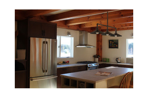
Mixing tile sizes in backsplash
localeater
11 years ago
Featured Answer
Comments (73)

localeater
11 years agolast modified: 9 years ago
eam44
11 years agolast modified: 9 years agoRelated Professionals
Midvale Kitchen & Bathroom Designers · South Farmingdale Kitchen & Bathroom Designers · Glen Carbon Kitchen & Bathroom Remodelers · Green Bay Kitchen & Bathroom Remodelers · Phoenix Kitchen & Bathroom Remodelers · Rancho Palos Verdes Kitchen & Bathroom Remodelers · Rolling Hills Estates Kitchen & Bathroom Remodelers · Wilson Kitchen & Bathroom Remodelers · Shaker Heights Kitchen & Bathroom Remodelers · Phillipsburg Kitchen & Bathroom Remodelers · Stoughton Cabinets & Cabinetry · Hermosa Beach Tile and Stone Contractors · Rancho Cordova Tile and Stone Contractors · Gardere Design-Build Firms · Glassmanor Design-Build Firms
oldbat2be
11 years agolast modified: 9 years agooldbat2be
11 years agolast modified: 9 years agooldbat2be
11 years agolast modified: 9 years agooldbat2be
11 years agolast modified: 9 years agooldbat2be
11 years agolast modified: 9 years ago
finestra
11 years agolast modified: 9 years agolocaleater
11 years agolast modified: 9 years agokitchendetective
11 years agolast modified: 9 years agoislanddevil
11 years agolast modified: 9 years agofinestra
11 years agolast modified: 9 years agoeam44
11 years agolast modified: 9 years agoeam44
11 years agolast modified: 9 years agolocaleater
11 years agolast modified: 9 years agoeam44
11 years agolast modified: 9 years agodeedles
10 years agolast modified: 9 years agolocaleater
10 years agolast modified: 9 years agoeam44
10 years agolast modified: 9 years ago
enduring
10 years agolast modified: 9 years ago
corgimum
10 years agolast modified: 9 years agocorgimum
10 years agolast modified: 9 years agonosoccermom
10 years agolast modified: 9 years agodeedles
10 years agolast modified: 9 years agodeedles
10 years agolast modified: 9 years agocorgimum
10 years agolast modified: 9 years agooldbat2be
10 years agolast modified: 9 years agodeedles
10 years agolast modified: 9 years agodeedles
10 years agolast modified: 9 years agolocaleater
10 years agolast modified: 9 years agolocaleater
10 years agolast modified: 9 years agodeedles
10 years agolast modified: 9 years agoeam44
10 years agolast modified: 9 years agooldbat2be
10 years agolast modified: 9 years agooldbat2be
10 years agolast modified: 9 years agooldbat2be
10 years agolast modified: 9 years agooldbat2be
10 years agolast modified: 9 years ago
a2gemini
10 years agolast modified: 9 years agodeedles
10 years agolast modified: 9 years ago
Bunny
10 years agolast modified: 9 years agonosoccermom
10 years agolast modified: 9 years agodeedles
10 years agolast modified: 9 years agooldbat2be
10 years agolast modified: 9 years agooldbat2be
10 years agolast modified: 9 years agodeedles
10 years agolast modified: 9 years agolocaleater
10 years agolast modified: 9 years agolocaleater
10 years agolast modified: 9 years agodeedles
10 years agolast modified: 9 years agolocaleater
10 years agolast modified: 9 years agosunfeather
6 years ago


Related Stories
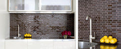
BATHROOM DESIGN9 Tips for Mixing and Matching Tile Styles
Get acquainted with the basics of combining shapes, colors and finishes for a symphony of tiles
Full Story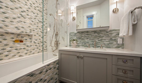
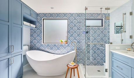
BEFORE AND AFTERSRoom of the Day: Tile Patterns Mix It Up in a Master Bath
Contemporary and classic elements mix in a boldly detailed San Francisco bathroom makeover
Full Story
KITCHEN DESIGNBar Stools: What Style, What Finish, What Size?
How to Choose the Right Seating For Your Kitchen Island or Counter
Full Story
KITCHEN DESIGNRelocated Colonial Kitchen More Than Doubles in Size
Putting the kitchen in a central location allows for a big boost in square footage and helps better connect it with other living spaces
Full Story
HOUZZ TOURSMy Houzz: Pint-Size Playfulness in Vancouver
An interior designer mixes handmade art with creative touches to give his small downtown Vancouver home a fresh look
Full Story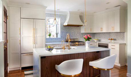
KITCHEN DESIGNCouple Renovates to Spend More Time in the Kitchen
Artistic mosaic tile, custom cabinetry and a thoughtful layout make the most of this modest-size room
Full Story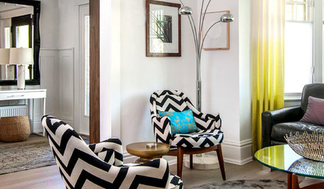
HOUZZ TOURSHouzz Tour: Mixing It Up in a Century-Old Edwardian
Different eras, patterns and textures mingle beautifully in a Canadian interior designer's home and 'design lab'
Full Story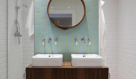
BATHROOM TILEBathroom Backsplashes Make a Style Statement
Be inspired to turn this small bathroom detail into a big design feature
Full Story
HOUZZ TOURSMy Houzz: Art Dealer's Modern-Native Mix in Canada
Traditional Northwest style meets a modern aesthetic in this comfortable, gallery-like home in downtown Vancouver
Full StorySponsored
Columbus Design-Build, Kitchen & Bath Remodeling, Historic Renovations
More Discussions


islanddevil