


Design Around #18: Post Designs for Art of Kitchen Design.
palimpsest
12 years ago
Featured Answer
Sort by:Oldest
Comments (153)

palimpsest
12 years agolast modified: 9 years ago
cawaps
12 years agolast modified: 9 years agoRelated Professionals
Clute Kitchen & Bathroom Designers · Pike Creek Valley Kitchen & Bathroom Designers · East Tulare County Kitchen & Bathroom Remodelers · Glade Hill Kitchen & Bathroom Remodelers · Charlottesville Kitchen & Bathroom Remodelers · Honolulu Kitchen & Bathroom Remodelers · Las Vegas Kitchen & Bathroom Remodelers · Skokie Kitchen & Bathroom Remodelers · Thonotosassa Kitchen & Bathroom Remodelers · Princeton Kitchen & Bathroom Remodelers · Kentwood Cabinets & Cabinetry · Riverbank Cabinets & Cabinetry · North Bay Shore Cabinets & Cabinetry · Hermiston Tile and Stone Contractors · Roxbury Crossing Tile and Stone Contractors
enduring
12 years agolast modified: 9 years agopalimpsest
12 years agolast modified: 9 years agomjsee
12 years agolast modified: 9 years agodee850
12 years agolast modified: 9 years ago
lazy_gardens
12 years agolast modified: 9 years agopurplepansies
12 years agolast modified: 9 years agoformerlyflorantha
12 years agolast modified: 9 years agocawaps
12 years agolast modified: 9 years agolavender_lass
12 years agolast modified: 9 years agoangie_diy
12 years agolast modified: 9 years agopalimpsest
12 years agolast modified: 9 years agoangie_diy
12 years agolast modified: 9 years agoangie_diy
12 years agolast modified: 9 years agoangie_diy
12 years agolast modified: 9 years agopurplepansies
12 years agolast modified: 9 years agocawaps
12 years agolast modified: 9 years ago
sochi
12 years agolast modified: 9 years agolavender_lass
12 years agolast modified: 9 years agopalimpsest
12 years agolast modified: 9 years agocawaps
12 years agolast modified: 9 years agopalimpsest
12 years agolast modified: 9 years agopalimpsest
12 years agolast modified: 9 years agolavender_lass
12 years agolast modified: 9 years agocawaps
12 years agolast modified: 9 years agoedeevee
12 years agolast modified: 9 years agoformerlyflorantha
12 years agolast modified: 9 years agopalimpsest
12 years agolast modified: 9 years agoformerlyflorantha
12 years agolast modified: 9 years agoangie_diy
12 years agolast modified: 9 years agopurplepansies
12 years agolast modified: 9 years agopalimpsest
11 years agolast modified: 9 years agopurplepansies
11 years agolast modified: 9 years agohonorbiltkit
11 years agolast modified: 9 years agoformerlyflorantha
11 years agolast modified: 9 years agohonorbiltkit
11 years agolast modified: 9 years agopurplepansies
11 years agolast modified: 9 years agopalimpsest
11 years agolast modified: 9 years agopalimpsest
11 years agolast modified: 9 years agopricklypearcactus
11 years agolast modified: 9 years agocawaps
11 years agolast modified: 9 years agopalimpsest
11 years agolast modified: 9 years agohonorbiltkit
11 years agolast modified: 9 years agopricklypearcactus
11 years agolast modified: 9 years agoangie_diy
11 years agolast modified: 9 years ago
Carla Houston
6 years agolast modified: 6 years agocawaps
6 years agoCarla Houston
6 years ago


Related Stories
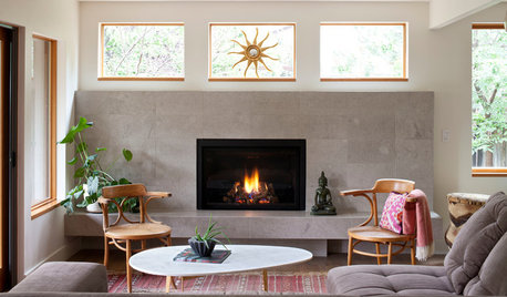
LIVING ROOMSNew This Week: 5 Living Rooms Designed Around the Fireplace
Overcome one of design’s top obstacles with tips and tricks from these living rooms uploaded recently to Houzz
Full Story
THE ART OF ARCHITECTUREDesign Workshop: Put Industrial Mesh to Work Around the Home
From open gratings to fine weaves, commercial metal mesh is a durable and beautiful choice for residences too
Full Story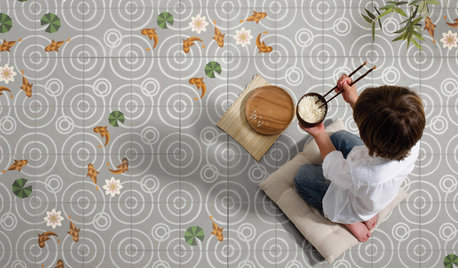
TILEWorld of Design: How Modern Geometric Designs Are Reinventing Cement
Intricate and eye-catching, the patterns of today’s cement tiles mark a break with their past while preserving an age-old technique
Full Story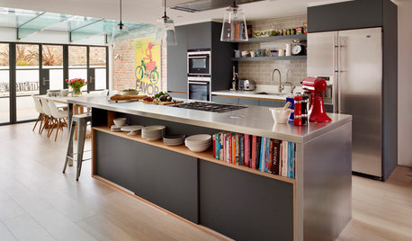
KITCHEN DESIGNKitchen of the Week: Industrial Design’s Softer Side
Dark gray cabinets and stainless steel mix with warm oak accents in a bright, family-friendly London kitchen
Full Story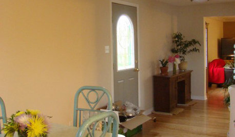
MORE ROOMSDesign Dilemma: Decorating Around an Open Entryway
How Would You Design This Narrow Space?
Full Story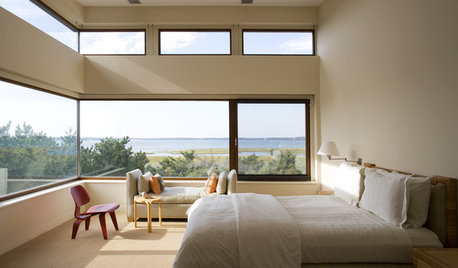
MORE ROOMSA Room with a View: Designing Around a Panorama
How to Decorate When the Room's Best Feature is Outside
Full Story
DECORATING GUIDESWorld of Design: Decorating Ideas From 10 Renters Around the Globe
Even if you don’t own your home, you can live beautifully. Browse these ideas from international tenants who’ve made their spaces special
Full Story
KITCHEN DESIGNWorld of Design: Favorite Recipes From Food Lovers Around the Globe
Travel with your tastebuds and experience for yourself these international foodies' favorite dishes
Full Story
HOMES AROUND THE WORLDWorld of Design: 11 Book Lovers and Where They Like to Read
Bibliophiles across the globe reveal their top books and favorite reading spots, from a 2-story library to an artfully curated book nook
Full Story
EVENTS12 Must-See Art and Design Events This January
Get out and get inspired! See what’s on the Houzz creative calendar in the new year
Full Story


sochi