


2 Toned Kitchen, Can't decide on Benjamin moore colors
mariat_e12
10 years ago
Sort by:Oldest
Comments (11)
Related Stories

COLORBenjamin Moore Floats Breath of Fresh Air as Its Color of 2014
Touted as a new neutral, this baby blue can stand on its own or support bolder colors. Here's how to use it
Full Story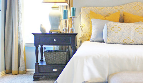
COLOR8 Color Palettes You Can't Get Wrong
Can't decide on a color scheme? Choose one of these foolproof palettes for a room that feels both timeless and fresh
Full Story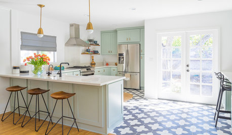
KITCHEN DESIGNTrending Now: 25 Kitchen Photos Houzzers Can’t Get Enough Of
Use the kitchens that have been added to the most ideabooks in the last few months to inspire your dream project
Full Story
COLORBest Ways to Use the Neutral Green Color of 2015
Benjamin Moore’s Color of the Year is soft and natural
Full Story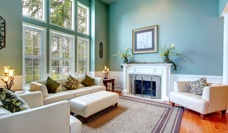
DECORATING GUIDESNeed Peace and Quiet? Muted Colors Tone Things Down
Subtle hues can be perfect for large rooms and to balance out bolder colors in a home
Full Story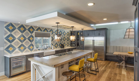
KITCHEN DESIGNKitchen of the Week: Tile Sets the Tone in a Modern Farmhouse Kitchen
A boldly graphic wall and soft blue cabinets create a colorful focal point in this spacious new Washington, D.C.-area kitchen
Full Story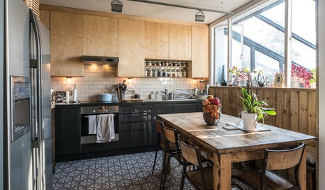
KITCHEN DESIGNA Two-Tone Cabinet Scheme Gives Your Kitchen the Best of Both Worlds
Waffling between paint and stain or dark and light? Here’s how to mix and match colors and materials
Full Story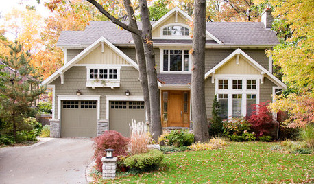
EXTERIOR COLORDynamic Duo: How to Pull Off a Two-Tone Exterior Color Scheme
Why stick to one main house color if you can easily and beautifully combine two?
Full Story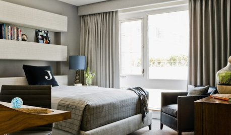
BEDROOMS10 Stylish Bedrooms With a Decidedly Masculine Vibe
Cut the fluff and get right to the point with crisper edges, toned-down colors and a whole lot less stuff
Full Story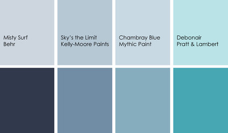
DECORATING GUIDESColor Feast: Yes, You Can Use Blue in the Dining Room
The sky's the limit for beautiful blues in your home's dining spaces; here's how to make it work
Full Story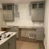


robo (z6a)
Bunny
Related Professionals
Clute Kitchen & Bathroom Designers · Flint Kitchen & Bathroom Designers · Fresno Kitchen & Bathroom Designers · San Jose Kitchen & Bathroom Designers · Southampton Kitchen & Bathroom Designers · Eagle Mountain Kitchen & Bathroom Remodelers · Avondale Kitchen & Bathroom Remodelers · Blasdell Kitchen & Bathroom Remodelers · Ewa Beach Kitchen & Bathroom Remodelers · Fair Oaks Kitchen & Bathroom Remodelers · Warren Kitchen & Bathroom Remodelers · Los Altos Cabinets & Cabinetry · Marco Island Cabinets & Cabinetry · Prospect Heights Cabinets & Cabinetry · Short Hills Cabinets & CabinetryMajra
teacats
amck2
gnancyanne
susanlynn2012
crl_
feisty68
greenhaven
carree