


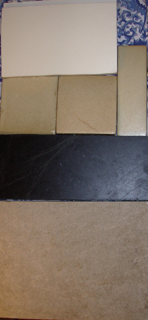
Help before I ruin my almost finished kitchen
lucretzia
14 years ago

Related Stories
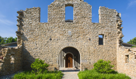
HOUZZ TOURSHouzz Tour: Taking on the Ruins of an 1800s Bourbon Distillery
Crumbling stone walls and wood from former tobacco barns creates a stunning new home amid rolling Kentucky farmland
Full Story
KITCHEN DESIGNKey Measurements to Help You Design Your Kitchen
Get the ideal kitchen setup by understanding spatial relationships, building dimensions and work zones
Full Story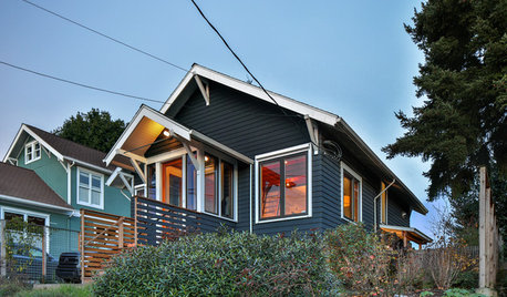
MODERN HOMESHouzz TV: Seattle Family Almost Doubles Its Space Without Adding On
See how 2 work-from-home architects design and build an adaptable space for their family and business
Full Story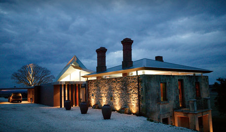
CONTEMPORARY HOMESHouzz Tour: Modern Retreat Emerges From a 19th-Century Ruin
A contemporary country home builds on the remains of an abandoned 1860s homestead
Full Story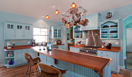
KITCHEN DESIGNHere's Help for Your Next Appliance Shopping Trip
It may be time to think about your appliances in a new way. These guides can help you set up your kitchen for how you like to cook
Full Story
SELLING YOUR HOUSE10 Low-Cost Tweaks to Help Your Home Sell
Put these inexpensive but invaluable fixes on your to-do list before you put your home on the market
Full Story
SELLING YOUR HOUSEHelp for Selling Your Home Faster — and Maybe for More
Prep your home properly before you put it on the market. Learn what tasks are worth the money and the best pros for the jobs
Full Story
COLORPaint-Picking Help and Secrets From a Color Expert
Advice for wall and trim colors, what to always do before committing and the one paint feature you should completely ignore
Full Story
LIVING ROOMSA Living Room Miracle With $1,000 and a Little Help From Houzzers
Frustrated with competing focal points, Kimberlee Dray took her dilemma to the people and got her problem solved
Full Story
KITCHEN DESIGNDesign Dilemma: My Kitchen Needs Help!
See how you can update a kitchen with new countertops, light fixtures, paint and hardware
Full StoryMore Discussions


yayagal
desertsteph
Related Professionals
Carson Kitchen & Bathroom Designers · Glens Falls Kitchen & Bathroom Designers · Manchester Kitchen & Bathroom Designers · Covington Kitchen & Bathroom Designers · North Druid Hills Kitchen & Bathroom Remodelers · Buffalo Grove Kitchen & Bathroom Remodelers · Dearborn Kitchen & Bathroom Remodelers · Independence Kitchen & Bathroom Remodelers · Kettering Kitchen & Bathroom Remodelers · Terrell Kitchen & Bathroom Remodelers · West Palm Beach Kitchen & Bathroom Remodelers · Westminster Kitchen & Bathroom Remodelers · Middletown Cabinets & Cabinetry · Corsicana Tile and Stone Contractors · Riverdale Design-Build Firmsrhome410
remodelfla
lucretziaOriginal Author
lucretziaOriginal Author
lucretziaOriginal Author
marcolo
amberley
daisychain01
lucretziaOriginal Author
amberley
petepie1
marcolo
sochi
lucretziaOriginal Author
lucretziaOriginal Author
littlesmokie
amberley
rhome410
lucretziaOriginal Author
sweeby
lucretziaOriginal Author
rhome410
amberley
marcolo
rhome410
sweeby
lucretziaOriginal Author
amberley
lucretziaOriginal Author
petepie1
marcolo
beckysharp Reinstate SW Unconditionally
beckysharp Reinstate SW Unconditionally
lucretziaOriginal Author
lucretziaOriginal Author
wdstkdaisy
lucretziaOriginal Author