


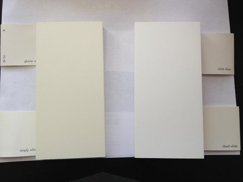
Seeing undertones in white kitchen cabinets
dckitrem
11 years ago
Featured Answer
Comments (24)

Kathy Rivera
11 years ago
smiling
11 years agoRelated Professionals
Hershey Kitchen & Bathroom Designers · Queen Creek Kitchen & Bathroom Designers · Salmon Creek Kitchen & Bathroom Designers · Schaumburg Kitchen & Bathroom Designers · Bay Shore Kitchen & Bathroom Remodelers · Bethel Park Kitchen & Bathroom Remodelers · Gardner Kitchen & Bathroom Remodelers · Oceanside Kitchen & Bathroom Remodelers · Waukegan Kitchen & Bathroom Remodelers · Wilson Kitchen & Bathroom Remodelers · Roanoke Cabinets & Cabinetry · Phelan Cabinets & Cabinetry · Cornelius Tile and Stone Contractors · Des Moines Tile and Stone Contractors · Farragut Tile and Stone Contractorswilltv
11 years ago
Fori
11 years agomiffybunny
11 years agoTmnca
11 years agodckitrem
11 years ago
lazy_gardens
11 years agoTmnca
11 years agosocalsister
11 years agoblondelle
11 years agoellendi
11 years agodckitrem
11 years agoislanddevil
11 years agoSparklingWater
11 years agoblondelle
11 years agolannegreene
11 years agowi-sailorgirl
11 years agolannegreene
11 years agodckitrem
11 years agodckitrem
11 years agoSparklingWater
11 years agoislanddevil
11 years ago
Related Stories
KITCHEN DESIGNSee How Wood Warms Modern White Kitchens
Have your shining all-white kitchen and warmth too, with this natural material that keeps starkness at bay
Full Story
DECORATING GUIDESSee the Light With White Accessories
Dark isn't the only drama maker. White frames, vases, art and more can add sensational style to rooms from traditional to modern
Full Story
KITCHEN DESIGNCooking With Color: When to Use White in the Kitchen
Make sure your snowy walls, cabinets and counters don't feel cold while you're riding white's popularity peak
Full Story
KITCHEN DESIGN5 Favorite Granites for Gorgeous Kitchen Countertops
See granite types from white to black in action, and learn which cabinet finishes and fixture materials pair best with each
Full Story
KITCHEN DESIGNSee-Through Refrigerators Dare to Go Bare
Glass-front fridge doors put your food and drinks on display, for better or worse. See the benefits and disadvantages
Full Story
KITCHEN DESIGNNew This Week: Moody Kitchens to Make You Rethink All-White
Not into the all-white fascination? Look to these kitchens for a glimpse of the dark side
Full Story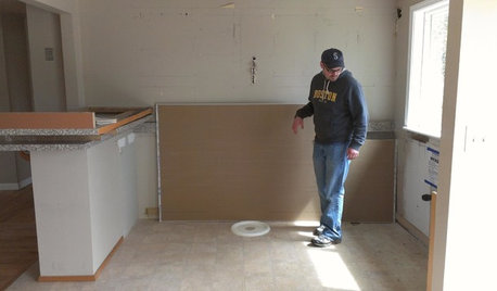
KITCHEN DESIGNStylish New Kitchen, Shoestring Budget: See the Process Start to Finish
For less than $13,000 total — and in 34 days — a hardworking family builds a kitchen to be proud of
Full Story
KITCHEN DESIGNLove to Cook? We Want to See Your Kitchen
Houzz Call: Show us a photo of your great home kitchen and tell us how you’ve made it work for you
Full Story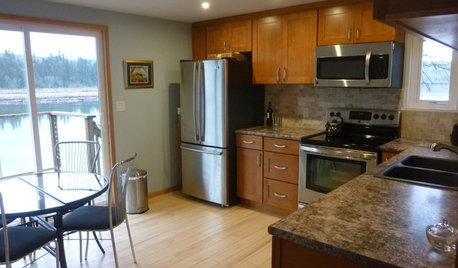
KITCHEN MAKEOVERSSee a Kitchen Refresh for $11,000
Budget materials, some DIY spirit and a little help from a friend turn an impractical kitchen into a waterfront workhorse
Full Story
INSIDE HOUZZHouzz Survey: See the Latest Benchmarks on Remodeling Costs and More
The annual Houzz & Home survey reveals what you can expect to pay for a renovation project and how long it may take
Full StoryMore Discussions


wolfgang80