


update: backsplash opinions please -- all comments welcome!
karlau
16 years ago


Related Stories

DECORATING GUIDESNo Neutral Ground? Why the Color Camps Are So Opinionated
Can't we all just get along when it comes to color versus neutrals?
Full Story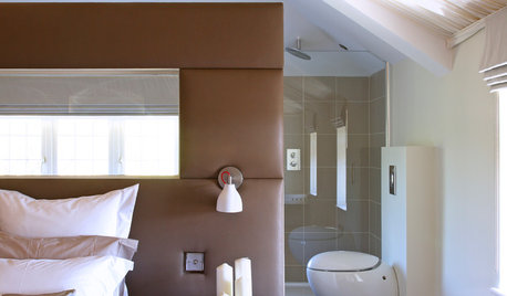
You Said It: Hot-Button Issues Fired Up the Comments This Week
Dust, window coverings, contemporary designs and more are inspiring lively conversations on Houzz
Full Story
HOUZZ TOURSMy Houzz: Color and Heirlooms Combine in a Welcoming Bungalow
Inherited furniture mixes with bright hues in a 1921 Dallas home that embraces the neighborhood and modern life
Full Story
MOST POPULARHouzz Tour: Gracious Older Home Updated for a Young Family
A Texas designer lightens up and repurposes rooms, creating a welcoming space that suits this family’s casual lifestyle
Full Story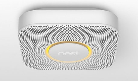
HOME TECHBetter, Smarter Smoke Detectors Push All the Right Buttons
No more bashing in that smoke detector with a broomstick at 3 a.m. — if you haven't already yanked it out. Welcome the new, civilized breed
Full Story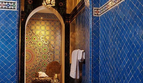
TILEMoor Tile, Please!
Add an exotic touch with Moroccan tiles in everything from intricate patterns and rich colors to subtle, luminous neutrals
Full Story
BATHROOM DESIGNUpload of the Day: A Mini Fridge in the Master Bathroom? Yes, Please!
Talk about convenience. Better yet, get it yourself after being inspired by this Texas bath
Full Story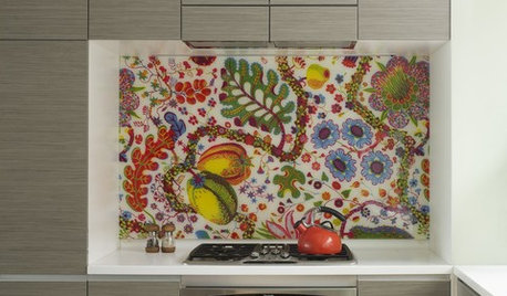
DECORATING GUIDESCelebrate Spring All Year With Florals in the Kitchen
Bring in the beauty of spring and summer color with a flourish of blooms on your kitchen backsplash, curtains, wallpaper and more
Full Story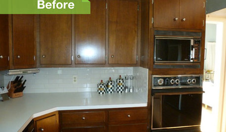
KITCHEN DESIGN3 Dark Kitchens, 6 Affordable Updates
Color advice: Three Houzzers get budget-friendly ideas to spruce up their kitchens with new paint, backsplashes and countertops
Full Story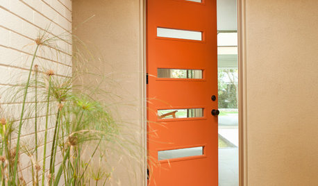
CURB APPEAL77 Front Doors to Welcome You Home
Crossing the threshold is an event with these doors in a gamut of styles
Full Story


karlauOriginal Author
msrose
Related Professionals
Owasso Kitchen & Bathroom Designers · Saint Peters Kitchen & Bathroom Designers · San Jacinto Kitchen & Bathroom Designers · San Jose Kitchen & Bathroom Designers · Schaumburg Kitchen & Bathroom Designers · Sun City Kitchen & Bathroom Designers · Normal Kitchen & Bathroom Remodelers · Cloverly Kitchen & Bathroom Remodelers · Deerfield Beach Kitchen & Bathroom Remodelers · Glendale Kitchen & Bathroom Remodelers · Wilmington Island Kitchen & Bathroom Remodelers · Fort Lauderdale Cabinets & Cabinetry · Hanover Park Cabinets & Cabinetry · Tacoma Cabinets & Cabinetry · Short Hills Cabinets & Cabinetrycasey3
msrose
karlauOriginal Author
msrose
holligator
bellsrus
kristenfl
Nancy in Mich
pbrisjar
karlauOriginal Author
edlakin
glassman
karlauOriginal Author
rmlanza
rmlanza
msrose
Nancy in Mich
mysterymachine
cpang74
rmlanza
msrose
Nancy in Mich
msrose
mary_in_nc
mary_in_nc
mitchdesj
jejvtr
house_vixen
judydel
judydel
louisianapurchase
karlauOriginal Author
karlauOriginal Author
makeitsew
User
cpang74
nancyjn
mommycooks
pbrisjar
kristenfl
tanders
sholt576
rachelle_g
rmlanza
holligator
tanders
kitchenredo08
karlauOriginal Author