


Backsplash opinions please -- ALL comments welcome!
karlau
16 years ago
Sort by:Oldest
Comments (32)
Related Stories

DECORATING GUIDESNo Neutral Ground? Why the Color Camps Are So Opinionated
Can't we all just get along when it comes to color versus neutrals?
Full Story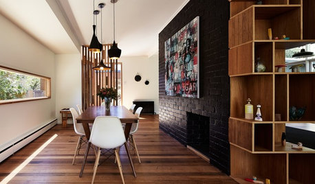
WALL TREATMENTSExpert Opinion: What’s Next for the Feature Wall?
Designers look beyond painted accent walls to wallpaper, layered artwork, paneling and more
Full Story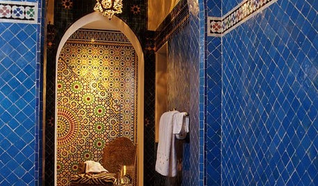
TILEMoor Tile, Please!
Add an exotic touch with Moroccan tiles in everything from intricate patterns and rich colors to subtle, luminous neutrals
Full Story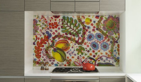
DECORATING GUIDESCelebrate Spring All Year With Florals in the Kitchen
Bring in the beauty of spring and summer color with a flourish of blooms on your kitchen backsplash, curtains, wallpaper and more
Full Story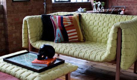
DECORATING GUIDESPlease Touch: Texture Makes Rooms Spring to Life
Great design stimulates all the senses, including touch. Check out these great uses of texture, then let your fingers do the walking
Full Story
HOUZZ TOURSMy Houzz: Color and Heirlooms Combine in a Welcoming Bungalow
Inherited furniture mixes with bright hues in a 1921 Dallas home that embraces the neighborhood and modern life
Full Story
KIDS’ SPACESInspiring Book Nooks Welcome Young Readers
Encourage a lifelong love of reading with inviting and cozy places where kids can burrow into books
Full Story
CONTEMPORARY HOMESHouzz Tour: Contemporary Canadian Lake House Warms and Welcomes
A northern Ontario home accommodates parties of 100 but is cozy enough for two
Full Story
You Said It: Hot-Button Issues Fired Up the Comments This Week
Dust, window coverings, contemporary designs and more are inspiring lively conversations on Houzz
Full Story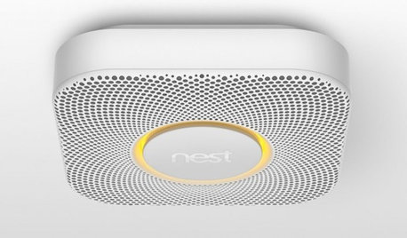
HOME TECHBetter, Smarter Smoke Detectors Push All the Right Buttons
No more bashing in that smoke detector with a broomstick at 3 a.m. — if you haven't already yanked it out. Welcome the new, civilized breed
Full Story

karlauOriginal Author
alywa
Related Professionals
Bloomington Kitchen & Bathroom Designers · Everett Kitchen & Bathroom Designers · Freehold Kitchen & Bathroom Designers · Fresno Kitchen & Bathroom Designers · Portland Kitchen & Bathroom Designers · Saint Peters Kitchen & Bathroom Designers · Minnetonka Mills Kitchen & Bathroom Remodelers · Centerville Kitchen & Bathroom Remodelers · Upper Saint Clair Kitchen & Bathroom Remodelers · Bon Air Cabinets & Cabinetry · Hammond Cabinets & Cabinetry · Watauga Cabinets & Cabinetry · Wyckoff Cabinets & Cabinetry · Edwards Tile and Stone Contractors · La Canada Flintridge Tile and Stone Contractorswestsider40
edlakin
rosalita
glad
annie1971
remodelfla
karlauOriginal Author
pbrisjar
edlakin
annie1971
amcofar
slc2053
paddytc
annie1971
raehelen
remodelfla
shugee
karlauOriginal Author
redroze
redroze
berryberry
berryberry
mary_in_nc
flatlander62
rmlanza
kitchenkelly
edlakin
cabinlover
hmsweethm
saskatchewan_girl