Shop Products
Houzz Logo Print
needsometips08

What is wrong with thtis?

needsometips08
15 years ago

I've been tossing around ideas and thoughts on redoing my kitchen for months now. I purchased the BHG home design software ($99 version), and it has severe limitations, but I am unwilling to spend more since that takes away from what we are saving for the kitchen reno.

Problem: the best I think I can do is falling miserably short and I can't identify what's wrong. Is it the WHOLE thing? Is it colors? Is it cabinet style? What's the problem? Is it really not that bad and I've just been looking it it too long? This kitchen doesn't say wow to me, and I am guessing it doesn't say wow to anyone else either. Can you help pick apart what's failing (and what's working if anything)?

There are some major issues due to software limitations that I will clear up now:

- the backsplash behind the range was a mistake but left as is because it won't let me put anything custom there so I left the mistake to draw some dilineation that there WILL be a backsplash design of some sort (to be determined)

- the range hood is pieced together with any bits and pieces the software will let me finaggle with

- my kitchen ceiling will be WHITE, not grey

- my carpet in dining room is a really nice beige, not a gross grey beige as shown

- if we do wood floors, the planks will lay horizontal, not vertical as shown

- microwave is the Sharp drawer, I know it's sticking out many inches, but I can't get it in any other way

-lighting isn't for sure, it's just the closest style I like in what the software offers

- there is 43" from all sides of the island

I am using this layout cause it's the same as our current kitchen and it really works well, and to also cut down on costs. I am expanding the island - that's the only change to the layout.
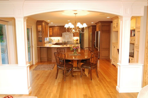
Here's pics:

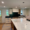
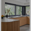
the first is my design for my kitchen, the second is hood (and sink) inspiration, and the last 2 are overall inspiration:

{{gwi:1740876}}

{{gwi:1740877}}

{{gwi:1740878}}

Comments (41)

  • rhome410
    15 years ago
    last modified: 9 years ago

    I think you've done a fine job in capturing the feel and look of your inspiration photos. If it isn't 'wow' to you, can you tell us what is 'wow' in the inspiration photos that yours might be lacking? (Each person's 'wow' is different) Software renderings all have limitations, and you need to ignore things like grayish ceilings and off-beige carpets, because we don't even see those things when we're looking at your kitchen design.

    I like to see a layout to get a specific ideas of sizes and orientation, but the only thing I see by looking is the doors on the upper to the right of the hood are pretty large in comparison to the ones on the left. They can be a little larger than those, for balance, since there are fewer, but maybe not as wide as shown. Also, if you could reduce the width of that cabinet, it would give the decorative upper unit to the far right a little more width, which might help its look also. On that one, I might reduce its depth a little, and maybe also bring the bottom of the uppers just a bit more...It's heavy looking for its width.

    Now these comments are because I'm looking for possible problems...Not things I noticed right off the bat.

    I think maybe you are doubting yourself more than you need to. You have done a great job creating the look you're after with the limitations you've encountered. I wish I could see your software options, because I suspect there may be ways to improve and change things like the colors that bother you and the direction of the flooring.

  • busybme
    15 years ago
    last modified: 9 years ago

    I think you are off to a good start with your rendering. Aren't those design programs frustrating? I bought the online subscription to Plan3D and found myself very overwhelmed by the learning-curve.

    Just a couple of thoughts:
    The 'hutch' by the telephone looks out of proportion to me. The open shelves look too narrow.
    Also, all of your inspiration pics have a lot of white in them (either cabs or moulding) and you have none.
    Both of your last two pics use cabs of two different colors. Try coloring your island differently from the perimeter cabs and see if that helps. You could do the same for the 'hutch' to give it a built-in look.
    Consider finishing the island surface in a different countertop, as well.

    Btw, I love margieb's kitchen (your last picture) and her remodel has been a huge inspiration to me, as well.

    I remember your first post, as I took your picture and played around with it in Paint! It's fun to see what you've come up with and I think, in the end, you will have yourself a 'wow' kitchen!

    Sandy

  • pence
    15 years ago
    last modified: 9 years ago

    I think it looks pretty good, the only thing that bothers me is that eating table. the island looks off center because of it. you didn't send a "top view" but is there any way to center the sink opposite the hood--get rid of the eating table?, make island bigger?

  • bmorepanic
    15 years ago
    last modified: 9 years ago

    The island is too small for the sink and the light fixture over it is way big.

    The little glass cabinets on the end are too narrow for their height and importance.

    The micro door opens into the range oven door - the dishwasher, range oven door also have an interference thing going on.

  • needsometips08
    Original Author
    15 years ago
    last modified: 9 years ago

    First off, I apologize for posting this new thread. I came right in today and clicked the link at top for a new post, posted, and THEN checked the forum thread list - oooops!!! Sorry!

    Now that it's here already, I guess we have to roll with it....

    Busyme, yep, I remember you doing that - you were the one who came up with the idea for expanding the island :-).

    Maybe to the right of the range I should just have the microwave/drawer bank, and then use all the rest of the space for the hutch. Currently that area is a "desk" area (aka clutter collector) - it is 4', and the hutch I put in there is the same (4'). Using that extra space would give the hutch an additional 13 inches.

    So here is a top view, and this will show just how messy this program is!

  • rhome410
    15 years ago
    last modified: 9 years ago

    OK, now that I see the plan, I see problems...Your island chairs are only a foot wide, and you only have a foot between the table and whatever is under the window. In fact, you don't show enough clearance on any side of the table, I don't think. You need to make sure things are realistically sized and you have room for people and moving around. It doesn't seem like you have room for a table in this space, because Bmore's right that it'd be better to have more room on at least the fridge side of your sink...So if you could put in a nice-sized island and take out the table, you would have a nice plan started.

  • needsometips08
    Original Author
    15 years ago
    last modified: 9 years ago

    bmorepanic, my current island is a little bigger than 5.5' x 3' and a 33" sink sits in that (with a 2" counter lip on one side and a seat spot immediately behind the sink so it's unusable because you'll get splashed - as does the floor on a daily basis!!)

    So to me, the bigger island will feel luxurious, even though it's still too small for the sink. I really enjoy looking out over the family room, so I love the location of the sink.

    The microwave is a drawer so the door can't swing into the range - it slides out.

    Ug, I feel so stuck because we use our table all the time. We eat every single meal there - even the ones with friends over, even the bigger gatherings of up to 10 or 12 people, we will put the table diagonal and put in the leaves. We play games and have coffee with friends there on at least a weekly basis. The kids often do school there. I would really, really be sad to give up the table. I admit it's a bigger table than the space is made for - I knew that when I bought it, but we need a big sturdy table area more than the walking room so we've gotten used to the "crowding" to the extend that it no longer really "feels" crowded, except when we have to walk between the table and the wall - it's tight there. That said, I am a tinge concerned about adding the 9" to the island that I planned to....I was doing it to get more than 2" countertop on the R side of the sink, but maybe all I can add in is 3" and consider the 5" better than the 2" I have now?

    Let say I did take out the table though (boo hoo, boo hoo!!!), the current amount of space between my island and the exterior wall on the right is 10'3". I'd have to do something with that space - really, what would you propose??? Initially, I don't love the concept of basically a very long rectangle island so that in essence what I have is a galley kitchen....is that the only option? I don't love that we can't interact as well sitting all in a line. It would make school, socializing, and interacting while eating difficult,and those are all things that are an important part of our lifestyle - we eat 2 homecooked meals together as a family daily.

    Here is one thought: I am going to have to sacrafice SOMETHING, so I figure being short on space is the one compromise I am comfortable making. When we sell far in the future, the new owners can put a round 4 seater table in, which is what was here when we bought the place, instead of my oversized 6' rectangle table.

  • needsometips08
    Original Author
    15 years ago
    last modified: 9 years ago

    Oh by the way Rhome, the thing "under" the window, is actually over the window - it's a shelf/curtain rod unit so it does create about 2' of space there.

  • rhome410
    15 years ago
    last modified: 9 years ago

    Can you show us the existing plan? Do you have that table in that tight of a space now? Looking at the drawing I just don't see how people can get around it straight, or how it could run diagonally and fit any longer... Might it be possible to trade the table and the island? Not sure that would help, but trying to brainstorm and look for alternatives.

  • lascatx
    15 years ago
    last modified: 9 years ago

    Is that a tall window near the table? How far is it off the ground? Is it possible to use that wall for your sink and DW and put a table in the center farmhouse style? More room for both -- different view when at the sink.

  • busybme
    15 years ago
    last modified: 9 years ago

    How about a banquette built along the window wall? You could have some storage underneath it and seat 3 there when needed. Still using your same table and at least 4 of your current chairs.

    I'm trying to remember from your earlier post how large your family is. How much seating do you need for your family meals? We use our kitchen table all the time, too, and I wouldn't want to give mine up either.

    You should post your pics of the space, as it will help everyone to visualize what you are working with. And are you getting new cabs or re-using your oak ones?

    Sandy

  • bmorepanic
    15 years ago
    last modified: 9 years ago

    I think you're spending a lot of money to get back the same problems you have. I'm being blunt because you asked what was wrong with the way it looked and that's what I answered.

    I think you would be better off with a larger peninsula type thing AT THE WINDOW and then have a smaller table pushed up against it ON THE HALL WAY side. When you want to have a crowd, you can expand the table with leaves into the next room.

    The other way you could treat this is to do a one wall kitchen - both sink, range on the wall - and your large table AS the island. Get a 2x3 foot piece of boos block and sit it on the table for workspace. When you have company, take it off. You can attach "feet" to the bottom of it to adjust its height.

  • needsometips08
    Original Author
    15 years ago
    last modified: 9 years ago

    OK, I spent all day so far taking and posting pics, making sure ALL of my measurements are 100% accurate - they were off a bit before. I fixed them and will post the pics.

    bmorepanic, I appreciate blunt :-). I am spending a lot of money and want this to be as perfect as possible given the limitations.

    That said, here are the limitations, and why we are re-doing this kitchen:
    - no hood venting in this kitchen whatsoever
    - no counter on R side of sink and the seat directly in front of sink is unusable due to close proximity to sink
    - appliances are all on their last last leg (except dw, which is ss and new)
    - vinyl on floor has about 100 gouges in it
    - tile countertops are very gross
    - non-functional storage layout resulting in appliances in plain sight over fridge and under desk, and unorganized space inside cabinets
    - the "desk" is a clutter dump and horrible use of precious space
    -inefficient use of pantry space

    what works:
    - the layout (unless something more fabulous can be acheived). Even with 2 cooks, it's very comfortable and enjoyable working in this kitchen.
    - the sink overlooking the family room
    - the kitchen table

    Can someone help me re-evaluate the penninsula idea in light of these new photos? I am thinking it wouldn't work because it would cover up the sliding glass door and the table would block the flow of "the loop" (you can see the loop in the whole house layout). That particular spot acts almost as more of a hall than kitchen room.

    So here they are:

    first floor (with proposed new kichen plan:

    Proposed kitchen. I took out the shelf cause it was visually confusing. In the big picture, it's an irrelevant piece. This is with the proposed almost-six-foot island (compared to my now barely-over-five-foot one):

    overall:

    facing the family room...please pardon the dishes. Note the sliding glass door:

    Rhome, this is how we move it diagonal and then put in more leaves on occasion (like very informal dinners with lots of friends):

    table up close to wall - we've been living with it this close to see if it's tolerable - we've found it to be a "negative" we can live with:

    {{gwi:1740888}}

    from another angle - this, along with the house plan, shows why the island doesn't feel off-centered...the table space really juts off to the side, while the island is more in the center of things:

    the clutter dump that I thought could be replaced with a hutch:

    OK, that was a lot! Thank you guys so much for helping me figure out the best plan for this kitchen. It means so much to me!

  • rhome410
    15 years ago
    last modified: 9 years ago

    Well, mocking it up an living with it is certainly a better test than strangers looking at a 2D floorplan. :-) We all have to decide our own compromises. I guess what worried me is that a longer island may keep you from doing the diagonal thing. It helps to see things in photos, and if something works for you, it works!

    I still don't think the hutch is wide enough for the 3 elements you have in the rendering. Maybe you can stretch the uppers over the cabinet to the right of the microwave drawer? This will widen the hutch uppers, and narrow those doors that look oversized in comparison to the ones on the other side. Maybe I already suggested this...

  • gldnfan
    15 years ago
    last modified: 9 years ago

    If it were me - I would get rid of the island and build out the window wall where you have the table now to make an L shape kitchen. Make the window smaller if you need more upper cabinets - if not - center the sink and give yourself lots of glorious sunlit counter space on either side. I can't completely tell from the picture but it looks like with trim adjustment you can fit counters under the window - but reframing and getting another window may be a better option.

    In the now large open area put a big beautiful table as the "hub" of your home.

    You can't get rid of the table. You identified it very well as the most important piece in the room for your family's lifestyle. Don't just squeeze it in - make it the focal point. I know I have seen many inspiration photos that show what I am talking about - including a good friends kitchen. It really is wonderful for making the kitchen a wonderful place for everyone to gather and socialize.

    Many New England kitchen's - where I grew up - are like this. THey often use benches on the kitchen side because they can be pushed under the table and kept out of the way when the table is not in use.

    THis idea eliminates my issue with the lighting fixtures. I would either choose 2 that are the same or do something very different - a chandelier over the table and individual pendents over the island so the two styles don't have to compete so much in a small space.

  • needsometips08
    Original Author
    15 years ago
    last modified: 9 years ago

    adding in subject line that I added photos

  • jenise
    15 years ago
    last modified: 9 years ago

    I'm with bmore--you have a very generous sized overall space, which you've reduced to traffic patterns around the seating instead of improving to increase your flow as cook and server. IMO, you need to 1) lose the island and turn that into an L-configuration, or peninsula, off the left side of the counter, longer than it is currently allowing you even more storage and worktop, or 2) just turn the island on it's side and allow passage on either. from the view looking into your family room, you have the space for that, and the gain to your main traffic area in the center of the kitchen will be huge.

  • needsometips08
    Original Author
    15 years ago
    last modified: 9 years ago

    oops, adding to the subject line didn't work.

    I measured the window. It's 35". Counters are 36". So I would have to re-do the window - and the sliding glass door would have to be moved to the right. There is room, but just barely...moving the sliding glass door as far as I can to the R to make room for cabinet run, I would have less than 1/2" clearance before the cabinet door ended and the door opened up...no room for trim....and that's assuming I don't run into load bearing studs in moving the door!

    But it's worth a mock up for sure - I like the idea of the table being the centerpiece with a beautiful range hood right behind it as a backdrop. Would that put my sink, fridge, and range too far apart? The work triangle would go away.

    Also, money - for something this big, the ideal would be hiring out the labor...are we talking $1,000 or $10,000?

    If this option is too cost prohibitive, would you do nothing because the affordable options aren't perfect....and just wait till we have enough saved up?

  • twoscoops
    15 years ago
    last modified: 9 years ago

    I like the feel of the way your table relates to the window and the sliding door.

    You've done a great job taking pictures and explaining how your family uses the kitchen, it seems like it truly is the heart of your home:)

    Here is my idea:
    I wish I knew how to use graphic software so I could draw it out for you...
    What if(my 2 favorite words in the English language) you moved the dining room door down to where the range is? If there is enough clearance you could make a galley. The range and refrig would be one leg, facing the island which could be extended over to the wall. Dining room traffic would flow between the island and the table. The space to the left of the dining room door would make a great hutch area...
    Thats my 2 cents~Jeannie

  • bmorepanic
    15 years ago
    last modified: 9 years ago

    Great minds and all that. for the window, I think what you'd do is order the cabinets as plain boxes without toe kick and build one on site just a bit shorter than standard. Whether you build one or have it attached to the cabinet, it gets faced with a skin - so nobody will ever notice a thing.

    The only complication might be the new dw - you'd have to look up how short it could get.

    I'm not sure this design is successful, tho. The sink and ref have a poor relationship to each other.
    {{gwi:1740891}}

  • rhome410
    15 years ago
    last modified: 9 years ago

    All exterior walls are load-bearing, but that's what the header is for over the door...That would need to be moved or added to. You might be better off to make the doorway smaller, or, I'm guessing you won't like this one...put a window there and make a patio door in the other room.

    BUT...Let's consider Bmore's one-wall kitchen for a moment, and add a work island where the table is (thinking on the fly, but I'm picturing a beefy butcher block, maybe on wheels about 3 1/2 ft square?) and the table where the island is, stretching into the larger room, as she said, when needed. No need to change windows or door.

  • needsometips08
    Original Author
    15 years ago
    last modified: 9 years ago

    Holy moly, this is different. I did a very rough mock up and suprisingly really like it, which complicates things!

    But here is the fast and quick and rough version, full of little mistakes, but you get the pic....what do you think? I'd lose 3 seats this way.....

  • needsometips08
    Original Author
    15 years ago
    last modified: 9 years ago

    one more:

  • fern76
    15 years ago
    last modified: 9 years ago

    Not really great with these things, but I like the above plan, really glad you moved the sink, I have a similar set up only I have a penisula, the fridge is in a similar position (across the kitchen from the sink, but for me its a straight walk and I can use the end of the peninsula for a rest spot. This was our original kitchen set up which I loved. Our table is just on the other side of peninsula overlooking the family room. I have no seating at my peninsula, but it is my main work area, so I always have a view of the family room/fireplace, which I love, especially when baking.

    My only other suggestion would possibly be to reduce the size of that window, keeping it over the sink, for more cabinet storage if you feel you need it.

  • gldnfan
    15 years ago
    last modified: 9 years ago

    Well, I love it - But that is no surprise since that is what I had in my mind ;-)

    Drawer dishwashers on either side of the sink are an idea if the counters are lower over there.

    The fridge is a little far - but that isn't always unheard of and this layout gives you the most usable new counter area.

  • bmorepanic
    15 years ago
    last modified: 9 years ago

    I don't think of it as losing three stools as much as gaining the use of all of the chairs all the time.

    If those windows are a possibility, could/should the range move to the outer wall and the sink go where the range is? Makes for a better work flow - ref to sink to range. Make the two windows just a bit smaller and put the range between them. Easy venting.

    I'm also thinking, like rhome about the other arrangement (island-like object closer to windows) - the social stuff is different in each kitchen. If you do a work island in the window, your orientation to others while cooking is different and may fit better with your life style.

  • Cook1
    15 years ago

    I agree with moving the kitchen table into the middle of the room. Don't give up on your favorite part of your kitchen.

    I also, think the frig is far from the sink, except with the table in the middle of the room it is an easy grab for the milk etc. Is it possible to move the frig to where the microwave is shown on the last rendering? The microwave could go in an upper closer to the stove and the space where the frig was originally could be turned into a fabulous pantry.

    You are on the right path... good luck.

  • holligator
    15 years ago
    last modified: 9 years ago

    I like this plan a lot. If you could add a prep sink in the counter to the left of the stove, you'd eliminate the fridge-too-far-from-the-sink problem. Food would go from fridge and pantry to prep sink/prep counter to stove. The window wall would then be reserved for clean up and dish storage.

  • sailormann
    15 years ago
    last modified: 9 years ago

    Made a change or two...smaller glass cabinets - higher valance - more corbels - stainless backsplash (or tiles with a bit more contrast)...

    I'd suggest a slightly darker floor as well.. outside of that it looks great !

    Here is a link that might be useful:

  • sailormann
    15 years ago
    last modified: 9 years ago

    Disregard my post - the photo Gods are not with me tonight...

  • lascatx
    15 years ago
    last modified: 9 years ago

    I like the new idea and agree that it is gaining function, not losing three seats -- especially if you have leaves for that table. You can use them when you need them and have better use of the table and seats all the time. The fridge is a bit far from the sink, but if there is not a work around (something like flipping the range and sink -- if you can do that), then weigh how many times you go from sink to fridge and back and whether it is okay. I've had my fridge and sink opposite each other and lived with it. It didn't bother me near as much as some of the other things I've had to work with.

  • surveymom
    15 years ago
    last modified: 9 years ago

    I also think this new layout with the table in the center is better. Maybe I've been helping DD with her English homework too much.... but there is a symbolism / value statement being made with that table placement being in the center of the kitchen which appears to be in the heart of your house. This is a home/family where sharing lives and being together is important. It's a place I'd very much want to be a part of. I wouldn't give a whit about the backsplash or the color of the appliances or how wonderful that range hood is going to look (which I know is going to look fabulous anyway). I just want to hang out with whoever put this kitchen table here!

    (And it's a good thing that DH is the final QC on the english paper. Just read what I wrote... I need some serious help from a writing coach!)

  • malhgold
    15 years ago
    last modified: 9 years ago

    have you considered opening up the space from the kitchen to the DR, using the DR for your table and making a bigger island in the kitchen?

  • needsometips08
    Original Author
    15 years ago
    last modified: 9 years ago

    OH MY GOSH!!!! I THINK I GOT IT!!!!!!! OH MY GOSH!!!

    This may seem like an overkill reaction, but I am so excited, I am about to jump outta my pants. I literally could laugh and scream and cry and jump up and down because I have been wracking my brain incessantly trying to come up with something workable. It's not even that I am in a hurry to start the reno - even with the perfect plan, work probably won't start till maybe even a year out, but it was really bothering me that there was NO workable solution no matter which way I diced it! I simply refused to just give up. I KNEW there had to be SOME solution. So I kept at it - thinking, thinking, thinking, and I GOT IT! (I think!) Tell me please, do I have it? Is this workable?

    I just re-read this entire thread, and coming at it with fresh eyes, things made more sense. Holligator, I have to say your suggestion about a prep sink got me thinking. Initially I thought I could make a small no-seater island with only a prep sink, then when I analyzed the plan and how the island would lay out, all of a sudden it hit me - that open wall!!! Not only that, but that wall makes the PERFECT coffee center, and being that I make espresso at least twice a day, I need all these elements close at hand: water, microwave, fridge, sink, mugs. What was really bothering me about the earlier version is the coffe making. I didn't want it to require 3 or 4 trips cross-kitchen just to make a cup of coffee. This plan makes it happen. I even thought about how I could put the insta-hot/filtered water faucet in the prep sink! I LOVE IT. The workflow seems perfectly fabulous!

    So is it doable?

    {{gwi:1740896}}

  • bmorepanic
    15 years ago
    last modified: 9 years ago

    Ok, there is nothing wrong with what you are showing. The only thing I noticed that might be a flaw is - you are showing 18" deep cabinets as the coffee center. Whatever sink goes in that is gonna be mighty small. I think your kitchen would work better, tho, if the prep-to-cook functions were closer together.

    As an example, the "flow" of broccoli is...? From ref to prep sink back to somewhere near range. Pot from somewhere near range to other sink to be filled, back to range and add broccoli? Which location has knives?

    It would work better, most of the time, if the prep sink was between the ref and range. It would be a slightly longer walk from the coffee kingdom to fill the pot, but not as often as the walk for everything else.

    Again, just my opinion, but it would work even better to reverse the clean up and cooking areas. It places the dishes in an easily accessible area for the table and the dining room, puts a sink between ref and range and places the cooking area in a more protected spot. If we go back to "flow", to get a glass of water involves... crossing the kitchen to where the dishes are stored, back to ref for ice and then to prep sink?

  • busybme
    15 years ago
    last modified: 9 years ago

    Not to throw in a monkey wrench now that you feel you've had a breakthrough, but have you played around with the banquette idea at all? Your window is at a good height for it, I think. And then you could scootch your island over a bit and still have your coffee bar (which I think is very cool).

    Or how about moving the table over to be part of the island? You could still fatten up the island a bit for more depth/less splash.

    Here are my non-pro renderings to give you a couple of ideas:

    If you are looking to stay within a modest budget, keeping your plumbing and electrical to a minimum is key. We are 8 weeks into phase 1 of our whole house renovation and those are the trades that really get the big checks. Relatively speaking, the framing work (even if you had to add a header) is a lot of bang for your buck. just fyi

    Sandy

  • needsometips08
    Original Author
    15 years ago
    last modified: 9 years ago

    Thank you Bmore and Busybme for your responses. Last night after I posted, I got to thinking about both the prep issue and the banquette idea and actually mocked up the plan you posted Busybme with both the banquette and the coffee area, and I ended up liking that one the very best!

    To the window sill, it's 36" so that should be enough space without raising the window, right? I was even thinking about making the top of the banquette flush with/part of the window sill and perhaps even putting some fun material up there - whatever matches the countertops maybe?

    We would likely get a different table, a bit smaller than our current 4x6 and with pedastal type legs for easy schooching in and out, and if it came down to it, we would have a custom one made to make this work.

    I really like this plan a lot. I feel better about this than any of them so far. It eliminates the earlier problem of the figure-8-walk-around two seating areas. I sacrafice nothing, and get more than I thought could be had, And as you mentioned Busybme, it cuts down on costs since it elimates those big labor money-sucks! (And how exciting that you are starting yours!)

    My one question is the coffee area - it's close enough to the sink in the island that I don't *have* to have the prep sink, but people tend to love them and it would be kinda nice to have another sink area. What do you think? Is it ridiculous being so close to the main sink? We would look into doing the plumbing ourselves (don't know if it could be done, but we'd see!). As DIY, this part would really be our only "big challenge" and we are up for handling one (vs 3 or 4) :-).

    Here is what I drew up last night:

  • shannonaz
    15 years ago
    last modified: 9 years ago

    I think your new plan looks great! Is it going to be a problem that you no longer have a table that can be moved around and expanded? I love your coffee station. I have a coffee station with no prep sink and it works out great. I use filtered water from the fridge anyway...
    I have a different area in my kitchen that could really use a prep sink. We didn't put one in because of the cost: for us at least $1800 for the plumbing. I don't wish we had skimped on something else to get the sink...and I appreciate the extra counter space that would have been used up by the sink. Good luck and let us know what you decide!

  • needsometips08
    Original Author
    15 years ago
    last modified: 9 years ago

    Shannonaz, thanks for your reply and your input with the prep sink. If it cost $1,800 I can see why you skipped it! We'll have to see how much it costs for us, and if affordable, weigh out if it really does add value or just isn't necessary.

    It won't be an issue to not expand the table. I've actually really fallen in love with the banquette idea. My final plan does allow for a lot of people between the island, table, and banquette, but if that's not enough, we will use the formal dining room, which has a table that expands to hold about 10 for the adults, and the kitchen for the kids. This might be motivation to spruce up the dining room finally! It wouldn't take a whole lot - paint and some millwork will do it.

    I am so excited and can't wait for everything to get going, but we are diliberately taking it VERY slow with this crazy economy, so I have a ways to wait yet. I am on the super-good-deal appliance hunt right now!

  • phaze
    15 years ago
    last modified: 9 years ago

    I was just wondering how tall are your ceilings? Mine are 9 foot and I am having trouble with how tall the cabinet doors will be if I take the cabinets all the way to the ceiling. Our cabinet maker will not warranty the doors over a certain height and I don't want dividers in the door.

  • needsometips08
    Original Author
    15 years ago
    last modified: 9 years ago

    My ceilings are only 8' and all the cabinets will go to ceiling (I think the photo shows a tiny stagger which was unintentional and I've since corrected).

    Ug, I sympathize with your problem because I don't like the divided door look either. One thing I've learned in this process though is that perfect solutions do emerge out of seemingly impossible situations.

0