


mom6 -- more pictures?
plants4
16 years ago
Sort by:Oldest
Comments (2)
Related Stories
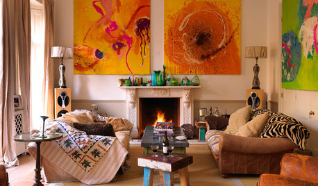
DECORATING GUIDESMore Is More: The 10 Tenets of Maximalist Style
Ready to join the school of over-the-top design? Learn how to embrace excess in your interiors
Full Story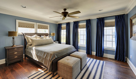
COLORBedroom Color: The Secret to More Sex and More Sleep
Look to surprising revelations about bedroom wall colors to get more of what you want
Full Story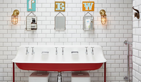
BATHROOM VANITIESMore Is More With a Triple Vanity
Dip into 10 stylish examples of 3-person sinks
Full Story
DECORATING GUIDESLess Is More: 6 Principles of Minimalist Design
Consider the Impact of Stunning Materials Left to Stand on Their Own
Full Story
SELLING YOUR HOUSEHelp for Selling Your Home Faster — and Maybe for More
Prep your home properly before you put it on the market. Learn what tasks are worth the money and the best pros for the jobs
Full Story
DISASTER PREP & RECOVERYMore Power to You: How to Pick the Right Generator
If your home's electricity goes, don't let it take your necessities with it — keep systems running with this guide to backup power
Full Story
COLOR8 Ways to Rev Up Your Garden Color With More Than Just Plants
Bring energy and excitement to your outdoor space by going bold with color, from small touches to big changes
Full Story
FEEL-GOOD HOME10 Tips for a More Peaceful Home
Turn your everyday living space into a serene retreat by clearing visual distractions, softening your lighting and more
Full Story
MORE ROOMSMore Living Space: Converting a Garage
5 things to consider when creating new living space in the garage
Full Story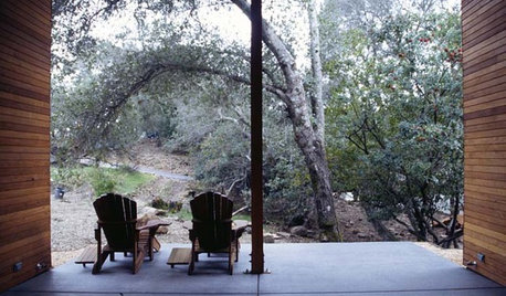
ARCHITECTURETell a Story With Design for a More Meaningful Home
Go beyond a home's bones to find the narrative at its heart, for a more rewarding experience
Full Story
mom6
plants4Original Author
Related Professionals
Albany Kitchen & Bathroom Designers · Schaumburg Kitchen & Bathroom Designers · University City Kitchen & Bathroom Remodelers · Plainview Kitchen & Bathroom Remodelers · Mesquite Kitchen & Bathroom Remodelers · Plant City Kitchen & Bathroom Remodelers · Highland Village Cabinets & Cabinetry · Kaneohe Cabinets & Cabinetry · Lindenhurst Cabinets & Cabinetry · Little Chute Cabinets & Cabinetry · Mount Holly Cabinets & Cabinetry · Rowland Heights Cabinets & Cabinetry · Cornelius Tile and Stone Contractors · Niceville Tile and Stone Contractors · Oak Hills Design-Build Firms