


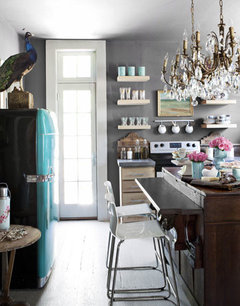
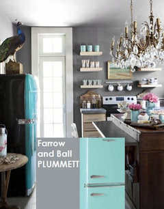
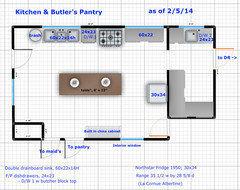
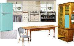
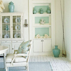
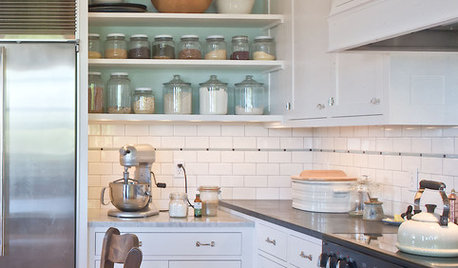
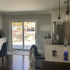
My half-baked kitchen (cross post)
mtnrdredux_gw
10 years ago
Featured Answer
Sort by:Oldest
Comments (39)

robo (z6a)
10 years ago
localeater
10 years agoRelated Professionals
Knoxville Kitchen & Bathroom Designers · United States Kitchen & Bathroom Designers · Williamstown Kitchen & Bathroom Designers · Normal Kitchen & Bathroom Remodelers · Citrus Park Kitchen & Bathroom Remodelers · Allouez Kitchen & Bathroom Remodelers · Islip Kitchen & Bathroom Remodelers · North Arlington Kitchen & Bathroom Remodelers · Glendale Heights Cabinets & Cabinetry · Hanover Park Cabinets & Cabinetry · Lakeside Cabinets & Cabinetry · Potomac Cabinets & Cabinetry · Corsicana Tile and Stone Contractors · Elmwood Park Tile and Stone Contractors · Farragut Tile and Stone Contractors
blfenton
10 years agorobo (z6a)
10 years ago
eam44
10 years agoiroll_gw
10 years agonosoccermom
10 years agorobo (z6a)
10 years agoedeevee
10 years ago
mtnrdredux_gw
10 years agomkleparek
10 years agogreenhaven
10 years agogreenhaven
10 years agoedeevee
10 years agogreenhaven
10 years agoppbenn
10 years agodeedles
10 years agofeisty68
10 years agofeisty68
10 years agomtnrdredux_gw
10 years agofeisty68
10 years agomtnrdredux_gw
10 years agofeisty68
10 years agomtnrdredux_gw
10 years agogreenhaven
10 years agoarch123
10 years agomtnrdredux_gw
10 years agofirstmmo
10 years agofeisty68
10 years agogreenhaven
10 years agomtnrdredux_gw
10 years agomermanmike
10 years agomtnrdredux_gw
10 years agogreenhaven
10 years agofeisty68
10 years agomtnrdredux_gw
10 years agofeisty68
10 years agomtnrdredux_gw
last year


Related Stories
KITCHEN DESIGNLove to Bake? Try These 13 Ideas for a Better Baker's Kitchen
Whether you dabble in devil's food cake or are bidding for a bake-off title, these kitchen ideas will boost your baking experience
Full Story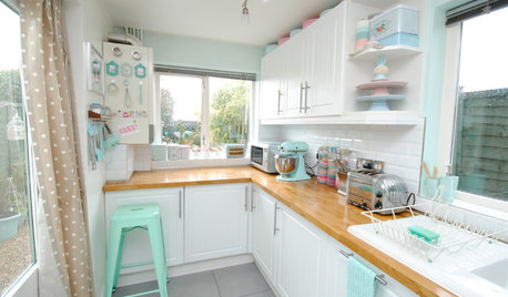
KITCHEN DESIGNGet Your Kitchen ‘Bake Off’ Ready
Make it easy to whip up a cake or a batch of cookies with these tips for organizing your space
Full Story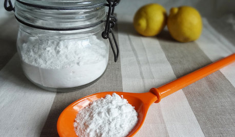
HOUSEKEEPINGBaking Soda: The Amazing All-Natural Cleanser You Already Own
Battle grime, banish odors and freshen clothes with this common nontoxic cupboard staple
Full Story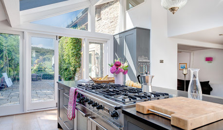
LIFESimple Pleasures: The Joy of Baking
Fill your house with a heavenly scent and your heart with cheer by making time to bake
Full Story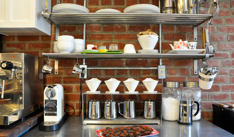
KITCHEN DESIGNSweet Ideas and a Truffle Recipe from a Chocolatier's Test Kitchen
A $2,100 budget didn't mean a half-baked kitchen redo; this confectioner just rolled up her sleeves and rolled out the improvements
Full Story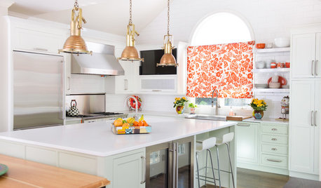
KITCHEN DESIGNKitchen of the Week: Orange Splashes Add Personality in Kansas
Bursts of color and a better layout make cookie baking and everything else more fun for a Midwestern family
Full Story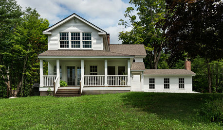
TRADITIONAL HOMESHouzz Tour: Reviving a Half-Finished Farmhouse in New England
This 1790s foreclosure home was flooded and caved in, but the new homeowners stepped right up to the renovation
Full Story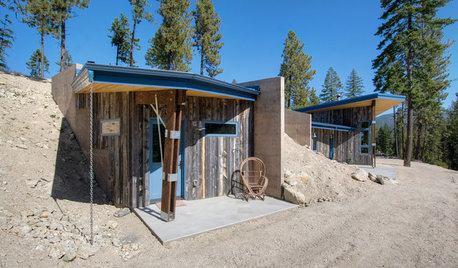
HOUZZ TOURSHouzz Tour: Having Fun With a Half-Buried House
Layers of dirt help create energy efficiency and an unusual look on a steep slope in Washington state
Full Story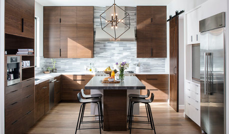
KITCHEN DESIGNNew This Week: Moody Kitchens to Make You Rethink All-White
Not into the all-white fascination? Look to these kitchens for a glimpse of the dark side
Full Story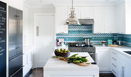
DECORATING GUIDESHow to Love Your Kitchen More, Right Now
Make small changes to increase the joy in your kitchen while you cook and bake, without shelling out lots of dough
Full Story


greenhaven