

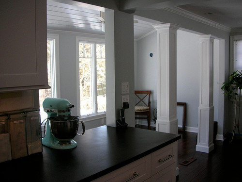
Column, soffit, headers design detail advice? (pics)
Stacey Collins
15 years ago
Sort by:Oldest
Comments (14)
Related Stories
DECORATING GUIDES9 Design Details You Might Have Overlooked
A designer shares key decorating moves that homeowners often don't think about
Full Story
STANDARD MEASUREMENTSThe Right Dimensions for Your Porch
Depth, width, proportion and detailing all contribute to the comfort and functionality of this transitional space
Full Story
ARCHITECTUREDesign Workshop: The Lowdown on Colossal Doors
Want to erase the boundary to the outdoors? Here’s what to know about materials, cost, energy efficiency and more
Full Story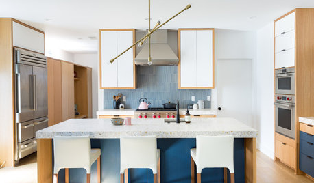
STANDARD MEASUREMENTSKey Measurements to Help You Design Your Home
Architect Steven Randel has taken the measure of each room of the house and its contents. You’ll find everything here
Full Story
WORKING WITH PROSWorking With Pros: When You Just Need a Little Design Guidance
Save money with a design consultation for the big picture or specific details
Full Story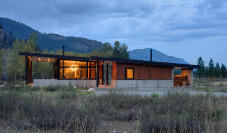
MODERN HOMESHouzz Tour: A Base Camp Designed for Adventure, Durability and Style
Rugged materials join refined good looks and clever details in a Washington family’s all-year getaway
Full Story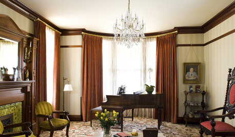
GREAT HOME PROJECTSHow to Bring Out Your Home’s Character With Trim
New project for a new year: Add moldings and baseboards to enhance architectural style and create visual interest
Full Story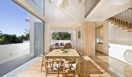
ARCHITECTUREAre Vaulted Ceilings Right for Your Next Home?
See the pros and cons of choosing soaring ceilings for rooms large and small
Full Story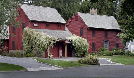
GREAT HOME PROJECTSReady to Repaint Your Home’s Exterior? Get Project Details Here
Boost curb appeal and prevent underlying damage by patching and repainting your home’s outer layer
Full Story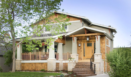
CRAFTSMAN DESIGNAmerican Architecture: The Elements of Craftsman Style
Proud of its handiwork details and with nature as inspiration, Craftsman architecture stands out for its purity of style
Full StoryMore Discussions


smilingjudy
Stacey CollinsOriginal Author
Related Professionals
Carson Kitchen & Bathroom Designers · East Tulare County Kitchen & Bathroom Remodelers · Bellevue Kitchen & Bathroom Remodelers · Bethel Park Kitchen & Bathroom Remodelers · Crestline Kitchen & Bathroom Remodelers · Eureka Kitchen & Bathroom Remodelers · Trenton Kitchen & Bathroom Remodelers · Hopkinsville Cabinets & Cabinetry · Mount Holly Cabinets & Cabinetry · Spring Valley Cabinets & Cabinetry · Wyckoff Cabinets & Cabinetry · Milford Mill Cabinets & Cabinetry · Short Hills Cabinets & Cabinetry · Spartanburg Tile and Stone Contractors · Boise Design-Build FirmsStacey CollinsOriginal Author
dkitchenreno
puertasdesign
bmorepanic
smilingjudy
smilingjudy
Stacey CollinsOriginal Author
Stacey CollinsOriginal Author
Stacey CollinsOriginal Author
Stacey CollinsOriginal Author
bmorepanic
Stacey CollinsOriginal Author