


Design Around This #16: Yellow Kitchens
cawaps
12 years ago
Related Stories
COLORWelcome Yellow Around Your Home for an Instant Lift
Keep on the sunny side with shades of yellow from buttery and soft to dynamic and bright
Full Story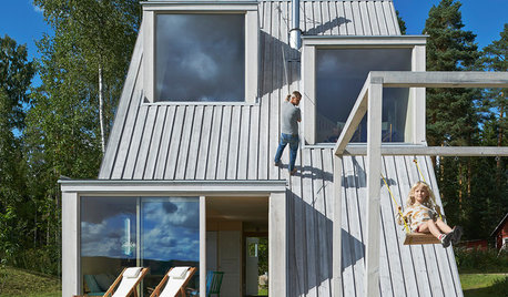
FUN HOUZZWorld of Design: 16 Fun Homes That Encourage Play
What does a fun home look like? These 16 very different properties around the world are designed with enjoyment in mind
Full Story
KITCHEN DESIGNWorld of Design: Favorite Recipes From Food Lovers Around the Globe
Travel with your tastebuds and experience for yourself these international foodies' favorite dishes
Full Story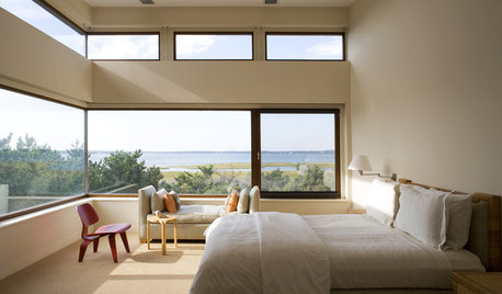
MORE ROOMSA Room with a View: Designing Around a Panorama
How to Decorate When the Room's Best Feature is Outside
Full Story
THE ART OF ARCHITECTUREDesign Workshop: Put Industrial Mesh to Work Around the Home
From open gratings to fine weaves, commercial metal mesh is a durable and beautiful choice for residences too
Full Story
DECORATING GUIDESWorld of Design: Decorating Ideas From 10 Renters Around the Globe
Even if you don’t own your home, you can live beautifully. Browse these ideas from international tenants who’ve made their spaces special
Full Story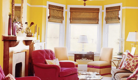
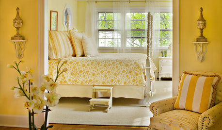
YELLOWYour Colors: Stick Around, Sunshine
Warm up the season with yellow walls, fabrics and sunny accents
Full Story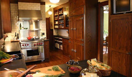
KITCHEN DESIGN20 of the Coziest Kitchens Around
Reclaimed wood, exposed brick, fireplaces and distressed surfaces add warmth and character to the heart of the home
Full Story
EVENTSReport From Italy: Mustard Yellow, Hidden Kitchens and More
See what our team in Italy discovered at Salone del Mobile 2016. Which new design idea speaks to you?
Full Story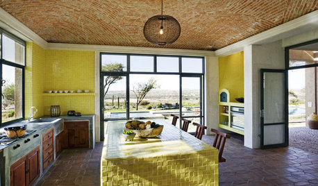
KITCHEN DESIGNKitchen Color: 7 Sensational Yellow Backsplashes
Warm up a white kitchen or add some zing to wood tones with a backsplash that glows
Full StoryMore Discussions


dee850
cawapsOriginal Author
Related Professionals
Hemet Kitchen & Bathroom Designers · Hybla Valley Kitchen & Bathroom Designers · Verona Kitchen & Bathroom Designers · Shamong Kitchen & Bathroom Remodelers · Andover Kitchen & Bathroom Remodelers · Auburn Kitchen & Bathroom Remodelers · Gardner Kitchen & Bathroom Remodelers · Jefferson Hills Kitchen & Bathroom Remodelers · League City Kitchen & Bathroom Remodelers · Lyons Kitchen & Bathroom Remodelers · Spanish Springs Kitchen & Bathroom Remodelers · Brea Cabinets & Cabinetry · Hammond Cabinets & Cabinetry · Lockport Cabinets & Cabinetry · Maywood Cabinets & Cabinetry2LittleFishies
palimpsest
cawapsOriginal Author
palimpsest
cawapsOriginal Author
hosenemesis
dee850
cawapsOriginal Author
formerlyflorantha
User
boxerpups
purplepansies
palimpsest
pricklypearcactus
dee850
mtnfever (9b AZ/HZ 11)
Circus Peanut
User
gregincal
palimpsest
marcolo
formerlyflorantha
lavender_lass
sedona_heaven
formerlyflorantha
lavender_lass
CEFreeman
User
formerlyflorantha
cawapsOriginal Author
formerlyflorantha
pricklypearcactus
marcolo
boxerpups
formerlyflorantha
palimpsest
lalithar
lavender_lass
formerlyflorantha
cawapsOriginal Author
purplepansies
formerlyflorantha
purplepansies
formerlyflorantha
jterrilynn
jterrilynn
pricklypearcactus
doggonegardener