


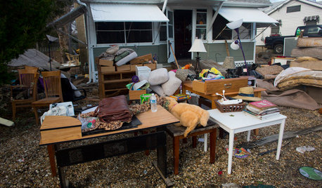
18.5 MILLION Dollar Apartment Disaster
aloha2009
11 years ago
Sort by:Oldest
Comments (25)
Related Stories
DISASTER PREP & RECOVERYHow to Prep for Disaster Insurance Claims
Tools and tips for making an inventory list, documenting damage to your home, and working with your adjuster
Full Story
LIFEWhy We Want a House With a Great View
Research shows that just looking at nature has powerful mental benefits. Here's how to get a boost — with or without a million-dollar view
Full Story
SELLING YOUR HOUSE5 Savvy Fixes to Help Your Home Sell
Get the maximum return on your spruce-up dollars by putting your money in the areas buyers care most about
Full Story
BATHROOM DESIGN18 Knockout Ideas for Wooden Floor Showers
Look to an often-forgotten material choice for shower floors that radiate beauty in almost any style bathroom
Full Story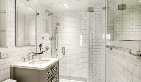
BATHROOM WORKBOOK5 Ways With a 5-by-8-Foot Bathroom
Look to these bathroom makeovers to learn about budgets, special features, splurges, bargains and more
Full Story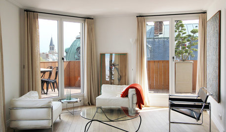
HOUZZ TOURSHouzz Tour: A Parisian Apartment Goes Modern and Bright
Sporting a rare terrace, this small French home gets stripped and redone to highlight the gorgeous skyline view
Full Story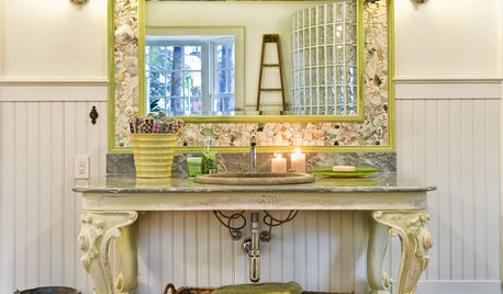
BATHROOM DESIGN18 Sumptuous Vanities for Singular Bathrooms
Uncommonly beautiful or dazzlingly detailed, these dream vanities bring a rarefied air to bathrooms
Full Story
MOST POPULAR15 Remodeling ‘Uh-Oh’ Moments to Learn From
The road to successful design is paved with disaster stories. What’s yours?
Full Story
TILEPorcelain vs. Ceramic Tile: A Five-Scenario Showdown
Explore where and why one of these popular tile choices makes more sense than the other
Full Story
REMODELING GUIDES5 Ways DIY Remodels Get Derailed — and How to Deal
Keep your remodel on track by knowing the potential pitfalls ahead of time
Full StoryMore Discussions


angie_diy
desert_gal_nv
Related Professionals
Bonita Kitchen & Bathroom Designers · Northbrook Kitchen & Bathroom Designers · North Druid Hills Kitchen & Bathroom Remodelers · Apex Kitchen & Bathroom Remodelers · Beverly Hills Kitchen & Bathroom Remodelers · Emeryville Kitchen & Bathroom Remodelers · Green Bay Kitchen & Bathroom Remodelers · Port Charlotte Kitchen & Bathroom Remodelers · Santa Fe Kitchen & Bathroom Remodelers · Dover Cabinets & Cabinetry · Middletown Cabinets & Cabinetry · Murray Cabinets & Cabinetry · New Castle Cabinets & Cabinetry · Wildomar Cabinets & Cabinetry · Riverdale Design-Build FirmsGooster
jakabedy
gayl
User
function_first
springroz
spayurdog
PeterH2
blondelle
aloha2009Original Author
robo (z6a)
robo (z6a)
jakabedy
Annie Deighnaugh
ginny20
jill_h
writersblock (9b/10a)
marcolo
sochi
drbeanie2000
tealeaf1012
EATREALFOOD
cawaps