


Terrazo-type counter too busy with backsplash?
wi-sailorgirl
11 years ago

Sort by:Oldest
Comments (19)
Related Stories
KITCHEN BACKSPLASHESHow to Choose a Backsplash for Your Granite Counters
If you’ve fallen for a gorgeous slab, pair it with a backsplash material that will show it at its best
Full Story
KITCHEN BACKSPLASHES10 Top Backsplashes to Pair With Concrete Counters
Simplify your decision making with these ideas for materials that work well with concrete
Full Story
KITCHEN DESIGNKitchen of the Week: Classic Style Creates Calm for a Busy Family
Fresh take on traditional lightens up a kitchen in a large, open space
Full Story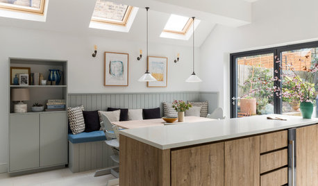
KITCHEN DESIGNA Calm Kitchen for a Busy Family
A London couple and their kids get an eat-in kitchen featuring a serene blue and garden view
Full Story
KITCHEN DESIGNCountertop and Backsplash: Making the Perfect Match
Zero in on a kitchen combo you'll love with these strategies and great countertop-backsplash mixes for inspiration
Full Story
KITCHEN DESIGNNew This Week: 4 Surprising Backsplash and Countertop Pairings
Make your kitchen workspace stand out with colored ceramic tile, back-painted glass, butcher block and more
Full Story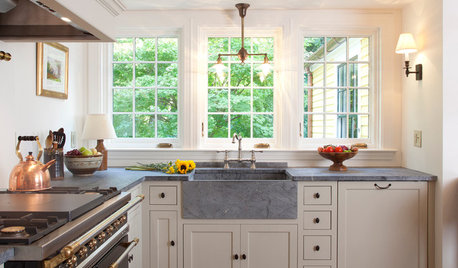
KITCHEN COUNTERTOPS10 Top Backsplashes to Pair With Soapstone Countertops
Simplify your decision-making process by checking out how these styles work with soapstone
Full Story
KITCHEN DESIGN10 Creative Kitchen Backsplashes
Patterns, bold colors, natural wood, beveled mirror — even a favorite photo — sub for standard white behind the counter
Full Story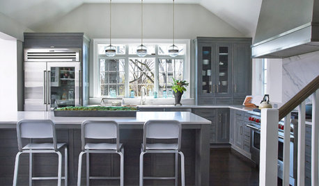
KITCHEN OF THE WEEKKitchen of the Week: Colonial Kitchen Opens Up to Scenic Views
A lack of counters and a small sink window motivate a New York couple to update their kitchen to add space for their busy family
Full Story
KITCHEN DESIGNWhat Goes With Granite Counters?
Coordinate your kitchen finishes beautifully by choosing colors that complement granite’s natural tones
Full Story


eam44
angie_diy
Related Professionals
Ramsey Kitchen & Bathroom Designers · United States Kitchen & Bathroom Designers · South Farmingdale Kitchen & Bathroom Designers · Minnetonka Mills Kitchen & Bathroom Remodelers · Allouez Kitchen & Bathroom Remodelers · Emeryville Kitchen & Bathroom Remodelers · Ewa Beach Kitchen & Bathroom Remodelers · Folsom Kitchen & Bathroom Remodelers · Londonderry Kitchen & Bathroom Remodelers · Port Orange Kitchen & Bathroom Remodelers · Shaker Heights Kitchen & Bathroom Remodelers · Joppatowne Kitchen & Bathroom Remodelers · Beaumont Cabinets & Cabinetry · Graham Cabinets & Cabinetry · Kentwood Cabinets & Cabinetrywi-sailorgirlOriginal Author
gr8daygw
homebuyer23
wi-sailorgirlOriginal Author
Pipdog
bcafe
wi-sailorgirlOriginal Author
bcafe
pricklypearcactus
Gracie
olivertwistkitchen
herbflavor
D Ahn
sas95
wi-sailorgirlOriginal Author
justmakeit
kailuamom