


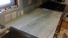
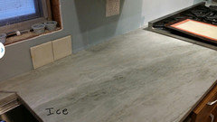
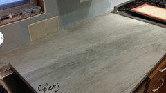
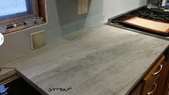
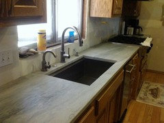
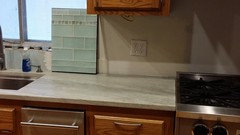
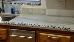
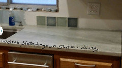
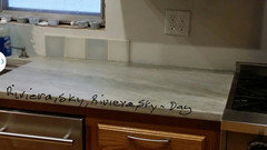
Sea Pearl needs a backsplash II
Peke
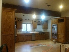
10 years ago

Featured Answer
Comments (150)

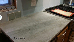
Peke
10 years ago
romy718
10 years agoRelated Professionals
Clute Kitchen & Bathroom Designers · Fox Lake Kitchen & Bathroom Designers · Magna Kitchen & Bathroom Designers · Pleasanton Kitchen & Bathroom Designers · Winton Kitchen & Bathroom Designers · Alpine Kitchen & Bathroom Remodelers · Charlottesville Kitchen & Bathroom Remodelers · New Port Richey East Kitchen & Bathroom Remodelers · Portage Kitchen & Bathroom Remodelers · South Plainfield Kitchen & Bathroom Remodelers · Spanish Springs Kitchen & Bathroom Remodelers · Bonita Cabinets & Cabinetry · Forest Hills Cabinets & Cabinetry · Riverbank Cabinets & Cabinetry · Eastchester Tile and Stone ContractorsPeke
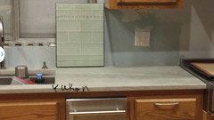
10 years agoPeke
10 years agoPeke
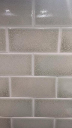
10 years agoPeke
10 years agoPeke
10 years agoPeke
10 years agoPeke
10 years agoPeke
10 years agoPeke
10 years agoPeke
10 years agoPeke
10 years agoPeke
10 years agoPeke
10 years agoPeke
10 years agoPeke
10 years agoPeke
10 years agoromy718
10 years agoromy718
10 years agobookworm4321
10 years agohomebuyer23
10 years agoromy718
10 years agoromy718
10 years agoromy718
10 years agoromy718
10 years agoromy718
10 years ago
Gracie
10 years agoPeke
10 years agoPeke
10 years agoGracie
10 years agoPeke
10 years agoPeke
10 years agoPeke
10 years agoPeke
10 years agoPeke
10 years agoPeke
10 years agoPeke
10 years agoPeke
10 years agoPeke
10 years agoPeke
10 years agoPeke
10 years agoromy718
10 years ago
gr8daygw
10 years agogr8daygw
10 years ago
msrose
10 years agoPeke
10 years agobookworm4321
10 years agoromy718
10 years agoromy718
10 years ago


Related Stories
COLORGet a Soft Spot for Sea-Glass Green
Soften a room's look by washing its walls in this delightfully airy shade, no sand in your shoes required
Full Story
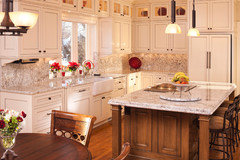
KITCHEN DESIGNCountertop and Backsplash: Making the Perfect Match
Zero in on a kitchen combo you'll love with these strategies and great countertop-backsplash mixes for inspiration
Full Story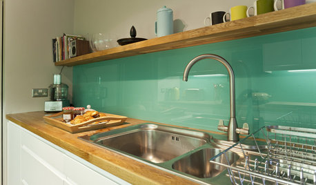
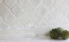
KITCHEN DESIGNHow to Pick a Kitchen Backsplash That Wows
Design your ideal backsplash with help from these Houzz guides and inspiring ideas for every kitchen style
Full Story
COLORColor of the Week: Watery Blue Is Summer's Best Hue
See how to bring the soothing colors of the sea into your home
Full Story
HOUZZ TOURSHouzz Tour: Refined, Contemporary Florida Apartment
Gallery walls, a Zen-like bath and a palette reflecting sand and sea create a serene part-time home for a young family
Full Story
MOST POPULAR7 Soothing Spaces: How to Use Color to Create Calm at Home
Started your new year on the wrong foot? Feeling the February blahs? Maybe you need a color fix in your home
Full Story
ART8 Ways Vermeer’s Work Can Make Its Mark in Your Home
Go Dutch with stained glass, Oriental rugs, checkered floors and delft tile
Full Story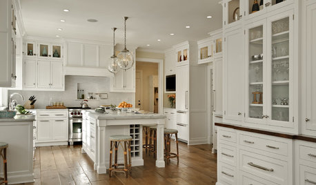
KITCHEN DESIGNDream Spaces: 12 Beautiful White Kitchens
Snowy cabinets and walls speak to a certain elegance, while marble counters whisper of luxury
Full Story
LIGHTINGToday's Icons: The Oly Studio Meri Drum Chandelier
Unique fixture is at once a glamorous chandelier and a contemporary pendant light
Full Story
KITCHEN DESIGN9 Ideas From an Ecofriendly Kitchen Makeover
In this kitchen, green materials and upcycled finds create an environmentally friendly heart of the home
Full StoryMore Discussions


bookworm4321