Shop Products
Houzz Logo Print
olivertwistkitchen

Which counter with this backsplash?

olivertwistkitchen
11 years ago

I know, I know, I did it backwards.
I picked the backsplash.
Now please help me choose the counter.

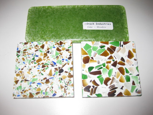
Backsplash is from Bedrock Industries and is made of recycled green glass.
Counter is GlassSlab by GlassRecycled and is bits of recycled glass in resin. I'm trying to decide between the smaller shards of glass and the larger pieces. I'm trying to imagine it as an entire counter. I'm worried that one or the other will look too "busy" and frenzied, but I keep going back and forth on which one (the smaller or the larger shards) are busier. When I look at pictures on Houzz or elsewhere, neither look too crazy, but when I lay it down in my kitchen and try to "imagine" an entire counter made of the stuff, I start to panic.

Even if this isn't your style (and I'm sure it isn't for most of you), please tell me your thoughts about the big picture: which one is more soothing and calm and less likely to make me either lose a raisin on the countertop or walk into the kitchen and go "Aaaaggh!"

Thanks.

Please also see my other post that includes the cork floor and cabinet color.
https://www.houzz.com/discussions/flooring-dsvw-vd~96247-

Comments (88)

  • lolauren
    11 years ago
    last modified: 9 years ago

    Large shards and absolutely no blue. :)

  • scootermom
    11 years ago
    last modified: 9 years ago

    The big chunks remind me of beach glass. Blue beach glass is my favorite, so I'd get it with blue (if they had it in the big-chunk version, maybe with less amber) and accent with just a few blue glass bottles or bowls. Then again, I'd probably have white cabinets, too.

    I think the large chunk one with lots of amber and no blue works well with your warm-looking cabinets and floor.

    Can't wait to see your "after" pictures!

  • sprtphntc7a
    11 years ago
    last modified: 9 years ago

    big chunks, no blue,
    maybe less brown???

  • LE
    11 years ago
    last modified: 9 years ago

    I love going to Bedrock-- such a cool place, makes me want to do a whole house of recycled glass every time I go there! Love the green backsplash and love love your cork. Oh yeah, that wasn't the question... I don't think there is a clear winner or you'd see more I'd a consensus. My first thought was the smaller, but it is hard to evaluate scale with samples this size, so I'm waiting to see what your scaled mockup reveals. Sorry to be so unhelpful, but your kitchen is going to rock (pun intended).

  • olivertwistkitchen
    Original Author
    11 years ago
    last modified: 9 years ago

    OK, folks, I got the new sample of with the smaller shards and no blue. Both have some shell sprinkled in (not sure if you noticed that the last time). I've also added a 3rd sample into the running. And, thankfully, I was able to make color Xerox copies of everything and lay them all out in my kitchen. But it's still such a hard choice!
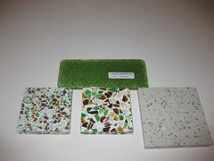
    Here are the 3 choices laid out next to the backsplash tile. The Backsplash tile is green recycled glass in a subway tile. It looks dark but there's actually a lot of variability and "movement" in it because it's clear with green in it. Really cool.

    So that we all use the same terms, I will describe what's in this photo:
    On top is the subway tile for the backsplash.
    Below it, going left to right are 2 GlassRecycled countertop samples and then 1 from Geos. From left to right let's call them: medium shards, large shards, and tiny shards/Geos.

  • olivertwistkitchen
    Original Author
    11 years ago
    last modified: 9 years ago

    OK, so here they are in the kitchen. First the medium shards:

  • olivertwistkitchen
    Original Author
    11 years ago
    last modified: 9 years ago

    Here it is with the large shards:

  • olivertwistkitchen
    Original Author
    11 years ago
    last modified: 9 years ago

    and the other one by Geos in tiny shards. This one is clearly the "safest" and not shocking or bold, but Hubby things this one is "too" common, or boring, or that it even looks like a fancy formica. It is pretty - I don't think this picture does it justice.

    Each member of my family has a different favorite - so I have no idea what to do!

  • Tmnca
    11 years ago
    last modified: 9 years ago

    I like the large shards, for sure! The smaller ones end up looking like speckles.

  • olivertwistkitchen
    Original Author
    11 years ago
    last modified: 9 years ago

    Sorry, I just had to bump.
    :)

  • localeater
    11 years ago
    last modified: 9 years ago

    I am sticking with my original choice- I like the big chunks and I am glad you got rid of the blue. I think the Geos-tiny shards is so far away from your original vision that you need to delete it as an option. The link below is a green tile backsplash with a big chunk green countertop. It is a small image but it looks great. Yours will look better because your cabinet color is so much warmer.

    Here is a link that might be useful: green and chunky

  • angie_diy
    11 years ago
    last modified: 9 years ago

    I am so pleased that you were able to do color xeroxes. I think that helps a lot.

    So, to me, the large shards are the clear winner.

    PS, if you want to help make the pattern of your xeroxes look more random, you could orient some of them in different directions.

  • 1929Spanish
    11 years ago
    last modified: 9 years ago

    I like the new sample, but it is a different look. If you want the original bold look, then you have to go with the big glass. I think the introduction of blue gets busy in a bad way. IMHO.

    ps. I love green!

  • Gracie
    11 years ago
    last modified: 9 years ago

    I still like the large shards the best. I like the white space with the solid green tile. The Geo is lacking the bold color that stands up to the green tile.

  • suzanne_sl
    11 years ago
    last modified: 9 years ago

    Here's the photo localeater found

    Interesting that your DH thinks the tiny one is boring, and I agree with you that it's the "safest," but you clearly don't have a safe and boring family. If you guys were safe and boring, you'd never have chosen the green glass backsplash! I say, celebrate your exuberance and go with the large shards. Your backsplash tiles are much richer than the ones in the photo and your wood colors warmer. It's going to be a spectacular kitchen.

    (Hm... just noticed the mult-icolored knobs and pulls in the photo, and the non-typical placement of the knobs on the uppers.)

  • kailuamom
    11 years ago
    last modified: 9 years ago

    I hate the medium.

    Love the bold artistic look of the large and the subtle look of the tiny. I think that the medium will just look busy with no benefit...

    That said with subway tile and grout lines, I'm not sure i would go bold.....I would absolutely go with the large if it were sheets of the glass, but I'm on the fence because of grout lines. What color grout are you planning?

  • sixtyohno
    11 years ago
    last modified: 9 years ago

    large for sure. Can't wait to see it finished.

  • olivertwistkitchen
    Original Author
    11 years ago
    last modified: 9 years ago

    Bedrock industries recommended using a white thin-set grout with the backsplash tile.

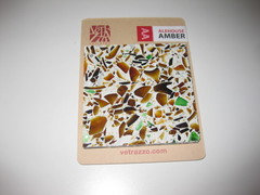
    I can't help thinking that the Vetrazzo Alehouse Amber (which was my inspiration but I didn't want to go with Vetrazzo) is somehow much different and nicer and less busy but I can't figure out exactly why. Maybe because it has both big and little shards? Maybe because it's less green and more brown? Here's Vetrazzo Alehouse Amber in these links and attached.

    http://thereformatory.blogspot.com/

    Look at the finished pics near the top, and then scroll down and see the ones right after their sink was installed.

  • ntredway
    11 years ago
    last modified: 9 years ago

    It's interesting that when the blue was included I liked the medium best. Now that there is no blue I definitely like the large one best. I think the medium looks speckled and the small doesn't have enough contrast.

  • a2gemini
    11 years ago
    last modified: 9 years ago

    I lusted for those counter tops but way out of my budget. At first I liked the smaller shards but when I see it all together - I like the larger shards.

  • LE
    11 years ago
    last modified: 9 years ago

    After seeing the scaled mockup, I'm switching my vote to the large!

  • LE
    11 years ago
    last modified: 9 years ago

    After seeing the scaled mockup, I'm switching my vote to the large!

  • mrspete
    11 years ago
    last modified: 9 years ago

    My opinion changed as I read through the posts:

    When I initially saw the pictures at the top of the post, I preferred the small chips . . .

    However, when you added the brown tiles to the mix, the larger chips rocketed to the forefront for me -- the combination looked much different. And when I saw the pictures toward the end of a real countertop with real cabinets, I was absolutely sold on the larger chips.

    I LOVE this countertop, though I'm not a green person. I mean the color green, not saying I dislike recycled or ecological-minded products. Unlike granite, it isn't something you see all the time, but it's beautiful. I suspect it'd be at its best in a kitchen with great natural light.

    By the way, I do not care for the one you described as "safest" -- the white countertop with only tiny green bits. It's not "enough".

  • eam44
    11 years ago
    last modified: 9 years ago

    I love that you started out with the disclaimer, "even if it's not your style..." It's not mine, and I don't want to criticize yours. I hope that you are happy with whatever you choose. Before you take the plunge though, have you had a chance to think about resale?

    I liked the product better in the sample images than on an actual counter, so my guess is that your return on investment will be much lower with this material than it would be if you used a solid surface. The average kitchen reno gives a 70% roi. You're tanking yours by making an eclectic choice on a "permanent" feature. If you wanted lime green walls that'd be fine, it's just paint. But replacing counter tops is expensive and necessitates replacing bs as well, and anyone buying your house is going to charge you for that by de-valuing your home.

    Might you consider using that material as a backsplash instead? On a vertical surface it will grab your eye more than it can on the counter, and potential buyers would have much less of an issue replacing just the bs if the counters are more appealing. You might consider Corian in Concrete or Copperite. Good luck.


  • ginny20
    11 years ago
    last modified: 9 years ago

    I like the large chunks, for the reason that may_flowers gave.The bigger pattern looks better because the other patterns are small/solid. I like the amber, I don't need the blue. I also liked the quieter version that EAM44 posted, without the amber, but your original choice is great. Very exciting.

    Emerald green is Pantone's color of the year! This isn't quite emerald, but it's close.

  • steph2000
    11 years ago
    last modified: 9 years ago

    I hate to say this, but I do agree with you, olivertwist. The amber Vetrazzo just does look richer - because it is. I think a few things are happening in that counter that are really helping it. The darker background as opposed to the starker whites on your samples, for one. Also, the creams, browns and ambers are dominant in it, with green accents, which further tones it down. It ends up looking much more tone on tone, which makes it more nuanced and slightly less busy in a good way.

    Sometimes, you get what you pay for. Is this one of those times? How much of a price difference are we talking?

  • olivertwistkitchen
    Original Author
    11 years ago
    last modified: 9 years ago

    HOLD the voting!
    Steph2000 you are totally right.
    I just ordered a new sample with more brown and less green.
    It wasn't a cost-issue. Vetrazzo uses concrete (which requires more maintenance), and the one I'm using is resin-based.
    Let's see how that looks.

    EAM, I"m not worried about re-sale. If I was, I wouldn't be getting a compost pail built into the counter! :)

  • sedona_heaven
    11 years ago
    last modified: 9 years ago

    Love the big chunky shards! Go for it, live large! Your green backsplash has a big presence and it actually balances out to my eye.

    The medium is great too - the only one I don't like (and I really don't like it) is the tiny one. The other two are fab.

  • olivertwistkitchen
    Original Author
    11 years ago
    last modified: 9 years ago

    I ordered a Vetrazzo sample just for kicks to see what that would look like close up since I do like it in the installation pictures.

  • olivertwistkitchen
    Original Author
    11 years ago
    last modified: 9 years ago

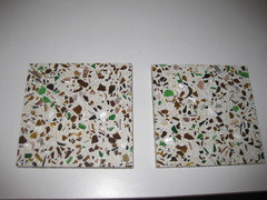
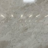
    Then I called up GlassRecycled again and had them custom design me a new sample. They were so helpful. I basically told them to try to make it look like the Vetrazzo and I was able to specify 20% small brown chips, 20% large brown chips, 20% mother of pearl, 30% porcelain, 10% small green. Here's what they sent me.
    They sent me 2 samples - they are the same but they sent me 2 just to show me the variation that will occur.

    I think I am in love. It's the perfect mix - all my colors, but not too hectic. The added porcelain much to my surprise added a neutral to the background.

  • islanddevil
    11 years ago
    last modified: 9 years ago

    Can we see the backsplash and cabs with the countertop choices in your last 2 posts? Thanks.

  • Nancy in Mich
    11 years ago
    last modified: 9 years ago

    I like the larger pieces in the counter tops. I prefer the larger pieces in your original large sample. These new samples look less bold. There seems to be less color and more neutrals in them. I don't like the green being small, either. When the green is large, you can get more deep green tones, as well as the softer greens we see in your sample. I really don't like small brown in the mix, either. You had mentioned amber earlier. If there is an amber color, why not large amber instead of small brown? I would switch percentages, too. I would prefer 20% large green and 10% large amber,

    Boy, are you going to regret giving us mix percentages to fool with!

    Anyway, given a choice of the first large chip sample and the new samples, I would go with the first large chip sample. What are the dimension of the subway backsplash tiles?

  • olivertwistkitchen
    Original Author
    11 years ago
    last modified: 9 years ago

    Hi all,

    I really really don't mean to sound ungrateful or anything, but I posted my last photo as more of a follow-up rather than to ask more advice.

    I actually am very happy with this last sample and think it works for me, so please don't talk me out of it or I will go bonkers! :)

  • kam76
    11 years ago
    last modified: 9 years ago

    Love your last sample I can't wait to see the install pictures...do you have any updates?

  • olivertwistkitchen
    Original Author
    11 years ago
    last modified: 9 years ago

    sorry, no updates yet.
    Demo begins in June.

  • andreak100
    11 years ago
    last modified: 9 years ago

    Missed this the first go around and it's definitely not my style...but I can't wait to see it! I think it's going to be a great kitchen for you!

  • a2gemini
    11 years ago
    last modified: 9 years ago

    Love your final choice! I will be watching for your progress in June.
    If you have any leftover, I am looking for remnants:-). I was disappointed that they don't sell remnants.

  • heidihausfrau
    11 years ago
    last modified: 9 years ago

    I vote for the larger chips. I think it is a stunning combo with the green backsplash!

  • olivertwistkitchen
    Original Author
    10 years ago
    last modified: 9 years ago

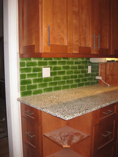
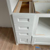
    Sneak Peak!

  • olivertwistkitchen
    Original Author
    10 years ago
    last modified: 9 years ago

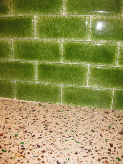
    In case one was not enough...

  • Nancy in Mich
    10 years ago
    last modified: 9 years ago

    Oh yes, that second picture shows the two together. They look so nice! The green wall tile goes well with the solid surface with the multicolored speckles, with just enough green to tie the two together! I know a lot of thought went into your choices. Congratulations on a job well done!

  • localeater
    10 years ago
    last modified: 9 years ago

    Looks wonderful, cant wait to see the full reveal. The counter is the perfect blend of browns and greens.

  • amykath
    10 years ago
    last modified: 9 years ago

    Wow! That backsplash is gorgeous! Congrats! Cannot wait to see more photos.

  • j_hack
    10 years ago
    last modified: 9 years ago

    Looks good! I like the face drawn in the dust on the cabinet shelf. My daughter was writing notes for the people working on our home as well on the cardboard. Kids are so funny.

  • jody7sharp
    10 years ago
    last modified: 9 years ago

    Hi, I was not following the original decision making thread at the time. I stumbled on this today. These are styles that I would never, ever pick, they are so far removed from things I like in my own house... but I just had to tell you that it is absolutely beautiful! Just stunning. I hope you love it and enjoy it. I am very happy that you kept pressing to find just what you liked and in the end it is an amazing kitchen. I don't care that you did not get mainstream materials, and that you chose items "backwards". Good for you. It is lovely.

  • steph2000
    10 years ago
    last modified: 9 years ago

    Looking good! I really like the tone-on-tone with green accents as the tweaking evolved. Great sneak peek, Olivertwist. Been wondering how you've been!

  • bookworm4321
    10 years ago
    last modified: 9 years ago

    I think the large original one would have been great, but thanks to Steph..., you ordered more samples, and now have something perfect. congrats to you

  • olivertwistkitchen
    Original Author
    10 years ago
    last modified: 9 years ago

    Thank you all for your nice feedback!
    They grouted today so now it's even more wonderful.

    But alas, for that, you will have to wait for the final reveal...

    :)

  • karin_mt
    10 years ago
    last modified: 9 years ago

    Oooh! I've been waiting for this because I love the materials you chose. It's terrific! The green backsplash shimmers like candy - love it. And yes, you got the countertop just right and it was well worth all the fretting you did. The cabinets and pulls are excellent. Exciting! Looking forward to the final reveal!

  • mudhouse_gw
    10 years ago
    last modified: 9 years ago

    OK, I missed your earlier thread as well, so now I know why you liked the handblown, colorful Cloud tumblers in your other thread (if you recall I liked those too.) I think you make some really fun, artsy, cheerful choices, and I applaud you for it.

    I am looking forward to seeing the rest of your kitchen!