


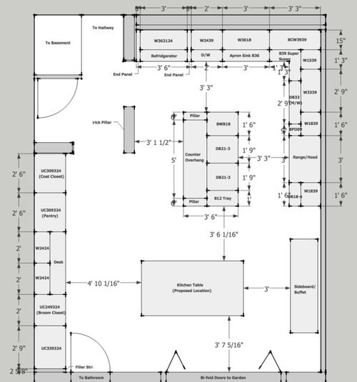
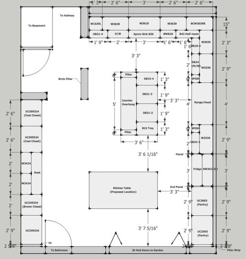
Brownstone Kitchen Layout: Feedback Requested
sethamin
11 years ago


Sort by:Oldest
Comments (10)
Related Stories
KITCHEN DESIGNKitchen Banquettes: Explaining the Buffet of Options
We dish up info on all your choices — shapes, materials, storage types — so you can choose the banquette that suits your kitchen best
Full Story
KITCHEN DESIGN10 Tips for Planning a Galley Kitchen
Follow these guidelines to make your galley kitchen layout work better for you
Full Story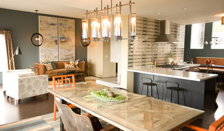
KITCHEN DESIGNKitchen of the Week: Navy and Orange Offer Eclectic Chic in California
Daring color choices mixed with a newly opened layout and an artful backsplash make for personalized luxury in a San Francisco kitchen
Full Story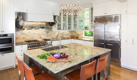
KITCHEN DESIGNKitchen of the Week: Elegant Updates for a Serious Cook
High-end appliances and finishes, and a more open layout, give a home chef in California everything she needs
Full Story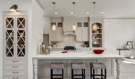
KITCHEN DESIGN12 Designer Details for Your Kitchen Cabinets and Island
Take your kitchen to the next level with these special touches
Full Story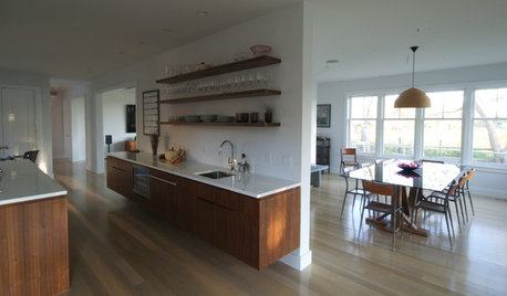
KITCHEN DESIGNThe 4 Things Home Buyers Really Want in Kitchen Cabinetry
For the biggest return on your kitchen investment, you've got to know these key ingredients for cabinetry with wide appeal
Full Story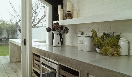
KITCHEN COUNTERTOPSKitchen Counters: Concrete, the Nearly Indestructible Option
Infinitely customizable and with an amazingly long life span, concrete countertops are an excellent option for any kitchen
Full Story
KITCHEN DESIGNKitchen Remodel Costs: 3 Budgets, 3 Kitchens
What you can expect from a kitchen remodel with a budget from $20,000 to $100,000
Full Story
KITCHEN WORKBOOKHow to Remodel Your Kitchen
Follow these start-to-finish steps to achieve a successful kitchen remodel
Full Story
KITCHEN DESIGNSpecial Report: Kitchen News from Cologne
Blended Kitchen-Living Rooms, Super-Skinny Counters and Hidden Appliances Are Headed This Way
Full Story


williamsem
sethaminOriginal Author
Related Professionals
Clute Kitchen & Bathroom Designers · Hammond Kitchen & Bathroom Designers · Hybla Valley Kitchen & Bathroom Designers · Portland Kitchen & Bathroom Designers · Schenectady Kitchen & Bathroom Designers · Southbridge Kitchen & Bathroom Designers · Calverton Kitchen & Bathroom Remodelers · Cocoa Beach Kitchen & Bathroom Remodelers · Hickory Kitchen & Bathroom Remodelers · Alton Cabinets & Cabinetry · Kaneohe Cabinets & Cabinetry · South Riding Cabinets & Cabinetry · University Park Cabinets & Cabinetry · Suamico Design-Build Firms · Yorkville Design-Build FirmsMizinformation
williamsem
D Ahn
Kathy Rivera
D Ahn
sethaminOriginal Author
amandasplit
sethaminOriginal Author