


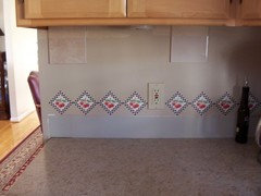
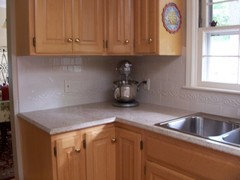
Neutral Backsplash dilemma
ivytrail
10 years ago

Featured Answer
Sort by:Oldest
Comments (48)

ivytrail
10 years agoAmy Sumner
10 years agoRelated Professionals
Highland Kitchen & Bathroom Designers · Moraga Kitchen & Bathroom Designers · Ocala Kitchen & Bathroom Designers · Pleasant Grove Kitchen & Bathroom Designers · Saratoga Springs Kitchen & Bathroom Designers · Wesley Chapel Kitchen & Bathroom Designers · Bloomingdale Kitchen & Bathroom Remodelers · Galena Park Kitchen & Bathroom Remodelers · Hickory Kitchen & Bathroom Remodelers · Lynn Haven Kitchen & Bathroom Remodelers · Langley Park Cabinets & Cabinetry · Sunset Cabinets & Cabinetry · Cornelius Tile and Stone Contractors · Boise Design-Build Firms · Woodland Design-Build Firmsivytrail
10 years agoivytrail
10 years agoivytrail
10 years agoinfinitylounge
10 years agoAmy Sumner
10 years ago
jellytoast
10 years ago
annac54
10 years ago
eam44
10 years ago
Gracie
10 years agoeandhl
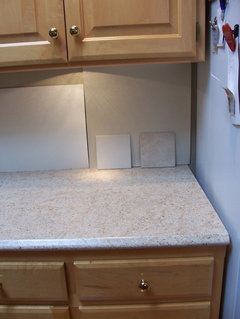
10 years agoivytrail
10 years agoivytrail
10 years agoivytrail
10 years agoeam44
10 years agodeedles
10 years agohappy2learn
10 years ago
susanlynn2012
10 years agoBethanysmom
10 years agoivytrail
9 years agoivytrail
9 years agojuddgirl2
9 years agoeam44
9 years ago
romy718
9 years agobrightm
9 years agosusanlynn2012
9 years ago
speaktodeek
9 years agodebrak2008
9 years agohappy2learn
9 years agodretutz
9 years agosuel41452
9 years agoivytrail
9 years agoivytrail
9 years agoivytrail
9 years agoivytrail
9 years agoivytrail
9 years agoivytrail
9 years agobicyclegirl1
9 years agoAmy Sumner
9 years agoannac54
9 years ago
tinker1121
9 years agoHydragea
9 years agosuel41452
9 years agoivytrail
9 years agoHydragea
9 years agoeam44
8 years agolast modified: 8 years ago


Related Stories

KITCHEN DESIGNDesign Dilemma: My Kitchen Needs Help!
See how you can update a kitchen with new countertops, light fixtures, paint and hardware
Full Story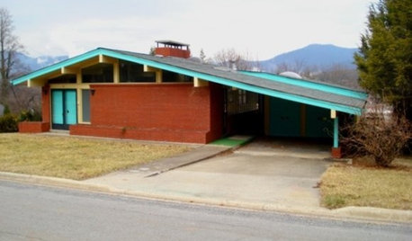
REMODELING GUIDESHouzzers to the Rescue: Users Solve Design Dilemmas
The proof is in the painting — and the pond. As Houzz users hit 100,000 discussions, see some of the results of their advice and ideas
Full Story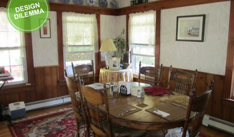
Design Dilemma: Keep or Nix Knotty Pine?
Help a Houzz User Choose a Paint Color for a Cohesive Design
Full Story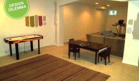
MORE ROOMSDesign Dilemma: The Perfect Basement Lounge
What Color to Paint It? Where to Put the TV?
Full Story
REMODELING GUIDESDesign Dilemma: How Do I Modernize My Cedar Walls?
8 Ways to Give Wood Walls a More Contemporary Look
Full Story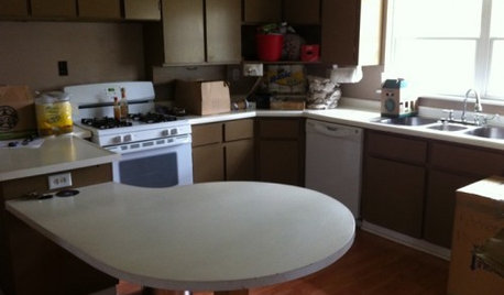
Design Dilemmas: 5 Questions for Houzzers!
Post Ideas for Landscaping for a Modern Home, Updating a Rental and More
Full Story
DECORATING GUIDESDesign Dilemma: I Need Lake House Decor Ideas!
How to Update a Lake House With Wood, Views, and Just Enough Accessories
Full Story
Design Dilemmas: 5 Questions for Design Stars
Share Your Design Know-How on the Houzz Questions Board
Full StoryDECORATING GUIDESDesign Dilemma: How Do I Get a 5th Avenue Style?
The Decor Demon Comes to the Rescue in the Questions Board
Full Story
SMALL SPACESDesign Dilemma: Decorating a Dorm Room
How to Create a Stylish Collegiate Abode
Full StoryMore Discussions


ivytrailOriginal Author