Shop Products
Houzz Logo Print
hobokenkitchen

X post - need paint color help please!!!

hobokenkitchen
11 years ago

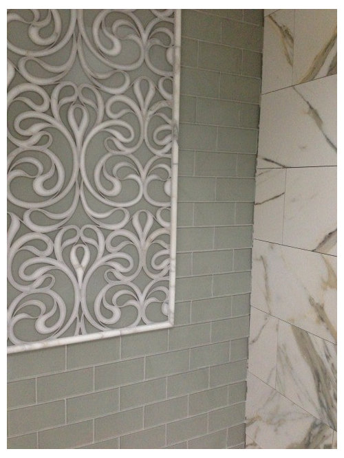
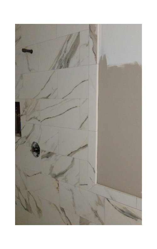
So I thought we'd picked our paint color for the bathroom but while I love the color I now think it's pulling out too much yellow and muddy colors in the tile.

Please give me opinions. I'm thinking maybe more of a warm grey or light green to pull out the green of the subways.

First pic just shows the shower with no paint. I don't see the muddy, yellow tones until the Smokey Taupe is added.

Help Please!!

Now with the Smokey Taupe.

Comments (28)

  • oldbat2be
    11 years ago

    I will be no help with the paint colors, just wanted to say that your tile looks BEAUTIFUL!!! Wow, would love to tour your home one day, what a show piece/place you are building!

  • lannegreene
    11 years ago

    I think a light gray or tan pulled from your stone. Lean towards green, not pink. I too love that green tile. Sorry I can't help with a specific color. I would take a sample of tile and stone with me to the paint store and go from there.

  • hobokenkitchen
    Original Author
    11 years ago

    I DID!!! This was what I came up with. : (

    I thought it was perfect from the sample until he put a bigger sample up right next to the tile and then I thought 'uh oh'.

    Someone recommended Stonington Gray - what do you think of that? I think it might be really good?

  • stealthecrumbs
    11 years ago

    Stonington Gray is a nice creamy pale- mid gray. Do your subway tiles have a green undertone? Looks on my screen like they might. If so, Stonington might feel too blue. SW Comfort Gray is another nice gray. I also really like BM Healing Aloe- it is a dreamy pale grey green. Looks a little gray blue on the chip but reads grey green in my space.

  • hobokenkitchen
    Original Author
    11 years ago

    The glass is definitely greenish - I'll take a look at the ones you mentioned - blue for sure wouldn't work.

  • mpagmom (SW Ohio)
    11 years ago

    Here is a list of Benjamin Moore green-grays from color consultant Maria Killam:

    Edgecomb Gray
    Revere Pewter
    Thunder
    Pashmina
    Sandy Hook Gray
    Rockport Gray
    Copley Gray

    Your tile looks more like a blue/green-gray on my monitor so you might try Wickham Gray, Titanium, and Gray Cashmere.

    Good luck!

  • ginagordon_gw
    11 years ago

    Also try Owl Gray and Coventry Gray

  • marcolo
    11 years ago

    Ben Moore classic gray at 200%.

  • hobokenkitchen
    Original Author
    11 years ago

    Ok this is great!!! Thanks so much!
    I am going to go and get loads of samples tomorrow. I really want to get this right!

  • islanddevil
    11 years ago

    Hoboken. I can't help you with the color either, but your shower looks beautiful!! I've been drooling over that tile after seeing it used the same way by Rebecca Robeson a San Diego designer who also posted it on Houzz. Have you seen it?
    https://www.houzz.com/discussions/can-you-tell-me-what-brand-and-color-of-tile-you-used-and-is-the-scroll-work-commercially-available-dsvw-vd~140203

    Can you please tell me what the specific tile style # and color for all the Artistic tiles? And what is the background marble and size. So wonderful!
    Also can you please tell me what you're using for the bathroom floor, what color vanity and countertop? Can't wait to see the finished space!
    Thanks.

  • hobokenkitchen
    Original Author
    11 years ago

    I saw that link last week I think! Looks like ours is a total knock off. Lol.

    I will get all the tile specs and post them tomorrow. I can't wait for it to be done and I'll post pics. This bathroom has been a long time coming.

  • enduring
    11 years ago

    I find the pinkish gray paint and the greenish tiles looking nice together. It is a different look than we are used to. Downton Abby had a color combo like that in their drawing room.

  • amandasplit
    11 years ago

    Where are those tiles from ? Gorgeous! I wanted to chime in and say we have rever pewter in the majority of our house and I don't think it's blue enough...

  • eam44
    11 years ago

    Mizzle might be the perfect green grey for you.

    Farrow and Ball Mizzle

    But, if you want to tone down the yellow, you might want to go for blue grey instead.

    Farrow and Ball Pigeon

    p.s. I love, love, love the tiles!

    This post was edited by EAM44 on Tue, Feb 26, 13 at 8:23

  • hobokenkitchen
    Original Author
    11 years ago

    At the Benjamin Moore store complete with tile samples again.
    Looking at Moonshine 2140-60

    I'm having them mix a small sample. Please let this be the one!!

  • hobokenkitchen
    Original Author
    11 years ago

    How's this? I like it a lot more than the Smokey Taupe.

    Thoughts?

  • islanddevil
    11 years ago

    Hard to tell. On my monitor the tile color looks different than your first pics and the floor looks like a completely different shade, more green than the first set and the wall color looks more blue than either tile.
    Also where is the scroll piece? Was it just not installed yet or does it go in that niche you're showing the paint samples?

  • hobokenkitchen
    Original Author
    11 years ago

    It's on the other wall:

  • hobokenkitchen
    Original Author
    11 years ago

    The floor is exactly the same color as the wall. I don't know why it's reading so different.

  • steph2000
    11 years ago

    I like this shade, on my monitor. Paint is so darn tricky - and so are monitors when it comes to color!

  • hobokenkitchen
    Original Author
    11 years ago

    Ok I think it's too blue. Which is weird because in the store it was perfect.

  • Molly Phillips
    11 years ago

    Looks too blue to me too but again, all monitors are different.

    I hate buying samples but I think if you get enough, your heart will say "YAY! That's it!" once you see it. You clearly have a good eye so if your gut tells you it's not right, it's not.

  • eleena
    11 years ago

    Just wanted to share my experience.

    I asked a similar question on the Paint forum about wall color a few years ago when we remodeled the bathrooms. I got a lot of very good answers and got as many samples as I could (not all mentioned paints were sold locally). Unfortunately, none of them worked.

    Why?

    It is impossible to convey the lighting and other nuances over the Internet. Finally, I went to a local specialized shop and asked them. They suggested a color which we then diluted in half. There is a trial-and-error process involved in color selection which is unavoidable, I am afraid.

    You may wish to hire a color consultant (which doesn't always work). I'd definitely try to get some local help, if I were you.

    GL!

  • remodelfla
    11 years ago

    Just a tad too blue. Is beach glass too green?

    Here is a link that might be useful: BM beachglass

  • momand3boys
    11 years ago

    Beautiful tile. The only comment I can add is that my tile store recommended a Ben Moore specialty store that had 5 X 7 sheets of the colors that I could borrow. This way, I did not have to spend $7 for each sample. I'm on my second set of choices. I hope tomorrow morning I will be picking the final color in the morning light!

  • blackchamois
    11 years ago

    I like it better than the Smokey Taupe but think you might go more towards a green gray. Did you look at Gray Owl?

  • enduring
    11 years ago

    I can't help it but the more I look at your original images with the Smokey Taupe the more I really like it. At least on my monitor. But I can understand if it is picking up something in the tile that you don't like. But the two colors on my monitor just have a lovely soft quality that has depth. I think it is a nice take on the contrasting colors of red and green. The taupe being the red and of course the light soft green tiles being the green.

    Does anyone else see this and appreciate the combo?

  • hobokenkitchen
    Original Author
    11 years ago

    So sorry I never updated this thread (such a bad habit to not conclude threads in case they pop up in future searches).

    I posted the tile info in another thread, but i should post it here too.

    The 'marble' tile is porcelain and is called Exedra Calacutta. 18 x 18 on the floor, 9 x 18 on the walls.

    The feature tile is Danse Lucido Vetromarmi collection water jet tile with glass and calcutta marble.

    The subways and shower floor 1 x 1s are Pavarotti Pearl.
    All tile is from Artistic Tile.

    BlackChamois the Gray Owl didn't work at all. All the ones I thought would be great just didn't look the same in the space.
    Enduring, we LOVE Smokey Taupe. It's our whole kitchen and library area paint. I just didn't like how it was pulling out the strong yellows in the tile. Maybe because the tile is porcelain and I felt it made it look more like porcelain and less like marble?

    In the end we stuck with Moonshine. It ended up settling in much less blue and much more green. I must have caught it in very specific light for it to look that blue. Paint is so tricky!

    Anyway, here is a link to the updated thread so I don't have two running at once on the same topic.

    Here is a link that might be useful: Sneak Peak of UNfinished Master Bath