


A good, vintage-y Ben Moore cabinet yellow?
marcolo
11 years ago
Sort by:Oldest
Comments (54)
Related Stories
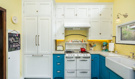
COLORFUL KITCHENSYellow-and-Blue Kitchen Mixes Modern Amenities With Vintage Charm
A vintage stove, encaustic cement floor tiles and a breakfast banquette star in this cheerful Los Angeles space
Full Story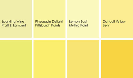
KITCHEN DESIGNCooking With Color: When to Use Yellow in the Kitchen
Perk up your kitchen with a burst of Pineapple Delight or a dollop of Top Banana on the walls, cabinets or countertops
Full Story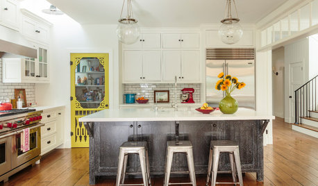
KITCHEN MAKEOVERSYellow Pantry Door Steals the Show in a Modern Farmhouse Kitchen
Pre-aged floors, vintage hardware and rough-hewn materials add an old-world feel to this new Los Angeles kitchen
Full Story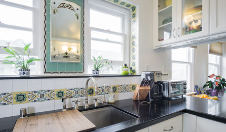
VINTAGE STYLEKitchen of the Week: Vintage Charm in Southern California
A designer helps a Los Angeles family keep the Art Deco vibe of their kitchen while increasing counter and storage space
Full Story
COLORBest Ways to Use the Soft Yellow Color of 2014
You may fall for PPG Pittsburgh Paints’ Turning Oakleaf if you like your hues warm, mellow and cheery
Full Story
KITCHEN CABINETSHow to Update Your Kitchen Cabinets With Paint
A pro gives advice on when and how to paint your cabinets. Get the step-by-step
Full Story
KITCHEN CABINETSKeeping Cabinet Color on the Down Low
Give just base cabinets a colorful coat for a kitchen sporting character and a spacious look
Full Story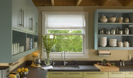
MOST POPULAR8 Great Kitchen Cabinet Color Palettes
Make your kitchen uniquely yours with painted cabinetry. Here's how (and what) to paint them
Full Story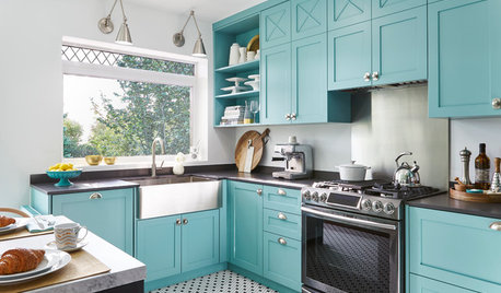
SMALL KITCHENSTeal Cabinets and Custom Details Create a Bright, Fun Kitchen
Bold color, a graphic wallcovering and small, thoughtful details bring big character to this 130-square-foot space
Full Story
KITCHEN DESIGNA Two-Tone Cabinet Scheme Gives Your Kitchen the Best of Both Worlds
Waffling between paint and stain or dark and light? Here’s how to mix and match colors and materials
Full StoryMore Discussions


gwlolo
Fori
Related Professionals
Buffalo Kitchen & Bathroom Designers · Carson Kitchen & Bathroom Designers · El Sobrante Kitchen & Bathroom Designers · Southbridge Kitchen & Bathroom Designers · Artondale Kitchen & Bathroom Remodelers · Hanover Township Kitchen & Bathroom Remodelers · Lakeside Kitchen & Bathroom Remodelers · Sioux Falls Kitchen & Bathroom Remodelers · Murray Cabinets & Cabinetry · Spring Valley Cabinets & Cabinetry · Stoughton Cabinets & Cabinetry · Warr Acres Cabinets & Cabinetry · Short Hills Cabinets & Cabinetry · Niceville Tile and Stone Contractors · Soledad Tile and Stone Contractors2LittleFishies
2LittleFishies
2LittleFishies
Gracie
Bunny
eleena
alvmusick
Gracie
marcoloOriginal Author
sas95
2LittleFishies
marcoloOriginal Author
2LittleFishies
raee_gw zone 5b-6a Ohio
Bunny
lannegreene
marcoloOriginal Author
2LittleFishies
kitchendetective
JXBrown (Sunset 24, N San Diego County)
friedajune
ginagordon_gw
marcoloOriginal Author
2LittleFishies
Gracie
michoumonster
2LittleFishies
jterrilynn
raee_gw zone 5b-6a Ohio
jterrilynn
lavender_lass
marcoloOriginal Author
Circus Peanut
2LittleFishies
User
Donaleen Kohn
Circus Peanut
ArlingtonVAremodel
ArlingtonVAremodel
kitchendetective
raee_gw zone 5b-6a Ohio
deedles
grlwprls
2LittleFishies
User
2LittleFishies
grlwprls
2LittleFishies