


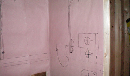
How much of an oops is this backsplash layout
cubedrose
10 years ago

Related Stories
REMODELING GUIDESMust-See Mock-ups for Your Remodel
Avoid 'oops' and 'oh, no' with real-life tryouts of any design elements in question
Full Story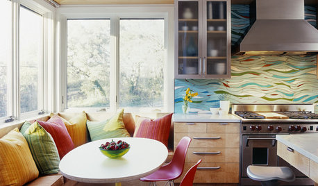
KITCHEN DESIGNKitchen of the Week: Exquisite Artistic Backsplash
Rippling colored glass forms an imaginative wall, while a clever layout embraces practicality in this stunning Texas kitchen
Full Story
MATERIALSKitchen Ideas: How to Choose the Perfect Backsplash
Backsplashes not only protect your walls, they also add color, pattern and texture. Find out which material is right for you
Full Story
KITCHEN DESIGNCountertop and Backsplash: Making the Perfect Match
Zero in on a kitchen combo you'll love with these strategies and great countertop-backsplash mixes for inspiration
Full Story
KITCHEN DESIGNKitchen of the Week: Navy and Orange Offer Eclectic Chic in California
Daring color choices mixed with a newly opened layout and an artful backsplash make for personalized luxury in a San Francisco kitchen
Full Story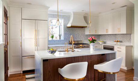
KITCHEN DESIGNCouple Renovates to Spend More Time in the Kitchen
Artistic mosaic tile, custom cabinetry and a thoughtful layout make the most of this modest-size room
Full Story
KITCHEN DESIGNKitchen Layouts: A Vote for the Good Old Galley
Less popular now, the galley kitchen is still a great layout for cooking
Full Story
TILEHow to Choose the Right Tile Layout
Brick, stacked, mosaic and more — get to know the most popular tile layouts and see which one is best for your room
Full Story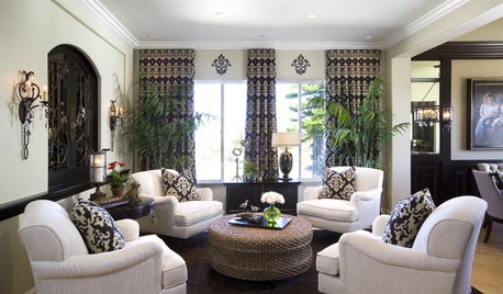
LIVING ROOMS8 Living Room Layouts for All Tastes
Go formal or as playful as you please. One of these furniture layouts for the living room is sure to suit your style
Full Story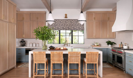
KITCHEN LAYOUTSThe Pros and Cons of 3 Popular Kitchen Layouts
U-shaped, L-shaped or galley? Find out which is best for you and why
Full StorySponsored
Columbus Design-Build, Kitchen & Bath Remodeling, Historic Renovations
More Discussions


cubedroseOriginal Author
sjhockeyfan325
Related Professionals
Barrington Hills Kitchen & Bathroom Designers · Carlisle Kitchen & Bathroom Designers · Greensboro Kitchen & Bathroom Designers · Hammond Kitchen & Bathroom Designers · Lafayette Kitchen & Bathroom Designers · Ocala Kitchen & Bathroom Designers · Ojus Kitchen & Bathroom Designers · Salmon Creek Kitchen & Bathroom Designers · South Farmingdale Kitchen & Bathroom Designers · South Farmingdale Kitchen & Bathroom Designers · Terrell Kitchen & Bathroom Remodelers · Eufaula Kitchen & Bathroom Remodelers · Cranford Cabinets & Cabinetry · Harrison Cabinets & Cabinetry · Boise Design-Build Firmsdebrak2008
speaktodeek
CEFreeman
magsnj
jellytoast
akl_vdb
cubedroseOriginal Author
Fori
canuckplayer
CEFreeman
farmhousemom
cindallas
a2gemini
countryatheart
mrsc
CEFreeman
romy718
cubedroseOriginal Author
detroit_burb
chiefy
bellsmom
bellsmom
patty_cakes
cubedroseOriginal Author