Shop Products
Houzz Logo Print
gena_hooper

If not white, what painted cabinet color?

Gena Hooper
14 years ago

I need ideas! I originally wanted white cabinets, but I think I'm too slapdash a housekeeper for white cabinets. Then we bought a 44" black Aga Legacy which...I think...sets the tone for the kitchen. Although it's classic, black and white is a bit severe for me. I love color.

My kitchen is small (10x21 including eat-in space), but filled with light. It's in a 1935 Colonial. What colors should I explore for the cabinets? For the paint (we're probably doing it ourselves), I'm strongly considering F&B and FPE. Expensive, but I want the paint to last since we're putting in the time and sweat investment.

A creamy yellow? Grayed green? Warm taupe? Pale aqua? Warm putty?

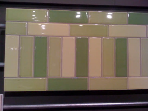
My Sweeby test terms are: simple, warm, inviting, light, touchable. I love these backsplash colors and can imagine something in this range...or maybe going a bit more toward aqua and yellow? Maybe keep the cabinets a more neutral color and go hogwild with the backsplash? Or the other way around?

I loved the kitchens I saw in the Plain English site, but the colors used are generally cold and austere. I'd like something warmer. So...let your imaginations fly. Colors?

Here is a link that might be useful: Plain English

Comments (38)

  • arlosmom
    14 years ago

    That tile is beautiful. If I were using it as a backsplash, I'd think about a fern green for the cabinets, with dark hardware to compliment the Aga.

    I painted my cabinets a creamy white, but in retrospect I wish I'd gone with a warm gray or putty color (like mouse's back or fieldstone). The cabinets were a LOT of work to paint though, so I'm not eager to change my color any time soon. When I do though, it will probably be to a warm, neutral gray/putty/taupe.

  • grlwprls
    14 years ago

    Love those tiles! Source?

    Cooking Apple green by F&B?

  • night_jasmine
    14 years ago

    One of the farrow and ball green/grays.

  • plllog
    14 years ago

    I'm with the others: A not too dark green would be great with the black. Maybe something between two of the tiles?

    I'm not sure about yellow and aqua. They could look stark with the black range, unless you're a big lover of ultra high contrast. That is, they're more colorful, but have a similar impact to white, and the wrong shades could appear cloying in this context. Maybe a clear, beachy blue type of aqua.

    Or a darker turquoise blue or dark sunflower gold. I think dark sunflower gold could look really brilliant with a black range!

    If you want to keep more in keeping with the period of the house, a creamy color or pale warm taupe would give you more of the "white kitchen" look without being white.

  • fleur222
    14 years ago

    That first picture with the blue cabinets on the Plain English site gave me the same feeling as when I see a kitchen with a beautiful slab of Calacutta marble. I think it is LOVE!
    Wonderful for you to explore colored cabinets. Just like you did with the tiles... find colors that you really like... I am such a fan of white, cream, grey, and blue.
    Arlosmom had a great idea of bringing in the color of the Aga with the dark hardware.
    I like the idea of a softer color to the cabinets and a little style to the backsplash.

  • palimpsest
    14 years ago

    How fickle are you about color? Do you like things that you've always liked, living with them day in day out? Or do you like change? If you like greens or yellows all the time, go for that. If you like to change things, perhaps a very greyed version of a color that will be more of a chameleon if you want to change other things in the room.

  • willowdecor
    14 years ago

    I painted my pantry cabinets a gray green color with honed Calcutta marble. I think my color is too gray for you but I think any of the F&B dull greens would work. Here are my photos so you can get a feel for greenish cabinets. Btw, I really love your choice of tile.

    Here is a link that might be useful: Green Gray Cabinets with Marble

  • chris11895
    14 years ago

    I also think a gray/green - F&B makes some real beauties! I recently saw a kitchen where they painted the bottom cabinets a darker color than the top creamy off-white/ The counter was also marble, and it looked really nice.

  • junicb
    14 years ago

    We are thinking about the same issue right now. My partner is set on a real color (i.e., not white or gray), but I don't want anything too overpowering. Here are some of the greenish photos I saved:

    From Apartment Therapy last week:

    From Canac Kitchens (which has closed):

    From Farrow & Ball:

    The Cook's Country TV set:

  • farmhousebound
    14 years ago

    I am so glad you did not post those tiles before we finished our kitchen as I would have had to figure out a way to use them--they are gorgeous! Can you disclose your source? Take this with a grain of salt as green is my favorite color (DH has threatened to change our last name to green LOL) but I think matching the cream or a the lightest shade of green from those tiles, soapstone countertops, and dark-colored hardware would be absolutely beautiful. Really looking forward to seeing this kitchen!

  • cawaps
    14 years ago

    Below is a link to one of my favorite kitchen inspiration photos.

    Here is a link that might be useful: Green kitchen

  • sw_in_austin
    14 years ago

    That is some lovely tile. Like farmhousebound I'm glad you didn't post it before we finished or I might have had to start all over just to use it.

    I think a gray green, sort of gray like the grout in the picture but with a bit more green, would look great with both the tile and the AGA. With some other black accents elsewhere to tie in the stove. And it seems like a more grayed down, neutral color would be more likely to stand the test of time than a more vibrant color (although if you love color then that would be amazing with the black stove too!).

    I definitely looking forward to seeing the finished kitchen.

  • igloochic
    14 years ago

    "I think dark sunflower gold could look really brilliant with a black range!"

    Mind you if you do that color wrong it's gonna look like the backside of a bumblebee's arse :oP

    I just toured a lovely kitchen done in a mossy soft green (like the softest of your tiles) a yellow that was so pale it was almost cream, and quarter sawn oak. Gorgeous place (unfitted look in a victorian home). The homey mix of colors was wonderful.

  • pps7
    14 years ago

    I'd also choose a gray green like BM rockport gray. Green is my favorite color, my entire previous home was green in some form or another.

  • segbrown
    14 years ago

    Here's one I saved when I was thinking about going taupe, but I don't know anything about it.

  • amberley
    14 years ago

    I am doing a warm putty grey. I think that if you want to go crazy with the backsplash- I would go netural. That way the cabinets are a backdrop for anything you choose, and it will be easier to coordinate your other finishes- floors, counters, etc. I am using Farrow and Ball most likely (FPE is great too- I've used it), but I am not sure which colors yet. We just demoed so it won't be too long before I can post finished kitchen pics (that is if it ever stops snowing). I LOVE the PLain English cabs- one of my main inspiration places- they have fabulous stuff.

  • Gena Hooper
    Original Author
    14 years ago

    Thanks for all the suggestions! I need to visit the local stores that carry F&B and FPE for some samples and put them up on our old cabinet doors. I've been staring at my F&B card for awhile. Love the Cooking Apple Green, but it scares my husband. Maybe something like Shaded White or Old White or something more tan?

    Bumblebee...hmmm...Could I use these as accent tiles?

    The green tiles are Pratt and Larson R-gloss tiles. The tile is PF-28XX (2x8 field tile). The field tiles come in a ton of sizes as well as diamonds, hexagons, etc. The sample board is from Architerra in Austin, TX. My husband took a photo of the board a year ago when we didn't even own our current house. The darkest green shows a little light in this photo. It's darker in real life.

    I also love P&L's Victorian glaze tiles. So pretty! Reminds me of Monet's Water Lilies for some reason. (Just sharing some tile love.)

  • sw_in_austin
    14 years ago

    Oh Architerra. My favorite tile store ever. Are you all in Austin? The tile for the bathroom in an addition we built a couple of years ago was from Architerra and so was the tile for our kitchen. So much lovely stuff to chose from.

  • Gena Hooper
    Original Author
    14 years ago

    I lived in Austin for almost twenty years, but moved up to the Boston area last year. Loved Architerra! Could browse there for hours and hours. Austin has changed so much! Were you around when Durham Trading was open? Loved that store.

  • artemis78
    14 years ago

    I like green grays a lot---we're going with something more on the gray side just to have the flexibility of changing the color later (DH wanted green but I was afraid we might get tired of it), but here's one of my favorite inspiration kitchens, which is unabashedly green!

    Here is a link that might be useful: Green galley kitchen from Sunset Magazine

  • boxerpups
    14 years ago

    How about one of these ideas?
    ~boxerpups

    Ps. I love your backsplash stones. I wonder if I have
    the same Sweeby test style.

    This kitchen makes me think of those first tiles.
    Green island Sshelley Gordonvia hou


    Fale

    Kitchen DA1

    google images

    Yellow Kitchens

    Bungaloblissblog sand green cabs

    Olsen Covenant Kitchens

    Clive Christians SFran kitchen

    Yellow creamy kitchens

  • sw_in_austin
    14 years ago

    I've been in Austin for -- gasp -- 28 years and it certainly has changed during that time. But I don't remember Durham Trading. Where was it?

  • Gena Hooper
    Original Author
    14 years ago

    Durham Trading was by Sixth and Lamar...across the parking lot from that antiques place with the dealers...the name escapes me now. They sold all sorts of house stuff. The owner died a few years ago, and it closed.

    Thanks for all the photos. I'm loving the ones with more color, but guys...I'm a bit scared too. I can hear those HGTV real estate folks in my head saying, "Oh no! She made the wrong choice here. This is very taste-specific."

  • Gena Hooper
    Original Author
    14 years ago

    Oh we called the store this morning, and I think the tiles are actually 2x6.

  • kathec
    14 years ago

    I just wanted to weigh in and say thanks to everyone for the ideas. I'm struggling with the same color issues. I love the look of white, but don't think I can really keep it up with 3 kids and 2 dogs.

    Recently I've seen Julia Child's kitchen that featured blue uppers with green lowers, both in a medium tone with butcher block counters. What is amazing is that her husband designed the kitchen and chose the colors in the 60's. She used it for nearly 40 years. It just goes to show that great design is great design and it will stand the test of time.

    Now I just have to lock in on the colors and I'll be good to go.

    Good luck with your choice!

    Kathe

  • User
    14 years ago

    If not white, then with the black stove, I'm all for the warm taupe. Very dramatic.It looks good with stainless appliances and fixtures also.

  • barthelemy
    14 years ago

    F&B Old White is a great color.

    I painted a bathroom with it (I should be able to post a photo if anybody wants it) and every single person who enters this bathroom tells how much she/he likes the paint color. It is warm, light and sophisticated.

    I almost regret using it in the bathroom because I do not want to repeat the same color throughout the house, but kitchen cabs would look terrific with this shade.

    I do not think it would work with blue/green tiles though.

    If you have not purchased the F&B color chart, the one with bigger color cards, you might want to get it, as the tiny rectangles on the free colour card are not really accurate.

  • Gena Hooper
    Original Author
    14 years ago

    I should have asked the paint store today if they had the color chart with the bigger cards. You're right. The tiny rectangles really don't give a true impression of the colors.

    I bought four samples today: Old White, Vert de Terre, Ball Green, and Green Ground. My husband and I loved Old White. A perfect putty/taupe! As you said very warm and sophisticated. Maybe too sophisticated? And if it's doesn't go with my greens...hmmm...It would look killer with marble.

    I loved Green Ground, and my husband is a bit afraid. It's muted and screams English unfitted kitchen to me. Ball Green is darker than I thought, and Vert de Terre goes a bit blue. I don't know!!

    One good thing about having old built-on-site, can't-donate cabinets is that you can slap the paint right on them. Great way to get the feel of the colors.

  • melissastar
    14 years ago

    Oh my...all those lovely green kitchens. The kitchen I remodeled at the house I just sold had a sort of Lafayette/colonial green bottoms and medium walnut upper cabs, with Verde Maritaca granite...a really swirly, silver/grey/brown/green slab. I loved it. But it'll be too dark for my skinny, light-deprived rowhouse kitchen...and besides, there's all this lovely oak trim in the dining room that will open into the kitchen. So, I'm contemplating quarter sawn oak uppers and soft sage green painted base cabs. But there are so many pretty pictures here....I'll have a hard time choosing!

  • merripie
    14 years ago

    My cabinets are a grayish green similar to the photos above. I was also planning on white but made a rash decision at the last moment and I love them. I have orb hardware and the green looks beautiful in all light. In the end I am so happy that I did not play it safe.

  • desertsteph
    14 years ago

    i'd go with something like Calke Green - maybe a shade lighter. or card room green. I wouldn't do a pastel green or a light grey/green. if you decide on a black or dark counter top then i'd go with an even lighter green tho. Ball Green would be light enough i think - w/o being too light.

    I do like the idea of a muted turquoise (an old looking color) and a darkened gold (like gold that was been antiqued). i'd love that combo. print room ylw and dix blue? that blue isn't as turquoisey as I'd want but i didn't look on paint charts for any other brand.

  • night_jasmine
    14 years ago

    This thread is making me drool.

  • segbrown
    14 years ago

    FOund another couple

  • patty_cakes
    14 years ago

    I can envision ivory glazed cabs with the gorgeous green tile, and maybe an island or other large cab in a green color. All the cabs in a color....not! Just my 2 cents. ;o)

  • prairie-girl
    14 years ago

    What a great thread! I love all the different colour ideas.
    We are making our door/drawer faces and I have been thinking of painting them non-white, too (but I like light).
    Does anyone have any ideas as to what green this is? (thanks Boxerpups for posting it!)

  • pinch_me
    14 years ago

    pickle2, I know I can't afford those Pratt and Larson Victorian glaze tiles but can you post the link to that page? I can't find it at the web site. Maybe I can have some on the window sill or something. "Reminds me of Monet's Water Lilies for some reason" Me, too!

  • littlesmokie
    14 years ago

    We're also remodeling a (1913) Colonial. If you haven't already, do check out the book Colonial Style by Treena Crochet. In the chapter on kitchens, there are roughly 30 different kitchens-only a handful of stained wood the rest are painted. If I remember, there is only one white kitchen.

    Just wanted to reassure you (and your husband) that wanting a painted- but not necessarily white painted-kitchen would certainly befit the style and era of your home. No need to blame your housekeeping for the choice. ;)

    It sounds like you're liking a warm putty color and I think that would look great with your stove. Neutral enough and you can always add in other colors with your tile/wall color/countertops etc. (Did I miss it, what are you thinking of for countertops?)

    PS Thanks to everyone who posted the fabulous eye candy.

    Dawn

  • Gena Hooper
    Original Author
    14 years ago

    Love the photos and suggestions! Littlesmokie, I haven't read that book. I'll look for it in the library. I'm heading back to the F&B paint store tomorrow with my tile samples. I went to the store that carries FPE and just got completely overwhelmed. I can't make rhyme nor reason out of their system. I don't understand why they don't offer a deck of their sample colors.

    Pinch Me, though I love P&L tiles, their website is almost completely useless. My husband found the P&L catalogue online at http://digitallibrary.interiordesign.net/doc/Library/Pratt-_-Larson-Ceramics/2009063001/ which is so much more helpful. Their Victorian glazed tiles are even more delicious in person. The crackle and glazes and colors. Gorgeous!

    If anyone's interested in the funky green tiles I'm using, they're P&L R-gloss tiles, colors R-135, R-136, and #-137. If you want to go darker, R-108 is a deeper version of 137. For my counters, I hope to use soapstone. I think I can swing that in the budget. If not, I'll go with butcher block counters.

    Here is a link that might be useful: Online Pratt & Larson catalogue