


HELP!! I can't make paint color decision!
I am losing my mind. I have never had this much trouble figuring out paint colors. I can do this for other people in 5 minutes! I am priming on Thursday, and painting the walls and ceilingsin the kitchen and dining room Friday-Sunday. My cabinets will also be painted (by me- IKEA door fronts only). In addition, we are repainting the walls and ceiling of the living room. I have also been considering painting the floors.
And they will all be neutrals, which I am finding very difficult to choose! What I think I like during the day turns totally different at night. I have been going back and forth for weeks now. I am pretty certain that I want to use Farrow and Ball, which means I need to come to a decision FAST, because the closest store is 1 1/2 hours away.
So, here is my problem- the kitchen has been opened up to the dining room. The ceilings of the two rooms will be separated by a beam in order to have something to attach crown to on the DR side. The walls, however, connect, so I need to do the same color in the whole space. The cabinets will be painted a putty color. I want the walls to be a light neutral. The trim, which is existing is some places, is already BM Mascarpone, which is a dead ringer for Farrow's Pointing. The ceiling in the DR is original plaster, and the kitchen will have a 5" wood plank ceiling. The kitchen side has northern light, but opens to the DR which gets northern/eastern light. So this means nothing too dark. I also don't want anything with a yellowish or greenish cast, or anything with a mauvey cast.
I want to make sure that the wall color reads as a color, not just an off-white, and that it has enough distinction from the trim and also the ceiling color. In the kitchen, the ceiling color will touch both the wall and cabinet colors.
I am playing with the idea of doing an accent color on the island (won't decide that until everything is in). I am also doing a wainscot backsplash, so that color will be the same as the cabinets, or the walls.
The colors that I have been considering from Farrow and Ball are:
Light Gray, or Fawn for the cabinets
White Tie, or a shade or two darker for the ceiling
just about every other neutral color for the walls.
Does anyone have any of the Farrow colors on their walls? I love rococcogurls apt kit, whcih is painted in Stoney Ground, but it looks too cool in my kitchen. Sorry for teh long post, it is really getting to me.
Comments (141)

Gena Hooper
14 years agoSo sorry about Old White! I'm surprised it went that cool. It's cool in my space, but has a hint of warmth. Definitely not *cold*. It's really amazing how complex these colors are.
Love the Shaded White. That is absolutely gorgeous!
I had to laugh at colors going fleshy. I am so paranoid about colors going skin-toned which is probably why I'm avoiding beiges and tans.

pirula
14 years agoI'm very sensitive about it too pickle2, so trust me about DKC #16!! ; )
Sitting hitting refresh every 10 seconds to see more pics of histokitch's kitchen....
Related Professionals
Agoura Hills Kitchen & Bathroom Designers · Haslett Kitchen & Bathroom Designers · Queen Creek Kitchen & Bathroom Designers · Holden Kitchen & Bathroom Remodelers · Kettering Kitchen & Bathroom Remodelers · Lyons Kitchen & Bathroom Remodelers · Omaha Kitchen & Bathroom Remodelers · Tempe Kitchen & Bathroom Remodelers · Middlesex Kitchen & Bathroom Remodelers · Eufaula Kitchen & Bathroom Remodelers · Gaffney Cabinets & Cabinetry · Kentwood Cabinets & Cabinetry · Red Bank Cabinets & Cabinetry · North Bay Shore Cabinets & Cabinetry · Brentwood Tile and Stone Contractorsamberley
Original Author14 years agoOMG I love your ki*tchen histokitch! Details!!!! We are begging for more pics too! I know the cabs are Shaded White (it is really killing me now that I didn't get that sample- I had it in my hands), but what are the walls? And that floor is really really swaying me toward Waterlox and not painted...
At least so far Clunch isn't going fleshy. But I haven't seen it in light prior to 4:30 pm either. Funny too, I just looked again at Old White and it isn't quite as cold...
If I took pics I am not sure that they would show up well because alot of it is on bare dry*wall, or over really saturated colors that would make it look off. I will try in the am.
BTW this add thing embedded in our own posts is really annoying.
histokitch
14 years agoThanks for the compliments. It's reassuring, as I'm holding my breath as everything goes in. Floors are quartersawn white oak. They have two coats of regular old satin oil stinky stuff on them. The walls are Benjamin Moore Indian White. I needed something that turned the Shaded White grayer rather than whiter. Here's a link to my photobucket. I'm hoping we're done in maybe 3 weeks and I'll put up more finished pics that aren't from my iphone.
Here is a link that might be useful: my pics
amberley
Original Author14 years agoI am swooning over the fantastic light that you seem to get in your space! Can't wait to see more pics!
The dry*wall will be sanded and the ceiling (hopefully) finished tomorrow, so I will try to take some pics. There is still alot of red in the DR though, so it might throw off the color.
pirula
14 years agowhat a beautiful place histokitch. Did you keep that fabulous stove??
looking forward to pics amberly.
(ahem, and you too mindstorm. tomorrow is Saturday, afterall).
junicb
14 years agoOooh, Histokitch! The Shaded White is fabulous! I can't wait to hear all about your kitchen. Did you use Clunch somewhere in the kitchen or elsewhere in your house?
The thought of fleshy Clunch is funny and surprising - it seems so un-fleshy to me. That's one of the reasons I am a bad paint-chooser, though, I like to rush into painting (just choose a color and go!), instead of sampling. When will I learn?
I'm looking forward to all sorts of pics on Saturday!
pirula
14 years agoNo junicb, you'd never think it would go fleshy from the fandex. I wanted to use it as a tonal thing with Joa's White on my dining room chairs (four are Joa's White already). Nothin doin. They went completely pink. Now, my surrounding colors and light has a lot to do with it. I'm hoping very much that Clunch won't turn to baby cheek in amberley's kitchen this morning. So yes, sample sample sample!! Ringwold Ground is another one that might as well be rose petal in my house.
Now, to the combo of Off White and CLunch: Bright sunny day here in Virginia and the combo is very lovely. I like the White Tie in there too to warm things up. Not much contrast between tones of Off White and CLunch but that's just how I like it. There'll be enough to see their very different colors. Beautiful and I hope it's working in the daylight amberley.
So, 100 posts. What happens now?

rococogurl
14 years agoFor Shaded White fans, here's a good rep on wall (in my monitor) against a sofa that's dead-on Dauphin for reference.
The color does flash green in north light but is very mutable when lightbulbs are changed out.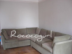
amberley
Original Author14 years agoI will take daylight pics as soon as my GC finishes sanding the dry*wall. Old white is not the right color. It goes even darker, and slightly mauvish (more twd purple). I like the Off-White even better in daylight. I am also liking the Old Gray again, but it is much much darker than Clunch, so there would be alot of contrast there. What I want to avoid is the cabinets looking creamy, or like a real off-white.
Pale powder is absolutely beautiful, and I really like matchstick alot too. White Tie has a subtle glow. And Clunch is definitely going fleshy. It is more cashmere gray with a very pale celedon undertone at times. I really like it alot. It too almost sees to glow. I think that I am finding that alot of the F&B colors are doing this!
The more I look at Old White the more I am liking it for the DR table though (or my breakfront). Ceiling didn't go up today :(, but will be done on Monday. They are also sanding the floor*s on Monday. We aren't finishing them until the end though.
I will post pics soon!
mindstorm
14 years agoIvette,
I've got pics of LRG taken early this morning in clouds and then a bit later when the sun popped out for a minute. LRG on my walls in my East facing room looks like Hardwick White some of the time! At other times it is the expected blu-ish grey. Also, I suppose like most paints it goes lighter or darker depending on the illumination intensity. You won't believe that all the pics are the same colour but they really are.Fer instance:
Early Morning:
Later morning in sunlight:
For reference the trim is Pointing while the ceiling (if it shows up - I'd tried when composing the pics to include the ceiling so that you have some reference) is All White. The opposite wall is Strong White.
As a lagniappe, I've included some pictures of Strong White. They are in the same room as the LRG. Last of the Strong Whites of them just looks wrong as it shows up quite pink and even as I took the photograph I checked the wall and to my eye there was no pink/violet on the wall. I suspect it was just the sunlight reflecting on the wall but whatever.
What amused me was how much Rocs' Shaded White on her 12th storey home looks like my Strong White on my 2nd storey place! ;-) Wouldn't have expected it. I've seen her Shaded White in her country house at less stratospheric altitudes and know that there was no confusing Strong White with Shaded White.
BTW, and this is where I disagree with Roc. To me, you look at the colours during the daylight in your house. Because while the lamp lights can be adjusted, you can't change the sun or how it lights your room. I've been on a quest for Shaded White but I'd need to change the sun for it to be acceptable in my house! The night time is easier! ;-)
pirula
14 years agoAstounding how different it looks, but I like it in all iterations so I think we're good! We'll test it soon here, and if we use it I'll post pics once we repaint the room! It's going to be quite a change from the cooking apple green/chinese blue. Thanks mindstorm! It's really beautiful.
Agree about the Shaded White in the high apartment. It's beautiful, but about 109 shades lighter than it looks like here!
pirula
14 years agoforgot to mention amberley, that matchstick is a beautiful color. The inside of the kitchen bookshelf and the cubby above the fridge are painted in Matchstick. I love it, and if I had wanted to go anything but as light as possible in the kitchen I'd have used it on the walls instead of the White Tie. On my screen, it looks alot like the middle drawers on your side board.
amberley
Original Author14 years agoJust downloaded my pics now, but I am too tired to organize and upload to Photobucket. I may not be able to do it until Monday, as I work tomorrow and I am priming in the am before hand. Then I have to pack up my breakfront in the LR tomorrow night- they are sanding the floors on Monday am. I will also be spending most of the day building my IKEA cabs.
Thought I would leave a quick link to an English bespoke cab co though. Has F&B named on some of the cabinetry pics.
Here is a link that might be useful: exmoor
trinkette1
14 years agoamberley, I can't wait to see your pics. I am very curious to hear how you like Clunch and Off White together  is this what you are doing? Ack! Too many colors to keep straight, LOL!
When we put up Clunch in the bedroom here, we did notice that it appeared MUCH darker than expected (perhaps even brownish) during the first several days; then, after awhile, it settled into a more light and subtle color. I have it in a corner room roughly facing east/south and it never seems fleshy to me; that would drive me nuts (and, it is the reason that I stayed away from some of the more pinkinsh/cooler F&B choices). After reading here, I guess that I should try Clunch in a west/north room to see what I get. Anyway, here it definitely reflects the colors and light sources in the room. All four walls can look different at the same time and yet the overall color remains fairly neutral.
If you like blue/green, for a little pop of color, Theresa's Green is stunning with Clunch.
amberley
Original Author14 years agoSo here are the pics. This was late afternoon light.
Clunch on Left, Off-White on Right. Pic right next to french door.
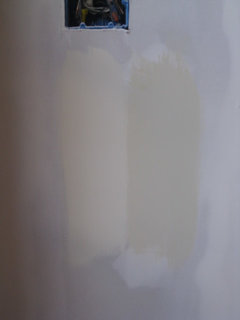
Left long strip: White Tie, then top to btm: Off White, Clunch, Mouse's Back (I think), then strip of White Tie, Old White, Fawn. notice how Old White is almost the same color as the drywall? This is on the left side of the utility closet which doesn't get direct light.
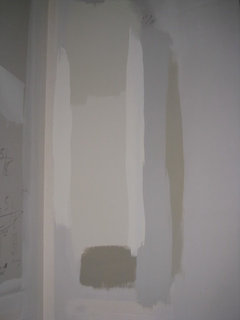
This is on the main cabinet wall. Mouse's Back, Old White, Light Gray, French Gray. Underneath is Fawn, and above is White Tie.
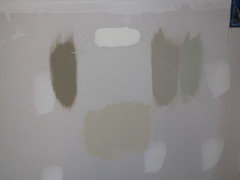
This is on the wall that straddles the kit and DR. It probably has the best color representation of real life- especially Clunch. L to R: Small strip of Matchstick, top: White Tie, middle: Old White, btm: Fawn. Then top Matchstick, then Off White, then another strip of White Tie.
Gotta run!
trinkette1
14 years agoThanks for the photos! Ummm, I'm having trouble matching captions to photos... is the last pic uploaded? Perhaps it is me?
Anyway, it is great to see how the colors play off one another. I'll have to study.
After just a quick look, Fawn appears quite lovely. And, as you mentioned, it IS funny how Old White matches the drywall  I never thought of it that way before seeing this.
Can't wait to hear everyone's thoughts and your ultimate decision. Thank you for sharing.
pirula
14 years agoYeah, I'm confused too. There's one color I really like on the last picture above, but can't figure out what it is. I think it may be the French Gray because it's so green.
For sure CLunch and Off White look lovely together in your space. And the White Tie goes with them beautifully. I also really like that medium dark color. Fawn? Mouse Back? can't tell....

bmorepanic
14 years agoFawn or french gray for the walls. White tie - ceiling and trim.
I can see doing the cabinets in off white or clunch.
Just don't ask me why.
Gena Hooper
14 years agoSo funny how dull and institutional Old White goes in your space. It's really beautiful in mine.
Love Fawn. So pretty. French Gray goes pretty dark in my kitchen, but it hasn't really cured yet. I've noticed the colors subtly change as they get fully dry. It looks so green beside your other choices!! Beside all the greens in my kitchen, it looks quite gray with just a hint of green.
Off White looks really lovely in your space. It looks like it has quite a bit of color!
I think I'm narrowing my choices down to Stone White, Cooking Apple Green, String, and French Gray in some combination or another. Possibly with a cream in there to lighten things up. Apparently doing offhandedly warm and comfy is really hard!
amberley
Original Author14 years agoI did forget to paste the html for the last pic. Here it is:
This is on the wall that straddles the kit and DR. It probably has the best color representation of real life- especially Clunch. L to R: Small strip of Matchstick, top: White Tie, middle: Old White, btm: Fawn. Then top Matchstick, then Off White, then another strip of White Tie.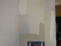
pirula- I think that the medium dark color you are refering to is Light Gray. I like it alot, and was my original thought for the cabs, but it is too dark for that application. I may use it on a piece of furn*iture, or as the floors if I decide to paint. French Gray is pretty, but reads just plain GREEN in my space. It is too much for me too live with as the cabs (green is not my fav color). It is a possiblity for a painted furn*iture pieces as well (can you tell that I will take a paintbrush to anything?).
bmore- I want the cabs to read darker than the walls- I want to avoid the cabs looking white or cream. I really like fawn alot, though, and I will sample it for teh walls in the LR as well, once I have it primed. French Gray is just too green and too cool. It would end up looking antiseptic in my space I think.
I think that Fawn would look nice as the cabs, but Off-White looks better with my Python ss sample since it is a bit cooler. I am thinking about painting one small cab area (separated from the rest) in Pointing to match the trim. Will get opinions once we get the cabs up. Oh, and I am loving Pale Powder in the closets. It looks fab!!
Didi you guys look at the Exmoor link? Some of the colors we have been talking about are on there on freestanding kit units. Here is another one:Here is a link that might be useful: John Willies UK bespoke kitchens
amberley
Original Author14 years agoI created a thread that has pics of most of my choices for the kitchen and DR, and some of my LR furnishings so you can see what I will have against the F&B colors.
Here is a link that might be useful: my choices thread
kimiko232
14 years agoI hope you don't mind me asking a question in here rather than paint. I've never seen this long of a thread on FB colors and have been stalking this thread ever since it popped up. I've been having a heck of a time trying to find colors to complement my stinking couches. I have been tempted by the FB ever since I have been lurking on this site. Low and behold, my weird gray/green/blue couch color is on there (on the little fandeck that never matches what the real color is to be). It's called pigeon. Looks green during the day and gray at night. Can anyone suggest a few colors (wall colors) that I could order that would complement those couches? My family room and kitchen and nook are all on the north side, so we don't get a huge amount of light in there (except the nook). It's really dark in there during the day and drives me nuts. Maybe old white or off white for the walls? Something neutral as I can't paint again for a few years (after the baby has grown/ I have time) and want to brighten the area up. Just nothing too dark (I'm not afraid of color, just darkness.) I don't know if I should go more yellow/cream or greenish in my choices. My floors are just regular old orangy oak. And, I'm planning on painting my kitchen cabs (they are maple pickle). Mainly, I'm hoping that you guys could give a few suggestions on walls before I spend 100 dollars on paint pots. :) I'm preggo and can't spend a huge amount of money on those little pots. I was hoping maybe three or five. If I order the wall color pots, then I'm hoping that the colors of the cabs will be easier for me to decide.
One other thing, is there that much of a difference between the FB and the FPE? I ordered a deck from them also. I've seen on the paint forum that they suggest the FPE more than the FB. But, I can't figure out why that is. I'm assuming that they are using similar pigments and combinations of those. Why are there only so few fB paints and millions of FPE available? Do you have a particular favorite and why? Just wondering....
Thank you for any insight/ suggestions. I really appreciate it. BTW, I do have a BM colordeck. But, am dying to use the FB colors from all the posts on here and how everyone raves about them.
Thanks again!
pirula
14 years agoI've used both and here is my opinion: FPE is the best paint on the planet if you want to paint cabinets, or outdoor woodwork. Their ECO is an alkyd blend that is incredibly durable. As far as interior paint goes, I much prefer F&B for their beautiful finishes, the mutable colors, and yes the price by comparison. To me, the other FPE paints, while also fantastic, are not worth the extra price of admission. The only other paint I consider for inside is DKC, again, because of the colors mostly.
So for you cabinets, F&B would also be excellent (I know this now, after four years of living with F&B on wood trim and built ins). But I think I'd still choose the FPE ECO over F&B for kitchen cabinets at this stage of my life with kids and a dog. But for that, I'd not hesitate to use F&B on the kitchen cabinets. Note I'm only talking the kitchen here, which gets by far more wear and tear than anywhere else in our house. For everything else, F&B is my first choice. But I love their colors and appreciate their limited color selection. FPE on the other hand will make paint matched to any of the Pantone color wheel colrs. So alot depends on the color you want too. For quality, either paint will measure up.
rococogurl
14 years agokimiko -- We're talking about painting kit*chens here!
I've used both brands and you cannot go wrong with either one. F&B are harder to work with because instead of 3-4 pigments they can have as many as 16 so most of the colors have different undertones -- daylight and artificial light changes them.
I get the little pots and put 2 coats on a huge poster board (22x30) of each color to be sure because a tiny swatch can look really different when it's on a whole wall. Trust me it's worth the work doing this since the paint is expensive.
But once you figure out what you want, the F&B paint lasts and lasts. The estate (flat) has a very velvety texture and I think it makes my walls look better. It cleans and touches up OK. Also, since you're bumped, know that there is 0 odor -- it's hard to tell the house was painted.
FPE water-base is superb paint. The have a consultant who will help with color schemes over the phone (free), they will match any color and once it cures it's scrubbable. But it's a different animal as it doesn't have the mesmerizing color shift and while the surface is excellent, the flat isn't as velvety in texture. However, it's scrubbable. Their old-base paint for door and exterior is amazing and some paint kit*chen cab*inets with it but I wouldn't go near it right now -- fumes are not good.
Both are premium price paints. F&B are a bit more than Aura but FPE are much more.
I've stuck with F&B for three rounds of painting now and did my kit*chen cabi*nets this summer with eggshell. It's holding up very well. Allison also used it on her cabi*nets which are older and also holding up.
On the link is a huge article done in an English magazine which gives a lot of color schemes -- hope it will be helpful to you.
One thought about cabi*net color. In my kit*chen I did the lower cabinets and island in Dauphin as a tie-in to my liv*ing room sofa which matches Dauphin -- as the rooms are open to each other. I went much lighter on the walls and used White Tie on the trim and pointing on my ceilings.
Here is a link that might be useful: F&B color schemes
pirula
14 years agoJust want to point out that FPE's ECO is an alkyd water combination with very little fumes. I'm sure their old, original oil paint is the pits fume-wise.
Why do so many posts have asterisk's in the middle of words? Maddening.
bmorepanic
14 years agoI have two thoughts - not about specific colors. You have something in mind but the farrow and ball colors may not be extensive enough to express it. It might be really disappointing, but true.
When I look at your choices page, you could take smaller snippets and make a color story for the first floor. What I picked is what I think might be part of the story. If you can develop a scheme from photo snippets that express what you want your cabinets or walls to look like, then it becomes a matter of slightly shifting paint hues to match the effect of the photos considering the actual light in your room. Right now, we're all taking pot shots at a scheme.
Did the idea of creamy walls die? Or are we just all ignoring it?
What about something like the burlap color in the living room picture (that you picked for the dining room chair fabric) for the cabinets.. Nice wood knobs like the buttons but maybe the mahogany version?
Pull the wall shade from the lightest tone in the sink skirt fabric.
Maybe a little gutsy, but the orange-pink from the living room carpet as the trim or the orange-rust shades from the leather chair picture. Slightly less shouty would be the red from the fabric. Still noticed, but calmer would be to pull the gray-green-lichen color from the background of the same rug. More zen is the brown from the sofa ticking or a shade thereof.
I speak of myself as a decorating-ho - cause I like just about everything. You have strong feelings about the idea in your mind. The other thing you could do is try sitting in another room with a cuppa tea. If you want to stay with farrow and ball, have the color chart nearby. Close your eyes and see the layout in your head, see the way the kitchen and the dining room partner each other, the newly sanded floors lending some unity. Then see yourself walking into the kitchen from the back yard, carrying groceries or flowers from the garden, or baking cookies. Write down the colors of the kitchen you see. Have some faith in your choices - Ithink they are beautiful.
Completely different thought: I love the card idea. Maybe stop in the as-is area of ikea and get some painted drawer fronts - like $5 and I think half price on one day of the week? Put the cabinet choices on the drawer fronts - an actual 3d object instead. Then you can mix and match the painted cards and fronts.
amberley
Original Author14 years agobmore- in the other post- I didn't upload any accessory pics (mostly because they are packed!). but I have a few red items that pull out the color in the rug. The rug does tend more to soft red than orangey red. I am going from darker and more saturated wall colors, so I decided to avoid a deeper brown or burlap color on the LR walls, even though it would work. I am considering a cafe au lait color for the bedroom though, which get ALOT of light.
THe gray-green of the rug I do plan to pull out- most likely on the breakfront- possibly French Gray with a glaze over it (pretty similiar finish to Allison's English island cabinetry), and then do the interior in a lighter color.
Oh, and the wall clor will work beautifully with the sink fabric. It is in the mail, so when the yardage arrives I will take a pic next to Clunch and Off-White (and Pale Powder too).
kimiko- I too have used FPR, but only the full gloss oil (my front door) and the satin oil (exterior trim and wood windows). This stuff is FANTASTIC. I can't tell you how many people comment on my black front door. That said, you could only use the ECO since you are expecting. F&B is an edited palette, and it comes premixed. It is sometimes helpful becuase you don't have as many choices, but like rococcogurl said, the colors have slight shifts from day to night and look very different in rooms with different exposures.
I am not even going to try to make a final decision on the LR walls until I have it primed, because the BM double tinted Concord Ivory is so saturated- it throws a yellow cast on everything.
kimiko232
14 years agoHoly shamoly, thank you for that snippet of the color combinations of FB colors. It was something that I was hoping to find. I didn't even think to look for something on the internet for that.
Thanks for all the responses. I think that I will go with the FPE for the cabs and do the FB for the walls as you guys have suggested. I didn't realize that the FPE wouldn't change as the FB paints would do in different areas/lights. I think that I would prefer the depth rather than the usual paint. I think it's something that I've got to really see to appreciate. I'm sure that none of my friends would even take notice. I think you have to be a gardenweb junkie to really appreciate something subtle like it. I know my husband won't notice all. He will just notice the bill for the paint!
I've got a few narrowed down that I think I'll order this week. Hopefully, I can post some next week for you guys to see. Thanks for all the responses again!
Kimamberley
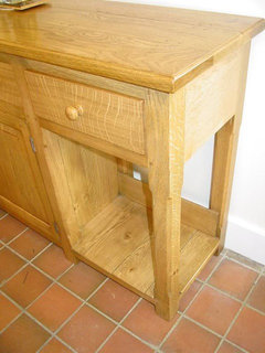
Original Author14 years agoSo what do you guys think of this idea:
Cabinets: F&B Off-White
Beadboard backsplash: Pale Powder
Walls: Clunch- or maybe I should go even lighter??I also plan to paint the Pale Powder inside the 2 closets flanking the window.
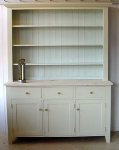
I found this pic on an English bespoke cabinetry site with those 2 colors:
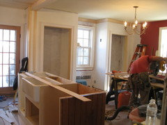
Here is the main wall in progress:
(beadboard on the island will all be painted Off-White)
closets in progress:
pirula
14 years agoThe cabinet in that picture is absolutely exquisite. i see the pale powder but what is the main color? Whatever it is, go for it. I also love those two colors with the Clunch. Yes yes double yes.
You're going very light! Which is certainly my preference. Are you still considering some of the darker colors somewhere? Or not so much anymore?
amberley
Original Author14 years agopirula- the English cabinet is painted F&B Off-White. It does show up darker in my space, but I am afraid it might be to light to achieve the look I want. I do want the cabs to read a light putty, and not creamy. I have to wait and see what Clunch does to the whole room's "temperature". I may need to go a little darker. I am planning to do one of teh darker colors on the table apron and legs. And, there is always the possibility of doing the island in a darker color too. My carpenter is doing my apron/legs/stretcher for the island right now. The legs look AWESOME. They will look like this:
amberley
Original Author14 years agoOh my. I think Old White may be back in the running for the cabs. And Fawn too. Off White looks like it is not going to have enough contrast with Clunch, especially where the two colors meet on a change of plane. Now that the space is totally open and light filled, I think I need more contrast.
It looks like I will get the doors from Scherrs, so I won't be able to paint a door sample yet.
pirula
14 years agoHmm, those are pretty dark, so you won't have the "feel" of that light as air cabinet you posted above. I'm just saying.
Have you looked at Stony Ground too?
amberley
Original Author14 years agoI like that cabinet alot- but I don't want the cabs to blend into the background. I am definitely going for contrast. I have looked at Stony Ground, but I like Old White and Fawn even better. The electrician is here on Saturday to install all the lights, so I think that I will have an even better idea then.
pirula
14 years agoGreat. They're beautiful colors so go for it. Definitely smart to see them in the actual light you'll have.
amberley
Original Author14 years agoI am going nuts! So I thought I had ruled out Old White because it looked like drywall in my space. Then I decided to try again now that alot of the elements are in (soapstone, etc.). So I painted a bunch of areas with the Old White sample pot. It looked great! So, I though, I just needed to have everything in place! So I went ahead and finished up the pot, painting a bunch of areas. Looks good. Great. Now onto the small can of Old White Estate Eggshell (which I already had). So I paint out the first few brushstrokes. Uh oh. The color is TOTALLY different. The Eggshell must have been the one I did the original tests with, because it still looks like the color of drywall. The areas painted with the Estate Emulsion in the SAME color look totally different. Why is there such a huge difference? Do I have an "off" lot of Old White in the Eggshell, or an off lot of the sample pot in Estate Emulsion? The Eggshell is NOT what I want at all, but the sample pot was perfect! How do I get the color I want, and know that it will be right? This is infuriating!!!
BTW, I tried Off-White and whil I like it and it works, it is just too close to Clunch (the walls) to be the cab color.
I also tried Fawn, which I liked, but seemed just a bit darker than the sample pot of Old White. Maybe I will have to go with that after all...
What to do?
rococogurl
14 years agoI have 3 different finishes in same room. The color does vary slightly between the eggshell and modern or estate due to sheen and finish but they are close enough to blend. You may also notice that the eggshell is slightly smelly (others have 0 odor) no doubt due to binder needed to make it washable.
amberley
Original Author14 years agoThe difference is HUGE and doesn't blend at all. I called the paint store where I got it and they were absolutely aghast!! They are calling the F&B rep tomorrow am about it. After looking at all of the colors in the fandeck, I have determined that I got a quart labeled Old White, but was actually Cornforth White. Check it out- doesn't it look just like the color of drywall? I will most likely get a new quart sent to me in the mail. Bad news is I couldn't paint today and won't be able to until I get the new can...
So I will be working on the walls and ceilings I guess.
rococogurl
14 years agoGlad it's a big mistake and doesn't mess up your plans. I must be weird as I like all those grays. But Cornforth and Old are verrrrry different.
amberley
Original Author14 years agoI like the grays, but not for what I am doing in this space- with the northern light and all. The paint store called me today to let me know that they have contacted F&B and will fix the problem- they said they may have to recall the whole lot! I am going to be painting the walls this weekend.
I LOVE Pale Powder in the closets! I used all of the paint in the sample pot to get a good idea, and it is just beautiful! I think I will paint my bathroom upstairs that color too.
amberley
Original Author14 years agoI got my replacement paint and the original did turn out to be Cornforth White. So I painted the first coat of on teh cabinet boxes with Old White and I LOVE IT. It is perfect. I haven't taken pictures yet since it is just the first coat- but I will take some tomorrow when I finish the second coat.
Now I am wondering if I should shift Clunch into the living room, and do White Tie on the kitchen and DR walls (would have much more contrast with the cabs), with Pale Powder on the planked kitchen ceiling?
oldhouse1
14 years agoAmberley, I've never posted to anything like this before and who knows whether or not I'm even doing it right. I guess I'll soon find out. We are putting on a new kitchen addition to our 1840 Canadiana house and came across Garden Web recently. I was intrigued by your post because we have so many similar design and color choices in common. Would love to do old white on our cupboards but can only choose from BM colors. So I think I'm going for Mascarpone cupboards,off white beadboard backsplash and ceiling and old white walls. You mentioned that mascarpone was similar to pointing, have you seen it side by side? I check often to see if you have posted any updates.I'm anxious to hear about your progress.
amberley
Original Author14 years agooldhouse1-
Just curious as to why you can olny choose from BM? You can have Farrow & Ball shipped if you need to. Regardless, I LOVE the Old White. I haven't posted any new pics as I am waiting until I have the doors up and painted. Mascaapone IS very close to Pointing, but maybe just a tinge creamier. I would point out that the F&B finish I am using on the cabs is exquisite- It is their Estate Eggshell. It is the perfect sheen for cabs. I would test the BM sheens first before choosing, as too high of a sheen would look plasticy.
Others will tell you also that even if you "match" BM to a F&B color, it will not look the same. This is because of the number of pigments used in F&B paints, which is significantly higher than BM.
oldhouse1
14 years agoAmberley-
We are going for an unfitted look in our kitchen and have had a pine work island table an 2 jam cupboards custom made and because of budget the rest of the cupboards will be Ikea Tidaholm. We're doing alot of customizing ourselves so although they might not be our first choice in doors they are a simple shaker that we think will blend in well with our other period pieces.
I would really like to have the doors sprayed but cannot find a single place in Toronto who will spray them in F&B. Most places like to use their own brand. I know you can't color match BM to F&B and thats why I don't want to waste Old White on the cupboards. I thought it would be easier to pull off a cream/off white color in BM and use Old White on the walls.
We're putting on a fairly large addition and doing all our own work so having someone else paint the cupboards is a gift we decided to give ourselves.I guess the other alternative is to break down and just do it.The problem with that is that they have to be sanded as well, my least favorite job,
I think I recall that you were going to go with Ikea doors as well or order from Shers(spelling?) Did you paint your own and if so what kind of a finish did you get?
Your kitchen is going to be gorgeous and your house looks beautiful as well. It's old is is not? Theres nothing like old American Architecture.

Gillian Callan
6 years agoAmberley, can you give me an update on your kitchen colours now and if you're happy with them? I am currently going out of my mind trying to pick colours for my kitchen and walls. Was thinking of old white for presses and slipper satin for walls. Is the old white very green when it goes on the presses. Then I am thinking of Drop cloth on centre island, shaded white on units and shadow white on walls.
Can anyone give me advice? Want warm colour not too cool but I don't want the kitchen to be overpowered in green.

Bunny
6 years agoGillian, this is an old and very long thread. It's probably a better idea for you to start your own thread with a link to this one for reference.


Gena Hooper