Shop Products
Houzz Logo Print
bluestarrgallery

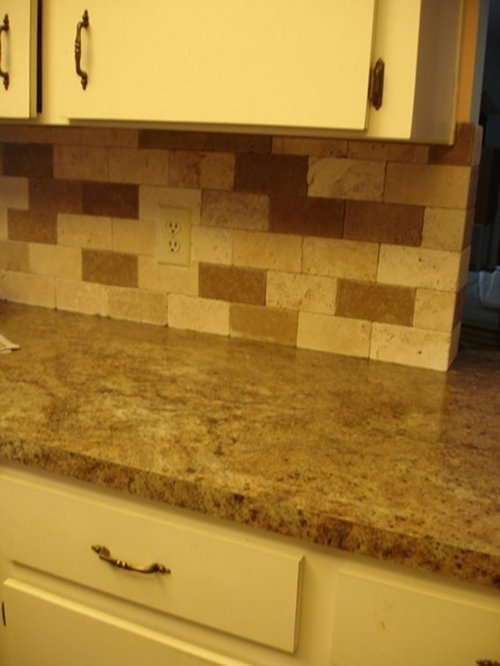
New Photo - Dark Beige or Tan Paint Recommendations Pls

bluestarrgallery
11 years ago

Can you please recommend a dark tan or beige paint that will complement my back splash, counter, and cabinets.

I forgot to show the back splash with the sealer which changes the color,

thanks so much.

Comments (12)

  • ellendi
    11 years ago

    On my monitor, your photo looks yellow, so it is difficult to suggest a paint color. If you have extra tiles you can bring one to a paint store and have it matched.

  • GreenDesigns
    11 years ago

    Skip more beige and brown. There's already an overwhelming amount of that. You need some color. Something like a sage green, or even a brick red, or a terracotta.

  • roulie
    11 years ago

    A beige that I have always liked (and have used in different rooms and in different houses) is BM Shaker Beige, but I agree with Ellendi that I can't tell from your picture (which looks yellow) whether it would be a good match for your kitchen.

  • bluestarrgallery
    Original Author
    11 years ago

    Thanks so much, Ellendi and roulie, you are correct about the color looking yellow, it is the fluorescent lighting which was in this house when we moved here. Now we are thinking of changing that out and getting some other type of lighting, one small remodel leads to more and more things to do.

    Green Designs, if I was planning on staying a long time I'd get some color, but I was trying to stay with the neutrals because we may want to sell. I will check out the Shaker Beige and see what it looks like, I now have the kitchen painted a coral color and it just doesn't seem to go with the new counter and backsplash.

  • raehelen
    11 years ago

    You may want to change your lighting before you paint. It's going to change how everything looks. I can imagine that you are chomping at the bit to start painting, but I would hold off until you have new lights. There are so many different choices out there now, and each one, will have a different effect on the colours you perceive.

    Having said that, I used BM CC460 Inukshuk in my downstairs bathroom. I also have a marble backsplash, and I was looking for a tan with grey tones, which I think from your previous post is what you were looking for.

  • bluestarrgallery
    Original Author
    11 years ago

    Hi Raehelen, I'm going to go look at lights tomorrow and see what I can find. I looked up BM CC460 Inukshuk and I was impressed with the BM site that came up showing that color and those that complemented it and similar colors, that made it easy for me to see how a darker shade would work.

    My thinking is I don't want a color too light because the cabinets are an ivory color and I want a contrast to them rather than an all one shade look to the kitchen, thanks so much.

    Hi Angela, I never heard of Porter Paint before so I did a search on their site to see if any were near me not expecting to find any and there are several places nearby that carry that paint, I will check it out. Since our kitchen is painted a coral color right now I would just as soon get a good quality paint that covers rather than having to paint numerous coats just to cover the old color. No I sure don't want a cardboard look. Ha.

  • thirdkitchenremodel
    11 years ago

    My realtor friend swears by Gobi Desert in Behr from HD.

  • bacin0
    11 years ago

    I just finished painting my kitchen and adjoining rooms a light tan. I LOVED the tan that a friend of mine had chosen for her house but when I swiped a sample on my walls it looked totally different. I ended up buying several sample cans and painting swatches of them on several walls. It was amazing how different the colors looked on the different walls. The "tans" ended up beige, grey and almost pink.

    Sooo, my advice to you would be to try several shades of the tans you love on different walls before choosing.

  • michoumonster
    11 years ago

    We used BM Edgecomb Grey which is a greyish tan with some all white cabs. I think it looks nice with white. Some other nice tans/beiges are BM bleeker beige, and BM manchester tan.
    good luck!!

  • Mizinformation
    11 years ago

    On our first floor we have several colors that repeat in different combinations in different rooms, and the warm neutral we used for continuity throughout was Cracker Bitz (which I think was from Pittsburgh, but I also find it listed with Olympic, so maybe they are the same company?). In some rooms it's the main wall color with a different accent wall, ceiling color, or accent between the plate rail and picture rail. In other rooms Cracker Bitz the accent color on one wall. It looks great with Lion's Mane of the same brand -- like they are just different values of the same color -- and the very orange Copper Penny. It also looks great next to a cooler color for contrast -- in one room it's a sagey green, in another a washed-out robin's egg blue. Anyway, I was surprised, because to me the color on its own is kind of a blah neutral beige, but it reads very warm and almost yellow, or lighter like parchment depending on the other colors around it and the lighting in the room. It's our go-to versatile color now. Good luck and have fun!

  • bluestarrgallery
    Original Author
    11 years ago

    Oh thanks so much for all the suggestions, I will check out these colors. I never knew choosing a paint color could be so much trouble.

    I have a chip of Gray Goose by Olympic which I am thinking about today, hum.