


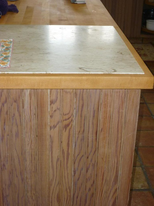
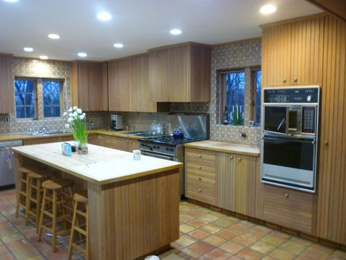
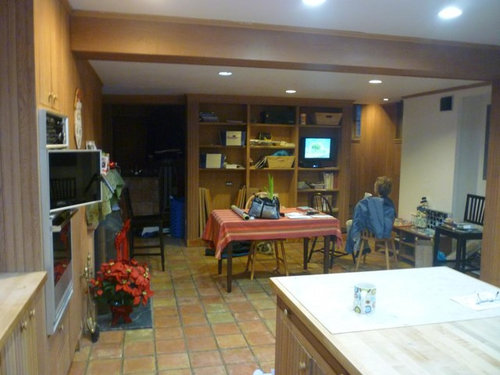
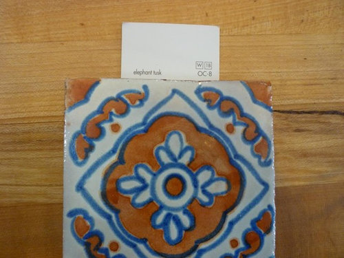
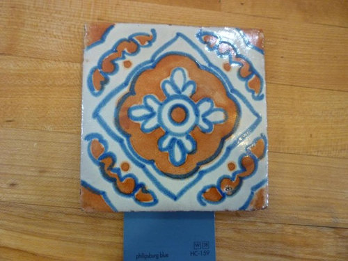
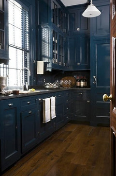
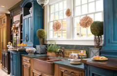
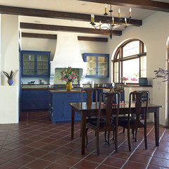
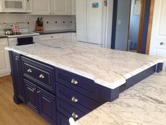
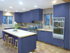
Navy cabinets... do I dare? Other suggestions?
roulie
11 years ago
Featured Answer
Sort by:Oldest
Comments (36)

beekeeperswife
11 years agoRelated Professionals
Gainesville Kitchen & Bathroom Designers · Lenexa Kitchen & Bathroom Designers · White House Kitchen & Bathroom Designers · South Sioux City Kitchen & Bathroom Designers · Adelphi Kitchen & Bathroom Remodelers · Beach Park Kitchen & Bathroom Remodelers · Grain Valley Kitchen & Bathroom Remodelers · Hoffman Estates Kitchen & Bathroom Remodelers · Spokane Kitchen & Bathroom Remodelers · Wilmington Island Kitchen & Bathroom Remodelers · Country Club Cabinets & Cabinetry · Dover Cabinets & Cabinetry · Scottdale Tile and Stone Contractors · Oak Hills Design-Build Firms · Shady Hills Design-Build Firms
cawaps
11 years agoLisaSE
11 years agoUser
11 years agorunninginplace
11 years agoCEFreeman
11 years agolucy0214
11 years ago
localeater
11 years ago
sanjuangirl
11 years ago
Debbi Branka
11 years agolannegreene
11 years agonomad4
11 years agochicagoans
11 years agobellsmom
11 years agobeekeeperswife
11 years agoroulie
11 years agotheclose
11 years agopricklypearcactus
11 years agoroulie
11 years agomsl511
11 years agothreeapples
11 years agonosoccermom
11 years agoroulie
11 years agosixtyohno
11 years agopricklypearcactus
11 years agobellsmom
11 years agofirstmmo
11 years agoaliris19
11 years agoliriodendron
11 years agoDebbi Branka
11 years agonosoccermom
11 years agobellsmom
11 years agoCEFreeman
11 years ago
laughablemoments
11 years agohosenemesis
11 years ago


Related Stories
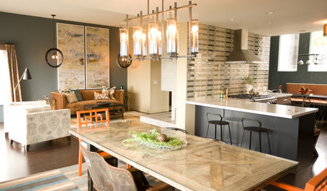
KITCHEN DESIGNKitchen of the Week: Navy and Orange Offer Eclectic Chic in California
Daring color choices mixed with a newly opened layout and an artful backsplash make for personalized luxury in a San Francisco kitchen
Full Story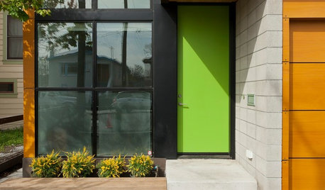
CURB APPEAL9 Daring Colors for Your Front Door
Stand out from the neighbors with a touch of neon green or a punch of hot pink
Full Story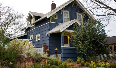
COLORExterior Color of the Week: Go Navy!
It’s daring and dramatic, but also a neutral. And it looks fantastic on almost any home
Full Story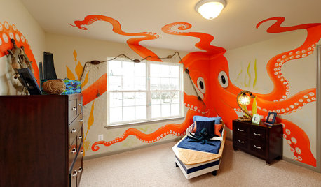
FUN HOUZZIn Honor of Inky’s Daring Escape: Octopuses Around the House
The slippery New Zealand sea creature has the internet abuzz, but an octopus as a conversation starter is nothing new to designers
Full Story
COLOR8 Daring Paint Palettes for Fearless Color Lovers
Dial up the volume on your home's color by nixing the neutrals and mixing in bold, beautiful colors that speak to your soul
Full Story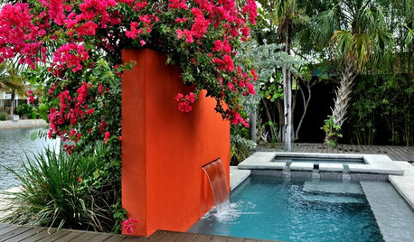
COLOROrange in the Garden: Do You Dare?
Tangerine and other oranges are boldly cavorting from fashionable interiors to outdoor rooms. See some in-vogue examples here
Full Story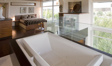
BATHROOM DESIGNDaring Style: Bedroom and Bath, All In One
Loft-Like Open Plans Remove the Master Bath Wall. Is This Look for You?
Full Story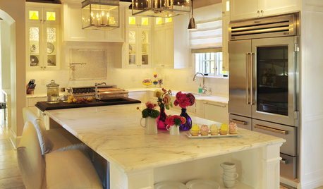
KITCHEN DESIGNSee-Through Refrigerators Dare to Go Bare
Glass-front fridge doors put your food and drinks on display, for better or worse. See the benefits and disadvantages
Full Story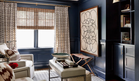
LIVING ROOMSRoom of the Day: Dark and Daring Pay Off in a Den Redesign
Indigo walls and woodwork, textured furnishings, task lighting and a media center turn a neglected room into a family hangout
Full Story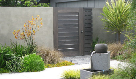
LANDSCAPE DESIGNDare to Go Gray in the Garden
Use neutral gray as a soother, a buffer and a framework for plants in many colors
Full Story


2LittleFishies