


Kitchen identity Crisis!
Jonnjen
11 years ago

Sort by:Oldest
Comments (40)
Related Stories
REMODELING GUIDESThe 4 Stages of a Remodel: The Midproject Crisis
Prepare for the mechanical rough-in stage, and don't worry if things don’t look like they’re progressing on the surface
Full Story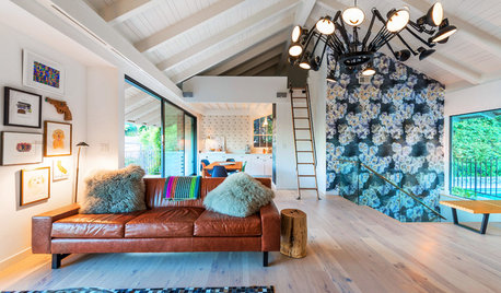
ROOM OF THE DAYRoom of the Day: More Fun for a Los Angeles Living Room
Bright furnishings and a newly open floor plan give a 1964 living room suffering from an identity crisis a new look
Full Story
KITCHEN DESIGN10 Ways to Add Personality to Your Kitchen
Quirky little details, unexpected ingredients and smart styling help give a kitchen its own identity
Full Story
HOUZZ TVHouzz TV: A Just-Right Kitchen With Vintage Style
Video update: A 1920s kitchen gets a refined makeover but stays true to its original character and size
Full Story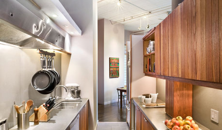
KITCHEN DESIGNKitchen Layouts: A Vote for the Good Old Galley
Less popular now, the galley kitchen is still a great layout for cooking
Full Story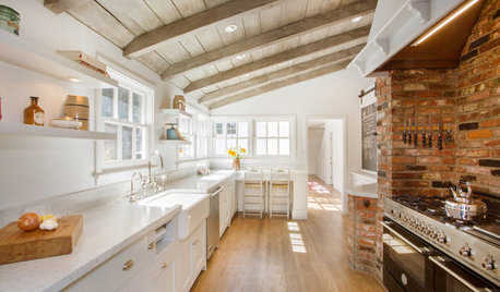
KITCHEN DESIGNKitchen of the Week: Brick, Wood and Clean White Lines
A family kitchen retains its original brick but adds an eat-in area and bright new cabinets
Full Story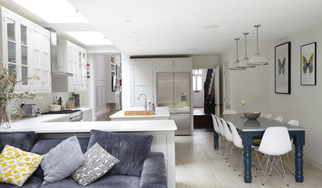
KITCHEN DESIGNKitchen of the Week: A Fresh Take on Classic Shaker Style
Quality craftsmanship and contemporary touches in a London kitchen bring the traditional look into the 21st century
Full Story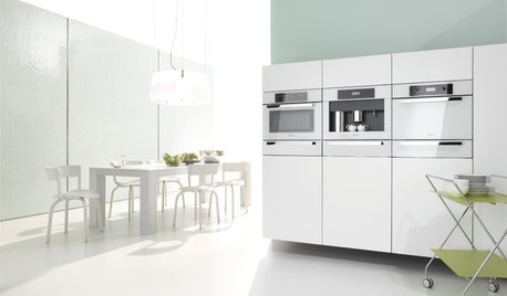
KITCHEN DESIGNWhite Appliances Find the Limelight
White is becoming a clear star across a broad range of kitchen styles and with all manner of appliances
Full Story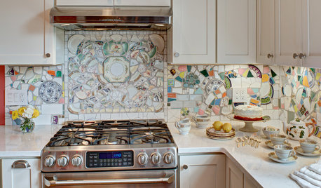
MOST POPULARKitchen of the Week: Broken China Makes a Splash in This Kitchen
When life handed this homeowner a smashed plate, her designer delivered a one-of-a-kind wall covering to fit the cheerful new room
Full Story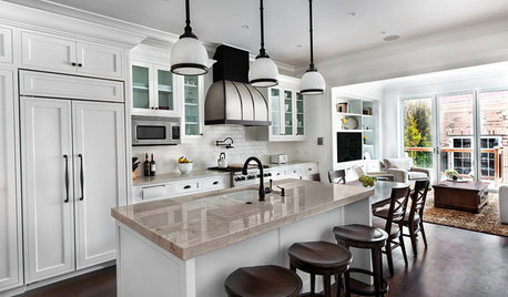
KITCHEN OF THE WEEKKitchen of the Week: Good Flow for a Well-Detailed Chicago Kitchen
A smart floor plan and a timeless look create an inviting kitchen in a narrow space for a newly married couple
Full Story


JonnjenOriginal Author
realism
Related Professionals
Agoura Hills Kitchen & Bathroom Designers · College Park Kitchen & Bathroom Designers · East Peoria Kitchen & Bathroom Designers · North Versailles Kitchen & Bathroom Designers · Ojus Kitchen & Bathroom Designers · Bay Shore Kitchen & Bathroom Remodelers · Garden Grove Kitchen & Bathroom Remodelers · Hoffman Estates Kitchen & Bathroom Remodelers · Jefferson Hills Kitchen & Bathroom Remodelers · Luling Kitchen & Bathroom Remodelers · Overland Park Kitchen & Bathroom Remodelers · Paducah Kitchen & Bathroom Remodelers · Vancouver Kitchen & Bathroom Remodelers · Bonita Cabinets & Cabinetry · Drexel Hill Cabinets & CabinetryJonnjenOriginal Author
rovo
JonnjenOriginal Author
Gracie
rovo
eam44
Gracie
nosoccermom
JonnjenOriginal Author
michellemarie
treasuretheday
nosoccermom
lascatx
JonnjenOriginal Author
JonnjenOriginal Author
JonnjenOriginal Author
JonnjenOriginal Author
Gracie
JonnjenOriginal Author
eam44
Gracie
JonnjenOriginal Author
JonnjenOriginal Author
JonnjenOriginal Author
eam44
onedogedie
JonnjenOriginal Author
Annie Deighnaugh
deedles
JonnjenOriginal Author
AboutToGetDusty
JonnjenOriginal Author
Gracie
islanddevil
JonnjenOriginal Author
eam44
Gracie
gr8daygw