


Coming....Going...Been? What have I read and haven't?
GreenDesigns
11 years ago
Sort by:Oldest
Comments (22)
Related Stories
FUN HOUZZ9 Places for the TV We Haven't Seen — Yet
Tube watching ventures into uncharted territory. How far would you go in your own home?
Full Story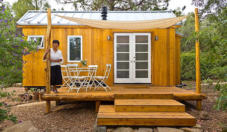
LIFEYou Said It: ‘Just Because I’m Tiny Doesn’t Mean I Don’t Go Big’
Changing things up with space, color and paint dominated the design conversations this week
Full Story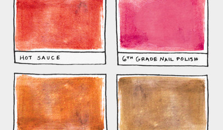
FUN HOUZZ16 Creative Paint Color Names We Haven't Seen — Yet
Someday, the namers of new paint colors will finally run out of ideas. We're here to help
Full Story
LIFEReading in Bed Comes Out From Under the Covers
No more sneaking a flashlight beneath the sheets. Grown-up bedtime reading deserves grown-up lighting and other bedside amenities
Full Story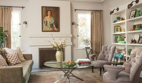
LIVING ROOMSNew This Week: 5 Fully Decorated Living Rooms That Don’t Go Overboard
See how designers filled these recently uploaded spaces with the right amount of furniture and accessories
Full Story
SMALL HOMES16 Smart Ideas for Small Homes From People Who’ve Been There
Got less than 1,000 square feet to work with? These design-savvy homeowners have ideas for you
Full Story
LIFESimple Pleasures: Get a Book Club Going
Kick back with friends and a thought-provoking read for an event that’s entertaining and educational all at once
Full Story
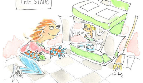
HOUSEKEEPINGDon't Touch Another Stain Before You Read This
Even an innocent swipe with water may cause permanent damage. Here's what to know about how rugs and fabrics react
Full Story
EVENTSDon't Throw Away Another Household Item Before Reading This
Repair Cafe events around the world enlist savvy volunteers to fix broken lamps, bicycles, electronics, small appliances, clothing and more
Full Story
HOME TECHComing Soon: Turn Your Kitchen Counter Into a Touch Screen
Discover how touch projection technology might turn your tables and countertops into iPad-like devices — and sooner than you think
Full StoryMore Discussions


function_first
beachlily z9a
Related Professionals
Bloomington Kitchen & Bathroom Designers · South Farmingdale Kitchen & Bathroom Designers · Brentwood Kitchen & Bathroom Remodelers · Hoffman Estates Kitchen & Bathroom Remodelers · Honolulu Kitchen & Bathroom Remodelers · Manassas Kitchen & Bathroom Remodelers · Port Orange Kitchen & Bathroom Remodelers · South Plainfield Kitchen & Bathroom Remodelers · Spokane Kitchen & Bathroom Remodelers · Spokane Kitchen & Bathroom Remodelers · Tempe Kitchen & Bathroom Remodelers · Farmers Branch Cabinets & Cabinetry · Hopkinsville Cabinets & Cabinetry · Liberty Township Cabinets & Cabinetry · Palos Verdes Estates Design-Build Firmsroarah
taggie
darbuka
function_first
darbuka
purplepansies
marcolo
ginny20
pricklypearcactus
angie_diy
ae2ga
blfenton
breezygirl
breezygirl
ginny20
Fori
annkathryn
CEFreeman
angie_diy
Bunny