Shop Products
Houzz Logo Print
polie_gw

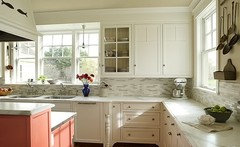
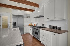
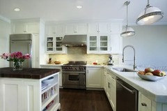
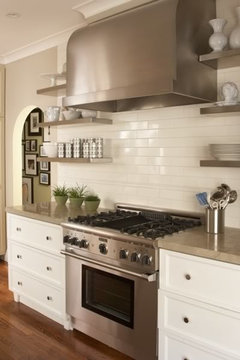
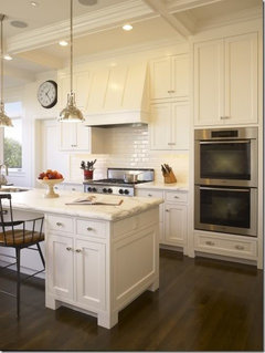
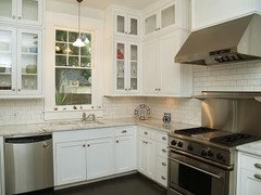
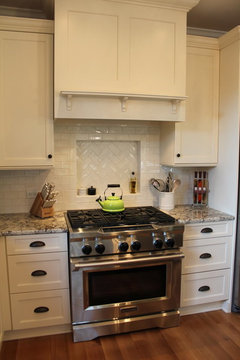
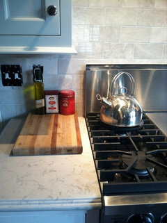
shade of white subway tile backsplash with white cabinets

polie
12 years ago

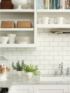
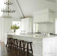
I'm trying to decide whether the shade of white subway tile for the backsplash should as closely match the shade of the white cabinets as possible or whether the tiles should be a lighter or darker shade of white than the white cabinets.

One person has advised going with a darker shade of white for the tiles, otherwise, he says a brighter white for the tiles would make the cabinets look "dirty." I'm now thinking, well, if I went down that path, wouldn't the cabinets make the backsplash look dirty? I definitely want some shade of white for the subway tiles for the backsplash. That much, I'm sure.

Any suggestions about the shade of white for the backsplash vs. the cabinets? Thank you.

Comments (30)

  • willtv
    12 years ago
    last modified: 9 years ago

    Our cabinets are BM Gardenia, a very warm white.
    For our backsplash we went with Daltile 3x6 subways in Arctic White. The whitest white they make.
    The tiles are whiter than the cabinets but don't make them look dirty.
    In fact, I don't really notice the difference in color.
    Here's a link to the completed kitchen.
    Keep in mind that, in keeping with the theme of the kitchen, my backsplash is black & white so that may be distracting your eye.
    Also in these pictures the under cabinet light are on.
    And my under cab lights are very cool on the color temp scale.
    HTH.

    Here is a link that might be useful: Completed Kitchen

  • boxerpups
    12 years ago
    last modified: 9 years ago

    Willtv,
    Beautiful!!!
    ~boxer

    If you can get some samples of different white tiles
    You can see which you find to be the best match for your
    cabs.
    keep in mind things like gloss, matte, grout color,
    lighting and brand can change the shade of white.
    I personally think matching the warm to warm or
    cool to cool to the cabs can help as in WillTv's kitchen.

    Tile brand and price can vary.
    American Olean .22 cents per tile from lowes or
    Dal-tile $4.00 per tile
    or $8.00 Walker Zanger or Modwalls Glass subway $10 per tile


    mixing whites

    not white but very pretty


    Dark tile (not sure I like this)

  • brianadarnell
    12 years ago
    last modified: 9 years ago

    I struggled with this too. My white tiles are slightly whiter than the cabinets because I didn't want to go slightly more creamy so I ended up picking the one that was slightly whiter. Its also hard to compare colors because obviously one is shiny and one is dull (cabinets). Definitely compare in daytime and nighttime as well as with all your lights on vs not on. I found this made a huge difference. hope that helps.
    You can see the slight difference in my

  • Circus Peanut
    12 years ago
    last modified: 9 years ago

    brianadarnell, I hadn't seen your splash before - really loving the spice niche. Gorgeous!

  • babushka_cat
    12 years ago
    last modified: 9 years ago

    am working on this issue as well. i ditto the suggestion to get samples and study in your own home. white are so subtle! good luck!

  • brianadarnell
    12 years ago
    last modified: 9 years ago

    Thanks CP! I posted my finished kitchen back in December I think.

  • 64reno64
    12 years ago
    last modified: 9 years ago

    We have shiloh soft white cabs and rixi mandorla subways which are a little darker than the cabs. I dont think the darker bs makes the cabs look dirty. I think the contrast is nice and helps to set each apart from the other. I guess it depends on the look you are going for.

  • gardenamy
    12 years ago
    last modified: 9 years ago

    Brianadarnell - can I ask what the make and color of your tiles are? They are great. Also, what size pulls did you use on your cabinets. Manyt thanks!

  • francoise47
    12 years ago
    last modified: 9 years ago

    I also obsessed about this question,
    holding up countless tile samples to my cabinets.
    In the end I selected a tile that is whiter than my slightly off-white cabinets.
    I like the depth and the slight "eclecticism"
    provided by the difference in color between the backsplash tile
    and painted cabinets.

    I remember Sarah Richardson's advice: do not be afraid to mix whites.
    I'm not sure if that is really true in all cases.
    But I think it worked in my case.

    Best wishes for your reno!

  • GreenDesigns
    12 years ago
    last modified: 9 years ago

    Matching whites is the kiss of death in an all white kitchen. It reads as totally flat and sterile. The key to success in a monochromatic room is to choose variations on that color and texture, not all one flat color. So, your cabinets should be one white and one gloss level, the backsplash should be another, the woodwork yet another, the light shades another still, the ceiling another sheen and different white, and the walls should not match anything either. This is the ONLY route to success with monochromatic. In fact, you should try using 3-4 different colors of white tile for your backsplash. It will be far more interesting and date your kitchen far less.

  • brianadarnell
    12 years ago
    last modified: 9 years ago

    My tiles are the Horus Cristalli in Bianco. The pulls are 3 3/4" or close to that. Definitely 3" and a fraction thereafter.

  • oceangirl67
    12 years ago
    last modified: 9 years ago

    I wonder if you could have had the cabinets color matched to the tiles, or the other way around?

  • boxerpups
    12 years ago
    last modified: 9 years ago

    Greendesigns
    you said it perfectly. Kiss of death!
    ~bp

  • athomesewing
    12 years ago
    last modified: 9 years ago

    I agree with greendesigns. Same applies to quilts! (;

    Much, however, depends on what your countertops will be.

  • jjdcl
    12 years ago
    last modified: 9 years ago

    My subway tiles match my cabinets. I tried a few different shades of white before we chose and it looked the best. I have a lot of different textures in my kitchen so I did not need a different color white to keep it from being boring. I also chose a dark granite, which is another reason why it worked. The grout is a linen color so it makes the tiles pop, which just adds to the subtle shades in the kitchen.

  • Laurie35
    12 years ago
    last modified: 9 years ago

    My subway tiles also largely match my cabinets, which coordinate with my granite countertop. I started with my granite, and worked out from there.

    I did chose the matching tones deliberately. I had originally thought that I would have a whiter, glossier subway than the cabinets, but it seemed discordant and I thought that the contrasts would make my narrow kitchen appear even narrower. My kitchen is only 7 1/2 feet by 10 feet.

    I think you have to keep the design and space of your kitchen in mind. Maybe matching whites is the "kiss of death" in some kitchens, like a previous poster said, but consciously picking different tones and glosses can be too. In a big space, a monotone might look bland. In my little kitchen, it gave me the illusion of space, and I can deal with the blandness with accent colors.

    I don't think there is a right decision here. I don't think it is a matter of saying "cabinets should be one white and one gloss level, the backsplash should be another, the woodwork yet another, the light shades another still, the ceiling another sheen and different white, and the walls should not match anything either."

    That is, in my opinion, formulaic. It may be right in the vast majority of spaces, but that doesn't make it right in your space.

    It really comes down to your aesthetic. And dealing with the reality of the space that you have to deal with.

    My cabinets are SW Alabaster and my tile is Daltile Biscuit.

  • polie
    Original Author
    12 years ago
    last modified: 9 years ago

    I really appreciate everyone's advice. I've taken a first step. I've ordered sample tiles from Keith at Subway Ceramics (an excellent company by the way). Gloss white, matte white, gloss bone, matte ivory, and their "Avalon" gloss white. Between the different shades of white and the matte vs. gloss finish, I'm sure I'll find something I like.

    Again, thank you to the GardenWeb community.

  • Bunny
    12 years ago
    last modified: 9 years ago

    I'm pretty sure I want some variety of white backsplash, but I don't want to match my cabinets--Cloud White--and I have enough gray in my Caesarstone Smoky Ash counters. I picked up samples of DalTile and, my favorites thus far, all the whites and creams in the Ashbury line of the Market Collection. I think the look I'm after is a little darker and warmer than my cabs, similar to Boxerpups' examples 3, 4, 6 and 10 (above).

    Are any of you familiar with the Ashbury collection?

  • lolauren
    12 years ago
    last modified: 9 years ago

    I am a little scared to say I matched my cabinets to the subways after reading some previous comments! I thought long and hard about it, and I'm happy with my bright whites matching. I picked the closest white subway to match my cabinets. (The subways are very glossy and the cabinets are a much more matte finish.... so they don't just blend together. Because of that glossiness, I doubt it would be very noticeable if the subways were a shade or two off.)

    With that said, I think this decision should also consider the other elements in your room.... what color is the countertop? the walls? I like that jillandmatt's kitchen has a slightly different subway since it helps to tie in the countertops choices in their room.

  • snagd
    12 years ago
    last modified: 9 years ago

    Jillandmatt...love your tile! can you share what the grout color is?

  • jillandmatt
    12 years ago
    last modified: 9 years ago

    Thanks! The grout is Mobe Pearl, from The Tile Shop (tileshop.com).

  • ileene
    12 years ago
    last modified: 9 years ago

    Thanks on advance for the backslash help, now if I could only pick out my granite....

  • polie
    Original Author
    12 years ago
    last modified: 9 years ago

    OP, following-up. My 2 favorite Subway Ceramic tiles have turned out to the gloss white and the gloss "Avalon", a kind of off-white. Decisions, decision. Again, many thanks to the GW members.

    Subway Ceramic tiles are so handsome looking, BTW. They're constructed to look the old fashioned way with crisp square edges rather than a pillow-y bevel. Keith at Subway Ceramics is also quite helpful in offering useful advice.

  • flynnnj
    12 years ago
    last modified: 9 years ago

    Briannadarnell - I LOVE your kitchen - what granite did you use?

    I'd like to use something very similar to yours. My cabinets will be Nordic white (not a bright white) and my floor is "whitish-oatmeal" ceramic tile. It's in the color family of the bisque stove that I'm replacing.

  • nicoleternity
    12 years ago
    last modified: 9 years ago

    I'm shopping for subway tile now and this thread was very helpful- thanks to all!

    Let me apologize in advance for the following ramble... if there's anyone else doing a remodel with subway tile perhaps this will be of interest. Mine is actually for a bathroom but the color discussion in this thread is so relevant, I hope it is still on topic enough.

    Now to decide not only whether it's Home Depot gloss white (US Ceramic, I think... though since we started shopping I think they are transitioning to selling a cheap version of Daltile only instead - which is fine that might work for us too. They no longer carry the US Ceramic we originally sampled in the store by us... though they do online).

    So... HD US Cermic Gloss white vs. Arctic White Daltile vs. Arctic White Matte Daltile vs. their slightly offwhite version.

    This is for a bathroom, pretty much floor to ceiling on 3 walls, with polished stainless steel and chrome fixtures, and ikea plain white cabinets (Applad doors - not quire as white and shiny as their ulta-mod Abstrakt).

    The Daltile HD option is a good one because it is 1/3 inch deep, which means it will match the depth of the carrera marble accent tiles we are thinking of using. It's actually hard to find anything but really common/cheap (and cold/too modern even for us) glass tile to match the 1/4 inch depth of the cheapest US Ceramic 22cent tiles that we thought we would use.

    I welcome any opinions/thoughts/advice/experiences...

    Has anyone used matte subway tiles? How do they compare in looks overall to gloss? To be honest I thought the matte finish might make it look LESS cold and sterile. My dad (the tile guy) thinks using subway tile and chrome is going to make my bathroom look like a gas station... I think the marble accent tiles (3x6 carrera hampton pillow top from TileShop is what we're leaning towards) will warm it up just enough. They are just a little visual interest for a border band around the middle of the wall all around the room.

    Also, the accents in the room are teak wood - the shower drain grill which is the length of the shower pan floor, the shower seat, and probably the shower mat and waste bin, etc. etc. Which also warms it up!

    Finally, I will be installing a crystal light fixture on the wall facing you when you walk in, to warm up the light in the room, provide some sparkling and "shadow interest".

    I am hoping the white tile, polished finishes, marble, crystal and teak will all harmonize well!

    I also hope putting marble and crystal accents in our second bathroom in our 50s postwar suburban bungalow won't be too high-minded an d out of keeping with the house... We are trying to be subtle and keep things in line. The rest of the basement model uses harmonizing and quality finishes... the upstairs has basic nice elements, hardwood floors, quality furnishings --transitional style-- but nothing as high quality as the work we are doing ourselves in the basement.

    Hopefully the handsome but mundane subway tile will bring down the tone enough to make it in keeping with rest of the house :)...

    Nicole

    Nicole

  • MIssyV
    10 years ago
    last modified: 9 years ago

    just bumping this for updated input, as this is where I am at!

  • Eden-Manor
    10 years ago
    last modified: 9 years ago

    I am getting off white cabinets and off white subway tiles. They just happen to match, which I like. The white was WAY too white and the white crackle/bevel which is what I'm getting matches perfectly. Both samples you see are "White Crackle" from Ann Sacks Davenport collection. One of them also has a bevel. My cabinets are Greenfield's Gardenia.

  • PRO
    modern life interiors
    10 years ago
    last modified: 9 years ago

    bump

  • kompy
    10 years ago
    last modified: 9 years ago

    Cabinets: Plain & Fancy "Cascade White" Paint
    Tops: Silestone "Lagoon"
    Tile: Meram Blanc from The Tile Shop

    I love the mix of white and grey in my tile.....matches great with my Lagoon quartz tops.