Shop Products
Houzz Logo Print
eurekahd_gw

Row House Kitchen Addition - Layout Advice

EurekaHD
10 years ago

Hi all,

I'm a long-time lurker who is finally coming out of the shadows with some questions of my own. I'd appreciate your thoughts and expert opinions about the proposed layout of our kitchen addition.

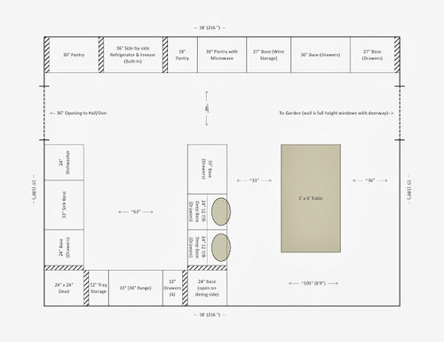
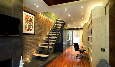
Our home is a narrow mid-19th century brick row house in NYC. We're renovating the entire home and putting an addition on the back, which will house our new kitchen and dining area. The doorways and walls cannot be moved, but any of the cabinetry, plumbing, etc. can.

My husband and I are both in our early 40's, no children. We like to cook and entertain (cook dinner at home almost nightly and host large gatherings for holidays, birthdays, etc.). Since this will be our only dining area (and guests always hang out in the kitchen anyway), we do want it to look nice but we also care a lot about function. We take turns cooking for each other, so one of us is usually cooking while the other sits with a glass of wine (and maybe does some chopping or other prep).

Some kind of seating perch that isn't the dining table is therefore very important to us. (Our current rental kitchen has a peninsula with 8'' overhand that works just fine for us, so we don't need a huge amount of space. This is truly a perch, not a place for eating or working.)

Details: The pantry wall is 24'' deep with a built-in refrigerator/freezer. The pantry cabinets are full-height, dropping down to base height in the dining area (to give more of a "sideboard" feel on that side). The clearances inside the U and elsewhere do not account for counter overhang. All of the 'wiggle room' spaces (shaded with diagonal lines) are 3'' wide (since I was using a 3'' scale), which is probably a bit too big. Therefore, the interior of the U as built will likely be closer to 60'' (before counters) - to me, anything greater than 4' seems fine, but let me know if I'm wrong.

Specific concerns:
1) To squeeze in seating at the peninsula while still allowing some space around the dining table, we've gone with two half-depth 24'' wide base cabinets (planned with 3-drawers each). Will these be deep enough to store some dishes? (If not dinner plates, at least salad plates and bowls, etc.)

2) I know the aisles around the table are a bit tight. Our current dining room actually has tighter aisle, so we're okay with them. And there will never be someone sitting on the barstools while people are at the table. Do you think the space is unbearably tight? [NB: We may end up with 19' of length (instead of the 18' on the plan), depending on some somewhat arcane zoning decisions. If that's the case, we would keep the exact same layout for the U part of the kitchen and use the extra foot to give the table more 'breathing room.']

3) While this kitchen probably seems small to many, I've lived in apartments in Boston and New York for the past two decades, so it feels huge to me. I'd appreciate any advice for planning the pantry storage (I've measured our current cabinets and think I know what goes where inside the U in terms of everyday dishes/pots/etc., but I'm a bit unsure what to do with all that pantry space).

4) I haven't drawn in uppers, but we plan to have them on the wall at the bottom of the U and the sink wall (with a vent hood over the range and likely open shelving over the sink, probably flanked by glass-fronted uppers). What should we do at the end of the upper cabinet run on the peninsula side? I've seen pictures of kitchens that took that last cabinet down to the counter (sometimes going deeper to create an appliance garage). Would something like that make the counter by the stove feel crowded?

Thanks in advance for any feedback!

Here is a link that might be useful:

Comments (11)

  • EurekaHD
    Original Author
    10 years ago
    last modified: 9 years ago

    Here's the first floor layout, if that helps. (The kitchen is laid out differently in this rendering, but you can see how the space flows.)

    Here is a link that might be useful:

  • bmorepanic
    10 years ago
    last modified: 9 years ago

    dunno, but maybe more like this...

    33" is the absolute minimum from a chair to a blank wall. Stools would stick out from the counter edge down at the bottom and the counter edge might be 1.5" further than you've allowed.

    You can try this by putting a chair up against a wall and then do 33" from the "front" of the chair back to a table edge and place another chair in the opening and try to get in it and out of it without striking the other chair.

    Doing something like this instead gives you everyday space for 5 seats and occasional space for 6 (with a chair in an adjoining room. You can have more cabinets too, if you'd like.

    There might be some reason you'd hate this, and that's fine. It's also good to know what you don't want.

  • missingtheobvious
    10 years ago
    last modified: 9 years ago

    For your below-counter space in the "dead" corner: have you considered a cabinet with revolving shelves? There are many different types (someone else will have to tell you the names) but they'd enable you to use much of that corner space.

    My parents have what's called a pie-cut lazy Susan. Many examples here:
    http://www.kitchensource.com/lazy-susan/d/pie-cut/

  • localeater
    10 years ago
    last modified: 9 years ago

    I like the U. Instead of having the two stools next to each other, what if the were across from each other. Then, one of you could perch and drink wine while the other is in the U. The person 'inside' would also have a perch for those long simmers or recipes where you need to monitor but not be active.
    If you wanted to switch the perch to the end you could also do it catty-corner and perhaps even use a fold down end or size to occasionally extend the space.
    I am not sure how set you are on that table, but I could see you kitchen with a round table in the corner. If seating for entertaining was a goal, I would get a table that could be extended to an oval. I would have 2 moveable benches against the wall with some chairs. I might even have the light swag with enough slack so I could have to hooks in the ceiling and could have the option to center it in two different locations. City living is all about flexibility!

  • EurekaHD
    Original Author
    10 years ago
    last modified: 9 years ago

    Thanks for the feedback! It's much appreciated.

    A little more about the table clearance (which I agree is an issue, I'm just not sure if it's a deal-breaker...) I think the layout as drawn has between 2-4'' extra inside the U (between oversized inside corner clearances and clearance around the range), so I don't think the aisle space between counter and table will be worse when built with a 1.5'' counter projection. Our stools project out 13'' at the bottom (widest part), so they shouldn't be much of an additional obstacle.

    And I just re-measured the wall/counter to table clearances around the dining table in our current rental and it's 33'', 32'', and 23.5'' (the fourth side is open to the living room), so I guess we're used to a tight squeeze!

    Although having the open side makes a world of difference, so I really am listening to your concerns. I do also worry that a shimmy that works when you've just turned 40 could become a more significant issue as we age, since we're planning/hoping for this to be our forever home.

    @bmorepanic - it's funny you should suggest that layout b/c I've been noticing a lot of home decor articles lately focused on having a large table in the center of the kitchen. So it would be both very stylish and of-the-moment, yet completely fitting in our Victorian. Your layout also makes clear that it would make our kitchen feel huge.

    The downside is I'm not sure I like the total openness between kitchen and dining. I was hoping to get away from the feeling of "I'm eating in the kitchen" - but that may be unavoidable in this space, so perhaps I should just really embrace it. I think I'd also miss having a seating option that's puts the sitter closer to the stander's eye level (if that makes any sense).

    Very good food for thought, though, as it's an option I hadn't seriously considered - thank you.

    @missingtheobvious - an earlier iteration of the design had smaller clearances in the corner (that couldn't accommodate a lazy susan or pull-out) but I forgot when we changed things around and decided that a 30'' range would be better than a 36'' one in this space that we now might be able to do more with that corner. I love the convenience of just having to open a drawer to grab a pot, but if we can really capture a significant chunk of new space, that would be great.

    I'm going to take @hollysprings advice from another thread and mock up some drawers to see what will really fit in them and see how much the extra space is needed. Thanks for the reminder to do this.

    @localeater - I purposefully didn't include any seating inside the U as I think I sit enough during the day and need to force myself to do more standing! ;) I love the idea of a round table. We've just been using the table we already have in the design (which has a leaf, so it can seat 8, 10 if we squeeze) but a round/oval table with a leaf would give us some more inches where we need them. I'm off to hunt for round tables so I can add them to the layout and see what that looks like!

    And great idea about swagging the light. In our current rental, when we extend the table, it's only possible to do so by moving it away from the center of the ceiling fixture, which drives me a bit batty. So I'm into a creative idea for being able to position the table in a way that allows for maximum traffic flow for everyday, while being able to move it for entertaining (when people expect to squeeze a bit anyway).

    Thank you all again for replying! It's really helpful to hear your ideas and think about my reaction to them, in terms of clarifying the priorities and concessions I'm willing to make.

  • bmorepanic
    10 years ago
    last modified: 9 years ago

    See, that's fine feedback.

    A counter is 1.5" wider than the cabinet on every exposed side. Usually, the cabinet depth doesn't include the doors, drawer fronts or handles. This breaks down as every style of frameless, full or partial overlay cabinets all take the 1.5" - 3/4" to get past the fronts and another 3/4" that extends past the run. For single line of cabinets, there is always some sort of decorative surface applied of 3/4" matching plywood or 5/8" ply with a skin (thin veneered covering) or something called wainscotting or paneling.

    On "raw" cabinet ends, people sometimes do nothing, or put a skin on it or get the cabinets made with something called furniture ends or get decorative panels which are something like an oversized door that is screwed on to the exposed end. That is how your counters magically eat your aisle space.

    So, in total, it's the cabinet depth, plus the doors, plus the backing plus 3/4". We just shortcut all that jazz and add 1.5" for every exposed face.

    So the "U" above would actually shrink down to 60" wide when the counters are installed. The peninsula would have a top of about 27" wide as a minimum and likely be 1.5" longer than you'd think.

    So, for the purposes of figuring aisles, space rules are almost always stated as the distance between the counters, not the cabinets. It makes a lot of difference when things are really tight.

    If the stools stick out 13" beyond the counter edge, the chairs will also stick backward some amount from the table. 33" is about the minimum an adult person needs to become seated. I'm sort of cringing at removing that 13" another 6" to 8" for the back of the chair and its legs. For me, it actually makes it worse that there are things at the floor that my feet will run into that can't be seen well.

    I re-thought about this earlier today. What I thought was
    - suppose all of the appliances, the pantry storage and the cleanup sink were on the extended "L". Then the opposite side could become a shallow form of storage - open or closed or some mix of that + some cabinets with glass doors.

    Aside from making it appear even larger, it could be humanizing/artistic/pretty. Maybe even skip a bit of wall cabinets for a sizable piece of art or paint the cabinet backs in contrasting colors or line with fabric. Call it the library (with a kitchen).

    No matter what, I'll be really interested to see what you come up with.

  • EurekaHD
    Original Author
    10 years ago
    last modified: 9 years ago

    @bmorepanic - Thank you (again!) for that detailed explanation. I am learning so much.

    I've been thinking a lot about your feedback b/c it really reinforces my sense that, while the table layout might be okay for now/a little while, it's probably not something I want to live with for several decades.

    Funnily enough, I found this image of a kitchen I really like today (not that I would copy every detail), which I *think* really reflects what you're describing about putting most of the function on the deeper L side and using the other more decoratively. That could be really, really great.

    [

    [(https://www.houzz.com/photos/family-kitchen-transitional-kitchen-san-francisco-phvw-vp~3915248)

    [Transitional Kitchen[(https://www.houzz.com/photos/transitional-kitchen-ideas-phbr1-bp~t_709~s_2112) by Mill Valley Interior Designers & Decorators Jute Interior Design

    I also thought about another suggestion to consider a round table and added that to the existing layout. (A round table could also fit more into a corner, but I didn't play with that yet. I also haven't had time to redo the layout the way you suggested, but I will this weekend. Maybe also in a 3D program, as I like to "walk" around the space.)

    Obviously, a 48'' round table makes the clearance much worse, but I wonder if 4 chairs were in the NE, SE, SW, and NE if it would feel better b/c you'd be sliding back into more room? Even the oval table might give more ability to push back in a direction other than straight into the wall or peninsula. (The blue circle and oval are a 48'' round that's extendable to 84'' and the red oval is a 40''x70'' table. Clearances for the widest part of each are in a note at the bottom right of the plan.) I appreciate it if you have an opinion on whether it's worth continuing to look for round options (try to find something closer to 40'' diameter) if round is just making things worse.

  • dilly_ny
    10 years ago
    last modified: 9 years ago

    I really don't think you need 63" between the back wall of cabinets and the peninsula. If you reduced that aisle width to 40" wide it would relieve your dining area spacing issues.

  • sena01
    10 years ago
    last modified: 9 years ago

    Can you use a bench/banquette on one side of the table?

    You'll need landing for fridge I think. As localeater already suggested, maybe you can consider a counter extension for the cab across the DW. That can be your seating perch and maybe help with fridge landing. I guess you can find folding stools.

    This post was edited by sena01 on Fri, Jan 31, 14 at 20:34

  • User
    10 years ago
    last modified: 9 years ago

    You didn't ask but I'll toss this out for consideration.

    I too built a full width 2 story addition to my rowhouse. The garden level is the bedroom of the rental apt, the parlor level is the (working) kitchen for my apt with a deck and stairs to the garden. It only goes out 10', has a 10' ceiling with a full wall of almost floor to ceiling windows, french door and 2 big skylights My original plans called for converting the 2 windows in the back parlor (dining room) to doorways into the addition with stained glass transoms relocated from elsewhere in the house. I thought that would maximize the light getting to the back parlor.

    My computer is in the back parlor. The back windows were still intact. As the construction progressed, I felt increasingly closed in when I was in the back parlor. There was great light in the addition but it didn't get to the back parlor unless the sun was directly opposite the back of the house and the sun was low in the sky (winter). It also started feeling claustrophobic. I could only see out the windows if I was standing in front of what would become the doorways. While sitting at the table or at the computer you could not see outdoors, only the side walls of the addition. I could see through the front parlor to the front windows but it wasn't enough.

    I redesigned, filed an amendment with the bulilding dept and took down the back wall of the back parlor between the two windows. The back parlor has lost that original cozy charm and I miss that. (It was the back parlor that sold me the house.) What it gained was spectacular light and a wonderful openness with that makes entertaining great. The kitchen is simply styled - the focal point was always the windows - and the back parlor is still all original Victorian. I did a lot with replicating window casing in the new addition and salvaging it to run the original casing around the new opening. I also did a lot of replicating original recessed panels to fill the original back wall thickness and wrap the raised cabinets on the dining room side which act as a room divider. I can't tell what your styling is so that might be irrelevant to you.

    A long winded way of saying you might want to consider taking down the wall between the addition and the den to get light and views to the den as well as being able to interact with guests overflowing from the kitchen to the den. You can design it to keep the rooms distinct but open. With all those cabinets on the side wall, you'll never miss the wall cabinets there. It will cost some for the steel support and finishing but you're referring to this as your forever house.

  • EurekaHD
    Original Author
    10 years ago
    last modified: 9 years ago

    @sena01 - Thanks for the suggestion - I had no idea something like that was possible. In our current (rental) kitchen, the refrigerator door is installed facing the wrong way (so it's between us and the nearest counter). We've been living with using the opposite counter (more than 7 feet away) as frig landing for 4 years and it hasn't bothered us, so I think frig placement is a compromise we're willing to live with.

    Seems like consensus is that the inside of the U and wall of storage are basically okay (with non-ridiculous compromises) - the dining table is definitely the issue. Thanks again everyone for helping us confirm this.

    We spent some time laying things out with boxes and tape this weekend and are going to go with the design pretty much as is (still fiddling with pantry layout), although we'll probably buy a new (round or oval) dining table.

    If we end up finding it too tight after living with it for a while, we'll downsize to a 2-person table (or even just a small seating area with upholstered chairs facing the garden) for morning coffee/evening wine and convert the den into a formal dining space (which just involves moving furniture and finding someplace else for the tv - or ditching it entirely, which I'd kind of like!).

    @judeny - we looked at taking down the wall b/w den and kitchen even before we bought the house, but it would cost in the $30-40k range, which we just can't squeeze into the budget (or not without sacrificing something else we want more). The den is only separated from the living room by glass pocket doors, and we're planning to use it for watching tv (at night), so I hope it will feel cozy and not claustrophobic... Our house also faces north/south, with the kitchen on the north side, so we don't get flooding sunlight from that direction anyway. Your renovation sounds stunning. I can't wait to be done with ours (although we're aiming for completion by end of 2014, so I guess I *can* wait ;).