

Have I made a terrible mistake?!
There is an awful lot of yellow going on in my kitchen! I have several inspiration pictures, and one in particular I have been following pretty closely, but I'm getting scared. Here is my moodboard, including the inspiration pic in the top right corner.

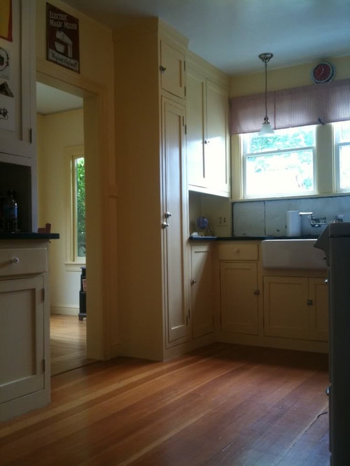
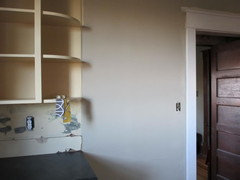
Here is my kitchen before, with the original cabinet frames that we are keeping:
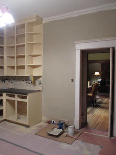
And in progress with all the yellow:

I am only part way, and I keep telling myself it will get better when I paint the walls and uncover the floor. Right now, there is yellow overspray everywhere and the floors are papered with red rosin. But I still worry that I've made a huge mistake with the cabinet color (or am about to with one of the other elements). I want a slightly vintage feel (to flow with the rest of the 1925 bungalow), with some transitional elements (to make the modern appliances and amenities fit). Yet I'm nervous it will look like a bumblebee or a chintzy diner.
I realized a little too late that my inspiration pic has no uppers. I, on the other hand, have lots and lots of uppers. So I have way more yellow and a lot less taupe/gray. Is that going to be a big issue? It isn't so much the look of the open shelves I'm trying to achieve, just the color balance. I plan to replace four of the top upper cabinets on the sink run with glass doors; maybe I should paint those interiors gray? It probably doesn't help that my dishwasher and fridge will both have panels, painted to match the cabinets, so there is very little to break up all that yellow.
I'm not sure if a different backsplash would work better instead of the beadboard (to be painted BM Linen White, same as all the trim). Or maybe the fabrics will tie it all together; I will have an upholstered window seat bench and am planning a sink skirt and some simple window treatments for light control. I need the sink skirt because my sink base is 42" and the Domsjo is for a 36", so my original doors don't fit right. I also like the look, as long is it's not too cutesy. I'm thinking something long and slightly shirred, like the pics below, in one of the fabrics on my moodboard.


I have found pics of yellow uppers and lowers that I like.

So I'm still hoping the scheme comes together. We're doing this all DIY, and I would really, really hate to have to repaint the cabinets. If there is some other element that is out of place or something I need to tweak, please let me know! I've read the tongue-in-cheek thread about compromising on your inspiration picture and ending up nowhere close, but if I've gone majorly wrong, I'm too close to the project to see it. Please help!
Comments (66)

skyedog
12 years agolast modified: 9 years agoTry not to make too many judgements until the rest of your elements are in place. Floors, ceilings, counters and backsplashes will dramatically impact the room.
Vellum is the color of my dining room - but it will take some getting used to. It's not a cream with a hint of yellow. It's a nice, toned down, goes with a lot, yellow. It's a great option for the age of your home and aside from susan's point about the wall color goes with all your choices. You've done a great job keeping the historic character of your home while still keeping it fresh and current. Take a deep breath, it will all work out.
francoise47
12 years agolast modified: 9 years agoYour yellow looks soft and lovely on my monitor.
I recommend you stay the course and see how it all comes together.
I love yellow kitchens!
I can't wait to see your charming kitchen when complete.Related Professionals
Glens Falls Kitchen & Bathroom Designers · Montrose Kitchen & Bathroom Designers · Minnetonka Mills Kitchen & Bathroom Remodelers · Channahon Kitchen & Bathroom Remodelers · Chicago Ridge Kitchen & Bathroom Remodelers · South Plainfield Kitchen & Bathroom Remodelers · Tuckahoe Kitchen & Bathroom Remodelers · Weymouth Kitchen & Bathroom Remodelers · Citrus Heights Cabinets & Cabinetry · Cranford Cabinets & Cabinetry · Red Bank Cabinets & Cabinetry · Saugus Cabinets & Cabinetry · White Center Cabinets & Cabinetry · Fayetteville Tile and Stone Contractors · Honolulu Design-Build Firmsequest17
Original Author12 years agolast modified: 9 years agoWow, thanks so much for the compliments, tips, comments, etc. I'm feeling better already! I think I get nervous every morning because the sunrise light comes pouring in that sink window (faces straight east) and can really make the open shelves look lemony - not what I was going for! But then it calms down and looks more muted all the rest of the day. I'll try to answer some specific questions and posts, but if I miss some, please forgive me; it's been a long, hard day!
Springroz, the photo I posted is pretty accurate during the majority of the day (and especially the late afternoon and evening when I'm in the kitchen the most), so thanks for thinking it looks pretty!
Fori, I like yellow too, but I've never had this much of a "true" yellow. I was going for a dirty vintage shade, and sometimes it looks that way, but sometimes it doesn't!
Herbflavor, I think you've nailed my concern. The ceilings are 10 feet, so that's a lot of cabinet! I should have thought to mention that the before photo was after all the doors were off. They are just a partial overlay slab door, nothing very interesting. I'm trying to figure out a way to add a simple flat stock molding (about 2 1/4" wide, like a shaker style door) around the edges, or maybe use a router and remove the bulk of the middle. If I do the latter, I would probably put glass in the four uppermost cabinets you see straight on, and do solid wood panels for the rest. I already have so many open shelves that I can't think of much else to display behind glass! What kind of light fixture would you recommend? I have toyed with the idea of marble subway tiles for the backsplash (we don't live far from the Alabama quarry), since it would give me more gray in the veining and grout; would that be a more high impact backsplash?
Gr8day, thanks for the suggestion. I've thought about toning down the final coat, but I already have three light coats on, so I think if I went to all the effort to spray another, I would chicken out and go white or something boring! I'm not sure about working blue in. The kitchen opens into the living room via a swinging door and I used BM Old Salem Gray in there, which I also think would preclude most blues. I really love the sophistication of yellow and gray, so I'm hoping to make it work without introducing too many other colors.
Old Salem Gray in the dining room:

Suzannes, sorry the layout isn't very clear. Here is a rough idea of the space, although the dimensions and proportions aren't exactly correct (for example, the sink is really centered; I'm not sure why this is off, but it's the only layout I can upload at this moment).

I love that the fridge lines up across from the doorway to the dining room; I think it will look like a lovely piece of furniture when seen from the dining or living room. But I do almost wish it wasn't paneled because of all the additional painted wood!Farmhousebound, that's my favorite fabric, too. I have a sample coming, but I haven't seen it in person yet. Another fabric pair I'm considering is Dwell Studios Vintage Blossom and Bella Porta in their citrine and brindle colorway, but it's awfully bright!
Lavendar, thanks for your honest opinion. I can't do anything about the lack of light, but I do have one east facing window (over the sink), a north window (on the left side out of the photo), and the kitchen opens to the mudroom with big windows along the north side, so I get very diffuse lighting throughout the day. I actually don't like the yellow in direct sunlight, so that doesn't bother me. I wanted something that seemed warm given the dearth of windows, but also sophisticated, so I went with the yellow and gray. But I do fear the yellow has outweighed the gray by a large margin!
You're right about the doors; everywhere closed but the open shelves on the end runs and by the sink. The cabinet interiors badly needed painting, so I sprayed them yellow like the frames, but I was thinking all along to paint the interiors of the glass ones something else, or at least a lighter shade for some variety.
I thought about white or cream cabinets. My DH said it would certainly be simpler than all the work I did to pick a yellow! But I had a black and white kitchen in my last bungalow, and I wanted something different here. I also felt it might seem cold or dingy given the light situation.
I plan to have a narrow black island in the middle of the U, which preserves the aisle width. I've been using one there for last few months and I really like. It gives landing space for the fridge and directs people out of my main prep area. I have a butcherblock top for it that should match the floors pretty well.
Girlville, thanks for the yellow hand-holding! I definitely need that right now. I know yellow is a difficult color, so part of me knows I need to give it a chance, adjust to seeing it, and get the other elements in place. Vellum has a bit of a warm peach undertone, as I wanted a dirty color. It's very close to Farrow and Ball Dorset Cream, so I thought that vouched well for its historic accuracy. I considered a more green-based yellow, but it seemed too modern.
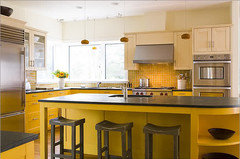
Lisa, I love that kitchen you posted! It makes me want to go for even more of a mustard instead of toning it down! I really fought with that decision, because I love a deep, saturated color; I didn't want a pale, baby yellow. But I wasn't sure I could take that much strong color all over the cabinets. That photo makes it work, and the black accents definitely don't make it look like a bumblebee.
Sochi, I hadn't thought about all glass on the sink wall. But if I do the router trick to the doors like I mentioned above, it wouldn't be any harder. I'm not sure my items are pretty enough for that, though. I am very tidy and organized, but I would want pretty containers for all my baking goods! The open shelves might work in another color, but how would I handle the crown molding at their tops? It goes around all the cabinets and it's currently painted the cab color.
Taggie, any photos? I would love to see more yellow cabinets. What backsplash did you use that was too dark, and what do you plan to replace it with?
Susanilz, the Bennington Gray is more of a khaki gray than taupe. It definitely doesn't have pink or purple undertones. I would say more green, if anything, but I just see a warm gray in my kitchen sample. Thanks for the taupe hints, though. I will definitely check my sample in some more light before I commit.
Skyedog, thank you for the Vellum vote. I had a hard time finding any images of it. I tested and tested until I (and my DH) were warn out and just went for Vellum. It's only in strong morning light that I really flinch; the rest of the time it's quite nice.
Shelayne, Claufers, Francoise, et al., thanks for the enthusiasm and encouragement! I hope I didn't miss anyone.
CEFreeman
12 years agolast modified: 9 years agoI read this last night and was too tired to type.
I was wondering what the yellow is that you've chosen? It's so soft and soothing.I don't think you have a thing to worry about. Committing to a color can be stressful, even though you actually love it.
I have painted my cabinets a gray green that absolutely draws me in and mesmerizes me. I've posted, though, how in indirect light it's the color I love, but in actual sunlight through the windows? OMG. It turns turquoise. Unfortunately the difference is clear because the natural light hits the bottom cabs, while the top (I don't get this) remain in indirect light. I'm trying to find another color for the bottoms. Bummer.
But hang in there. Go with your dream and worry about it after you've lived with it for awhile. It's a lot of work but remember: It's only paint.
Christine

sas95
12 years agolast modified: 9 years agoWe did our walls a shade of green that almost matches our green uppers, but in the morning light it looks almost neon! The first time I saw it in the morning I was floored. But it only reads like that for a few hours a day. The rest of the time I love it.
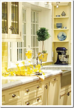
I think yellow cabinets are beautiful, and you will be happy you went a little bolder. My original inspiration kitchen was a super-bold yellow and everyone thought I was crazy for wanting a kitchen like this, but I just loved it. Unfortunately, I had to scrap the idea when I couldn't find a backsplash tile that worked as well as the one in the picture. I was afraid that if I went this bold and couldn't find the right tile, it wouldn't pull together.
My original sunny yellow inspiration picture.
pricklypearcactus
12 years agolast modified: 9 years agoWow, I think your kitchen is looking beautiful! I love the soft yellow and how it plays nicely with the dark counters and the crisp white trim and sink. I think once your actual floors are visible, things will feel a lot better. It already looks fantastic: warm and vintage. I also like the idea of putting glass in the cabinets near the window.
melissastar
12 years agolast modified: 9 years agoMy two bits: I love the yellow you've chosen and think you'll be happy with it in the end. BUT...I agree with Susan's suggestion that the Bennington grey may be off. On my monitor, the sample is definitely wrong...too taupe. The grey in your dining room, however, shows perfectly. Perhaps a lighter version of it?
I do think that's a lot of solid wood cabinet. The fact that they'll be yellow doesn't bother me, but it will be a lot of solid color. If you possibly can, I would try to use as much glass in the doors as you possibly can...all if humanly possible. I understand the need for covering "messy" storage, though, so perhaps you could do as someone else suggested and cover the bottom three shelves of several or all glass doors with shirred fabric on curtain rods. You might use the grey and yellow print fabric you use for under the sink (and I too like the floral) or a plain, semi-sheer white voile, that when shirred on the rods will be opaque enough to block the view of soup cans and sippy cups.
I especially like the idea of the glass doors because there are not a lot of window space. While not providing light, they'll reflect light and will give the impression of more windows.Seems to me you're doing a good job pulling it together and should be proud of how it's working out.
tinker_2006
12 years agolast modified: 9 years agoGood for you taking a chance!! I really, really was drawn to those pale yellow kitchens, but I was too chicken to bite the bullet. It will be BEAUTIFUL, I can't wait to see it finished!
boxerpups
12 years agolast modified: 9 years agoequest17,
Years ago I had my entire kitchen and surrounding walls
painted yellow.The yellow I chose looked pale and soft on the card.
Day 3 of my painters painting I walked into Chaos.
I was freaking out. OMG it was a bright, screaming,
wild, almost neon looking yellow. At least that was what
my brain said. DH was furious that I was now going
to change the color half way through the painting process.
Background I had done this before in a previous house with
a paint color of peach that was too peach.
DH said. You are going to have to live with it.And guess what? It turned out STUNNING. Honestly it
was gorgoeus. My paint color was Moonlight yellow by BM
and truly the entire space was fantastic.
It was the just seeing the yellow without my things,
window coverings, rugs, accent peices, trim, etc...
that had me blinded by yellow.Don't give up on your yellow. It is going to be stunning.
Already it is gorgoeus.~boxer
brickton
12 years agolast modified: 9 years agoIs there anyway you could remove some of the open shelving? At least the ones next to the sink? (The other ones would require changing the crown, which would not be easy I think) It would give you more "white space" in the sense of not cluttered or just "filled" and I think that would help a lot. The open-ness of your inspiration is what is most lacking to me. You have a very filled space, and if you could subtract, it would help.
Alternatively, how do you feel about painting the lower cabinets a very dark gray? Like two shades darker than whatever wall color you choose.
rafor
12 years agolast modified: 9 years agoI think your yellow cabs are pretty. I love yellow and know that sometimes yellow is hard to get right. I have a yellow kitchen (walls in a very pale yellow like your cabs). You're panicking (sp? that looks strange but spellcheck likes it!) because all your elements aren't in yet. Once your fabric is spread around the various locations, I bet you'll think it looks much better. It sort of absorbs colors and softens them. I find that's part of the problem with DIYing: you see each part but it takes a while to get to the whole.
All that being said, I somewhat agree with the poster who said to rethink your taupe walls.

suzanne_sl
12 years agolast modified: 9 years agoOn the subject of glass in some of the uppers and not necessarily wanting to display whatever you keep there: remember that glass inserts don't have to be clear. When we went to look at glass for our china cabinets, I was overwhelmed with sheer number of choices. There are lots of streaked and seeded sorts of looks, there but were all sorts of "art" solutions too. Google "cabinet glass inserts," or "art glass inserts" for all sorts of interesting stuff. You'll probably want one of the more vanilla solutions, but it's fun to look, and who knows?
dianalo
12 years agolast modified: 9 years agoI think that the wall color does not play well with your yellow. I'd want a softer, truer gray or perhaps better, a pale gray with a green tint.
If any of your uppers will be open shelves, I'd paint the backs the same linen white as the bs. Once you have items on the shelves, it will help tone down the overall yellow as well. Hardware on the doors will distract some from the color as will the fabrics, glass, etc....
I have to admit to not being a huge fan of yellow on cabs, but I do love yellow walls and accents. In our last house, we had yellow walls in the living room, dining room and hallways. When I started to paint, it was too yellow, so I added some white to the color to tone it down and made our own custom color. I was a newbie to painting, so did not know one should not do that on their own, lol. They were still decidedly yellow after I whitened them a little, but softer and less hard looking. I loved how the yellow contrasted with the bright white trim and white wts. It made the wood floors and darker wood antiques really look their best. I would suggest that the trim be as white as you can take it to make the yellow more special. I don't know what trim you have in your other rooms, so you may have to use the linen white. If you can, could you go with a little darker stain on the floors or do they flow into other rooms?
I'd try to find fabric that does not have much yellow in it at all. Just a hint would be enough. The problem with certain colors is when it is overloaded. If someone wants a blue element for example, that means that they don't need to match everything else to blue that they buy. That is when a kitchen becomes to "themey". Letting one element be the leader in a color is better than making everything the same. It takes away the special factor of a color element when everything else is along for the ride.singingmicki
12 years agolast modified: 9 years agoDon't chicken out on your yellow. I'm not even a fan of yellow, and I think it's a good one. This is a mellow yellow that is, as another poster said, a warm hug. You're just seeing it alone which is making it overwhelming.
Don't take out any of your open shelves, either! They're fabulous!!!
herbflavor
12 years agolast modified: 9 years agois the light fixture an accent piece over the black island you have? I'd think schoohouse charm..some darker metal-not satin nickel..If not designed to be over black table then go thru some online catalogues...is this the main lighting for the room? Close to ceiling type fixture with charm-fairly large...You are thinking a lot about the cab doors if you are contemplating molding addons.I would not do that...there's something about leaving them in the original configuration....Are they original? The backsplash question: is your counter option final? Is the backsplash just 14 or 15in high? Something smokey and run aubergine pencil molding or accent pieces through randomly,or maybe squares turned up on diagonal-avoid heavy vertical or horizontal I guess. Look around.I like the aubergine as an accent with yellow/black/gray-it shows up and dramatizes and enlivens..watch out for too much gray..and I like gray...Can some fabric be found with aubergine interspersed with the yellow/gray. For your size space I think this one other color in a small dose would be fabulous.... Look at the RobertAllen fabrics on line.
eandhl
12 years agolast modified: 9 years agoI think the color yellow of your cabs is rich & just stunning.
susanilz5
12 years agolast modified: 9 years agoI love the cabinets, but the Bennington Grey won't work with the Vellum. Try looking at different grays such as BM's Stonington, Edgecomb or Revere Pewter. Or paint the walls a soft white and use grey as an accent in your fabrics.
It's going to be beautiful!
mtnfever (9b AZ/HZ 11)
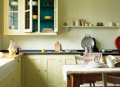
12 years agolast modified: 9 years agoI love yellow kitchens and if you can stand it, here's yet another yellow kitchen pic:
yeah it has white counters and even *more* yellow in the backsplash but check out the leaded glass uppers --doesn't that really go with your 1920s bungalow? If your wall color is really gray and you go with clear glass, painting the interiors gray may help but then won't all your stuff be blocking any interior color anyway? Suzannel's idea of non-clear glass is also brilliant for not having to do any extra interior painting!I can't tell where your microwave will be if you're going to have one--sorry if I missed it. If it's going to be in the uppers, having it be SS will also help break up the yellow. For the fridge also being panelled, it seems that you would see it most from the dining room, not the other door with all the other yellow cabs, so it would be more on its own.
Along the lines of Dianalo's green suggestion, on the Design Around 1920s thread, AngieDIY did a yellow kitchen with some green. The link to that thread is below.
Since you did BM Salem Gray in your dining room, would you want to do that again in the kitchen if the Bennington Gray is too taupe? The Salem Gray seems to have a green undertone.
anyway, I do love your yellow and your moodboard. Maybe selecting the beadboard and wall color can wait until the counters are in (or at least just set in place so you can see the colors together) and the floor uncovered but the upper cab doors not put in, so you see how you feel then?
HTH
Here is a link that might be useful: Design 1920s thread
equest17
Original Author12 years agolast modified: 9 years agoCEFreeman, the yellow is BM Vellum. Yellows are so hard, and I'm definitely having the same trouble with the sunlight on the cabs. Painting your lowers a slightly different shade is a great idea; it sounds like it would add a subtle variation as well as solve your turquoise problem.
Sas95, that is a bold yellow! I like that the uppers and lowers are two different shades, though.
Melissastar, the dining room is decidedly gray-green in person. It's a nice, subtle green, but I'm not sure I would like it next to the yellow cabinets. I do love it in the dining room, though (although it too took some days of adjustment)! I'm liking the ideal of more glass cabinets; I'll do some planning about which cabinets could stand some exposure.
Boxerpups, thank you so much for sharing your experience! Part of me knows I have to adjust to the color, and also see it with the other elements in place. I'm glad your DH made you see it through!
Brickton, you've hit on several things I've been considering. If we had the money, I would love to remove the open shelves by the sink, take off the valance and crown over that area, and widen the window. It would definitely open things up, and I don't need that many display shelves. The window change is definitely not in the budget, but I would like to lighten up the sink area. I've been thinking about painting the "wall" area there the gray shade to make the curved shelves look more like open floating shelves instead of built in units. Would that be crazy? And I love the idea of a darker color for the base cabinets. I'm already thinking about BM Kingsport Gray for the lowers if I get the whole thing done and don't like all the yellow. Do you think that would still work with the soapstone-look counters?
Rafor, DIY is definitely hard on your emotions. You put so much physical and mental energy into it, and you see it every step of the way. I sometimes wish for the dramatic TV reveal moment, just so I could feel what it's like for once!
Suzannes, I'll look into some more obscuring glass. I was planning on a seeded glass, but something else would definitely hide better. Any recommendations given the vintage of the house and kitchen? I've seen some great modern glass in frosted or linear reeds, but I don't know if that would work in my bungalow.
Dianolo, I have several items of white ironstone that will be displayed on the open shelves, so that might help break everything up. I hadn't thought about Linen White for the cabinet interiors, although I'm sure white is more standard than the frame color. Most of the trim in the house is stained, but where it's painted it's all Linen White, and the ceilings, too. I chose a creamier white since it looked better with the woodwork that could be seen. I would be afraid that a whiter white would make the cabinets even more yellow!
My favorite fabric, the Amy Butler Optic Blossom, has just a pinch of yellow with a gray print on an off-white background. It's the best I've found for combining my kitchen colors but not getting too cutesy. The floors flow throughout the entire house, so they have to stay as is. The Bennington Gray looks very gray in my kitchen. I already have it in the mudroom, and it is a bit of a chameleon. It can range from warm gray to khaki, but I don't really see taupe. Maybe I'm wrong, but I thought taupe usually had a red or purple undertone.
Herbflavor, the light will be the central lighting for the room and does hang over the black island. I went with a chrome finish tie in the faucet, but maybe I should consider something else? Are you thinking ORB or a soft iron finish? The cabinet doors are original to the frames, but this kitchen was put in around the '50's or '60's, so it's not original 1925. That's why I don't like the slab doors. I suppose slab was being used in the '30's and 40's, but I picture a simple shaker type door in a 20's kitchen. It would be a lot of work to reconfigure the doors, so I might run out of steam before I get to it! I could always route out the uppers only for glass and then see how I feel about the rest remaining slabs.
The backsplash area is 17". I hadn't thought about introducing any other color, and I'm not sure how DH would feel about aubergine. I'll do some fabric and backsplash looking. Do you think marble subways with gray grout would be too much gray? I really thought I needed to introduce more gray to balance all the yellow.
Susanilz, I already have a gallon of the Bennington Gray, so I think I'll roll it on the walls and see how it looks. I won't do the cutting in, but I can try to post a photo, probably by tomorrow. I've used Revere Pewter in a previous bungalow and liked it, so if the Bennington is not gray enough, I could try it. I may even have a sample pot still around. I have a pot of Weimaraner, but I'm thinking it may have the wrong undertones? What do you think?
Prickleypearcactus, Tinker, Singingmicki, Eandhl, and everyone, thanks again for the compliments and encouragement. It certainly makes it easier to move forward if I don't feel as though I'm making a disaster of it!
carybk
12 years agolast modified: 9 years agoI love your yellow.
Posting just to mention that cutting yellow with white per one poster's suggestion can really change the overtones of the color (not sure why). I did this with a yellow we were using in another room and it turned out much more green than the original yellow appeared. So if you reconsider that suggestion, go carefully-- don't assume that mixing it with white will lead to something similar but lighter.
melissastar
12 years agolast modified: 9 years agoI think it's the khaki inclination of the Bennington gray that is being described by some folks as "taupe"...or at least it is to me. I think of taupe in general as a greyish tan or a tannish-grey...one with more brown than a true grey. Take a look at the greys in the fabric swatches you've pictured: Is the bennington in the same shade family? Or is it more tan/khaki? I think a truer grey...with a green undertone or not...will work better with the yellow. My yellow cabs, by the way are not much different...they are BM Cream Yellow with BM Rich Cream walls.
Humorous (I hope) digression on the color taupe: As children, teens and young women, my mother's favorite color was taupe and my sister and I were frequently dressed in mouse-colored garments, while our friends wore colorful pinks, blues and greens. Mom swore that taupe flattered everyone and "cleared the complexion." She has been dead for 5 years now, but my sister (67) and I (58) can still be reduced to giggling 10-year-olds at the mere sight of a taupe hat or sweater and by a few muttered words about our complexions.
equest17
Original Author12 years agolast modified: 9 years agoMtnfever, sorry I missed your post. I love that photo; I actually have it on file and almost went with a light laminate counter because of it. If marble was in my budget, I would have done it! And I hadn't really thought about the leaded glass uppers, but now that you bring it to my attention, I love it. It would introduce a bit of gray, look period appropriate, and might even disguise cabinet contents just a bit, too.
I haven't decided about a microwave. We've been living without one for the last five months since moving in, and I don't really miss it. I may tuck a small one into the panty or something. And you're right about the fridge; it's off on the one leg and not centered on the main U of cabinets.
Waterdamage, I know what you mean about changing the overtones. I have had the paint store tweak colors for me before, and I'm always amazed that adding white or black doesn't just lighten or darken any given color.
Melissastar, I love your taupe story. It made me curious, so I looked up taupe. Wikipedia (the very reliable, knowledgeable source that it is ;-) agreed that it is a grayish brown or warm gray color. I don't know why I thought it had more purple undertones. So I would have to agree that Bennington may well be a taupe, not a gray. Since I have a gallon already, I'll give it a go and post a photo as soon as I can.
oldhouse1
12 years agolast modified: 9 years agoequest17, I absolutely adore the BM vellum that you have chosen and I think your mood board is charming. We've just completed our DIY kitchen and I know how stressful it is to make sure you get things right. It's a money thing of course but the thought of having to do something over when it may have taken weeks and often months of weeknights and weekends is not a pleasant thought. I could very happily move into your kitchen as we have similar tastes. We love our beadboard; we too have a black freestanding island and I love my double domsjo sink. I even found grids that fit it perfectly in case your interested. I ordered them from Home Depot in Canada. Am not sure you have Home Depot in the States. Let me know if you want the info. Good Luck as you move forward. Can't wait to see your finished kitchen.
melissastar
12 years agolast modified: 9 years agooldhouse1: Had to giggle at the idea that we might not have Home Depot in the states. In some parts of the country (like where I live in a city), it sometimes feels like you can't drive a mile without seeing another big orange store sign!
equest17
Original Author12 years agolast modified: 9 years agoOldhouse1, I have seen your finished kitchen thread and just love your work! It's very flattering to hear that you like what we've chosen so far. We, too, were perfectly settled in our recently remodeled previous home until this farmhouse that I had always lusted after came available. Now, six months later, we are in full and constant restoration mode!
Yes, it can certainly be frustrating to invest time, money, and energy only to have to spend more to undo and redo something. I would love to know about the sink grids you found. We just caulked the sink and installed the drains today, so I'm sure I'll be hesitant to use it until I get something in the bottom to protect that pretty finish. We do have HD, although I think they sometimes carry different things in the States.
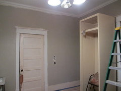
To all asking about the wall paint, I put a quick coat of Bennington on the walls and snapped some photos in the late afternoon light. Now everyone has me more worried about the gray than the yellow; at least it's something different for my mind to fixate on! The fabric in the pictures is a Robert Allen combo I'm considering. I don't have the sample yet of my favorite from the moodboard.
South wall with overhead light on (Reveal bulbs):

South wall with light off:

North wall looking at fridge cabinet (not in it's final position, and no window seat yet):

What does everyone think? On the south wall, I see a soft, warm gray. On the north fridge wall, I definitely see more brownish-gray or taupe at times. I'm not adverse to dark colors, and I could see going a little deeper as well as grayer, if that would tone down the yellow a bit. I have that sample pot of Weimaraner, but I'm not sure the undertones seem right with Vellum. I need to find some posterboard and try it. Any other recommendations? I feel like I want a warm gray, but I'm not sure. I usually pair warm colors with warm colors and cool with cool, but I'm not sure how yellow and gray work. I've seen the combo plenty of times, but I can't identify what undertones make it work.
celticmoon
12 years agolast modified: 9 years agoAwwwww, I am all verklepft remembering the 1897 house I grew up in that had a painted yellow kitchen. Sigh.
Your yellow will be wonderful. Great job picking such a pretty and pleasant yellow - so many yellows are, er, difficult. And take heed of advice on mating it with the right gray.
It is going to be stunning.

cawaps
12 years agolast modified: 9 years agoI haven't read all the posts, but I think it will be beautiful. I think that a wall color closer to the grays in your fabric options would be a better choice--I think it would help to balance the yellow of the cabinets, where it looks like the Bennington Gray has some yellow undertones and would tend to be more of the same. If, when the cabs are up and the floor uncovered, you want to tone down the yellow, you can choose one of the fabrics with more gray and less yellow. If you do glass front cabs, consider painting the back of the cabinets gray.
Your inspiration board is gorgeous, I love yellow and gray together, and I think the yellow paint you chose is great and won't be so overwhelming when some of the other colored elements are installed or uncovered. I had a yellow kitchen for many years, a bolder yellow than what you have and lots of it, and I loved it. I think you will too.
hlove
12 years agolast modified: 9 years agoJust piping in to say I love the yellow cabs! We're doing yellow, too, in our old house. I like the yellow you chose, especially for your light. Hard to say if it's "too much" especially w/o the doors on. I would also second the opinions to perhaps paint (or even paper?) the backs of some of the other uppers if they will be open or glass-fronted.
I would also go for a more grey grey, if that make sense. I love yellow and true grey...but then again, I love warm and cool tones together.
Can't wait to see your kitchen unfold!!!oldhouse1
12 years agolast modified: 9 years agoequest17, Below you will find the sink grid I found for the Domsjo sink. The grid does not have the openings for the drain. None seemed to have the openings to match the Domsjo, so I opted for the grid without. I have not found it to be a hassel to lift the grid to get to the drain and to wash the sink the grid will rest along the side. I was just grateful to find something that fit so was willing to be inconvenienced, although I'm used to it now so it isn't so. If I paid $800. for a sink I may feel differently but I didn't so for me this works. My sink looks perfect.
Funny, I was going to suggest Revere pewter but I see you've already considered it. I actually really like the Bennington Grey. Although the color swatch seems to look so much different then it does on your wall. If you are still undecided I agree with cawaps that you should wait until you choose your fabric sample.
I love your color choices and feel as though my kitchen looks much too anemic now. The good news is that I may consider the Vellum for my front hall, so thanks for that. I'm excited for you as I know what it's like to have a dream and watch it come to life. Would love to hear what else you're doing, perhaps on the Decorating forum.
Here is a link that might be useful: Sink Grid
marcolo
12 years agolast modified: 9 years agoDefinitely wait for the fabric. It is virtually impossible to find a fabric to match two existing paint colors, but much easier to mix a paint to match a fabric.
I would also suggest you look at other fabrics. Your color scheme, as will as your inspiration pics, are very rigidly duochromatic. Life often fails to happen in duochrome. A fabric pattern with multiple hues could give you other clues for accent pieces, small appliances, etc. You could always revert back to one of your existing choices but I think it's worth a look at other options.
You have chosen a yellow where you really don't need to worry about "toning it down" at this point. In fact, a lot of the effort to spew neutrals everywhere only serves to accentuate the color people are worried about. First nail down your favorite fabric. If you get the cabinets to work with a swatch, the wall color will follow more easily.
equest17
Original Author12 years agolast modified: 9 years agoI'm continually grateful for the kind comments and advice so freely offered by the forum members here. What a great resource!
I'm feeling better about the yellow. Just having the walls painted something other than Vellum overspray has helped. We will be ready to uncover the floors soon, hopefully in about a week. I was planning to have the walls painted by then so I didn't have to worry about paint splatters, but I'm a fairly careful painter, and I've always painted walls with finished floors or carpet in place, so I suppose it doesn't really matter if I can't nail down the wall color by then.
Celticmoon, it makes me happy to think I've struck the right vintage yellow note!
Cawaps, I'm interested to see what shade of gray my favorite fabric really is. I've seen various permutations of it on my monitor (it's a rather popular print), but have yet to see it in person. I don't see any yellow in the Bennington, maybe some green. I really like the idea of painting the inside of the glass cabinets gray, but someone above cautioned against this. Do you have any photos of painted interiors?
Hlove, I'm glad there are more of us doing yellow in old houses! It certainly seems like a period appropriate color, and so many shades work well with wood floors and trim. Since you mentioned the papered cabinet interiors, I'd love to know if you have any inspiration pics of such. I've seen bookcases done this way, and it looks really nice.
Oldhouse1, thanks for the links. We're at HD or Lowes just about every other day, so I'll see if we can get that grid in the States. I'll have to see if I still have a tester of Revere Pewter. I liked it in the small bedroom I used it in on our first house, but I don't have any good pictures of it. I can't find my paint chip to compare it to Bennington. On my walls, Bennington does look much more gray than the chip or other pictures I've seen of it. My very diffuse north and east light may be part of it, as well as the full-spectrum light bulbs. The Bennington in my mudroom looks much more khaki most of the time, and it gets a lot more natural light and has regular bulbs.
Marcolo, I'll wait for my fabric samples before I make a definitive choice about the wall color. I almost always start with the fabric and pick my colors from that, but usually I have a lot more soft items in the room (upholstered pieces, drapes, rugs, etc.). I guess since there was so little room for fabric in the kitchen, I didn't think to work that way. I also wasn't sure I would like any of the yellows in the fabric for a cabinet choice. What works in small doses on fabric seems all wrong spread across great swaths of wood. But you're certainly right that picking the wall paint from the fabric is much easier than the reverse.
As an aside, do white and black not count as "colors" in this scheme? I wasn't really planning on adding another accent color, but you bring out an interesting point about the duochrome. My heart pine floors are not exactly the most neutral woodtone, so I was thinking they were my third element (repeated in the island top). I'm not sure if I should be looking for a fabric that somehow ties together the yellow and gray/taupe with the flooring color (if such even exists). I do have a dhurrie rug I was using under the island temporarily (the vinyl tiles were peeling up and tripping me, so I threw something down to cover them until we could strip the floor), but I don't know that the color and pattern will go well with the new paint scheme, fabrics, or refinished floor. (The colors are a little off here, but it gives you the idea.)

marcolo
12 years agolast modified: 9 years agoSure, the W&B count as colors, so I guess you have a "trichromatic" scheme. My point is, look at that green inspiration pic. It looks great, but everything matches, including the sconces and the veg in the sink. IRL that never happens! So at least give a more complex color palette a shot for your fabric, and if you still prefer the more limited fabrics, then it's all good. But at least you explored.
Also, it's not that you have to match a fabric color--but you do have to pick a paint that goes with it.
CEFreeman
12 years agolast modified: 9 years agoI can't remember the last time when I've read so many posts with so many loving the same color. I'm going to look at it when I head to the BM store. :) I've been building a 16' 10" Tansu in my master bedroom and hadn't decided on a paint color. It's pure natural, bright natural light, so I'll have to buy a testing can!
For my bottom kitchen cabs that lean towards turquoise, I'm leaning towards SW 'Gettysburg Gray'. Another tester.
Oh!! The reason I was actually writing is to tell you how much I love your 5-panel door. I have 15 pocket doors in my house with solid, exterior modern style 6-panel. Unfinished. I'm slowly replacing them with those antique doors from the Community Forklift. I love their look!
Christine
equest17
Original Author12 years agolast modified: 9 years agoMarcolo, are you thinking something along the lines of this? It's obviously a rug, not a fabric, but I was searching for some ideas and patterns that would expand my palette.
CEFreeman, let me know what you think if you sample Vellum. It's a tricky color, but I like it in a low-light situation. In full sun, I think any yellow might go electric like you're finding with your turquoise troubles. I do love my original doors and all the hardware. The house actually has two styles of door; the five panel in the formal spaces and a simple four panel shaker type in the bedrooms and closets. Maybe it was a cost issue!
Back to the wall color situation, the Bennington looks much more gray under artificial light or indirect daylight, more taupe or khaki in direct sun (which only happens for a few hours each morning).
Here is the kitchen last night:
I'm not adverse to going darker and a little gray, but I want to avoid feeling cold. I'm not sure I understand the taupe and yellow issues. I've found a few pictures that combine it and I think it looks really nice. I'm sure there is something about the particular undertones of each that make it work, but I don't know if I have that yellow and that taupe.
The second photo is definitely a cleaner, sharper yellow, but it at least indicates that some yellows and some taupes work, doesn't it? I thought the brown base in Vellum would work well with a browned down gray (taupe). I am concerned about my strong floor tones and getting the right wall color. I guess until I uncover it and play with some wall samples, I won't know. Heart pine isn't golden oak, but it can have the same rich orangey hue, and that was another taupe no-no from above. Has anyone worked with a gray or taupe and an orangey wood?
marcolo
12 years agolast modified: 9 years agoIt's hard to see the subtleties from the photos. However, Vellum looks pinky/peachy to me--not in your photos so much as on the chips. Your bottom photo has a greener yellow and greener taupe walls. Those are the kinds of issues to watch out for.
Yes, that rug is one idea. I'm not saying you have to do this. Just give it a shot and collect a few more fabric or rug ideas with additional colors and see what floats your boat. You can always go back to the more limited palette--it's a nice palette, after all.
lavender_lass
12 years agolast modified: 9 years agoProbably not at all what you're considering...but I was just looking at your pictures...have you ever thought of using the taupe/gray on the bottom cabinets and the soft yellow, on the top? Would that chop it up, too much? It would look good with the stainless steel and the fabric, but still have lots of your sunny yellow, at eye level. Just another idea :)
equest17
Original Author12 years agolast modified: 9 years agoI've actually been thinking a lot about that. Someone above recommended the same thing, so I'm keeping it in mind. I think I'll wait until the floors, walls, and fabrics are in place, and then decide. The cabinet doors are all in my shop, so I won't be spraying them until later anyway. It wouldn't be too difficult to repaint the lower frames with a brush if I go that route. I really like the darker BM Kingsport Gray with the current Bennington on the walls, and it works with the Dwell Studio fabric in Brindle, so I'm certainly considering that option for the lowers. It wouldn't even be too tricky because my tall cabinet and paneled fridge sit with no uppers directly beside them (just the window seat on the right and a drawer base on the left, eventually), so I could use the gray/taupe on it to blend with the wall a bit better, given my concern about all the paneled painted appliances (say that three times fast ;-).
cawaps
12 years agolast modified: 9 years agoI just want to clarify that I don't dislike taupe and yellow together (I did a yellow and taupe kitchen on the Design Around This Patterned Formica thread). The reason I suggested a different gray was because that was what I was seeing in your mood board, especially in the fabrics. The grays in the fabrics are mostly much cooler than the Bennington Gray, which made me think (true or not) that the Bennington wouldn't match your big picture goals. Also, since your original issue was fear that it was too much yellow, I thought a cooler gray would provide balance.
While I don't like how the Bennington looks on your mood board, it really does look much different in the pics of your kitchen and I think it would be fine if you can find a fabric you like that goes with the it and the cab color.
CEFreeman
12 years agolast modified: 9 years agoSo I went today and bought the sample can of BM Vellum. I also bought the Di Vinci (something) right next to it on the chart.
Tomorrow I'm gonna paint a big section. :)
Christineequest17
Original Author12 years agolast modified: 9 years agoChristine, I'd love to know how your sampling of Vellum and Da Vinci's Canvas went. I actually considered the stronger color, but thought it would be too much with all my cabinets. Now that I'm considering painting the lowers gray, I wish I had at least sampled it. My dog's name is Da Vinci, so it would have been serendipitous!
Vellum can look a bit peachy at times, but I felt I needed that to tone down the electric propensity in direct light. It was either that or green undertones, which didn't seem very vintagey to me. But you might want a cleaner, more modern yellow.
chris11895
12 years agolast modified: 9 years agoI was just on the Plain English web site and thought of your kitchen when I saw this picture (below). If, when all is said and done, you think it's too much yellow on the upper cabs you could always do a section of glass doors and paint the inside of the cabs gray. I can't wait to see the finished kitchen!
taggie
12 years agolast modified: 9 years agoequest17, your yellow cabinets are so beautiful. I really hope you don't rush into painting your lowers gray. At least not without giving the yellow a chance to grow on you. Okay, granted I'm a "yellow" person ... my cabinet color looks pretty close to yours. It just makes me so happy every time I walk into the kitchen.
I really think you should live with it for a few weeks to be sure of what you want, before changing your mind on such a key element as the cabinet color. Give marcolo's advice a chance and try introducing additional color with fabric. Or not. But at least give your cabinets a chance. :)
After living with it for a little while, if you want to change it then at least you'll be doing so with a committed heart. Are you 100% confident that you won't be questioning the look of the gray+yellow the minute they're sprayed as well? It can be so hard to judge before the rest of the kitchen is finished.
equest17
Original Author12 years agolast modified: 9 years agoChris, thanks so much for taking the time to post that lovely photo. It's one of the first I've seen with an accent color on the cabinet interior, so it's nice to get a visual idea. I really like that soft, weathered English feel; in fact, I picked BM Vellum for the cabinets because it was virtually identical to Farrow and Ball's Dorset Cream, which Plain and Fancy uses on their cabinets.
Taggie, I'd love to see your cabinets, if you have a photo available. Several posters have said they have/had yellow cabinets, but I didn't find many inspiration photos when I was searching.
Since my kitchen is all DIY, I'm going to keep moving forward with the other elements (floors, fabric treatments, etc.) and see how it comes together with the existing yellow. I can even paint the upper doors and do the glass and hang those and see how I feel. I'm struggling with the gray for the walls, so I'm not in any hurry to throw myself into sampling grays for the lower cabinets, too! I had decision fatigue after testing and choosing a yellow (and then second guessing it), so I'd love to just be done with the cabinets and move on. It is growing on me, and it's no longer a shock to walk into the room.
taggie
12 years agolast modified: 9 years agoGood decision, equest!!
Re. pics, hopefully I can post my kitchen in a week or so. I've been mostly installed, and totally functional, since Christmas but there are just a few details to be finished up by next week (light valence, range hood detailing, one glass door that's still to come, etc). Bigger problem is I can't figure out how to get a picture of my kitchen that shows the true colors. Cheap stupid camera that always auto-overrides whatever I do, arrrgh. Any shot that's not a close up comes out super-dark and the cabinets look cream or white, not yellow. Geeez this damn camera's gonna be the death of me.
I did post a close up pic in the thread about glass install, which will at least give you an idea of the color if you're interested. Even those look less yellow than they are IRL:
Here is a link that might be useful: http://ths.gardenweb.com/forums/load/kitchbath/msg1209535416659.html

raee_gw zone 5b-6a Ohio
12 years agolast modified: 9 years agoHello,
I confess that I haven't read the entire thread, so please forgive me if what I have to add has already been discussed, done and dusted!
I love that yellow. I repainted one bedroom with a very subtle yellow, but while in the process, while the old color (apple blossom pink, a nearly white pink) was still showing, I thought the yellow was too strong! but, when it was all finished, it was perfect. You see, it was the contrast with the old paint that through off my perception.
Now, I love that gray, and I love the yellow, but to my eye they don't work together. The gray brings out some pink tones in the yellow, and somehow they aren't on the same wavelength either (I don't know what the word for that would be). That makes the cupboards stand out too much (I hope that makes sense). I am sure that you can find another gray that will work better. Once you do, I think that you will be happy with all the cabinets being yellow.
Someone mentioned Home Depot. I think that was the store that had a machine that would analyze your color and suggest shades that harmonised -- you picked the color family that you were interested in. Of course, then you could use that to help select a shade in the brand you preferred. It helped me find colors that worked with a difficult existing wallpaper -- and that helped to de-emphasize the disliked background color of the paper.
Hope this was helpful. It will all be good when you are done, I am sure!
dianalo
12 years agolast modified: 9 years agoWould you consider a deep purple as your 3rd color in the room? It would still be gray and yellow, but with a few dark purple accents, such as a small amount in the fabric. It can also be done as the backs of your open shelving area and with the white ironstone, would look smashing! The white ironstone would tie in the white sink nicely and the contrast with the deep rich tone would look very lush. My fave BM dark purple is Purple Rain. It looks like velvet when it is done. You would not need a lot of it to get a good effect.
equest17
Original Author12 years agolast modified: 9 years agoTaggie, I'll be eagerly awaiting your kitchen reveal. In the meantime, what wall color and backsplash did you use with your soft yellow cabs?
Raee, I'll be re-evaluating my grays once I get some fabric samples in. The Vellum color definitely has some peachy undertones, so I'm not sure it's the fault of the Bennington that those are showing. I actually switched to Reveal bulbs right after I painted the cabs because the yellow seemed to bright, but now I'm wondering if I should try regular ones again to avoid the peachy tint at night. Most of the day with diffuse light and the overhead on, the color is more true. Bennington has a green undertone, so that might exacerbate it, but I'm not sure what undertone to look for. I'd be nervous about a gray with some red in it (I've heard Silver Fox and Weimaraner have that), but maybe that's what I need to match the Vellum undertones.
Dianalo, I could get used to the deep purple idea. Someone above suggested aubergine, also in a very similar vein. If you have any specific fabric suggestions in mind, please let me know. I'll take a look at Purple Rain next time I'm at BM. Is it an Affinity color or one of the other collections?
equest17
Original Author12 years agolast modified: 9 years agoWell, nothing new on the search for gray; I still don't have my fabric samples. But here is a sneak peek at the newly Waterlox-ed floors. I'm loving the yellow cabinets against them and feeling much better about my decisions overall!
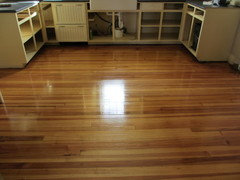
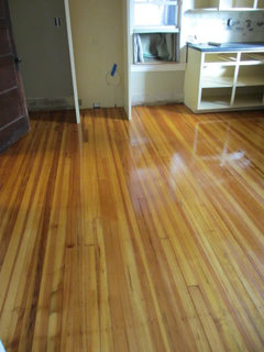
I love that they remind my DH of a basketball court (one of his favorite places to be)!
equest17
Original Author11 years agolast modified: 9 years agoOnedogedie, thanks for your interest. I don't know if you'll see this post, as I think it's too old to come to the top of the thread listing. But I got your email and went searching for my old posts.
Like so many DIY folks on here, the remodel is dragging on. I'm a little embarrassed that it's been over six months since I posted and we're not finished yet! I've ordered my undercabinet lighting and have to wait for it before I complete the backsplash (we have to do some routing out of plaster to run the wires. I hope to post a partial reveal in the next few weeks.


onedogedie