Shop Products
Houzz Logo Print
enduring

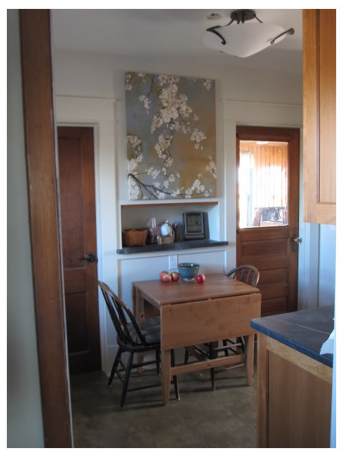
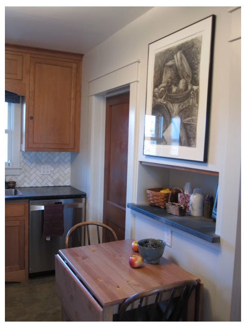
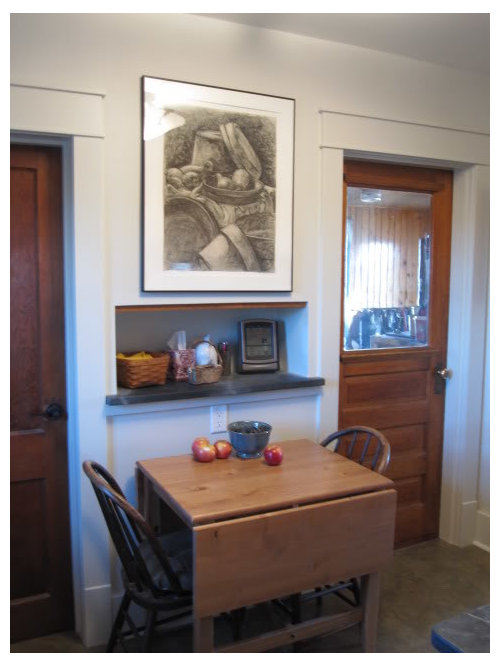
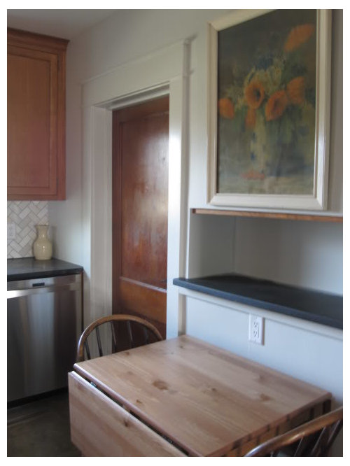
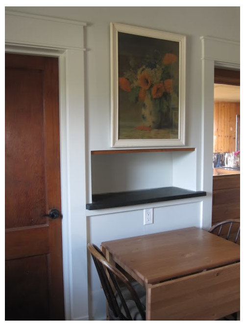
Help me please - pick out a picture option to hang in kitchen

enduring
12 years ago

Help me pick a picture to put in my very small kitchen location. Nothing is set in stone. There is always opportunity for another idea :)

Below are 5 options each taken from 2 diffent locations in my kitchen.

Extra large blue-green-rust colored with white blossoms I got yesterday at Lowes on sale. I consider this transitional, am I right? I can repurpose easily enough. I think it may be "over the top" large:

Pair of rather plain intentionally yellowed botanical prints I got cheap (for the frames):

Charcoal drawing of gourds and pots that I did some years back:

Old poppy and dasiy print in old white painted frame:

Silk screened print that is needing remounted on its matt:

Your thoughts would be so helpful and appreciated.

Comments (39)

  • greenhousems
    12 years ago

    Hi Enduring.

    I like that Poppy/Daisy selection.

    Rosaleen

  • Mercymygft
    12 years ago

    I like your drawing. I love original art.

  • remodelfla
    12 years ago

    I like the blossoms piece best based on content alone; but it's too big for the space and the colors don't feel right. My eye wants whatever you pick to end at the height of the moulding. SO scale wise the Poppys, but I think with a darker frame.

  • mtnrdredux_gw
    12 years ago

    I vote for your drawing. It's subtle, like your kitchen. Plus YOU did it! It is really nice in that space. No question

  • enduring
    Original Author
    12 years ago

    I've always loved this painting by Van Gogh. I think it is called Almond Blossom, but not sure:

  • Kode
    12 years ago

    I like the big blossom one for a couple reasons:

    1) looking at the one picture that shows your backsplash it seems to enhance/echo the subtle shadings of the BS. Maybe I'm not seeing it right, but to me the BS seemed "more visible" somehow in the comparison picture of the blossoms.

    2) the perspective could be off, but to my eye it looks like the doors molding are two different heights. I think the top of anything between them should be way above or way below the moldings, otherwise it will draw the eye to the uneven line there.

    My 2 cents tossed in.

  • cat_mom
    12 years ago

    Gourd drawing, but definitely re-framed using matte glass (or museum glass--just something less reflective), a different frame (stay dark, but go a little more substantial), and perhaps, a softer mat color (?). I think it works well in your space, looks nice, and it's all the more special because you drew it!

  • Redhead47
    12 years ago

    My vote goes to the gourd drawing, too.

    Very special that it is your own work. You should be proud of it & display it well.

    I also agree about changing to non-reflective glass and a more substantial frame (wood tone, maybe). Mat color could pick up the tones in the backsplash -- that would bring it all together. Perfect for the space.

  • Stacey Collins
    12 years ago

    I like the blossom print (first) best for the way the color and form play with the rest of your kitchen, but it's DEFINITELY too large for the space.

    The last one (fish print) seems like the right scale, but it's not as fabulous color- and design-wise.

    While I like the charcoal drawing, and LOVE that you did it, I also think it's too crowded in the space. Same with the poppy painting. I feel like there needs to be at least a couple of inches breathing space between the frame and the niche and door trim...

  • pupwhipped
    12 years ago

    I don't like anything that goes bigger then your doors. Your doors and their moldings are fabulous! So, of your choices, I think the scale of the botanical prints are best. I like the poppy picture, if it were just smaller. Also, the bigger pictures dwarf your table.

    What about a dried wreath of some sort? Do you like that look at all? Also, I can see oversize knife, fork and spoon there.....or decorative plates.

    Oh, I hate it when people suggest things you don't have. HA! So, I will stick with my original thought. Let your beautiful doors and mouldings be the star...keep the item smaller.

  • LottieS
    12 years ago

    Vote for your drawing! You did a lovely job and it's nice to display original work-makes your kitchen even more personal. I love the Van Gogh picture too and would love to see it in person. You're right it is called Almond Blossom.

  • ellendi
    12 years ago

    I like your drawing as well. I also like the two botanicals. Others are nice but seem to overwhelm the space. (Afer all, we do not want to take too much attention away from your backsplash!);)

  • sixtyohno
    12 years ago

    Your drawing definitely!!!

  • Bunny
    12 years ago

    I vote for 1) gourds, 2) poppies. I love that you did the drawing of the gourds. As others mentioned, swap out the glass and do a new frame and matte. It will make it a little large, but I think its originality trumps perfect size. The poppies look nice in that spot. I don't care that much for the blossoms, plus it's way too big. The two botanicals are okay, but kinda blah. I like the fish, but not in your kitchen...like I've even been in your kitchen. :) Speaking of which, I'd love to see the rest of your kitchen.

  • BalTra
    12 years ago

    YOUR DRAWING!!!

  • Stacey Collins
    12 years ago

    I hesitate to suggest this because in theory I MUCH prefer the idea of your original art to something mass-produced.... but I do like the colors for this room.

    So here's my idea: Is the Lowes print just canvas on wood stretcher bars? if so, you should be able to remove it, buy shorter stretcher bars that fit the space better, and restretch it. If it sounds too difficult, ask at an art-supply store (especially a real, local one -not like a chain) because they can often do it for you.

  • herbflavor
    12 years ago

    Like the fish , but- paint that wall a persimmon red...raise the pic up a few inches-then you've got a red white and blue thing going on-isn't this a country setting?-now you have a fresh take on that for this wall.[keep the gray curtain-it works with the fish and red wall].

  • gardenamy
    12 years ago

    My vote is for your drawing!!! I think it "adds" to the space and the others look too busy. Ties in nicely with your countertops...and you did it!!!

  • suzanne_sl
    12 years ago

    I like the fish in that space. With all the white space around them, and the vibrant color of the fish, it just pops that wall.

  • cawaps
    12 years ago

    If you need another vote saying pretty much the same thing, I also love the blossoms print but think it it way too big. Of all of them, though, I like the colors of it the best.

    Of the rest, I like yours the best, followed by the poppies. I think that the poppies need to be reframed, though. The white frame gets totally lost. I'd like to see a frame that matched the wood in your kitchen.

    I don't care for the botanical prints (too yellow), and while I like the circling salmon, I don't think they fit the space.

  • rosie
    12 years ago

    Of the pieces themselves, my favorite is also your own drawing. Very nice! However, considering just the spot itself, looking at the shape, it'd be the smaller silk screen, which echoes that square.

    That said, my vote, as here in my own house, goes to whichever piece gives you the most pleasure. Period.

  • enduring
    Original Author
    12 years ago

    OMG Stacey!!! brilliant!! Yes it is on stretchers and is just canvas. I can do anything!, and if I screw it up WTF :)

    pLease don't censor me for that comment.

    I love the idea Stacey, then maybe I can cut out a bit of the large piece of rust color in the lower right side. Of course I would need to make sure it was well balanced and lyrical. Its actually hanging sideways from how it was intended to hang, can you tell?;) I like the branching so would want to keep as much as possible.

    Greenhouse, pupwhipped I love that old poppy print so much. My late DFL got that at one of the MANY farm sales he attended in his retirement. BTW Pup, thanks for the deco ideas but I want "fine art" in my new kitchen;)

    BalTra, Mercy, Lottie, Cat , Mtntredux, sixtyohno, redhead, ellendi, Thanks for your input. Reframing is on my list for that charcoal. I framed it years ago with archival board but not thick matt board and the frame does not have visual substance. It is a floating mount and if I had it mounted regularly it would take up a bit less space. Will definitely use non reflective museum quality glass.

    Kode, remodelfla did you see Staceyneil's suggestion that I cut the Lowes print down? Great idea. Thanks for your vote. Kode I liked your observation of the shading and you're right the doors are not the same height. This old house was adjusted several times. The casing is brand new poplar that a carpenter friend did for me at a fair price.

    The doors are old and cute.

    Who ever said they wanted to see the rest of my kitchen is pretty much looking at 1/2 of the kitchen. It is small. I plan to do a posting in the future when I get it done.

    Thanks all.

  • Kode
    12 years ago

    Another case of the GW collective brain finding a solution. I am awed and amazed yet again at how that works here.

    Gratz, enduring, on your beautiful new "fine art" :)

  • enduring
    Original Author
    12 years ago

    Herbflavor, I just don't think I could paint that wall! Yes this is a farm house but I'm more of dual citizen when it comes to city vs country.

    Gardenamy, Thanks for the drawing vote, It needs reframing badly. At this point it is my standby. But I just think its not colorful enough for my kitchen.

    suzannesl, That silkscreen is usually in our extra room, I just put it up to see. I don't think I will go with it though, it is too stiff for me. It needs to be remounted too, it has fallen from its mount inside.

    cawapa, Did you see staceyneil's suggestion to cut the Lowes pic down? I just might do that if I can't decide on anything else.

    rosie thanks for your input for the charcoal. it could be smaller by a bit if it got reframed.

  • uroboros5
    12 years ago

    Chardcoal, for size, color and style.

  • pupwhipped
    12 years ago

    Okay, Enduring, let me just say, I'm still adamant here. HA! Get the proportion right...don't take away from your beautiful door mouldings! Now, Staceyneil's idea is really good....in theory, any way. I don't have a clue how you do that, but go for it. I thought from the start that the Lowe's piece, colorwise, was nice, but it's HUGE!!!!! It's the print that ate Cleveland! If you can scale that puppy down, GREAT. It really would look good with your backsplash...and with that new window treatment I just saw on another one of your threads.

    Hope it all works out. Oh, and duh, I love your backsplash. I think I mentioned it somewhere along the line in another post, but just had to say it again here.

    pup

  • sochi
    12 years ago

    I vote for poppies re-framed, but I'd like to see what the Lowe's canvas is like smaller, good suggestion.

  • Stacey Collins
    12 years ago

    Here's what I'd do:

    1) Make a "frame" out of a large sheet of paper or cardboard where the cutout middle are is the ideal size for the final piece (I like the proportions of the fish print, approximately.) Adjust size as needed to standard stretcher bars (which you can get at any art supply store or online: for example: http://www.rexart.com/regstretcherstrips.html#2148)

    2) spend some time moving it around the original piece to find the composition you like best.

    3) Unstaple the canvas, cut, restretch on the new bars. There should be plenty of tutorials on line. I stretched hundreds of them in art school! There's a tool called canvas pliers that makes it easier, you could probably make do without it though.

    Youtube video about restretching:
    http://www.youtube.com/watch?v=QkToBRa-O-U

  • sail_away
    12 years ago

    I like the charcoal drawing best (and it's a bonus that the artist is in-house), with the artwork from Lowe's second (if it were a bit smaller).

  • dianalo
    12 years ago

    Your drawing best, with the botanicals second.
    Use the Lowes print elsewhere...

  • fks3
    12 years ago

    Happy New Year. If it's not too late - I vote for your original.

    I am partial to black & white photos and love charcoal drawings. It looks right in that space

  • michoumonster
    12 years ago

    i vote for the fish. the color is great and really pops. otherwise, i would paint the wall and use your drawing.

  • enduring
    Original Author
    12 years ago

    Uroboros5, Sail-away, Dianalo, FKS3: thanks for the charcoal vote. I will be getting that one reframed. Can't wait to get that done. I've been dragging my feet to spend the $.

    Pupwhipped, Love it-what you said about Cleveland. I am going to cut that sucker down.

    Michoumonster, thanks for the fish vote but I probably wont go with that one. I think the size is right. It needs remounting. The print is a little stiff for me in this room I think, and I don't like all of the white background. I must be leaning towards more color.

    Sochi, I love those darned poppies, I've had it hung in that location for years in my UGLY old kitchen and didn't care one bit that it was large. Then, the white frame was ok because there was other white in the room. But now I agree that the frame is wrong. I don't know if the print would survive a reframing.

    Stacey, thanks for the tips and I will watch that Youtube video. I have been thinking I could even see if I could get a set of "paintings" out of the one. That might be too much. A simple single might be best with this print.

  • jejvtr
    12 years ago

    Enduring

    What a great dilemma to have! Too many pieces of art to choose from.

    I agree with many posters here about the scale issue - that said & looking at recommendations of the Lowes floral - I think if you do choose that I would be sure the cutting/stretching to fit the location, doesn't morph the artwork into something that appears like it was cropped to fit the space.

    I LOVE your original but it does overwhelm the space & think you would need a different wall color to use it in that space.

    Of all I think the botanicals are best suited for the space - to me, they look period, and they belong - scale, size, material, colors - they hit the beginning of top of door frame just right.

    The poppies are lovely - but the frame distracts from the artwork - it may be too large in scale.

    Posting broader pics of your lovely kitchen may render different perspectives. What are your accent colors - which window treatment did you decide on. Those decisions will also help drive the artwork.

    Best to you

  • boxerpups
    12 years ago

    I vote the first picture of blossoms
    and the first curtain in your other post.
    ~boxerpups

  • lazydaisynot
    12 years ago

    I like the blossoms and I'll go out on a (flowering tree) limb here and admit that I like its size. It almost feels like a tapestry, which makes its scale seem right to me. My preference is generally to hang art lower rather than higher but in this case I would scoot it a bit higher so it doesn't look so crowded at the bottom. The fact that it busts out of the space and extends way beyond the moldings appeals to me.

    As for the valance in your other thread, I like your Ikea fabric but if you don't need a valance my preference would be to keep the window bare because the horizontal line of the valance's bottom makes the bottom curve of your wood valance less apparent. I like that curve.

    I hope you find a spot to hang your gourd painting (other thread). It's great.

  • enduring
    Original Author
    12 years ago

    jejvtr, thanks for you input. You're seeing just about the whole kitchen in those shots. It is 12x7.5" & with 4 doorways.

    Boxer, thanks for your votes. I really love the blue-green floral branches. Maybe it wont be this one. I need some time to consider. If I decide not to use it I will give it to my 15yo niece who just helped my DH build a 12x12 cabin for her behind her DM's main home. There is a loft and insulation. I'm sure she will need a picture and this Lowes picture would be lovely. I'm not sure if I want to hang as is, cut it up, or give it to her.

    Lazydaisynot, I like your idea of raising this picture. I will give it a try. I sometimes like the extra large size of the print because it is almost like wallpaper. I will raise it and have a look.

    Thanks one and all. It has been a very helpful exercise. I will consider the input and in the next 2-3 weeks, hopefully, make a decision on something. I may end up with something totally new. This really helped guide me in a direction.

  • jscout
    12 years ago

    I think the yellowed botanical ones look best. But your personal art trumps everything, even though the scale is off.

  • jeanz
    12 years ago

    I DEFINITELY vote for either the gourds or the silk-screen print, but since you drew the gourds, that's the one I'd choose. It's awesome, is the right size, is the right theme for a kitchen (veggies.) GOR FOR IT!