


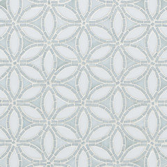
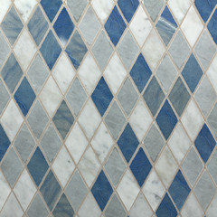
White Beveled Arabesque In Our Kitchen? Bee's opinion please!
sarends
11 years ago


Featured Answer
Comments (52)

enduring
11 years agolast modified: 9 years ago
berardmr
11 years agolast modified: 9 years agoRelated Professionals
Everett Kitchen & Bathroom Designers · South Farmingdale Kitchen & Bathroom Designers · South Farmingdale Kitchen & Bathroom Designers · Honolulu Kitchen & Bathroom Remodelers · Idaho Falls Kitchen & Bathroom Remodelers · Kuna Kitchen & Bathroom Remodelers · Lynn Haven Kitchen & Bathroom Remodelers · Omaha Kitchen & Bathroom Remodelers · Omaha Kitchen & Bathroom Remodelers · East Saint Louis Cabinets & Cabinetry · Lackawanna Cabinets & Cabinetry · Sunrise Manor Cabinets & Cabinetry · South Holland Tile and Stone Contractors · Glassmanor Design-Build Firms · Oak Hills Design-Build Firms
AboutToGetDusty
11 years agolast modified: 9 years agobeekeeperswife
11 years agolast modified: 9 years agosarends
11 years agolast modified: 9 years agohobokenkitchen
11 years agolast modified: 9 years agosarends
11 years agolast modified: 9 years ago
Debbi Branka
11 years agolast modified: 9 years ago
eam44
11 years agolast modified: 9 years agoenduring
11 years agolast modified: 9 years ago
Bunny
11 years agolast modified: 9 years agosarends
11 years agolast modified: 9 years ago
sprtphntc7a
11 years agolast modified: 9 years agoenduring
11 years agolast modified: 9 years ago
Gracie
11 years agolast modified: 9 years agohobokenkitchen
11 years agolast modified: 9 years agoAboutToGetDusty
11 years agolast modified: 9 years agoAboutToGetDusty
11 years agolast modified: 9 years agoEATREALFOOD
11 years agolast modified: 9 years agoeam44
11 years agolast modified: 9 years agoIvan I
11 years agolast modified: 9 years ago
gsciencechick
11 years agolast modified: 9 years agoalex9179
11 years agolast modified: 9 years ago
autumn.4
11 years agolast modified: 9 years agoAboutToGetDusty
11 years agolast modified: 9 years agoAboutToGetDusty
11 years agolast modified: 9 years ago
_sophiewheeler
11 years agolast modified: 9 years agosarends
11 years agolast modified: 9 years agocrl_
11 years agolast modified: 9 years agosarends
11 years agolast modified: 9 years agocrl_
11 years agolast modified: 9 years agosarends
11 years agolast modified: 9 years ago
function_first
11 years agosarends
11 years agolast modified: 9 years agoGracie
11 years agolast modified: 9 years ago
mtnrdredux_gw
11 years agolast modified: 9 years agocrl_
11 years agolast modified: 9 years agosarends
11 years agolast modified: 9 years agoeam44
11 years agolast modified: 9 years agosarends
11 years agolast modified: 9 years ago_sophiewheeler
11 years agolast modified: 9 years agokellienoelle
11 years agolast modified: 9 years agoeam44
11 years agolast modified: 9 years agosarends
11 years agolast modified: 9 years agosarends
11 years agolast modified: 9 years agosarends
11 years agolast modified: 9 years agohobokenkitchen
11 years agolast modified: 9 years agogsciencechick
11 years agolast modified: 9 years agosarends
11 years agolast modified: 9 years ago


Related Stories
TILEMoor Tile, Please!
Add an exotic touch with Moroccan tiles in everything from intricate patterns and rich colors to subtle, luminous neutrals
Full Story
KITCHEN DESIGNCooking With Color: When to Use White in the Kitchen
Make sure your snowy walls, cabinets and counters don't feel cold while you're riding white's popularity peak
Full Story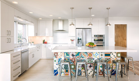
KITCHEN DESIGNNew This Week: 4 Ways to Punch Up a White Kitchen
Avoid the hospital look by introducing a bit of color, personality and contrast
Full Story
MOST POPULARMust-Try Color Combo: White With Warm Off-White
Avoid going too traditional and too clean by introducing an off-white palette that brings a touch of warmth and elegance
Full Story
KITCHEN DESIGNKitchen of the Week: A Dark Kitchen Brightens Up
A cooking space honors the past while embracing the present
Full Story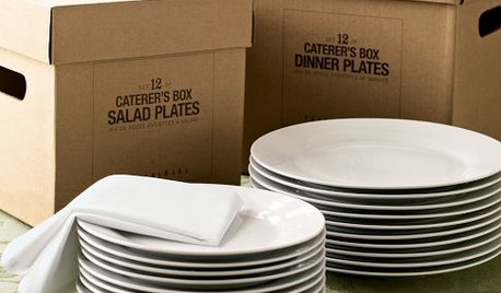
PRODUCT PICKSGuest Picks: White Dinnerware for the Holidays and After
Table settings in white can take you through the entire entertaining season and beyond, whether your style is casual or formal
Full Story
KITCHEN DESIGNThe Best Backsplashes to Pair With Wood Counters
Simplify your decision-making with these ideas for materials that work well with wood counters
Full Story
MOST POPULAR8 Great Kitchen Cabinet Color Palettes
Make your kitchen uniquely yours with painted cabinetry. Here's how (and what) to paint them
Full Story
KITCHEN DESIGNKitchen Countertops 101: Choosing a Surface Material
Explore the pros and cons of 11 kitchen countertop materials. The options may surprise you
Full Story
KITCHEN COUNTERTOPS10 Top Backsplashes to Pair With Soapstone Countertops
Simplify your decision-making process by checking out how these styles work with soapstone
Full Story


ae2ga