


How do you coordinate without being matchy-matchy?
peace_rose
14 years ago


Sort by:Oldest
Comments (27)
Related Stories
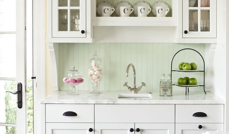
KITCHEN DESIGNHow to Mix Metal Finishes in the Kitchen
Leave matchy-matchy to the catalogs and let your kitchen's personality shine with a mix of metals for hardware and fixtures
Full Story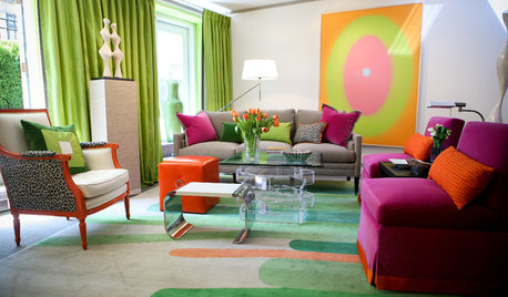
BOLD COLORBe Bold, Be Brave With Color
Add some fearless color to your home with help from designers who do it well
Full StoryDINING ROOMS10 Foolproof Ways to Mix Up Your Dining Chairs
Kick matchy-matchy to the curb and go for dining chairs that pull off a cohesive look with personality
Full Story
LIFE10 Reasons to Be Happy You’re a Renter
Homeownership has many benefits, but there are upsides to not owning a home too
Full Story
DINING ROOMS12 Ways to Make the Most of Your Dining Room Corners
More storage, artwork display space or a roaring fire to enliven your dining area can all be yours ... if the corners are right
Full Story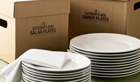
PRODUCT PICKSGuest Picks: White Dinnerware for the Holidays and After
Table settings in white can take you through the entire entertaining season and beyond, whether your style is casual or formal
Full Story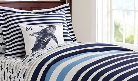
PRODUCT PICKSGuest Picks: Bedroom Decor a Little Boy Will Love
Set him up in a room filled with airplanes, maps and a bug or two, and you’ll be set for decor for years
Full Story
DECORATING GUIDESStrategies to Create Color Flow Throughout a Home — a Case Study
Unite your indoor and outdoor rooms with a consistent color palette, for cohesion and a polished look
Full Story
DECORATING GUIDES12 Deadly Decorating Sins
Are your room designs suffering from a few old habits? It may be time to change your ways
Full Story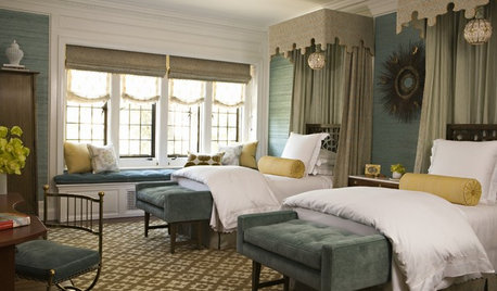


homey_bird
plllog
Related Professionals
King of Prussia Kitchen & Bathroom Designers · New Castle Kitchen & Bathroom Designers · Pike Creek Valley Kitchen & Bathroom Designers · San Jose Kitchen & Bathroom Designers · North Druid Hills Kitchen & Bathroom Remodelers · Sunrise Manor Kitchen & Bathroom Remodelers · Green Bay Kitchen & Bathroom Remodelers · Saint Augustine Kitchen & Bathroom Remodelers · South Barrington Kitchen & Bathroom Remodelers · Terrell Kitchen & Bathroom Remodelers · Murray Cabinets & Cabinetry · Wyckoff Cabinets & Cabinetry · Phelan Cabinets & Cabinetry · Gardere Design-Build Firms · Suamico Design-Build Firmsamberley
peace_roseOriginal Author
plllog
peace_roseOriginal Author
plllog
peace_roseOriginal Author
bmorepanic
Circus Peanut
lascatx
plllog
plllog
lascatx
plllog
peace_roseOriginal Author
plllog
peace_roseOriginal Author
plllog
bmorepanic
plllog
peace_roseOriginal Author
plllog
peace_roseOriginal Author
growlery
peace_roseOriginal Author
plllog