


dr.girlfriend's mega before-and-after kitchen thread
dr.girlfriend
9 years ago
Sort by:Oldest
Comments (33)
Related Stories
FRONT YARD IDEASBefore and After: Front Lawn to Prairie Garden
How they did it: Homeowners create a plan, stick to it and keep the neighbors (and wildlife) in mind
Full Story
LIFE7 Things to Do Before You Move Into a New House
Get life in a new house off to a great start with fresh paint and switch plates, new locks, a deep cleaning — and something on those windows
Full Story
CONTRACTOR TIPS10 Things to Discuss With Your Contractor Before Work Starts
Have a meeting a week before hammers and shovels fly to make sure everyone’s on the same page
Full Story
RANCH HOMESMy Houzz: Paint and Pluck Revamp a Portland Ranch
A 1930s fixer-upper becomes a cheery and personal home at the hands of an industrious homeowner
Full Story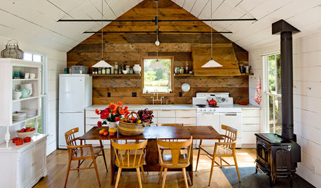
KITCHEN DESIGNA Single-Wall Kitchen May Be the Single Best Choice
Are your kitchen walls just getting in the way? See how these one-wall kitchens boost efficiency, share light and look amazing
Full Story
KITCHEN DESIGNSingle-Wall Galley Kitchens Catch the 'I'
I-shape kitchen layouts take a streamlined, flexible approach and can be easy on the wallet too
Full Story
KITCHEN DESIGN12 Items Worth a Spot on Your Kitchen Counter
Keep these useful tools and accessories out in the open to maintain high function without spoiling the view
Full Story
HOUZZ TOURSMy Houzz: Twister Damage Sparks a Whole Ranch Remodel
A Dallas couple transforms their traditional rambler into a bright, family-centered haven after a tornado
Full Story
DECORATING GUIDESDecorating 101: How to Use White Right
If you’ve ever been in white-paint-swatch limbo, you know white can be tricky to work with. Here’s how to get the fresh look you’re after
Full Story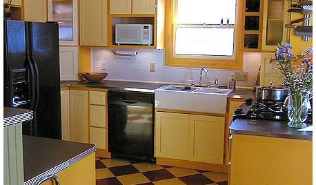
KITCHEN DESIGNKitchen Remodel Costs: 3 Budgets, 3 Kitchens
What you can expect from a kitchen remodel with a budget from $20,000 to $100,000
Full StorySponsored
More Discussions


heritagehd07
raee_gw zone 5b-6a Ohio
Related Professionals
Grafton Kitchen & Bathroom Designers · Riviera Beach Kitchen & Bathroom Designers · Glade Hill Kitchen & Bathroom Remodelers · Chandler Kitchen & Bathroom Remodelers · Fort Washington Kitchen & Bathroom Remodelers · Las Vegas Kitchen & Bathroom Remodelers · Oceanside Kitchen & Bathroom Remodelers · Santa Fe Kitchen & Bathroom Remodelers · Avocado Heights Cabinets & Cabinetry · Forest Hills Cabinets & Cabinetry · Maywood Cabinets & Cabinetry · Saint James Cabinets & Cabinetry · Roxbury Crossing Tile and Stone Contractors · Bell Design-Build Firms · Woodland Design-Build Firmslee676
nightowlrn
funkycamper
zorroslw1
Shelley Graham
bpath
mrspete
practigal
dr.girlfriendOriginal Author
dr.girlfriendOriginal Author
christina222_gw
ainelane
funkycamper
fldirt
dr.girlfriendOriginal Author
mgmum
lenzai
desertsteph
deedles
jlc712
funkycamper
nmjen
sombreuil_mongrel
szruns
steph2000
Errant_gw
lisa_a
tinker1121
dilly_ny
ghatta
User