Shop Products
Houzz Logo Print
fouramblues

pics of retro backsplash with pencil liner?

fouramblues
11 years ago

I've been taking a break from kitchen stuff recently. My budget and, frankly, my interest/stamina had dwindled. But we really want to get the backsplash in this spring, so I need to get all my ducks in a row. I hope you can help!

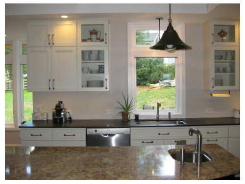
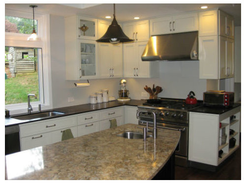
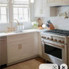
A while ago I posted for help deciding on what to do with the BS. Here are pics of my ABB kitchen:

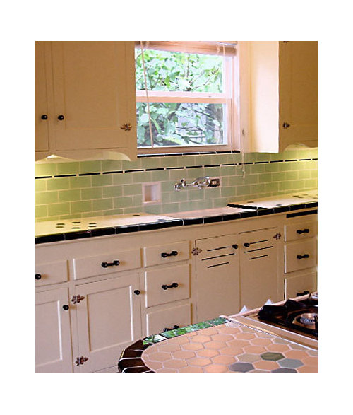
You came up with lots of great ideas in that thread, but the one that just seemed right was donaleen's suggestion of a vintage-vibe BS with pencil liner. (Thanks, donaleen!) I might take artistic license with the height. Here's the photo example she posted (sorry, I don't know to whom to give credit!):

Do any of you have other examples of this type of simple BS with pencil liner? I think it would really help me envision what it'll look like in my space.

Many thanks!

Here is a link that might be useful: my old backsplash thread

Comments (31)

  • debrak_2008
    11 years ago

    Here are some photos of my newly installed backsplash. The photos aren't great. When my camera batteries charge I should take better photos.

    Jog around stove. Note stove is not pushed back in this photos.

    The subway tile was $2 something per SF. Pencil line was inexpensive as well.

  • Fori
    11 years ago

    Here's a favorite--not mine, unfortunately!

    Here is a link that might be useful: http://finishedkitchens.blogspot.com/2007/06/jgarner53s-kitchen.html

  • Donaleen Kohn
    11 years ago

    That is indeed a nice one, Fori. I like that whole kitchen.

  • fouramblues
    Original Author
    11 years ago

    debrak, trust me, I've looked at the pics of your splash many times. I really like it, and the view of a whole wall really gives me a feel for how the liner will look in my kitchen. Thanks!

    fori, I'm with donaleen (hi again, donaleen!): that kitchen is a beauty! I love just about everything about it. I'd always thought that I'd run the splash up to the cabs and to the ceiling around the window. But now that kitchen really makes me want to go with the 12". I'm just not sure how to deal with the above the range area. Thank you so much for that link!

    Any other good inspiration pics out there?

  • Donaleen Kohn
    11 years ago

    Found a thread you might like

    Here is a link that might be useful: pencil line

  • Fori
    11 years ago

    Hehe. I always liked a lot in JGarner's kitchen (in spite of how I phrased it when I linked to it which I think was imprecise) which is why I remembered it. I don't remember many kitchens, but I remembered that one from the original remodel.

    I would show you my retro bathroom with the pencil line but I'd like to encourage you to do it, not scare ya! :)

    I was thinking that one you posted might be from a Rejuvenation catalog, but there are no lamps. Hmmmm.

    Anyway, your kitchen is awesome, 4AM, and a retro pencil liner would be perfect.

  • fouramblues
    Original Author
    11 years ago

    That is a fun thread, donaleen! Some nice pics of pencil liner.

    fori, I knew what you meant in your initial post. :) jgarner's kitchen is wonderful. And I'd like to see your retro bathroom; I'm sure it's not as scary as you seem to think. The bathroom in my grandma's old house is mint green and black, and I love it. Reminds me of Angie_DIYs, though not as stylish as Angie's. Finally, thank you for your kind words about my kitchen! I can't wait to pull together the last elements, though I'm very much enjoying it in spite of its ABB status.

    So here's my dilemma... I don't want to emphasize that my range run ends abruptly. Here's a head-on shot:

    I really like the feel of tito's finished kitchen:

    But this way of terminating around the range won't work with my range run. So maybe I need to do what jgarner did, leaving a bit of drywall around the tile above the range:

    Is it safe to have exposed drywall above the range (which is all I have now)? Would it look good in my kitchen? (I won't have a nook above the range, but there will be a narrow stainless shelf eventually.) I'm just having such a hard time envisioning this...

  • debrak_2008
    11 years ago

    What's on wall as you turn the corner? Hard to see in the photo.

  • fouramblues
    Original Author
    11 years ago

    debrak, it's about 2' of backsplash (open shelves below, cabs above) before you hit the pantry door. This is the best picture I have of that area:

  • Fori
    11 years ago

    I'd run it around the corner and die into the toaster.

    Actually I'd be playing with masking tape. Lots and lots of tape. :)

  • fouramblues
    Original Author
    11 years ago

    fori, the masking tape idea is genius!! Too bad I tore off the blue painter's tape on the top moulding, I could have reused it.

    I was thinking small, not big, so I played with colored pencils on a poor printout of a pic (tile not to scale):

  • Donaleen Kohn
    11 years ago

    why don't you try bringing the tile all the way to the side cabinets.... the trim tile would then butt up against the cabinet.

  • marcolo
    11 years ago

    I don't like the line remaining horizontal across the teapot handle. I'd follow the swoop. The top, thicker line can be a bullnose or cap molding.

    You should swoop down under the window, also, for full effect.

    I'm doing this only behind my range, because I realized that long cabinet brackets and pencil liners don't mix that well.

  • Fori
    11 years ago

    Since Marcolo brought up a thicker cap molding, you can see part of my groovy bathroom. This is from the 1950s and a little different from the 20s style, but I like the thick edge piece. It's looking tired here and needs a major facelift (to better frame the tile of course):

    Bad picture, but the cap is the same as this one (different color, obviously) that also forms the front of the vanity counters:

    (Sadly, the minty green tile can't be saved).

    (Have you considered a minty green?)

  • Donaleen Kohn
    11 years ago

    I think you are on to a good thing with your pencil drawing. Try Marcolo's idea. Try mine. You will figure out what you like. One thing, be sure and get some contrast and color in your pencil line.

  • ljwrar
    11 years ago

    Here are more examples with a thicker cap molding. These are from 1931.

  • debrak_2008
    11 years ago

    Try using black electrical tape on the wall to get the effect. Its not that sticky.

  • fouramblues
    Original Author
    11 years ago

    fori, love your bathroom! The green is the same as my grandma's and the pink is so retro. So pretty. And we did consider minty green for the kitchen, but DH think's it's too bathroom-y. :)

    ljwrar, thanks for the pics! That vintage kitchen is beautiful, and I really like the thicker cap. DH, however, isn't sold.

    debrak, when I think I've settled on the design, I'm going to do a real-life mock-up with painter's tape. Seems a little safer than electrical, and the color doesn't bother me.

    So here are some mock-ups, a la donaleen, marcolo, and me:

    I think I like the second the best (marcolo's), but have two reservations: will my 2' narrow shelf (aligned with the bottom of the top cabs) look OK with this; and that looks like much more complicated tile work, and I'm DIYing this!

    So what do you think? Anyone care to vote?

    Thanks so much for helping me brainstorm!

  • Donaleen Kohn
    11 years ago

    Hmmm... try an arc above like Marcolo said (like the guy in the kitchen we both like)... he has something that mimics a hearth look. Also try just continuing your double line behind the stove (don't go up). You could put a small shelf behind the stove. Things will get dirtier there but as long as they are easily cleaned, it shouldn't be too bad.

    If you do want to go up, the top horizontal line should be lower.

  • marcolo
    11 years ago

    Can you mock up your shelf?

    Also don't forget the window. Your two best options there, I think, are to have both lines die into the window casing, or to have the top cap die into the window facing, with the pencil liner turning down and dying into the countertop. Mock up both.

    Both the window and the range tile patterns need to work together.

  • Fori
    11 years ago

    I don't like having both lines railroad over the stove together--it makes the area behind the range look squishy.

    I think you need to put up a cardboard shelf before anything else. Painted or stainless or stone? If you don't have it yet, can it be...tile?

  • angie_diy
    11 years ago

    I'm late to the party, but here is my inspiration photo:

    I am still planning to do a pencil liner myself, but still stalled!

  • fouramblues
    Original Author
    11 years ago

    Ooh, that's a good one, Angie! I love having a to-the-counter window, but it does mean missing out on some fun like in that pic.

    About windows, marcolo, I'd always just assumed both lines should die into the window trim, so now I have another decision to make!

    donaleen, I love that arch, but there's no way this DIYer is going there!

    About the shelf, this is what I'm thinking:

    I realize that the reason I wanted this shelf in the first place is to add visual interest to a completely plain field of tile. Now that we're considering doing interesting things with liner and caps, maybe it's not necessary. So that's something to consider.

    Here are the options so far, with a poor rendering of the perhaps unnecessary shelf:

    The cap in the first three pics is still right under the hood, and I agree that it might look better a little lower but haven�t redrawn it yet.

  • Donaleen Kohn
    11 years ago

    I see your point. You could also add interest there with something hung on the wall. Maybe something simple and made of pottery. I am not a fan of fancy backsplashes above the stove. I know they are very popular BUT I wouldn't want something that permanent as a decoration. I like the flexibility to change the decorations and keep the more permanent stuff simple.

    I read something recently that said although we believe our taste has changed a lot in the last decade, we don't believe it will change a lot in the next decade... and yet, it will.

    They found that people underestimated how much they will change in the future. People just didn't recognize how much their seemingly essential selves would shift and grow.

    Many people take into account how saleable their houses are. Making strong difficult to change decisions in a kitchen certainly have a bearing there. Easy to take down your decoration. Fancy tile.. much harder.

    Here is a link that might be useful: changing over time

    This post was edited by donaleen on Mon, Jan 21, 13 at 13:56

  • cawaps
    11 years ago

    Here is a picture of Joss Whedon's kitchen from the YouTube video "Joss Whedon on Romney."

    Depending on your politics, you may find the video funny or not, but his kitchen is a vintage treat and worth a watch regardless. I found the video when someone here posted a link.

  • fouramblues
    Original Author
    11 years ago

    Interesting article, donaleen. I don't know how much I'll change in the next decade, but I know I won't like a feature range splash in future. That's probably because I'm not a fan of them now! :)

    I'm leaning toward pic #3 with the cap lowered a bit below the hood, no shelf. I think that might feel right proportionally, an would have enough visual interest that I won't feel it needs a shelf.

    Funny video, lovely kitchen, cawaps!

  • fouramblues
    Original Author
    11 years ago

    OK, last one, I hope:

    I like this, but does it look like it's trying too hard to be a "feature" backsplash? BTW, no room for a shelf with this one, details on measurements here:

    Is there a clear winner?

  • Donaleen Kohn
    11 years ago

    I think it looks pretty good. Did you allow for the space of the pencil line tile? I can't tell. Are you going to do brown? Will there be a second color in your pencil line, which is quite usual. It adds a bit of sparkle.

  • debrak_2008
    11 years ago

    Looks like a winner to me.

  • Fori
    11 years ago

    Classic. This is a little lower than the earlier rendition of the double stripe, isn't it? Maybe it's the photo angle, but it seems better proportioned. Will it turn the corner?

  • fouramblues
    Original Author
    11 years ago

    donaleen, I did allow space for the pencil horizontally, but not vertically. I'll redraw it accurately before I start tiling. The pencil and cap will be brown, which goes very nicely with the chocolate Paperstone on the perimeter. I'd love to do a little pop of color in the pencil, but don't think it'll work. Right now I'm having a lot of fun with pops of turquois/teal, but I'm really a green girl, so I can see down the road changing things out to green. I don't want the tile to box me in.

    Thanks, debrak! DH agrees. :)

    fori, the top of the cap is lower over the range than previous pics, so I think it does look better proportioned. I plan for it to turn the corner.

    Thank you all for holding my hand through this decision. I never would have thought of going with a vintage-vibe BS without your inspiration. I'm so excited about what you helped me come up with! So now I'm ready to order (more) samples of tile!