


Do you think this backsplash is going to be too busy?
16 years ago

Sort by:Oldest
Comments (33)
Related Stories
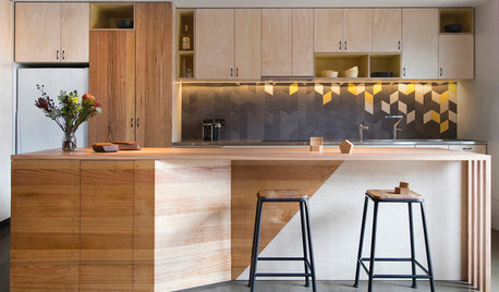
DECORATING GUIDESHow to Go Geometric Without Going Overboard
If your home decorating isn’t adding up, consider angles and shapes to help solve the equation
Full Story
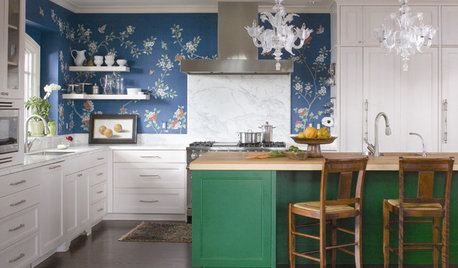
KITCHEN DESIGNWallpaper in the Kitchen: Is It a No or a Go?
A favorite wallpaper brings unexpected color and fun into the kitchen
Full Story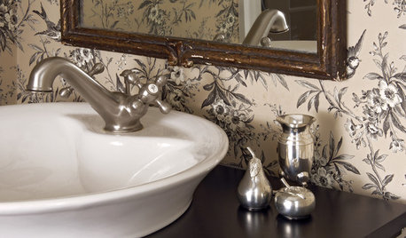
BATHROOM DESIGN10 Ways to Think Outside the Bathroom Sink Box
A Better Bathroom Sink: Go Stainless, Go Big, Go Sculptural
Full Story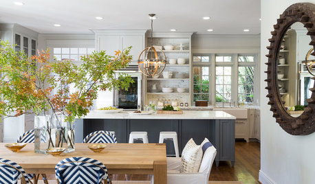
KITCHEN DESIGNKitchen of the Week: Classic Style Creates Calm for a Busy Family
Fresh take on traditional lightens up a kitchen in a large, open space
Full Story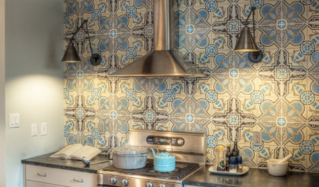
DECORATING GUIDES10 Places To Go Bold With Pattern
Express Yourself With an Invigorating Wall, Floor, Backsplash, Lamp or Rug
Full Story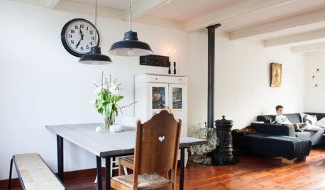
HOUZZ TOURSMy Houzz: Going Heavy on the Metal for Industrial-Style Beauty
Steel and iron pieces mix with antiques and heirlooms in an eclectic Netherlands home
Full Story
HOUSEKEEPINGCan-Do Cleaning Strategies for Busy People
While you dream of having a maid (to go with the cook and chauffer), this simplified cleaning routine can keep your real-world home tidy
Full Story
REMODELING GUIDESFrom the Pros: 8 Reasons Kitchen Renovations Go Over Budget
We asked kitchen designers to tell us the most common budget-busters they see
Full Story
KITCHEN COUNTERTOPSKitchen Counters: Granite, Still a Go-to Surface Choice
Every slab of this natural stone is one of a kind — but there are things to watch for while you're admiring its unique beauty
Full StoryMore Discussions
auchmedden
rmkitchen
Related Professionals
Amherst Kitchen & Bathroom Designers · University City Kitchen & Bathroom Remodelers · Forest Hill Kitchen & Bathroom Remodelers · Folsom Kitchen & Bathroom Remodelers · Galena Park Kitchen & Bathroom Remodelers · Warren Kitchen & Bathroom Remodelers · Wilmington Kitchen & Bathroom Remodelers · Phillipsburg Kitchen & Bathroom Remodelers · Country Club Cabinets & Cabinetry · Oakland Park Cabinets & Cabinetry · Wadsworth Cabinets & Cabinetry · Baldwin Tile and Stone Contractors · Soledad Tile and Stone Contractors · Gardere Design-Build Firms · Oak Hills Design-Build Firmsfran1523
raehelen
remodelfla
luvtoreno
sarschlos_remodeler
dd70
plllog
peggross1
atsmith
rhome410
debo_2006
sue_b
justnotmartha
brosamj
lascatx
vwhippiechick
atsmith
angier_2007
jillypie
atsmith
3katz4me
holligator
athomedad
sherilynn
bklyn2pok
msrose
polly929
mktoni
MariposaTraicionera
mars2006
xoxosmomOriginal Author