


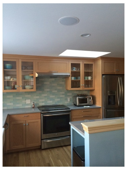
Is this backsplash too "busy?"
newenglandsara2
9 years ago
Sort by:Oldest
Comments (54)
Related Stories
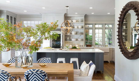
KITCHEN DESIGNKitchen of the Week: Classic Style Creates Calm for a Busy Family
Fresh take on traditional lightens up a kitchen in a large, open space
Full Story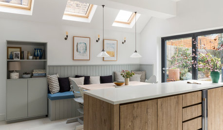
KITCHEN DESIGNA Calm Kitchen for a Busy Family
A London couple and their kids get an eat-in kitchen featuring a serene blue and garden view
Full Story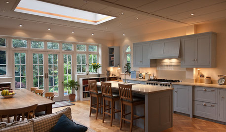
KITCHEN DESIGNA Busy London Kitchen Gets a New England–Style Makeover
Moving an overflowing book collection into a cozy new family room clears the way for a kitchen focused on socializing
Full Story
KITCHEN DESIGNHouzz Quiz: Which Kitchen Backsplash Material Is Right for You?
With so many options available, see if we can help you narrow down the selection
Full Story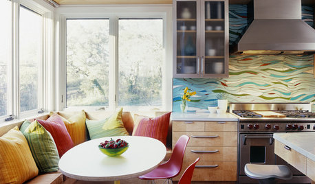
KITCHEN DESIGNKitchen of the Week: Exquisite Artistic Backsplash
Rippling colored glass forms an imaginative wall, while a clever layout embraces practicality in this stunning Texas kitchen
Full Story
KITCHEN BACKSPLASHESWhy You Should Embrace a Solid Slab Backsplash
The effect is stunning, and yet the cost can be minimal. Here’s what to know about using full slabs of stone in your kitchen
Full Story
KITCHEN BACKSPLASHESHow to Choose a Backsplash for Your Granite Counters
If you’ve fallen for a gorgeous slab, pair it with a backsplash material that will show it at its best
Full Story
KITCHEN DESIGNCountertop and Backsplash: Making the Perfect Match
Zero in on a kitchen combo you'll love with these strategies and great countertop-backsplash mixes for inspiration
Full Story
KITCHEN DESIGNHow to Add a Kitchen Backsplash
Great project: Install glass, tile or another decorative material for a gorgeous and protective backsplash
Full Story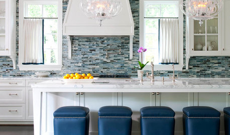
MOST POPULARBattle of the Backsplashes: Glass Mosaics vs. Natural Stone
Read about the pros and cons — and see great examples — of these two popular kitchen backsplash materials
Full StoryMore Discussions


mama goose_gw zn6OH
LE
Related Professionals
Everett Kitchen & Bathroom Designers · Williamstown Kitchen & Bathroom Designers · Charlottesville Kitchen & Bathroom Remodelers · Hoffman Estates Kitchen & Bathroom Remodelers · Idaho Falls Kitchen & Bathroom Remodelers · Trenton Kitchen & Bathroom Remodelers · Walnut Creek Kitchen & Bathroom Remodelers · Crestline Cabinets & Cabinetry · Crestview Cabinets & Cabinetry · Palos Verdes Estates Cabinets & Cabinetry · Prospect Heights Cabinets & Cabinetry · Warr Acres Cabinets & Cabinetry · Corsicana Tile and Stone Contractors · Roxbury Crossing Tile and Stone Contractors · Wyomissing Tile and Stone Contractorsmelle_sacto is hot and dry in CA Zone 9/
kitchendetective
sjhockeyfan325
ck_squared
gabytx12
my_four_sons
honeyb2
teresa_nc7
jlc712
Elisabeth0326
Jillius
antmaril
hyjenist
GauchoGordo1993
Fori
newenglandsara2Original Author
amck2
zorroslw1
romy718
Shelley Graham
Teehee1984
oldbat2be
mrspete
oldbat2be
oldbat2be
Alexander Timofeyev
User
romy718
SparklingWater
raenjapan
HomeChef59
friedajune
arkansas girl
razamatazzy
straikar
Jeannine Fay
rooandcheese
bicyclegirl1
ravencajun Zone 8b TX
andyscott
akl_vdb
newenglandsara2Original Author
feisty68
arch123
nightowlrn
betsyelise
szruns
artemis_ma