


Paint? OMG, thousands of chips later.
bmorepanic
14 years ago
Sort by:Oldest
Comments (22)
Related Stories
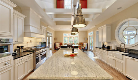
KITCHEN COUNTERTOPSKitchen Countertops: Granite for Incredible Longevity
This natural stone has been around for thousands of years, and it comes in myriad color options to match any kitchen
Full Story
ARCHITECTUREHouzz Call: Show Us Your Logo!
A picture is worth a thousand words, but your company’s symbol may be worth its weight in gold. We’d like to hear the graphic details
Full Story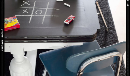
DECORATING GUIDESDIY Project: How to Make a Chalkboard Tabletop
The perfect table for grownups and kids — no power tools required
Full Story
DECORATING GUIDESWhat You Need to Know Before Painting Brick
Sure, painted brick can be a great look. But you need to take some risks into account. Here's how to paint brick like a pro
Full Story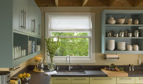
MOST POPULAR8 Great Kitchen Cabinet Color Palettes
Make your kitchen uniquely yours with painted cabinetry. Here's how (and what) to paint them
Full Story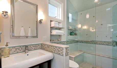
BATHROOM DESIGN6 Elements of a Perfect Bathroom Paint Job
High-quality paint alone won't cut it. For the best-looking painted bathroom walls, you'll need to get these other details right
Full Story
FLOORSHow to Paint Your Hardwood Floors
Know how to apply nail polish? Then you can give your wooden floors a brand-new look
Full Story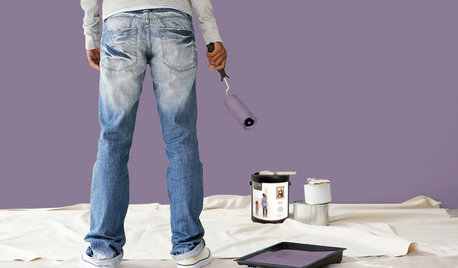
PAINTINGBulletproof Decorating: How to Pick the Right Kind of Paint
Choose a paint with some heft and a little sheen for walls and ceilings with long-lasting good looks. Here are some getting-started tips
Full Story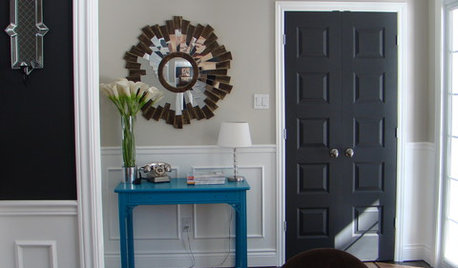
MOST POPULAR11 Reasons to Paint Your Interior Doors Black
Brush on some ebony paint and turn a dull doorway into a model of drop-dead sophistication
Full Story
EXTERIORSHelp! What Color Should I Paint My House Exterior?
Real homeowners get real help in choosing paint palettes. Bonus: 3 tips for everyone on picking exterior colors
Full StorySponsored
Central Ohio's Trusted Home Remodeler Specializing in Kitchens & Baths
More Discussions


prill
John Liu
Related Professionals
Bloomington Kitchen & Bathroom Designers · Georgetown Kitchen & Bathroom Designers · Saint Charles Kitchen & Bathroom Designers · Olympia Heights Kitchen & Bathroom Designers · Waianae Kitchen & Bathroom Designers · Cocoa Beach Kitchen & Bathroom Remodelers · Rancho Palos Verdes Kitchen & Bathroom Remodelers · Santa Fe Kitchen & Bathroom Remodelers · Terrell Kitchen & Bathroom Remodelers · Plant City Kitchen & Bathroom Remodelers · Lockport Cabinets & Cabinetry · Maywood Cabinets & Cabinetry · Watauga Cabinets & Cabinetry · Brentwood Tile and Stone Contractors · Glassmanor Design-Build Firmsbeekeeperswife
zeebee
rhome410
bmorepanicOriginal Author
zeebee
amberley
palimpsest
bmorepanicOriginal Author
rhome410
rhome410
amberley
amberley
rhome410
amberley
bmorepanicOriginal Author
beekeeperswife
rhome410
palimpsest
User
zeebee