


Backsplash tile - opinions? (pics incl)
avntgardnr
9 years ago
Sort by:Oldest
Comments (16)
Related Stories

DECORATING GUIDESNo Neutral Ground? Why the Color Camps Are So Opinionated
Can't we all just get along when it comes to color versus neutrals?
Full Story
KITCHEN BACKSPLASHESHow to Install a Tile Backsplash
If you've got a steady hand, a few easy-to-find supplies and patience, you can install a tile backsplash in a kitchen or bathroom
Full Story
KITCHEN DESIGN8 Top Tile Types for Your Kitchen Backsplash
Backsplash designs don't have to be set in stone; glass, mirror and mosaic tiles can create kitchen beauty in a range of styles
Full Story
KITCHEN DESIGN10 Gorgeous Backsplash Alternatives to Subway Tile
Artistic installations, back-painted glass and pivoting windows prove there are backsplash possibilities beyond the platform
Full Story
KITCHEN DESIGNHow to Add a Kitchen Backsplash
Great project: Install glass, tile or another decorative material for a gorgeous and protective backsplash
Full Story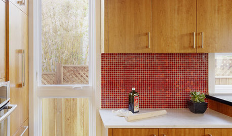
KITCHEN DESIGNKitchen Color: 15 Ravishing Red Backsplashes
Bring some zing to your kitchen with a backsplash of ruby-colored tiles or back-painted glass
Full Story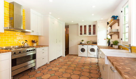
KITCHEN DESIGNNew This Week: 4 Surprising Backsplash and Countertop Pairings
Make your kitchen workspace stand out with colored ceramic tile, back-painted glass, butcher block and more
Full Story
MATERIALSKitchen Ideas: How to Choose the Perfect Backsplash
Backsplashes not only protect your walls, they also add color, pattern and texture. Find out which material is right for you
Full Story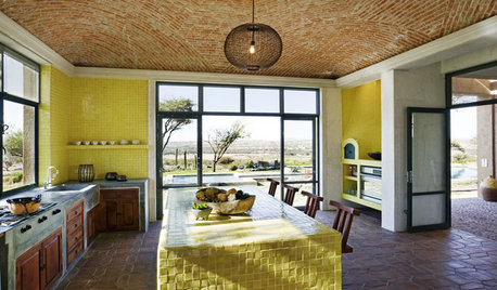
KITCHEN DESIGNKitchen Color: 7 Sensational Yellow Backsplashes
Warm up a white kitchen or add some zing to wood tones with a backsplash that glows
Full Story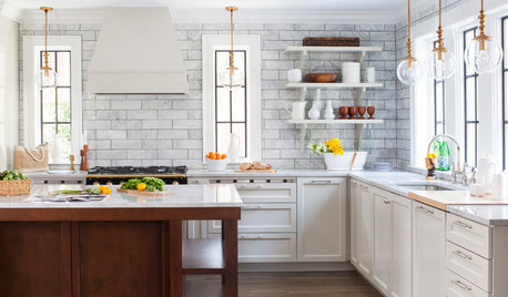
KITCHEN DESIGN7 Magnificent Oversize Backsplashes
They go up to the ceiling and don’t fall short on making a major impact. Are you ready to hop on the big-backsplash bandwagon?
Full Story


avntgardnrOriginal Author
Gracie
Related Professionals
Cuyahoga Falls Kitchen & Bathroom Designers · Four Corners Kitchen & Bathroom Designers · Schaumburg Kitchen & Bathroom Designers · Athens Kitchen & Bathroom Remodelers · Jacksonville Kitchen & Bathroom Remodelers · Lyons Kitchen & Bathroom Remodelers · Oklahoma City Kitchen & Bathroom Remodelers · Fairmont Kitchen & Bathroom Remodelers · Black Forest Cabinets & Cabinetry · Foster City Cabinets & Cabinetry · Key Biscayne Cabinets & Cabinetry · Murray Cabinets & Cabinetry · Channahon Tile and Stone Contractors · Farragut Tile and Stone Contractors · Pendleton Tile and Stone ContractorsVertise
avntgardnrOriginal Author
mark_rachel
Vertise
avntgardnrOriginal Author
amck2
avntgardnrOriginal Author
diymom79
sprtphntc7a
Gracie
avntgardnrOriginal Author
my_four_sons
sjhockeyfan325
Vertise