


A New (Yellow) Direction! Would love input!
2LittleFishies
12 years ago


Sort by:Oldest
Comments (138)
Related Stories
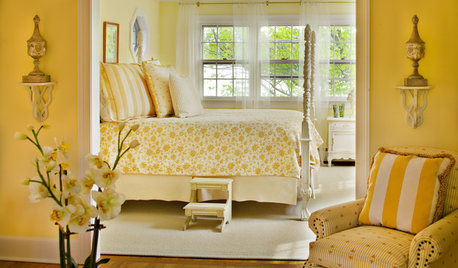
COLORWelcome Yellow Around Your Home for an Instant Lift
Keep on the sunny side with shades of yellow from buttery and soft to dynamic and bright
Full Story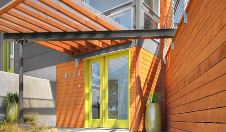
CURB APPEALFront and Center Color: When to Paint Your Door Yellow
Bring a burst of eternal sunshine to your home's entryway with an invigorating yellow front door
Full Story
COLORNature’s Color Wisdom: Lessons on Yellow From the Great Outdoors
Let the sunshine in. These ways to use yellow will cheer up your interiors and make Mother Nature proud
Full Story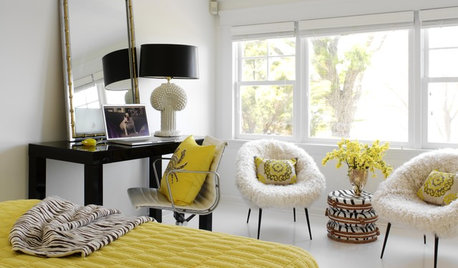
BLACK14 Buzzworthy Yellow and Black Interiors
Follow the flight of the bumblebee for a bold, glam, elegant or even subtle look for your home
Full Story
COLORColor of the Week: Spring Blossom Yellow
Tired of winter yet? Bring on spring with our featured color of the week
Full Story
COLOR11 Ways to Add a Splash of Yellow to Your Interior
See how a dab of this sunshiny color can bring warmth and cheer to a room
Full Story
COLORBest Ways to Use the Soft Yellow Color of 2014
You may fall for PPG Pittsburgh Paints’ Turning Oakleaf if you like your hues warm, mellow and cheery
Full Story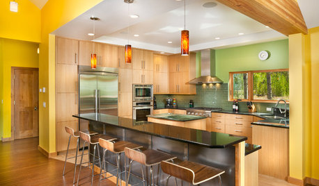
YELLOWColor of the Week: Celebrate Summer With Sunny Yellow
Bring home some of that glorious summer sunshine
Full Story
GARDENING GUIDESHartweg’s Sundrops Blankets Southwestern Landscapes in Yellow
The vivid flowers of Calylophus hartwegii add sunny color to drought-tolerant gardens from spring through fall
Full Story
EXTERIOR COLORThe Joyful Exterior: Say Hello to Yellow
Whether you favor bright or mellow, see how to add eye-catching yellow accents
Full Story

2LittleFishiesOriginal Author
jterrilynn
Related Professionals
Leicester Kitchen & Bathroom Designers · Peru Kitchen & Bathroom Designers · Saratoga Springs Kitchen & Bathroom Designers · Minnetonka Mills Kitchen & Bathroom Remodelers · Morgan Hill Kitchen & Bathroom Remodelers · Panama City Kitchen & Bathroom Remodelers · Skokie Kitchen & Bathroom Remodelers · Wilson Kitchen & Bathroom Remodelers · Lawndale Kitchen & Bathroom Remodelers · East Saint Louis Cabinets & Cabinetry · Jeffersontown Cabinets & Cabinetry · Little Chute Cabinets & Cabinetry · Manville Cabinets & Cabinetry · Whitehall Cabinets & Cabinetry · Des Moines Tile and Stone Contractors2LittleFishiesOriginal Author
jterrilynn
2LittleFishiesOriginal Author
marcolo
2LittleFishiesOriginal Author
2LittleFishiesOriginal Author
lavender_lass
2LittleFishiesOriginal Author
2LittleFishiesOriginal Author
lavender_lass
2LittleFishiesOriginal Author
lavender_lass
2LittleFishiesOriginal Author
enduring
lavender_lass
marcolo
2LittleFishiesOriginal Author
2LittleFishiesOriginal Author
2LittleFishiesOriginal Author
bellajourney
hlove
bellajourney
2LittleFishiesOriginal Author
mabeldingeldine_gw
2LittleFishiesOriginal Author
enduring
lavender_lass
hlove
marcolo
hlove
bethcw
mabeldingeldine_gw
2LittleFishiesOriginal Author
Lake_Girl
2LittleFishiesOriginal Author
lavender_lass
2LittleFishiesOriginal Author
lavender_lass
oasisowner
2LittleFishiesOriginal Author
baligirl
2LittleFishiesOriginal Author
lavender_lass
2LittleFishiesOriginal Author
doonie
taggie
2LittleFishiesOriginal Author
lavender_lass