


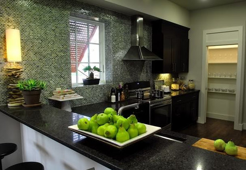
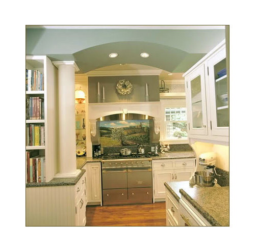
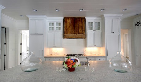
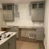
Assymetry flanking hood--is this a problem?
breezygirl
13 years ago


Sort by:Oldest
Comments (35)
Related Stories
KITCHEN DESIGNWood Range Hoods Naturally Fit Kitchen Style
Bring warmth and beauty into the heart of your home with a range hood crafted from nature's bounty
Full Story
LIFETrue Confessions of a House Stalker
Letting go when a new owner dares to change a beloved house's look can be downright difficult. Has this ever happened to you?
Full Story
LANDSCAPE DESIGNGreat Design Plant: Retreat to the Shade of Hardy Catalpa
Big foliage and a towering height provide a shady respite in summer, but that's not all hardy catalpa offers dedicated gardeners
Full Story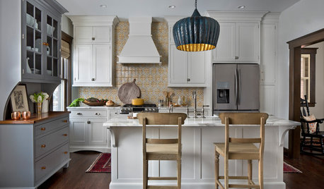
KITCHEN OF THE WEEKKitchen of the Week: New Kitchen Fits an Old Home
A designer does some clever room rearranging rather than adding on to this historic Detroit home
Full Story
KITCHEN DESIGNShow Us Your Best Kitchen Innovation
Did you take kitchen functionality up a notch this year? We want to see your best solutions for the hardest-working room in the house
Full Story
HOUZZ CALLShow Us the Best Kitchen in the Land
The Hardworking Home: We want to see why the kitchen is the heart of the home
Full Story
KITCHEN APPLIANCESFind the Right Oven Arrangement for Your Kitchen
Have all the options for ovens, with or without cooktops and drawers, left you steamed? This guide will help you simmer down
Full Story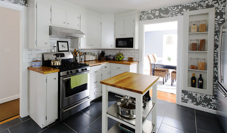
KITCHEN DESIGNKitchen of the Week: A Budget Makeover in Massachusetts
For less than $3,000 (not including appliances), a designing couple gets a new kitchen that honors the past
Full Story
BEFORE AND AFTERSA ‘Brady Bunch’ Kitchen Overhaul for Less Than $25,000
Homeowners say goodbye to avocado-colored appliances and orange-brown cabinets and hello to a bright new way of cooking
Full Story
KITCHEN DESIGNKitchen of the Week: Function and Flow Come First
A designer helps a passionate cook and her family plan out every detail for cooking, storage and gathering
Full StoryMore Discussions


lyvia
User
Related Professionals
Kalamazoo Kitchen & Bathroom Designers · Redmond Kitchen & Bathroom Designers · Springfield Kitchen & Bathroom Designers · Olympia Heights Kitchen & Bathroom Designers · Cherry Hill Kitchen & Bathroom Designers · Waianae Kitchen & Bathroom Designers · University City Kitchen & Bathroom Remodelers · Allouez Kitchen & Bathroom Remodelers · Elk Grove Kitchen & Bathroom Remodelers · Pearl City Kitchen & Bathroom Remodelers · Pinellas Park Kitchen & Bathroom Remodelers · Bon Air Cabinets & Cabinetry · Plymouth Cabinets & Cabinetry · White Center Cabinets & Cabinetry · Milford Mill Cabinets & Cabinetrymalhgold
User
palimpsest
live_wire_oak
sandn
rhome410
breezygirlOriginal Author
babs711
breezygirlOriginal Author
NYSteve
rhome410
tanders
rhome410
User
rhome410
rhome410
tanders
breezygirlOriginal Author
elle3
rhome410
live_wire_oak
boxerpups
malhgold
rhome410
breezygirlOriginal Author
breezygirlOriginal Author
live_wire_oak
breezygirlOriginal Author
rhome410
breezygirlOriginal Author
breezygirlOriginal Author
rhome410
breezygirlOriginal Author