


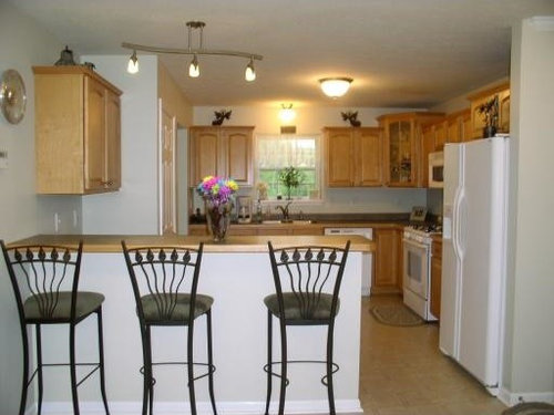
need help with kitchen color
djs6
13 years ago
Related Stories
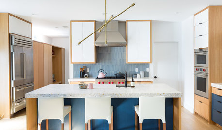
KITCHEN DESIGNHere's Help for Your Next Appliance Shopping Trip
It may be time to think about your appliances in a new way. These guides can help you set up your kitchen for how you like to cook
Full Story
KITCHEN DESIGNKey Measurements to Help You Design Your Kitchen
Get the ideal kitchen setup by understanding spatial relationships, building dimensions and work zones
Full Story
MOST POPULAR7 Ways to Design Your Kitchen to Help You Lose Weight
In his new book, Slim by Design, eating-behavior expert Brian Wansink shows us how to get our kitchens working better
Full Story
KITCHEN DESIGNDesign Dilemma: My Kitchen Needs Help!
See how you can update a kitchen with new countertops, light fixtures, paint and hardware
Full Story
SELLING YOUR HOUSE10 Tricks to Help Your Bathroom Sell Your House
As with the kitchen, the bathroom is always a high priority for home buyers. Here’s how to showcase your bathroom so it looks its best
Full Story
MY HOUZZMy Houzz: Friends Help With the DIY Redo of a San Antonio Kitchen
A Texas homeowner and her pals transform the room with green painted cabinets, open shelving and shiplap walls
Full Story
LIFEDecluttering — How to Get the Help You Need
Don't worry if you can't shed stuff and organize alone; help is at your disposal
Full Story
STANDARD MEASUREMENTSKey Measurements to Help You Design Your Home
Architect Steven Randel has taken the measure of each room of the house and its contents. You’ll find everything here
Full Story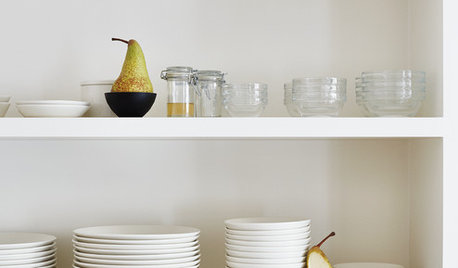
LIFEYou Said It: ‘Put It Back’ If It Won’t Help Your House, and More Wisdom
Highlights from the week include stopping clutter from getting past the door, fall planting ideas and a grandfather’s gift of love
Full StoryMore Discussions

steff_1
djs6Original Author
Related Professionals
Clarksburg Kitchen & Bathroom Designers · Haslett Kitchen & Bathroom Designers · University City Kitchen & Bathroom Remodelers · Forest Hill Kitchen & Bathroom Remodelers · Bay Shore Kitchen & Bathroom Remodelers · Bremerton Kitchen & Bathroom Remodelers · Honolulu Kitchen & Bathroom Remodelers · Lomita Kitchen & Bathroom Remodelers · Roselle Kitchen & Bathroom Remodelers · Vashon Kitchen & Bathroom Remodelers · Waukegan Kitchen & Bathroom Remodelers · Gibsonton Kitchen & Bathroom Remodelers · Burr Ridge Cabinets & Cabinetry · Hammond Cabinets & Cabinetry · Santa Rosa Tile and Stone Contractorssteff_1
djs6Original Author
steff_1
djs6Original Author
steff_1
nansea